A climate tech founder preparing for a Series A meeting has a website that doesn't match the credibility of the technology. The product interface tells a different visual story from the pitch deck. The brand looks assembled, not designed. The question they're asking isn't "do we need a designer?" — it's whether they need brand guidelines, a design system, or both, and which one to build first.
Most founding teams treat this as a design problem. In our experience, it's a positioning problem. Getting the sequencing wrong creates a credibility gap at exactly the moment investors and enterprise buyers are deciding whether you're ready.
Here, we break down what each framework actually does, where they differ, how they work together, and how to decide which one your current stage demands.
TL;DR
- Design systems provide reusable UI components, design tokens, and documentation for digital product development
- Brand guidelines govern visual identity — logos, colors, typography, tone — across your website, pitch materials, print collateral, and every channel where your brand appears
- Use design systems to keep your product team building consistently; use brand guidelines to govern how your identity is expressed by agencies, vendors, and marketing
- Both work together: brand guidelines define your identity, design systems scale digital products
- Start with brand guidelines for foundational identity; prioritize design systems when scaling digital products rapidly
What is a design system?
A design system is a complete set of standards intended to manage design at scale, using reusable components and patterns. Static style guides don't evolve — design systems do. They're living infrastructure connecting design decisions directly to code, enabling teams to build consistent, scalable digital products across platforms.
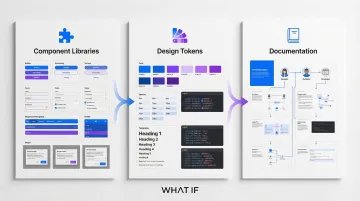
The core components include:
- Component libraries — Reusable UI elements (buttons, forms, navigation, modals) that serve as interface building blocks
- Design tokens — Named entities storing visual attributes (colors, spacing, typography) in formats converted across platforms
- Documentation — Guidelines explaining component usage to align designers and developers
Within your team, the primary users of a design system are your product designers, developers, and UX/UI specialists. They rely on design systems to reduce decision fatigue and focus on solving user problems rather than rebuilding basic interface patterns from scratch.
Key characteristics of design systems
Digital-first focus: Design systems are built specifically for screens using RGB color modes, interactive states (hover, focus, active), and responsive behaviors that adapt across devices. Every component considers touch targets, keyboard navigation, and screen reader compatibility.
Living documentation: Design systems evolve continuously with version control and regular updates. Leading systems like Procore's CORE release updates every 2 weeks, ensuring teams always work with current patterns.
Established examples:
- Google Material Design — Open-source code library with motion design principles and adaptive layouts that work across Android, iOS, and web platforms
- IBM Carbon Design System — Enterprise-focused system featuring accessibility-first components and extensive developer resources for building data-heavy applications
- Shopify Polaris — Merchant-experience system optimized for e-commerce workflows, with strict versioning and contribution governance
Benefits for product development
Speed and efficiency: Research by Sparkbox demonstrates that using the Carbon Design System made building a simple form page 47% faster (median time 2 hours) compared to coding from scratch (median time 4.2 hours).
Design systems ensure a unified user experience across multiple products, platforms, and teams. When every button, form field, and navigation pattern follows the same rules, users develop familiarity that transfers across your entire product suite.
A Forrester study on Figma's Dev Mode found that improved design-dev efficiency delivered a 351% ROI and a net present value of $7.9 million over three years. Shared language and components reduce miscommunication and handoff friction.
In practice, what we see most often is that climate tech teams — whether building grid analytics tools or carbon monitoring platforms — accumulate design debt fast. A design system isn't a luxury at that stage. It's what prevents your product from looking like a different company on every screen.
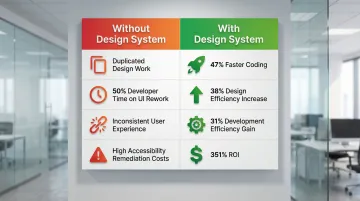
Design systems act as critical control points for digital compliance. Fix accessibility issues (focus indicators, contrast ratios, ARIA labels) in a single master component, and those errors resolve instantly across hundreds of instances. This significantly reduces remediation costs and legal risk.
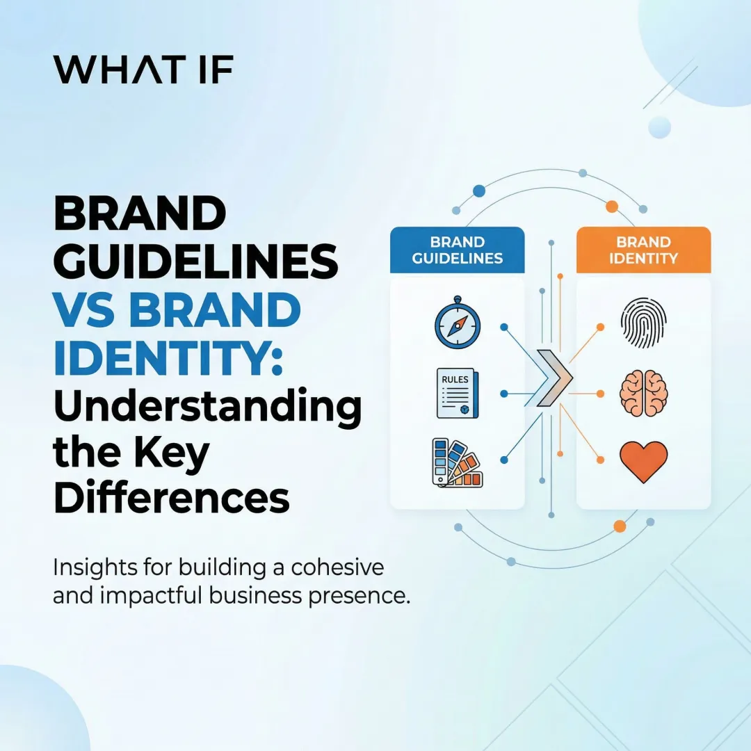
What are brand guidelines?
Brand guidelines are comprehensive frameworks establishing rules for maintaining consistent brand identity across all places customers encounter your brand — both digital and physical.
They define the "soul" of your brand, including philosophy, voice, tone, and visual strategy that differentiates you in the market.
Core components include:
- Logo specifications for placement, safe zones, minimum sizes, and prohibited modifications
- Color palettes with complete specifications (CMYK and Pantone for print, RGB/HEX for digital)
- Typography standards covering typeface selections, hierarchy rules, and usage guidelines
- Imagery guidelines defining photography style, illustration approach, and iconography rules
- Tone of voice principles establishing communication style and messaging frameworks

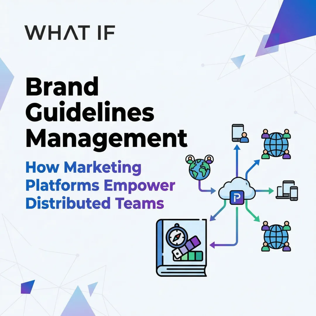
These guidelines serve marketing teams, content creators, external agencies, and vendors who create brand materials. The framework allows distributed teams to maintain brand integrity without constant oversight.
Key characteristics of brand guidelines
Cross-medium application:
Brand guidelines work across every channel where your brand appears — websites and social media, printed pitch decks and conference materials, physical trade show booths, and merchandise. The color specifications cover both digital (RGB/HEX) and print (CMYK, Pantone) formats, so your identity holds whether it's on a screen or a banner at a climate conference.
Static documentation:
Delivered as PDF or web-based style guides providing clear rules and restrictions. While content may evolve during major rebrands, the format remains reference documentation rather than interactive tooling.
Real-world examples:
- Coca-Cola — Defines primary and secondary color palettes with specific CMYK/PMS values and strict logo usage rules maintaining global consistency across billions of touchpoints
- Spotify — Provides detailed developer guidelines on logo usage, color restrictions (the distinctive "Spotify Green"), and attribution requirements for partner integrations
- Airbnb — Establishes clear trademark usage rules, prohibiting use of their "Bélo" logo or "Rausch" color in ways that imply endorsement or cause confusion
Benefits for brand management
Strong brand guidelines deliver measurable business impact.
Trust and recognition:
- McKinsey research documents how one bank achieved a $2.3 billion lift in customer spend through consistent brand experience
- The same research showed a 28-percentage-point increase in customer satisfaction
- Consistency builds recognition and trust across all customer interactions
Scalability across teams:
- Well-defined brand identity (logo, colors, typography) provides the foundation for all future marketing
- Clear guidelines reduce the need to renegotiate scope for every new asset
- External vendors and global teams maintain brand integrity without constant supervision
Flexibility with boundaries: Good brand guidelines don't cage your team — they define what's required and leave the rest open. When the rules are clear about which elements are fixed (logo, primary colors) and which are flexible (photography style, layout), teams can adapt brand expression to new contexts without compromising recognizability.
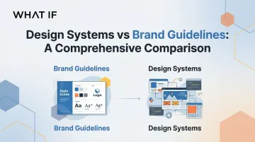
Design systems vs brand guidelines: quick comparison
| Feature | Brand Guidelines | Design Systems |
|---|---|---|
| Primary focus | Identity and brand perception | Digital product consistency and scalability |
| Target audience | Marketers, designers, agencies, vendors | Product teams, developers, UX designers |
| Core components | Logo rules, color palettes (CMYK/Pantone/RGB), typography, tone of voice | Component libraries, design tokens, interactive patterns, code documentation |
| Color specifications | CMYK, Pantone, RGB for cross-medium use | RGB/HEX for screens, with interactive state variations |
| Update frequency | Refresh every 3–5 years or during rebrands | Continuous iteration with bi-weekly to monthly releases |
| Primary use cases | Marketing materials, print collateral, vendor communications, physical spaces | Websites, mobile apps, SaaS products, digital experiences |
| Format | Static PDF or web-based reference documentation | Living code repositories with version control |
Design systems are deliberate tools for building digital products. Brand guidelines are frameworks for maintaining brand identity across every surface — digital and physical.
How they work together:
- Brand guidelines establish the "what" and "why" of your identity
- Design systems provide the "how" for digital implementation
- Color tokens in your design system should map directly to your brand palette
- Component styling must reflect brand personality across your website, mobile app, and product interfaces
- Design systems add technical specifications (interactive states, responsive behavior, accessibility standards) that brand guidelines don't address
What this comparison doesn't show is the sequencing problem. Most founders we work with have one or the other, rarely both — and when they built their design system before establishing brand guidelines, the system ends up encoding inconsistency rather than resolving it.
Design systems vs brand guidelines: which should you choose?
The choice isn't either/or for most founders — it's about timing and priorities based on where you are and what you're building toward. Getting this right early prevents costly retrofitting later.
When to start with brand guidelines
You're establishing or rebranding your company identity and need foundational visual and verbal standards before building digital products. For a climate tech founder, this often coincides with closing a seed round — the moment your brand shifts from internal tool to investor-facing asset. Clear brand direction prevents arbitrary, inconsistent design decisions.
You have multiple external partners, agencies, or distributed teams that need clear brand rules. Brand guidelines allow vendors to execute correctly without constant oversight, reducing bottlenecks and maintaining consistency.
You need cross-medium consistency across digital, print, physical spaces, and merchandise. If your brand appears on packaging, trade show booths, or printed materials, brand guidelines with CMYK/Pantone specifications are essential.
When to start with design systems
You're scaling digital products rapidly and need to maintain UI/UX consistency across multiple platforms or product lines. Without a design system, teams duplicate work and create divergent patterns that confuse users.
You have an established brand identity but struggle with inconsistent implementation in digital experiences. If your website, mobile app, and SaaS platform look like they're from different companies despite sharing a logo, you need a design system.
Developer efficiency is critical to your business model. If engineering velocity determines your competitive advantage, the 47% speed improvement from design systems directly impacts your bottom line.
When you need both simultaneously
While the previous scenarios suggest choosing one framework first, some situations demand both from day one.
You're launching a new product or company and need both brand foundation and scalable digital infrastructure. Early integration prevents costly retrofitting — building a design system after the fact means your engineering team spends significant time reworking accumulated inconsistencies rather than shipping new features.
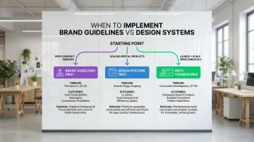
You're in climate tech or sustainability-focused industries where you need to build trust (brand) while moving fast (design systems). In climate tech especially, the credibility gap is costly. Green hydrogen companies, grid analytics platforms, and carbon monitoring tools are asking enterprise buyers and investors to trust technology that's still proving itself in the market. Your brand needs to carry that trust; your product needs to move fast enough to deliver on it.
Your go-to-market strategy demands both brand presence and digital product excellence. Companies that successfully integrate both from the start avoid the technical debt and brand inconsistencies that plague organizations retrofitting later.
Real-world applications: how leading organizations use both
Leading tech companies demonstrate how to bridge the gap between brand identity and digital product infrastructure through intentional integration.
IBM & Databand integration: When IBM acquired Databand, the startup team had to migrate from their lean design system to IBM's enterprise Carbon Design System. They conducted a full audit, mapping Databand components to Carbon equivalents, starting with foundational "atoms" like fonts, icons, and color tokens.
The results were concrete: product consistency improved across IBM's suite, developer handoff accelerated through reusable component patterns, and accessibility compliance — previously inconsistent — was resolved at the system level rather than component by component.
Spotify's "Encore" system: Spotify's design system focuses on creating coherence across mobile and desktop platforms. By centralizing logic and using shared tokens, they ensure the Spotify brand experience remains uniform regardless of device.
Their contribution model encourages community input. Teams add new components to a backlog, develop them collaboratively, and ship them as part of Encore — allowing the system to grow organically while maintaining brand consistency.
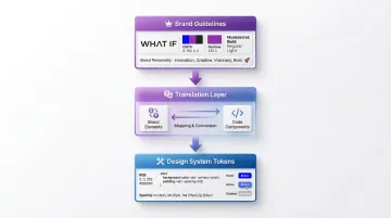
Practical workflow: Brand guidelines inform design system decisions at the token level:
- Color tokens map directly to brand palette values
- Component styling reflects brand personality (rounded vs. sharp corners, friendly vs. formal tone)
- Spacing systems align with brand's visual rhythm
This alignment means every interface built with the design system automatically expresses brand identity correctly.
How What if Design approaches this challenge
What these examples illustrate is that brand and design system thinking works best when it's integrated from the start. We apply this directly, working with climate tech companies to build both frameworks simultaneously.
When brand identity informs design system creation from day one, you avoid retrofitting costs and ensure consistency across digital products and marketing materials.
We worked with HYDGEN, a green hydrogen startup, to build a brand identity and digital presence that enterprise buyers could evaluate without a technical briefing first — and that held up as their product platform scaled. We approached the same challenge with Ribbit Network, a climate sensor network company, where a consistent visual identity needed to carry weight in funding conversations while their product continued to develop.
Working with a specialist design partner — rather than hiring senior in-house designers — gives you access to expertise in both brand strategy and design system architecture without the overhead of building a full internal team.
If your brand and product haven't been built to work together from day one, it's worth looking at the signal that sends. Connect with What if Design.
Frequently asked questions
Can a small startup afford both a design system and brand guidelines?
Yes — startups can begin with lightweight versions of both. Establishing core brand guidelines (logo, color, typography, tone) doesn't require a large team, and open-source systems like Material Design provide a foundation for a design system without building from scratch.
How often should design systems and brand guidelines be updated?
Brand guidelines update every 3–5 years or during major rebrands. Design systems evolve continuously — leading systems update every 2 weeks, while others follow monthly or quarterly cycles.
Do design systems replace the need for brand guidelines?
No — design systems complement but don't replace brand guidelines. Design systems handle digital product consistency and technical implementation, while brand guidelines govern broader identity across websites, print materials, physical spaces, and vendor communications. Both frameworks serve distinct operational needs and work best when aligned.