You've raised your seed round. You have a working pilot and a technology that genuinely solves a hard problem. But when an investor or potential enterprise partner lands on your website, they leave within seconds. Not because your technology is unimpressive, but because your website doesn't make that case fast enough.
This is a positioning problem, not a marketing problem. For climate and deep tech startups, the website is the first credibility signal, and it carries more weight than most technical founders expect. Investors and partners don't have time to decode complex architecture or parse dense feature lists. They're looking for a clear signal that you understand the problem, you have a credible solution, and you're the right team to execute.
TLDR: key takeaways
- UX/UI design increases conversion rates by 200-400% through friction reduction and immediate credibility signals
- Mobile forms convert 14% lower than desktop despite 58-60% mobile traffic, a gap that represents a large volume of lost leads
- 40% of users abandon websites that take more than 3 seconds to load, making page speed a direct conversion factor
- Every additional form field reduces completion rates by approximately 11%, while multi-step forms can boost conversions by 35-50%
- For climate and deep tech companies, design is how you signal technical credibility and build trust with investors, enterprise buyers, and partners who are still evaluating your technology
Understanding UX/UI design: the foundation of digital lead generation
What UX and UI actually mean
User Experience (UX) covers the entire journey users take when interacting with your digital product, from their first impression through to completing a conversion action. It's about how things work, how intuitive the flow feels, and whether users can accomplish their goals without friction.
User Interface (UI) focuses on the visual and interactive elements users engage with directly: buttons, forms, color schemes, typography, and layout. UI is what users see and touch; UX is what they feel and experience.
These two disciplines work together as strategy and execution. UX provides the blueprint, the structure, logic, and flow that removes barriers to conversion. UI brings that blueprint to life through visual design that builds trust and guides attention. When both align, the path from first impression to lead conversion becomes clear and intuitive. For an enterprise buyer running a vendor evaluation, that alignment is often the difference between making the shortlist and being filtered out before a conversation happens.
The five layers of UX design
Effective UX design operates across five interconnected layers:
- Strategy: Defines what problem you're solving and for whom, the foundation of any design that drives conversions
- Scope: Determines which features and content support your lead generation goals
- Structure: Organizes information and workflows so users can navigate intuitively
- Skeleton: Establishes layout, placement, and arrangement of elements on each page
- Surface: Delivers the final visual design that users interact with directly
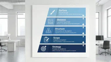
A gap in any single layer creates friction that costs you leads. A polished interface can't compensate for confusing navigation. Clear organization won't overcome slow load times or a weak visual hierarchy. In a procurement process where a buyer is evaluating multiple vendors in a single afternoon, friction in any layer costs you the evaluation before you've had a chance to make your case.
Why design matters more than ever
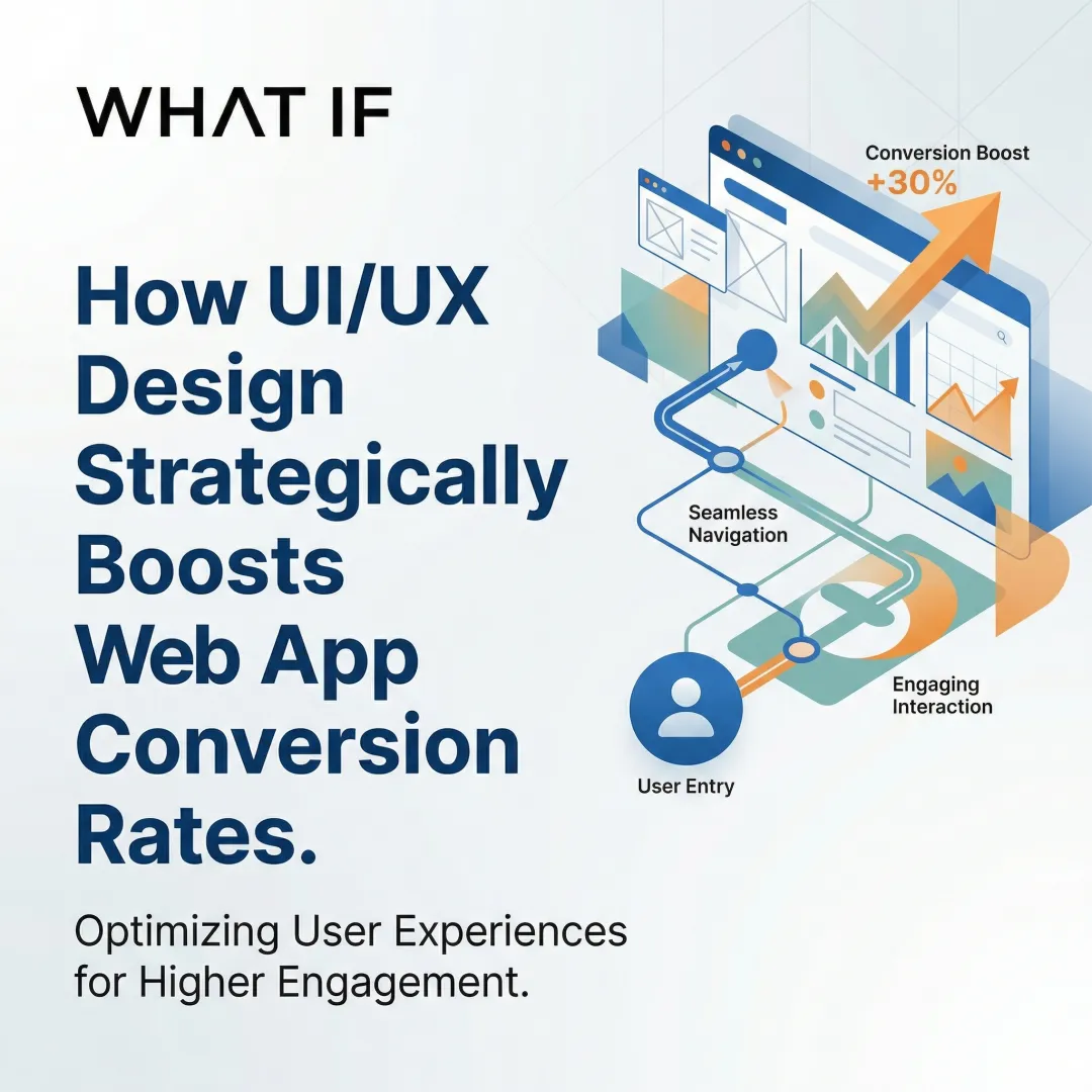
Design quality has become a primary credibility signal in digital-first buyer journeys. A well-designed UI can increase conversion rates by up to 200%, while improved UX design can boost conversions by 400%. Every $1 invested in UX returns approximately $100, a 9,900% ROI, largely because of design's role in first impressions. When 94% of initial credibility judgments are design-related, your visual presentation determines whether prospects stay long enough to become leads.
For climate and deep tech startups, this matters more acutely than it does for most categories. When your technology is novel and still proving itself at scale, a polished digital presence signals operational maturity. Investors, enterprise buyers, and government partners are pattern-matching for signals of credibility. A dated or generic website creates doubt before a single conversation begins, regardless of how strong your pilot data is.
Consider a battery storage startup that had completed a successful pilot with a regional grid operator. When the operator's procurement team visited the website to build an internal business case, they found a site that looked like it hadn't been updated since the fundraise. The deal slowed for weeks while the team rebuilt confidence through other channels — a delay caused entirely by a presentation problem, not a technology problem.
Key UX/UI elements that drive lead generation
Visual hierarchy and information architecture
Visual hierarchy directs attention using size, color, contrast, and placement. Intentional hierarchy guides visitors toward high-priority actions, whether that's requesting a demo, submitting a contact form, or starting a product trial, without overwhelming them with competing choices.
Effective information architecture matches how your prospects actually think about your solution. Your primary navigation should reflect how procurement teams or project developers think about your offering, not your internal org structure. Your content should follow a logical progression from problem to solution to clear next action, and every entry point needs a clear path to conversion without dead ends.
For climate and deep tech companies, this often means leading with the specific problem you solve for your buyer, not your technological breakthrough. A carbon capture startup's navigation should reflect how a project developer or asset manager evaluates solutions, not how your R&D team categorizes the science.
Strategic implementation means positioning prominent CTAs where decision-making naturally occurs in the user journey, using progressive disclosure that reveals technical depth gradually as users demonstrate interest, and building scannable layouts with clear headings that allow fast information extraction.
Mobile-first design and responsiveness
Mobile devices now drive 58-60% of web traffic, yet mobile conversion rates still lag desktop by 14% on average. That gap represents a significant volume of leads that never complete the journey.
Imagine a grid monitoring startup where 65% of inbound traffic comes from field engineers evaluating solutions on-site. If your contact form requires horizontal scrolling and lacks auto-fill support on mobile, you're losing procurement-stage leads from exactly the buyers you need to reach — before a single conversation begins.
Mobile-first design optimizes for touch interfaces, limited screen space, and on-the-go contexts. In practice, this means sizing touch targets appropriately (minimum 44x44 pixels) with adequate spacing, simplifying forms for mobile completion with appropriate keyboard types triggered automatically, streamlining navigation for thumb-friendly access, and prioritizing content for smaller viewports so less critical information doesn't compete for attention.
Validating the mobile experience requires testing on actual iOS and Android devices across multiple screen sizes — not just simulators — checking form completion and load times on mobile networks rather than high-speed connections. What works on a desktop simulator frequently breaks on an actual phone. In a competitive vendor evaluation, a broken mobile experience doesn't just cost you a lead — it costs you the evaluation.
Page speed and performance optimization
Page speed has a direct, measurable impact on whether visitors convert. A 1-second delay in page load reduces conversions by 7%, and bounce probability increases by 32% when load time goes from 1 to 3 seconds.
Performance optimization strategies:
- Image optimization: Compress images, use modern formats like WebP, and implement lazy loading
- Code efficiency: Minify CSS and JavaScript, eliminate render-blocking resources
- CDN deployment: Distribute content globally for faster delivery regardless of user location
- Core Web Vitals: Optimize for load time (under 2.5s), interaction speed (under 200ms), and visual stability (CLS below 0.1)
Vodafone achieved an 8% increase in sales and 15% improvement in lead-to-visit rate by improving their LCP score by 31%, demonstrating that speed improvements produce immediate, measurable revenue impact.
Strategic CTA placement and form design
CTAs convert visitors into leads when they're designed with intention. CTAs placed above the fold perform 304% better than those below, while action-focused button copy can lift conversions by 161%.
Effective CTAs have a distinct visual treatment that stands out without clashing with the surrounding layout, use action-oriented copy that describes the benefit rather than just the action, sit at natural decision points in the user journey, and maintain consistent design across touchpoints so prospects recognise them on return visits.
For B2B climate tech buyers, whether they're asset managers evaluating a project or procurement officers at a utility, your CTAs and forms need to reflect their context. A clear next step that feels low-risk and information-rich converts far better than a generic "get in touch" buried at the bottom of a page.
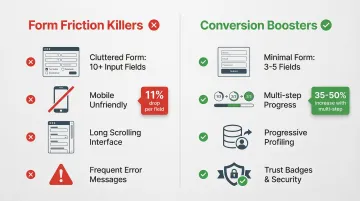
Form optimization is equally critical. Every additional form field reduces completion rates by approximately 11%, and requesting phone numbers carries the strongest negative impact, reducing conversions by an average of 18.7%.
Form best practices:
- Limit fields to 3-5 for maximum volume; add more only when lead quality justifies the friction
- Use multi-step forms to reduce the perceived effort, which can increase completion by 35-50%
- Implement progressive profiling to collect data across multiple interactions, which research suggests drives 47% higher conversion rates
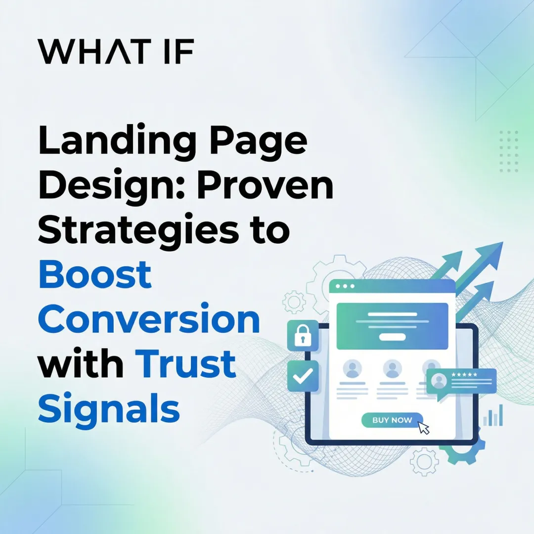
Add trust signals near your form — security badges, privacy policies, and relevant testimonials — and use smart defaults with real-time field validation to reduce errors without adding to the perceived effort.
Whitespace, simplicity, and clarity
Whitespace functions as a strategic design tool. Used generously, it reduces cognitive effort, helps information register clearly, and keeps visitors focused on conversion actions rather than overwhelmed by visual density.
Simplicity principles that directly support lead generation come down to discipline: every element should serve a clear purpose — remove anything that doesn't. Limit choices at each decision point to prevent decision paralysis, use language that matches your audience's vocabulary rather than your internal technical terminology, and create visual breathing room between sections and elements.
When prospects can quickly understand your value proposition and see clear next steps, conversion becomes a natural outcome of good navigation rather than something you're forcing. A procurement officer evaluating three shortlisted vendors in the same afternoon will progress fastest with the one whose website answers their questions without effort — that's the company that gets the callback.
The psychology behind design: building trust and reducing friction
How design builds (or destroys) trust
75% of users admit to judging a company's credibility based on website design. This judgment happens in milliseconds, before prospects read a word of your carefully crafted copy.
For climate and deep tech startups competing against incumbents with decades of brand equity and marketing budgets you can't match, a professional, coherent digital presence is one of the few credibility signals fully within your control. Inconsistent branding, outdated design patterns, or an interface that feels cobbled together raises an unspoken question: if they can't maintain their website, can they deliver on a complex, first-of-a-kind technology?
The basics matter: consistent branding across all touchpoints; security badges and SSL certificates prominently displayed; client logos and testimonials from recognizable organizations; case studies with specific, measurable outcomes; and professional photography and custom graphics rather than generic stock images.
19% of users abandon checkout flows because they don't trust the site with their information. For B2B lead generation where sensitive business data is shared, trust signals are a direct conversion requirement, not an optional enhancement.
The role of color, typography, and visual consistency
Color psychology influences perception and action. While context matters more than universal rules, blue conveys trust, stability, and professionalism and is well-suited to financial or enterprise contexts. Green signals growth and sustainability — a natural fit for environmental brands, though climate tech companies should be careful not to let it tip into visual cliché. Red draws attention and creates urgency, useful for time-sensitive offers but rarely the right choice for B2B lead generation.
Consistency in color usage matters more than any individual choice. Maintaining a coherent color scheme across all touchpoints builds the kind of visual familiarity that translates into trust. Research suggests strategic color use can boost brand recognition by up to 80%.
Typography communicates brand personality while directly affecting readability. Clean, professional fonts signal credibility for B2B audiences, while distinctive typography can differentiate your brand in a crowded field. Text must remain legible across devices regardless of the stylistic choices you make.
Visual consistency across pages, platforms, and campaigns builds recognition. When every touchpoint feels cohesive, prospects develop confidence in your organization's attention to detail, which matters when you're asking them to trust an unproven technology.
Reducing cognitive load and decision fatigue
Cognitive load refers to the mental effort required to process information and make decisions. High cognitive load causes abandonment, not conversion. This is especially relevant for climate and deep tech websites, which often carry significant technical content that founders want visitors to understand.
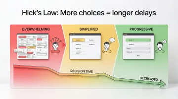
Hick's Law states that decision time increases with the number of available choices. More options create longer delays and higher abandonment rates, which is why simplifying navigation and conversion paths reliably improves results.
The practical application of Hick's Law means limiting navigation to 5-7 primary choices, using progressive disclosure to reveal technical depth as users demonstrate genuine interest, breaking complex processes into sequential steps, providing clear defaults and explicit recommendations, and cutting any choice at a decision point that isn't essential to moving forward.
Multi-step forms work because they reduce visible complexity at any given moment, even when collecting the same total information. Each step feels manageable, which keeps users moving forward rather than abandoning mid-flow. In a long B2B sales cycle, getting a buyer to complete your demo request form is a meaningful commercial milestone — complexity at that step doesn't just cost you data, it costs you a meeting.
Designing for accessibility expands your lead pool
Approximately 1.3 billion people (16% of the global population) live with disabilities, yet only 3% of the internet is fully accessible. Beyond the ethical case, this represents a significant segment of potential leads that poorly designed websites exclude.
Accessibility features improve experience for everyone, not just users with disabilities. Screen reader support requires clear heading hierarchy and descriptive labels — improvements that benefit content structure for all users, not just those using assistive technology. Keyboard navigation ensures forms work without a mouse, helping power users and those with motor impairments equally. Sufficient color contrast aids users with vision impairments while improving readability in bright lighting conditions, and clear error messages help everyone recover from mistakes efficiently.
55% of consumers have abandoned purchases due to accessibility issues, representing £120 billion in lost revenue in the UK alone. WCAG 2.2 compliance carries commercial weight alongside its ethical case.
Aligning design with brand mission and values
Climate tech companies face a specific credibility challenge: your technology may be years from full commercial deployment, and sophisticated buyers know it. Design that authentically communicates both mission and commercial viability helps close that gap. This means leading with the problem you solve and the proof points you currently have, not the long-term potential of the technology or the size of the addressable market.
Design signals values through visual identity choices — clean and efficient for sustainability-focused brands, bold and innovative for disruptive technologies — that communicate positioning before a word is read. Your content strategy should highlight impact metrics, certifications, and mission-aligned partnerships that demonstrate real traction. Low-carbon design practices reduce your environmental footprint while improving site speed. Accessibility through universal design principles signals inclusive values to an audience that often evaluates cultural alignment alongside commercial viability.
When design authentically reflects brand purpose, it attracts aligned customers while filtering out poor-fit prospects, improving both lead quality and conversion efficiency. One green hydrogen company targeting industrial offtakers restructured its site to lead with emissions reduction outcomes and pilot data rather than process chemistry. Within 60 days, inbound demo requests from qualified industrial buyers increased significantly — the same story told in the language buyers use to evaluate risk and value.
Common UX/UI mistakes that kill leads
Six preventable design flaws account for most lead generation failures. Fixing these consistently delivers measurable conversion improvements within weeks:
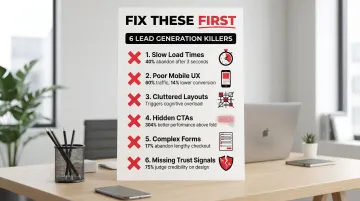
Slow load times drain revenue. According to Baymard Institute research, 88% of users won't return after a bad experience. Slow websites cost retailers $2.6 billion annually in lost sales, and the same principle applies to B2B lead generation.
Mobile experience gaps eliminate up to 60% of prospects. With mobile traffic dominating across industries, a suboptimal mobile experience blocks the majority of potential leads before they engage with your content.
Cluttered layouts trigger abandonment. Dense, visually overwhelming interfaces create cognitive overload. For technical founders who want to explain their technology in full, this is a common trap. The instinct to share everything works against you.
Hidden CTAs cost conversions. When the next step isn't visually obvious, prospects leave. CTAs must be visually distinct and placed at the points in the page where a decision naturally occurs.
Complex forms kill completion rates. The average US checkout includes 23.48 form elements, nearly double the optimal range of 12-14. Baymard Institute found that 17% of shoppers abandon orders due to lengthy, complicated checkout processes, a pattern that holds true for B2B lead forms.
Missing trust signals create hesitation. Without security indicators, recognizable client logos, or testimonials from credible organizations, prospects hesitate to share information or commit to next steps.
Internal teams often miss these issues because they know the product too well. What if Design's design audits consistently surface friction points that silently cost clients leads daily, problems that only become visible through fresh perspective and structured user testing.
Choosing the right UX/UI design partner for lead generation
Not all design agencies understand what drives lead generation. General agencies create visually appealing interfaces that fail to convert. The difference lies in whether your design partner treats the website as an aesthetic project or as lead generation infrastructure.
What to look for in a design partner:
- Portfolio evidence: Case studies showing measurable conversion improvements, not just attractive visuals
- Industry expertise: Real understanding of your sector's buyer journeys, sales cycles, and stakeholder expectations, not surface-level familiarity
- Strategic approach: A focus on business outcomes and lead generation metrics, not just project delivery
- Research methodology: Structured user testing, data analysis, and iterative optimization capabilities
- Technical competence: Page speed optimization, accessibility compliance, and mobile-first implementation
For climate tech and deep tech companies, agencies with genuine sector expertise offer a distinct advantage. The right partner understands complex technologies, long sales cycles, multi-audience messaging, and the specific trust-building challenge of selling a first-of-a-kind product to enterprise buyers or institutional investors. A general agency will require significant education before they can do meaningful strategic work. A sector-fluent partner can move fast.
Evaluating potential partners
Questions worth asking any design partner:
- Can you share specific conversion rate improvements from previous projects, with context on the starting point?
- How do you balance lead volume with lead quality in form design decisions?
- What does your user research and testing process look like?
- How do you ensure designs reflect our brand mission alongside our commercial positioning?
- What's your approach to mobile optimization and accessibility compliance?
The red flags are straightforward: a focus on aesthetics without any discussion of conversion metrics or business outcomes; generic approaches that don't account for your industry's unique buyer dynamics; an inability to provide measurable outcomes from past work; and no post-launch optimization or testing capabilities.
Some improvements produce immediate impact: page speed fixes and CTA redesigns can move metrics within days. Comprehensive redesigns typically show measurable results within 30-90 days as traffic accumulates and behavioral patterns emerge. Either way, lead generation through design requires ongoing optimization, not a one-time launch.
The startups that generate the most qualified leads aren't always the ones with the most traffic. They're the ones whose websites make the case clearly enough that the right people take the next step. That clarity is a design outcome.
Frequently asked questions
How does UX/UI design directly affect conversion rates?
Good design reduces friction at conversion points, builds trust quickly, and guides users toward action. Well-designed interfaces can increase conversion rates by 200%, while comprehensive UX improvements can boost conversions by 400%, primarily because design determines whether prospects stay long enough to engage with your value proposition.
What's the difference between UX and UI in the context of lead generation?
UX covers the overall strategy and user journey, removing barriers and creating clear conversion paths. UI is the visual execution through buttons, forms, colors, and layout that makes that journey intuitive. Both are required; strong UX without strong UI fails on credibility, and strong UI without strong UX fails on usability.
How long does it take to see results from UX/UI improvements?
Page speed optimizations and CTA redesigns can affect conversion rates within days. Comprehensive redesigns typically show measurable results within 30-90 days as traffic accumulates and behavioral patterns become statistically significant.
Can good design increase lead quality, not just quantity?
Yes. Strategic design pre-qualifies leads by clearly communicating your value proposition and positioning in a way that attracts ideal customers while filtering out poor fits. Form design choices also affect the quality of information you collect, allowing you to capture higher-value data without sacrificing completion rates.
What are the biggest UX mistakes that hurt lead generation?
The most common conversion killers are slow load times (40% of users abandon after 3 seconds), poor mobile experience (60% of traffic, 14% lower conversion rate), overly complex forms (each field reduces completion by approximately 11%), and weak or poorly placed CTAs.
How much should businesses invest in UX/UI design for lead generation?
Design is revenue-generating infrastructure, not a cost center. Every dollar invested in UX returns approximately $100 on average. Agencies specializing in lead generation-focused design typically cost significantly less than building an equivalent in-house team, while providing strategic depth that a single hire rarely can.