
You've built the product. The technology works, the pilot data is solid, and users are downloading the app. But somewhere between download and activation, they drop off. Sessions are short. Return rates are low. The support queue fills with questions that a better-designed flow would have answered automatically.
For climate tech and deep tech teams, a poorly designed mobile experience creates a specific kind of friction: it slows the path from interest to adoption at exactly the moment when traction matters most. With 46.1% of apps uninstalled within 30 days and mobile devices generating 62.5% of global web traffic, weak mobile UX doesn't just cost you users. It costs you validation data, pilot momentum, and the credibility that comes from demonstrable adoption.
This guide breaks down mobile UX design from first principles: the core constraints that make mobile different, the design decisions that determine whether users stay or leave, and the patterns that reliably improve activation and retention. Whether you're building your first app or auditing an existing product, here's what actually moves the needle.
TLDR: key takeaways
- Mobile UX design prioritizes touch interaction, smaller screens, and on-the-go usage patterns
- Core principles: thumb-friendly touch targets, simplified navigation, fast performance, and accessibility
- Mobile design differs fundamentally from desktop in screen size, interaction methods, and usage context
- Success depends on user research, platform-specific patterns, and continuous device testing
- Common pitfalls: cluttered interfaces, undersized touch targets, slow load times, and hidden navigation
What is mobile UX design?
Definition and scope
Mobile UX design is the practice of creating user experiences specifically optimized for mobile devices, covering smartphones and tablets.
Unlike desktop design, mobile UX must account for physical constraints (smaller screens, touch-based input), environmental factors (on-the-go usage, varying connectivity), and user behavior patterns (shorter sessions, task-focused interactions).
The discipline includes several interconnected elements:
- Visual design adapted for small screens and varying lighting conditions
- Interaction design built around touch gestures rather than mouse precision
- Information architecture that prioritizes essential content and progressive disclosure
- Usability optimization for one-handed use and distracted contexts
These elements combine to determine whether users can complete their intended tasks on your product — and whether your usage data tells the story you need for your next commercial conversation.
Why mobile UX matters
Mobile devices now generate 62.5% of global website traffic, yet mobile conversion rates consistently lag behind desktop. Most mobile experiences were not designed with mobile users in mind. They're scaled-down desktop interfaces that ignore how people actually use their phones: on the move, with divided attention, and expecting immediate results.
The business impact is direct and measurable. For every additional second of mobile page load time, bounce probability increases by 32%. Poor mobile UX raises app abandonment rates — 46.1% of apps are uninstalled within 30 days — while lowering conversion rates relative to desktop, reducing session duration, and generating negative app store reviews that deter new downloads.
These realities are why you need to prioritize mobile-first design — especially when pilot adoption rates feed directly into your commercial case.
Why mobile-first design matters
Modern design processes start with mobile, not desktop. This is a strategic necessity driven by usage patterns and design constraints, not a trend.
Designing for mobile first forces critical prioritization decisions. When you have limited screen space, you must identify the 20% of features that deliver 80% of user value. That constraint leads to clearer thinking about what users actually need versus what's simply nice to have.
Mobile-first design also ensures your core experience works in the most challenging conditions: small screens, touch input, variable connectivity, and divided attention. Once your mobile experience succeeds, adapting it to desktop becomes straightforward. Starting with desktop and trying to cram everything into mobile consistently produces cluttered, unusable interfaces.
Take a deep tech team building a field inspection tool for industrial sites. They designed a desktop-first interface and tried to adapt it for mobile three months before their enterprise pilot. Field engineers couldn't complete their primary log in fewer than eight taps — each one a drop-off risk. After rebuilding mobile-first, the same flow took three taps, pilot task completion was consistent, and the sales team had the adoption data they needed going into the contract conversation.
Key components of mobile UX
Effective mobile UX integrates six essential elements:
- Interface design: visual layouts optimized for small screens with clear hierarchy and readable typography
- Navigation patterns: thumb-friendly menus and controls positioned for easy one-handed access
- Touch gestures: standard interactions (tap, swipe, pinch) that users already know
- Performance optimization: fast load times and responsive feedback, even on slower networks
- Accessibility features: inclusive design supporting various abilities, ages, and technical literacy levels
- Content strategy: concise, scannable information chunked for mobile consumption
Together, these components determine how quickly your users reach value — and how confidently you can demonstrate your product to a buyer during an evaluation.
Building user-centric mobile experiences
Effective mobile UX begins with understanding your users' specific needs, contexts, and behaviors. Mobile users aren't just desktop users on smaller screens. They're people checking your app while commuting, comparing options in the field, or completing a task between meetings with one hand and five minutes.
For climate tech products, this context has some specific characteristics worth designing for. A utility field technician using an energy monitoring app may be outdoors in direct sunlight with one hand occupied. A fleet manager reviewing a carbon tracking dashboard might be in a noisy operations center, switching between your app and other tools every few minutes. A homeowner using an EV charging app may interact with it in short, task-focused bursts: start charge, check status, stop charge. These aren't edge cases. For many climate tech products, these are the primary use cases.
Start by understanding what tasks your users are trying to accomplish on mobile, where and when they're using the app (in the field, at home, in transit), what frustrations they experience with current solutions, and which features they use most frequently versus rarely.
User-centric mobile UX prioritizes these real-world behaviors over assumptions, creating experiences that fit naturally into users' lives rather than requiring them to adapt to your interface. When you get this right, your pilot data reflects real usage rather than drop-off caused by poor design fit — and that's what gives your commercial conversations credibility.
Core principles of mobile UX design
Thumb-friendly design and touch targets
Your users' thumbs, not their cursors, drive mobile interaction. This fundamental difference demands specific design considerations that desktop interfaces don't need to account for.
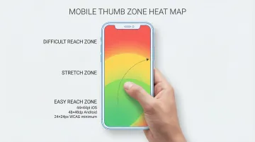
The "thumb zone" concept maps the areas of a mobile screen users can comfortably reach with one-handed use. The bottom third of the screen is easiest to access, the middle third requires stretching, and the top third is difficult or impossible to reach without shifting grip or using a second hand.
Touch target sizing is non-negotiable:
- Apple iOS requires minimum 44x44 points for all interactive elements
- Google Material Design mandates 48x48 density-independent pixels
- WCAG 2.2 Level AA accessibility standards require 24x24 CSS pixels as an absolute minimum
- Physical research shows targets must be at least 1cm x 1cm to prevent mis-tap errors
Spacing matters as much as size. Interactive elements placed too close together cause mis-taps and user frustration. Material Design recommends 8dp minimum spacing between touch targets to ensure comfortable, accurate interaction.
In a pilot evaluation or procurement demo, interface errors like frequent mis-taps signal poor product maturity. Getting these specifications right is a baseline for credible field deployment — and for making a strong impression when a buyer tests your product for the first time.
Simplicity and focus
Mobile screens offer roughly 80% less space than desktop monitors. That constraint is an opportunity to focus on what matters, not a limitation to design around.
80% of users typically use only 20% of features. Your mobile interface should prioritize that critical 20% while simplifying or hiding less-used functionality.
Progressive disclosure techniques help manage complexity: show primary actions immediately and prominently, reveal secondary options through menus or expandable sections, hide advanced features behind "More options" or settings, and use multi-step flows for complex tasks rather than cramming everything onto one screen.
Every element you add to a mobile screen competes for limited attention and increases cognitive load. Before including any component, ask: does this directly support the user's primary task?
An interface that surfaces only what your user needs to complete their task is also easier to demonstrate effectively to a buyer in ten minutes — which is often all the time you get in a procurement evaluation.
Performance and speed
Mobile users expect instant responsiveness. Their tolerance for delays is measured in seconds.
Google's Core Web Vitals define acceptable mobile performance:
- Largest Contentful Paint (LCP): main content must load within 2.5 seconds
- Interaction to Next Paint (INP): interface must respond to taps within 200 milliseconds
- Cumulative Layout Shift (CLS): visual stability score must stay below 0.1
Google treats these as minimum performance thresholds, not targets to strive toward. The business case is direct: every additional second of load time increases bounce probability by 32%, regardless of how good your content is once it loads. For field-deployed climate tech products where users may be on variable 4G or rural networks, this matters even more.
Optimization techniques include lazy loading images and content below the fold, compressing images without sacrificing quality, minimizing HTTP requests by combining files, implementing efficient caching strategies, and designing for graceful degradation on slow networks.
Think about what this means in a grid monitoring pilot with a utility company. Their operations engineers pull up your dashboard during a demand event on a 4G connection in the field. If it takes more than 2.5 seconds to load, they've already made their decision without your tool — and that failed use case surfaces in your pilot review before the contract conversation even starts.
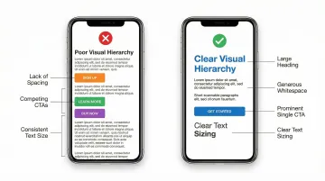
Creating clear visual hierarchy
Performance gains are wasted if users can't quickly understand your interface. Small screens demand clear visual hierarchy so users grasp what's important and what to do next within seconds of opening your app.
Create hierarchy through size (making primary actions noticeably larger than secondary content), color (using high-contrast to draw attention to key elements), whitespace (giving important elements breathing room), and position (placing critical actions in thumb-friendly zones at the bottom of screens).
Typography requires special attention on mobile. Apple recommends 17-point minimum for body text, with 11-point as the absolute minimum for captions. Android's Material Design uses 16sp for body text. Anything smaller forces users to zoom, breaking their flow and creating frustration.
Line spacing and paragraph length matter too. Dense text blocks are difficult to read on small screens. Break content into short paragraphs of 2-3 sentences with adequate line height for comfortable scanning.
In a buyer demo or pilot evaluation, users form their first impression of your interface in seconds. Clear visual hierarchy is what makes that impression positive — and directly affects whether they open the app again during the pilot.
Accessibility and inclusive design
Accessibility is a baseline requirement for mobile interfaces, not an optional enhancement. WCAG 2.2 standards establish specific criteria:
- Minimum touch target size: 24x24 CSS pixels (Level AA), with 44x44 pixels recommended for Level AAA
- Color contrast ratios: 4.5:1 for normal text, 3:1 for large text (18pt+ or 14pt+ bold)
- Single-pointer alternatives: all functionality must work with simple taps, not just complex gestures
- Text resizing: content must remain readable when users increase system font sizes
Inclusive design extends beyond WCAG compliance. Consider users with limited dexterity who struggle with small, precise taps, those with visual impairments requiring screen readers and high contrast, users with cognitive differences who benefit from simple, consistent patterns, and people with varying technical literacy levels who need clear affordances.
Enterprise buyers in regulated industries increasingly flag accessibility compliance during procurement. Meeting WCAG 2.2 requirements removes a potential blocker in your contract conversation before it becomes one.
Designing for real-world context
Mobile users interact with apps in dramatically different contexts than desktop users. They're walking down streets, riding transit, sitting in waiting rooms, or working in the field. Their attention is divided, connectivity is variable, and patience is limited.
These aren't abstract design constraints. For a climate tech product used in industrial or field environments, they're the default operating conditions. Design for these realities by saving user progress automatically, building offline functionality for core features, ensuring interfaces work in bright sunlight and low-light conditions, and keeping data payloads small for users on metered connections.
When your interface adapts to users' real-world situations, you remove friction from their experience and increase the likelihood they'll complete their intended tasks. Your pilot data then reflects genuine adoption rather than environmental drop-off — and that's the evidence that shortens the path from pilot to signed contract.
Mobile vs desktop UX: key differences
Mobile and desktop experiences serve fundamentally different use cases. Understanding these differences prevents the common mistake of simply shrinking desktop interfaces to fit smaller screens.
Screen size constraints:
- Desktop (1920x1080+ pixels) allows complex layouts and multiple simultaneous tasks
- Mobile (375x667 to 414x896 pixels) demands ruthless prioritization and single-task focus
Interaction methods:
- Desktop mouse precision enables hover states, right-clicks, and pixel-perfect targeting
- Mobile touch input requires larger targets (44px minimum), eliminates hover, and introduces gestures
Context of use:
- Desktop: typically seated, focused, stable environment with reliable connectivity
- Mobile: often on-the-go, distracted, variable lighting, and inconsistent network quality
Attention and behavior:
- Desktop supports longer sessions and research-oriented tasks; mobile favors quick, task-focused interactions
- Desktop users are more comfortable with complexity; mobile users expect immediate results
Why these differences matter
These platform distinctions have measurable consequences. Nielsen Norman Group research on mobile navigation patterns found that mobile users rate tasks as 21% more difficult when interfaces ignore these differences.
Desktop patterns like hidden navigation, hover-dependent interactions, and dense information layouts consistently fail on mobile because they weren't designed for touch, distraction, and limited screen space. Mobile experiences must be purpose-built for mobile behaviors, not adapted from desktop assumptions.
When an enterprise buyer evaluates your product on their own device in their own environment, they feel these differences immediately. An interface that ignores mobile conventions signals poor product maturity — and that impression is hard to recover from in a procurement conversation.

Essential mobile UX design patterns and best practices
Navigation patterns
Navigation has an outsized effect on whether users complete their intended tasks. Research from Nielsen Norman Group shows that hidden navigation increases task completion time by 15% and reduces content discoverability by over 20%. Visible navigation consistently outperforms hidden menus, and that gap is large enough to affect your core metrics.
A carbon accounting platform running a utility pilot had its compliance report function buried two levels deep in the settings menu. Pilot users completed the report 35% of the time. Moving it to the bottom navigation bar pushed completion to 78% before the enterprise evaluation. That navigation change was referenced directly in the contract conversation.
Effective mobile navigation patterns:
- Bottom navigation bars: best for 3-5 primary sections requiring frequent switching. Thumb-friendly and always visible.
- Tab bars: similar to bottom navigation, ideal for iOS apps with distinct content categories.
- Hamburger menus: use only for secondary navigation or content-heavy browse experiences where specific navigation is less critical.
- Navigation hubs: work well for task-based apps where users complete one task before moving to another.
Keep your navigation hierarchy shallow — no more than 3 levels deep. Provide clear visual indicators of current location, make back navigation obvious and consistent, and never hide primary navigation behind hamburger menus.
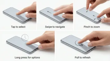
Gestures and interactions
Mobile users expect standard gestures to work consistently across apps. Apple and Google define platform-specific gesture conventions that users already know:
Standard gestures users already know:
- Tap to activate controls, select items, and follow links
- Swipe to navigate between screens, reveal actions, and dismiss views
- Pinch to zoom in/out on images and maps
- Long press to reveal contextual menus and additional options
- Pull-to-refresh to update content in feeds and lists
Prioritize standard gestures over custom interactions. Provide visible alternatives for critical actions — don't rely solely on gestures — and include visual affordances showing where gestures work. Avoid requiring complex multi-finger gestures for primary tasks.
Custom gestures suffer from severe discoverability problems. Unless you explicitly teach users through onboarding, they won't discover hidden swipe actions or multi-finger shortcuts.
Consistent, standard gesture behavior is part of what makes your product feel trustworthy to an enterprise buyer testing it for the first time — it signals that your team understands the platform.
Forms and input optimization
Beyond navigation and gestures, input methods determine how easily users complete tasks. Typing on mobile is slow and error-prone, so minimize it through smart design.
Form optimization techniques:
- Use appropriate keyboard types (numeric for phone numbers, email for email addresses)
- Enable autofill for common fields (name, address, payment information)
- Implement inline validation showing errors as they occur
- Provide smart defaults based on user context
- Offer alternative input methods (date pickers instead of text entry)
- Use selection controls (dropdowns, radio buttons) instead of free-text fields when possible
Form layout best practices:
- Single-column layouts work best on mobile
- Label fields clearly above inputs, not as placeholder text
- Make form fields large enough to tap easily (minimum 44px height)
- Group related fields logically
- Show progress indicators for multi-step forms
In a field pilot where your users need to log readings or submit data regularly, a poorly optimized form is one of the most common causes of drop-off. The quality and completeness of the data you can show your enterprise buyer at review depends directly on how easy those forms are to complete.
Content strategy for mobile
Mobile users scan rather than read, which means your content strategy needs to match that behavior from the first line.
Mobile content principles:
- Front-load key information in the first sentence of each section
- Use short paragraphs (2-3 sentences maximum)
- Break up text with subheadings, bullets, and whitespace
- Write in active voice with simple, direct language
- Cut unnecessary words
Content chunking strategies:
- Use expandable sections for supplementary information
- Implement "Read more" links for detailed content
- Provide summaries before full articles
- Use tabs to organize related content without excessive scrolling
When a buyer's procurement team reviews your app, they're scanning too. Content that front-loads value clearly reinforces the case your sales team made — and makes it easier for internal champions to advocate for your product.
Feedback and microinteractions
Mobile interfaces must provide immediate visual feedback for every user action. Without the hover states and cursor changes of desktop, users need clear confirmation that their taps registered.
Essential feedback patterns:
- Show spinners or skeleton screens during content load
- Provide visual response (color change, scale) when buttons are tapped
- Display inline, specific feedback for form validation errors
- Acknowledge completed actions with checkmarks or brief messages
- Show completion status for multi-step processes
Small animations and transitions (microinteractions) enhance the sense of polish and responsiveness. Use them to smooth screen transitions, draw attention to important changes, and confirm actions subtly. Keep animations brief (200-300ms) and purposeful. Excessive animation slows perceived performance and can trigger motion sensitivity issues.
During a pilot, users who aren't sure their action registered will either contact your support team or stop using the app. Clear feedback reduces that friction and keeps adoption rates high enough to support your commercial case at review.
Implementation: bringing mobile UX to life
Design systems and consistency
Platform-specific design guidelines exist for good reason: they set user expectations. Follow established patterns, and users will already know how to navigate your app.
iOS human interface guidelines:
- Uses points (pt) as the base unit
- Emphasizes clarity, deference, and depth
- Favors tab bars for primary navigation and navigation bars at the top
- Requires 44x44pt minimum touch targets
Material Design for Android:
- Uses density-independent pixels (dp) as the base unit
- Emphasizes material surfaces and elevation
- Supports navigation bars, rails, and drawers
- Mandates 48x48dp minimum touch targets
Design systems ensure consistency across screens and reduce development time. They provide reusable components, defined spacing scales, standardized color palettes, and documented interaction patterns that keep your interface cohesive.
An interface that behaves consistently across every screen also performs predictably when a buyer's IT team or end users test it during procurement evaluation — there are fewer surprises at the wrong moment.
Prototyping and testing
Interactive prototypes validate UX decisions before development begins, saving significant time and cost. Testing prototypes with users identifies usability issues when they're easy to fix, before any production code is written.
Effective testing methods:
- Usability testing: watch users attempt realistic tasks with your prototype, noting where they struggle or succeed
- A/B testing: compare different design approaches with real users to identify which performs better
- Analytics review: track user behavior in production to identify drop-off points and optimization opportunities
- Device testing: test on actual devices, not just simulators, to account for real-world handling and performance
When to test: Start early to validate core concepts and navigation structure, return mid-process to refine interactions and visual hierarchy, and run a final round pre-launch to catch usability issues and edge cases.
A climate hardware company testing a new installer onboarding flow ran three usability sessions on a Figma prototype before writing a line of production code. They found their primary setup flow required eleven taps to complete. By the time they shipped, it required five. Their pilot onboarding completion rate was strong enough to become a headline metric in their Series A fundraising.
Working with design partners
If your mobile UX project is complex, specialized expertise makes a meaningful difference. A design agency brings focused experience, established processes, and outside perspective your internal team may lack.
When testing reveals gaps in your team's mobile expertise or timelines demand faster execution, external partners can accelerate progress without the overhead of hiring.
What if Design works with climate tech and deep tech teams on mobile UX from concept to validated prototype, with sector fluency that removes the onboarding overhead. Prototype turnaround is often as fast as 48 hours.
Consider a design partner when you need to move quickly, lack specialized mobile UX expertise internally, or need an outside perspective on design decisions.
Common mobile UX mistakes to avoid
Even experienced designers fall into common mobile UX traps that undermine user experience. Understanding these pitfalls helps you build apps that users actually return to — and helps you avoid the failures that surface at the worst possible time, during pilot evaluations or enterprise demos.
Interface and layout mistakes:
- Cramming too much information onto limited screen space overwhelms users and buries primary actions
- Elements smaller than 44x44 pixels increase error rates and frustrate users with constant mis-taps
- Custom navigation patterns and non-standard interactions confuse users who expect familiar iOS or Android behaviors
- When everything looks equally important, users can't distinguish critical actions from secondary options
Performance problems directly impact user retention. Apps that feel slow get uninstalled, regardless of their feature set.
Performance and technical mistakes:
- Complex animations that slow perceived performance and drain battery faster than users expect
- Large image files that increase load times by 2-3 seconds and consume mobile data unnecessarily
- Making dozens of HTTP requests when each adds 100-300ms of latency on mobile networks
- Apps that fail completely without connectivity, frustrating users in basements, subways, or rural areas
Accessibility and testing shortcuts create technical debt that becomes expensive to fix later.
Accessibility and testing mistakes:
- Ignoring WCAG guidelines excludes approximately 15% of potential users and may create legal exposure under ADA or similar requirements
- Designing only for strong WiFi when a significant share of mobile usage happens on variable 4G or 3G networks
- Relying on emulators that miss real-world issues like touch accuracy, actual performance, and outdoor readability
- Testing on a single device size when users access your app on screens ranging from 4.7" to 6.7"

Frequently asked questions
What is mobile UX design?
Mobile UX design creates user experiences optimized for smartphones and tablets. It addresses specific constraints: smaller screens, touch interaction, on-the-go usage, and variable connectivity.
What is the 80/20 rule in UI/UX design?
The 80/20 rule recognizes that 80% of users typically rely on only 20% of features. In mobile UX, that means prioritizing the most-used functions prominently and simplifying or deprioritizing everything else.
What is the difference between mobile and desktop UX?
Mobile UX requires simplified layouts for smaller screens, larger touch targets (minimum 44px), and designs that account for divided attention and variable connectivity. Desktop UX can support more complex interfaces, precise mouse input, and longer user sessions.
What are the most common mobile UX mistakes?
The most common mistakes are undersized touch targets below 44 pixels, cluttered interfaces that bury primary actions, slow performance from unoptimized assets, and ignoring accessibility guidelines.
How do you test mobile UX effectively?
Effective mobile UX testing combines usability testing with real users attempting realistic tasks, A/B testing to compare design approaches, analytics review to identify drop-off points, and testing across multiple actual devices with different screen sizes. Emulators alone are not sufficient.
What tools are essential for mobile UX design?
Essential tools include Figma and Sketch for interface design, InVision and Principle for interactive prototyping, and Firebase and Mixpanel to measure user behavior and identify where to optimize.
The gap between a mobile app that gets uninstalled and one that becomes part of a user's daily workflow usually comes down to flow clarity. When you design for how your users actually interact with their phones rather than how you imagine they do, friction drops, retention improves, and the adoption data starts telling a better story. That's where good mobile UX design begins.