
Your climate tech product works. Users sign up, they get access, and then they stall. Not because the technology is unclear to engineers, but because the interface wasn't designed to communicate it to anyone else.
Most technical founders treat graphic design as polish, something applied after the product is built. The result is a functional interface that fails to translate complex data, guide non-technical users through unfamiliar workflows, or build the visual credibility that enterprise buyers and investors expect before they commit.
This article breaks down how graphic design principles operate as structural tools inside UX strategy, covering visual hierarchy, typography, color, and Gestalt principles, with specific applications for climate tech and deep tech products where clear visual communication directly affects adoption.
TLDR: Key takeaways
- Deliberate visual design reduces user friction and improves task completion rates
- Design systems maintain brand consistency while accelerating development up to 47%
- The aesthetic-usability effect means users tolerate minor friction in well-designed interfaces, which matters when your product is genuinely complex
- Applying graphic design principles to climate data visualization helps non-technical users reach value faster
- Measuring design impact through conversion rates and user metrics validates decisions and surfaces what to improve next
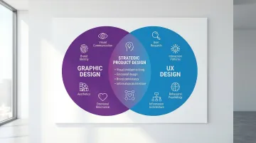
Understanding the intersection of graphic design and UX design
What graphic design brings to UX strategy
Graphic design focuses on visual communication, aesthetics, and emotional response, skills that translate directly into creating interfaces users can navigate without friction.
While UX designers map user journeys and interaction patterns, graphic designers bring expertise in composition, balance, and visual storytelling that makes complex information accessible and memorable.
This matters especially at the brand-product boundary. A carbon capture platform needs more than functional dashboards. It needs visual design that builds credibility with regulators, communicates technical sophistication to investors, and makes environmental impact legible for end users. Graphic designers understand how to create that clarity while maintaining emotional connection.
Graphic design contributes to UX strategy across four dimensions. It brings visual problem-solving that transforms abstract concepts into concrete, understandable elements, and emotional design that shapes first impressions and influences long-term retention. It maintains brand consistency from marketing materials through product interfaces, and provides information architecture through visual cues that organize complex data hierarchies—each of which has a direct bearing on whether users adopt your product or abandon it.
Why UX design needs graphic design principles
UX design without strong visual design produces functional but visually flat experiences that struggle to hold user attention. Users typically read only 20-28% of the words on a web page, relying instead on headings, layout, and visual cues to find relevant content.
This scanning behavior means visual design choices directly affect whether users can complete tasks or get lost.
Consider the aesthetic-usability effect: research shows users perceive attractive interfaces as more usable, regardless of actual performance. Users tolerate minor usability issues more readily in well-designed interfaces, and they often rate visually appealing products higher even when they encounter friction during tasks.
The mechanism is measurable. Color coding helps users recognize and categorize interface elements faster than text labels alone, particularly in data-heavy dashboards. Typography directly affects readability and comprehension, especially when users are processing unfamiliar technical content. Thoughtful layout and spacing reduce cognitive load—making interfaces feel less overwhelming when the underlying data is complex—while contrast and emphasis direct attention to critical elements, reducing errors in task-heavy workflows. When an enterprise buyer opens your platform during a procurement evaluation, the aesthetic-usability effect means your interface will be judged before a single feature is assessed — making visual design a factor in deal outcomes, not just user experience.
The complementary nature of both disciplines
Graphic design and UX design are not competing disciplines. Graphic designers bring visual problem-solving and the ability to create interfaces with emotional clarity, while UX designers focus on interaction patterns, user flows, and behavioral psychology. Together, they produce interfaces that are both usable and visually coherent.
You'll see this clearly when visual design and interaction design are kept separate — it creates friction in the final product. When your designers understand both disciplines, they make better decisions about when to prioritize visual appeal versus functional efficiency, and how to achieve both at the same time. For founders preparing for enterprise pilots or investor demos, having both capabilities unified means the product you show reflects the quality of what you've built.
Key graphic design principles that elevate UX strategy
Visual hierarchy: guiding user attention
Visual hierarchy uses size, color, contrast, and positioning to direct users toward the most important elements first. For climate tech products specifically, this is where many interfaces break down. When you're presenting energy output data, carbon metrics, or sensor readings across multiple variables, the temptation is to show everything at once. Without a deliberate hierarchy, users spend time scanning rather than acting.
When content is grouped into clearly labeled sections, users complete information-finding tasks 27% faster and report greater satisfaction. Eye-tracking studies confirm users follow predictable scanning patterns, such as the F-shaped pattern, focusing heavily on headings and the top-left of the screen.
Interfaces with strong visual hierarchy guide the eye toward decisions. Interfaces where everything competes for attention simultaneously push users toward the back button.
How to apply visual hierarchy in practice:
- Make CTAs stand out through size, color contrast, and positioning relative to supporting content
- Organize information from most to least important using size and typographic weight
- Use whitespace to separate content groups and reduce visual noise
- In complex dashboards, establish a logical scan order so users find critical data without hunting
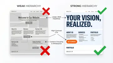
Conversion research consistently shows that landing pages with stronger visual hierarchy — larger headlines, contrasting CTA colors, and deliberate whitespace — outperform flat, information-dense layouts on sign-up rates. The same principle holds for product dashboards: clear scan order reduces time-to-insight for users who need to act on the data, not just view it.
Typography: more than just font selection
Typography choices affect readability, comprehension speed, and the perceived credibility of your product. Poor typography creates friction that pushes users away from technically sound products. For climate tech platforms where users are processing unfamiliar science, that friction is compounded.
The WCAG guidelines provide a practical baseline: minimum 16px body text, 1.5x line height, and maximum 80-character line length. On mobile, font sizes should run 15–18px while maintaining the same visual hierarchy. For dashboards or data-heavy views requiring quick reads, NNGroup's research on glanceable typography confirms that larger fonts and avoiding all-lowercase text measurably improve comprehension speed. Different font weights and styles establish information hierarchy across headings, subheadings, and body text—a structure that carries the reader through complex content without requiring them to consciously parse what's important.
Sans-serif fonts generally work better for digital interfaces. Serif fonts may improve readability in long-form content. Testing across devices and user contexts is necessary, particularly when your user base spans both technical operators and business decision-makers who engage with the same interface differently. Typography is often what signals production-readiness to a procurement team or technical evaluator before they've clicked a single button — particularly when your product is being assessed alongside more established competitors.
Color theory: psychology and functionality
Color does more than set the visual tone. It serves a functional role in navigation, status indication, and accessibility. The palette choices you make shape how users respond to the product and whether they can quickly locate what they need.
Strategic color applications:
- Use color-coded systems (green for success, red for errors) that users recognize from established conventions
- Maintain minimum 4.5:1 contrast ratio for normal text and 3:1 for large text per WCAG standards
- Apply contrast deliberately to draw attention to CTAs. Google famously tested 41 shades of blue, resulting in an estimated $200 million in additional revenue, which illustrates how much a single color decision can affect behavior at scale
- Develop primary and secondary color systems that carry consistently across your product
For climate tech applications, green often signals sustainability while blue conveys technical trust and reliability, both important for early adoption of novel technologies.
Balance and composition: creating visual harmony
Balance principles, whether symmetrical or asymmetrical, create different experiences for your users. Symmetrical balance feels stable and authoritative, which suits enterprise dashboards and financial or compliance interfaces. Asymmetrical balance creates more dynamic, attention-directing layouts suited for marketing pages and content-heavy flows.
Grid systems achieve functional clarity through predictable patterns that reduce cognitive load for returning users, consistent spacing that improves information retention across sessions, rule-of-thirds positioning for focal points that draw attention naturally, and modular layouts that reflow logically across screen sizes.
Consider a deep-tech startup running a pilot evaluation with a procurement team: a well-balanced dashboard that directs attention to the outcome metric that matters most — and a consistent grid that signals production-ready maturity — can shift buyer perception before a single technical question is asked.
Contrast and emphasis: highlighting what matters
Contrast in size, color, shape, or texture draws attention to key elements and creates clear focal points. In complex product interfaces, deliberate contrast is what separates interactive elements from informational ones, reducing errors and building user confidence.
Ensure sufficient contrast ratios (minimum 4.5:1 for normal text) and use multiple visual cues beyond color alone — icons, labels, and patterns — for users with color vision differences. Test contrast with color-vision-safe palettes before shipping, and balance visual interest with functional clarity throughout.
Note that automated checkers are necessary but not sufficient. Perceptual testing matters too. Some combinations that technically pass strict contrast ratios read poorly in practice, while some that technically fail are perceived as clear by most users.
In a demo or enterprise evaluation, low contrast is often what makes an interface read as unfinished — a perception that can stall a deal before the technical conversation begins.
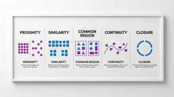
Gestalt principles: how users perceive visual elements
Gestalt principles describe how humans perceive visual elements as unified groups rather than isolated items. Applying these principles prevents user confusion and produces more intuitive interfaces, particularly for complex data views.
Core principles to apply:
- Proximity: Elements positioned close together appear related. In form design, labels must sit near their fields or users misread the pairing
- Similarity: Elements sharing visual characteristics (shape, color, size) form groups. This drives consistent UI patterns across a product
- Common region: Borders or background colors around sets of elements create clear visual boundaries
- Continuity: Visual flow guides the eye along a path. This is especially useful for multi-step processes or onboarding sequences
- Closure: Users mentally complete incomplete shapes, which allows simplified iconography without losing meaning
Research confirms that applying Gestalt principles significantly affects comprehension in complex diagrams and hierarchical information displays, both common in climate tech products. In a live demo or procurement review, misapplied proximity or similarity — a mislabeled form field, a navigation group that reads as unrelated — introduces doubt about your product's maturity that's hard to recover from in the same meeting.
Practical applications: graphic design in UX workflows
Creating intuitive navigation systems
Navigation design applies graphic design principles to create clear, usable pathways through a product. Effective navigation uses visual weight to indicate hierarchy, color to show active states, and typography to organize menu structures.
Poor navigation is a leading cause of abandonment. Research indicates 79% of users stop using an app due to confusing or cumbersome navigation. In contrast, well-designed UI can increase conversion rates by up to 200%.
For climate tech products with multiple user types — operators, analysts, executives — navigation design also needs to account for different entry points and task priorities across those roles.
Reducing navigation friction comes down to consistency: the same navigation elements across pages and devices help users build predictable mental models. Contrast differentiates primary from secondary navigation options, breadcrumbs and visual indicators show current location in multi-level products, and—critically—navigation patterns should be tested with real users before major redesigns, not after.
Designing effective visual feedback systems
Micro-interactions and visual feedback communicate system status using graphic design principles. Button states, loading indicators, and error messages use animation, color changes, and iconography to create experiences that feel responsive and trustworthy.
Effective feedback systems balance utility with delight:
- Button states: Clear visual changes (color, shadow, size) on hover, active, and disabled states
- Loading indicators: Progress bars or animations that set user expectations for wait times
- Error messages: Color-coded alerts with clear iconography and actionable guidance, not just a red banner
- Success confirmations: Subtle animations or color changes that acknowledge user actions without interrupting flow
When a prospective customer uses your product for the first time during a pilot, a missing loading state or an ambiguous error message can read as a system fault. Clear visual feedback is what keeps a pilot on track and builds the trust needed to convert to a contract — or, when it's absent, what triggers the support ticket that derails the evaluation.
Building responsive and adaptive visual systems
Graphic design principles must hold across screen sizes while maintaining brand consistency. That requires deliberate decisions about what to prioritize on mobile versus desktop based on how different users engage with the product in context.
Fluid typography scales proportionally across devices. Flexible grid systems reflow content logically at different breakpoints. The priority decision — mobile-first or desktop-first — should follow where your users actually spend time, not convention. Common breakpoints fall at 320px for phones, 768px for tablets, and 1024px for desktops.
If your enterprise buyers are reviewing dashboards on desktop while field operators access the same data on mobile, a layout that breaks at a key breakpoint can stall adoption across an entire account. Getting responsive design right before a pilot launch is cheaper than addressing it after a contract review has flagged interface concerns.
Enhancing emotional design through visuals
Don Norman's emotional design framework identifies three processing levels: visceral (immediate appearance), behavioral (everyday usage), and reflective (long-term satisfaction). Graphic design operates at all three levels simultaneously.
Visual choices create emotional connections that directly influence retention. Research on UX redesigns shows 30% increases in retention rates and 200% improvements in conversion rates when teams focus on intuitive navigation and visual clarity together.
Emotional design strategies include personalization, well-timed animations, and color schemes that create positive associations with the product over time. For climate tech, this also means conveying the technical seriousness of the work through the product's visual language, not just through copy.
Integrating brand identity into product experience
Graphic design connects brand consistency from marketing materials through to product interfaces. Your challenge is maintaining brand character while prioritizing usability and accessibility at every touchpoint.
When you cover brand strategy, website, and product design within a unified approach, the visual language carries through without creating disconnects. For your climate tech or sustainability-focused company, this means your product communicates technical credibility while remaining approachable for the full range of users, including those who don't come from a scientific background. Buyers who first encounter your company through marketing and then open your product expect a coherent visual language — a disconnect between the two signals early-stage roughness and can undermine the credibility you've been building.
Building effective design systems: where graphic design meets UX strategy
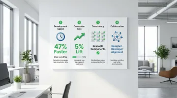
Design systems codify graphic design principles — typography, color, spacing — for consistent implementation across a product. They provide a shared language for design and development teams, and the operational benefits are measurable.
Documented outcomes from design system adoption:
- Faster development: Developers using IBM Carbon coded forms 47% faster than those building from scratch (median 2 hours vs. 4.2 hours)
- Consistent user experience: Reusable components ensure visual and functional consistency across the product as it scales
- Improved collaboration: Shared design tokens and documentation align designers and developers around the same source of truth
- Conversion improvements: IBM Commerce Platform saw a 5% conversion lift after transitioning to Carbon
Balancing structure and flexibility
These benefits appear when design systems establish clear guidelines while allowing contextual adaptation. A system that is too rigid limits how the product can evolve. One that is too loose produces inconsistency as the team grows. The right balance depends on the maturity of the product and how many people are contributing to it at any given time.
Getting this balance right early reduces the design debt that slows your team as you scale — which matters when you're shipping improvements between a pilot launch and a contract renewal review.
Measuring the impact of graphic design on UX metrics
Quantifying graphic design's impact requires structured testing methods. Key metrics affected by design decisions include conversion rates, task completion time, error rates, and user satisfaction scores.
Testing approaches
Your team has a few core methods to draw on. A/B testing compares design variations to validate visual choices and their effect on user behavior. Usability metrics track efficiency, effectiveness, and satisfaction scores across user segments. Conversion optimization tests visual hierarchy, color contrast, and layout changes against a defined baseline.
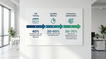
Research shows meaningful results are achievable. Systematic reviews demonstrate that applying ergonomic principles can reduce operational errors by 30-70% and improve task completion time by 20-60%.
Improving visual hierarchy on a landing page and tightening color contrast on CTAs are two of the highest-impact, lowest-effort changes documented consistently across conversion research. For early-stage companies, running even a basic A/B test on a sign-up flow or key landing page before an enterprise demo can validate whether your visual hierarchy is working — and give you concrete data to reference in a buyer conversation about product quality.
Real-world applications: graphic design enhancing UX in climate tech
Climate tech UX carries specific communication challenges: translating complex sustainability data for non-technical audiences, building trust in technologies that lack decades of market precedent, and making environmental impact legible in a way that supports business decisions, not just awareness.
Graphic design addresses different layers of this problem across sectors. Carbon capture companies use technical diagrams to translate process complexity into something investors and regulators can follow. Renewable energy platforms apply color-coded dashboards to make energy output and savings immediately readable without requiring technical knowledge. ESG reporting tools restructure dense compliance data into infographics that support faster decision-making.
At What if Design, we worked with HYDGEN to communicate their green hydrogen technology's value proposition through clear visual design that spoke to both technical and non-technical audiences. For Ribbit Network, we translated an open-source climate observability platform into a digital experience that non-technical stakeholders could engage with directly. In both cases, the design work made complex innovations accessible to investors, customers, and users who needed to understand the technology's impact before committing.
If your product is technically strong but visually unclear, the gap between what you've built and how it's perceived is a design problem worth solving.
Frequently asked questions
What are the approaches to UX design?
The main approaches are user-centered design, design thinking, lean UX, and agile UX. For climate tech products with multiple user types and complex data structures, user-centered design combined with strong graphic design principles typically produces the clearest path to faster user activation.
What are the 7 pillars of UX design?
The 7 pillars are useful, usable, findable, credible, desirable, accessible, and valuable. Graphic design primarily drives the "desirable" pillar through visual clarity and the "credible" pillar through professional, consistent presentation, both of which carry significant weight when your technology is new to market.
What are the 4 C's of UX design?
The 4 C's are consistency, continuity, context, and complementary. Graphic design supports each through visual systems, responsive layouts, and cohesive brand expression across every user-facing interface.
What is the 70-30 rule in graphic design?
The 70-30 rule allocates roughly 70% of a layout to neutral space and 30% to accent elements. This creates balanced, scannable designs that guide attention without overwhelming users, which is especially relevant for data-heavy interfaces where information density is high.
How does graphic design impact user experience?
Graphic design shapes first impressions, guides attention through visual hierarchy, communicates product credibility, and reduces friction through visual clarity. In products where users need to make decisions based on what they see, strong visual design is directly tied to whether they reach value or abandon the product.
What skills do graphic designers bring to UX design?
Graphic designers contribute visual communication expertise, typography knowledge, color theory understanding, composition skills, and the ability to create interfaces with emotional clarity. These skills improve UX by ensuring interfaces are both functionally effective and visually clear, particularly important when translating technical subject matter for non-expert audiences.