What makes web portal UX design different?
You've built a product worth showing. The demo goes well. Prospects understand the technology. Then they're handed a portal login and the momentum disappears. They can't find what they need, they submit a support ticket, and the sales cycle you've spent months building quietly stalls.
This is the portal UX problem that most climate tech and deep-tech companies underestimate. The portal is where the deal actually closes or quietly dies after the demo ends.
Web portals are fundamentally different from marketing websites. A website convinces. A portal proves. It's where authenticated users, whether prospects in trial, enterprise partners, or buyers evaluating integrations, return regularly to complete specific tasks: reviewing data, managing accounts, tracking project status, or validating your product's claims. For climate tech companies selling to utilities, enterprise buyers, or government procurement teams, the portal is often the first real taste of your product's operational reliability.
Poor portal UX creates measurable problems that show up in your pipeline, not just your product analytics:
- Authentication friction alone accounts for up to 52% of administrative support calls in some organizations
- 53% of users abandon sites that take longer than 3 seconds to load, and every 100ms delay reduces conversions by 7%
- Centralized portal architectures reduce task completion time by 37% compared to distributed models (78 seconds versus 123 seconds)
This guide breaks down what separates a portal that accelerates deal closure from one that creates friction at exactly the wrong moment.
TLDR: Key takeaways
- For climate tech and deep-tech companies, the portal is where post-demo deals are won or quietly lost
- Role-based personalization and authenticated access separate portals from standard websites
- Centralized information architecture cuts task completion time by 37%
- Authentication friction drives 52% of admin support calls
- 53% of users abandon slow portals; every 100ms delay reduces conversions by 7%
- WCAG accessibility compliance is required for enterprise and government-facing portals
What your portal needs to prove after the demo
The portal is where your product narrative either holds up under scrutiny or falls apart. After the demo, a prospect lands in your portal environment, and everything they interact with either reinforces their decision to move forward or introduces doubt. This is the part most UX guides skip over—and the part that matters most for companies running long, multi-stakeholder sales cycles.
Define what the portal needs to prove
Before designing a single screen, get specific about what your portal needs to accomplish commercially. For a carbon accounting platform, it might be proving data auditability to a CFO. For a grid analytics tool, it might be showing response speed to a utility operations team. For a clean energy project tracker, it might be giving a developer visibility without requiring a support call.
This functional clarity shapes every information architecture decision downstream. Without it, portals end up over-engineered with features that don't map to the buyer's actual evaluation criteria—and deals stall not because the product failed, but because the portal couldn't communicate what the product does.
Prioritize flows that match the evaluation stage
Not every portal user is at the same point in the buying process. A trial user at week one needs a different path than a procurement manager running a compliance check six months into a pilot. Designing role-based journeys that reflect where each user is in the relationship reduces friction and accelerates the moments that matter commercially.
Align features with what reduces doubt, not what looks comprehensive
The instinct in technical products is to show everything the platform can do. In practice, portal complexity at the wrong moment extends sales cycles. Build in progressive disclosure: show users the capabilities relevant to their role and access level, with depth available on demand rather than by default.
Balance openness with trust signals
For climate tech products selling to regulated industries, utilities, or large procurement teams, the portal also needs to communicate stability and reliability, not just functionality. Consistent performance, clear audit trails, and role-based data access signal that your platform is enterprise-ready, not just technically impressive.
Understanding web portal types and use cases
Different portal types serve distinct audiences and require tailored UX strategies—and what you're optimizing for in each case depends partly on where the portal sits in your sales cycle.
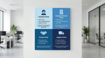
Customer portals
Customer portals prioritize self-service capabilities: account management, order tracking, support ticket submission, and knowledge base access. These portals reduce support costs while empowering customers to resolve issues independently.
For climate tech and clean energy companies, customer portals often serve as the primary interface where utilities or enterprise buyers monitor energy production data, track project milestones, or review compliance documentation. The UX quality of this interface directly affects whether a buyer renews a pilot or escalates it to a full contract. This is the portal type most likely to make or break a deal post-demo—it's where prospects spend evaluation time without a salesperson present, forming their own impressions of whether the product is operationally reliable.
Employee/intranet portals
Employee/intranet portals focus on collaboration, internal communication, and productivity tools. Modern intranets offer personalized dashboards, document management, and integrated workflows. A healthcare organization integrating ServiceNow with Epic saw 40% faster incident resolution and 70% faster IT onboarding through their employee portal—outcomes that translated directly into lower operational cost and faster time-to-productivity for new staff.
For climate tech companies scaling quickly after a raise, the intranet often becomes the operational backbone. When project engineers, business development leads, and policy teams all operate from different workflows, a poorly designed internal portal creates coordination bottlenecks that slow down the very speed-to-market these companies need.
Partner portals
For B2B relationships, partner portals enable partners to access sales resources, lead management tools, training materials, and co-marketing assets. These portals often include tiered access based on partnership levels. The UX priority here is transactional efficiency: partners are typically time-constrained professionals who need to complete a specific task and leave. Every extra click or confusing navigation element is friction in a relationship that has direct commercial value.
Supplier portals
Supplier portals streamline procurement and supply chain operations through purchase order management, invoice submission, inventory tracking, and compliance documentation.
BNP Paribas built secure portals for real-time transaction systems, using role-based permissions to manage customer loyalty platforms at scale—showing how supplier portal UX becomes infrastructure for commercial relationships that depend on speed and trust.
Matching portal type to UX strategy
Each portal type shapes your design priorities in different ways. Customer portals live or die on intuitive self-service and clear trust signals—they're where buyers evaluating your product form their first unmediated impressions of the platform. Intranets need to make information findable quickly across teams with different workflows and technical comfort levels. Partner and supplier portals have to be transactionally efficient, because the people using them are often time-constrained and focused purely on completing a specific exchange.
Core UX principles for web portals
User-centered information architecture
Effective portal IA requires you to organize content hierarchically while supporting role-based access and personalization.
Research demonstrates that centralized content management models significantly outperform distributed approaches, with users completing tasks in 78 seconds versus 123 seconds.
Structure content around user tasks, not organizational hierarchy. Users care about "submit emissions report," "check sensor data," or "review project milestone status," not which department owns the information. This is especially relevant for climate tech platforms where data complexity and multi-stakeholder access are common. Role-based personalization proves more effective than individual customization because users rarely configure their own experiences despite requesting the feature.
Key IA strategies include task-based navigation that surfaces frequent actions prominently, dynamic content visibility that adjusts based on user roles and permissions, clear hierarchy with no more than 3-4 levels of depth, and consistent categorization using terminology familiar to users rather than internal product jargon. For buyers in evaluation, a portal they can navigate independently—without needing a guided walkthrough—signals that your product is operationally mature.
Intuitive navigation and wayfinding
Once your IA is established, navigation brings it to life. Portal navigation faces unique challenges: multiple user roles, deep content hierarchies, and the need to support both frequent and occasional tasks. Your users need to orient themselves quickly and locate resources without extensive searching.
Persistent global navigation keeps core functions accessible from anywhere in the portal. Breadcrumbs show users their location within deep hierarchies and let them backtrack quickly without losing context. Contextual menus surface relevant options based on the current task or content type, and mega menus help portals with extensive content organize information by user goals rather than site structure.
Avoid forcing users to choose search scope before searching. A single search box that indexes all content, people, and tools reduces cognitive load and improves findability. During an evaluation, every navigation dead-end or failed search is a moment where a prospect's confidence in your product quietly erodes.
Authentication and onboarding UX
Before users can navigate your portal, they need to get in. The login process is your portal's gateway, and friction here causes immediate abandonment. Simplifying authentication increased portal adoption by 178% and reduced support calls by 52% in one healthcare case study.
The most effective approach combines Single Sign-On (SSO) to eliminate repeated logins across enterprise systems with adaptive MFA that applies additional verification only when risk signals require it. Passwordless options—biometrics or passkeys—reduce friction while maintaining security. Progressive onboarding introduces features gradually so new users aren't overwhelmed by the full platform on their first session.
First-time user onboarding should provide just-in-time guidance that helps users accomplish their first task successfully. Treat that first session as an activation moment rather than a security checkpoint: complex password requirements during initial account creation are a common source of early abandonment that has nothing to do with the product itself. In a competitive sales cycle, a prospect who can't log in on their first try is already forming opinions about whether your platform is enterprise-ready.
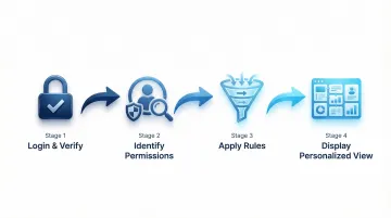
Personalization and customization
After users authenticate, personalization shapes their experience. The system delivers content, dashboards, and recommendations based on user roles and behavior.
System-driven personalization, meaning role-based defaults set by the platform rather than the user, consistently outperforms user-driven customization. Users rarely configure their own experiences despite requesting that ability, which means investing heavily in customization features often yields lower returns than investing in smarter defaults.
The most impactful implementations use role-based dashboards that surface only the metrics relevant to each user's responsibilities, paired with dynamic navigation that adjusts based on permissions and recent activity. Segment-based content visibility keeps the interface clean and contextually appropriate, while behavioral recommendations can surface resources based on what the user has already done in the platform. Allow additional customization for power users who want to configure homepages or dashboard widgets, but ensure role-based defaults work effectively for the majority who won't touch the settings. When a CFO and a technical lead both land in your portal during an evaluation, each seeing a view calibrated to their role isn't a nice-to-have—it's the difference between a buyer who feels understood and one who has to work to find what they need.
Performance and load times
Every personalization and navigation improvement loses its impact when the portal loads slowly. Portal users expect fast, responsive experiences even with complex data.
Performance directly impacts abandonment: 53% leave sites taking over 3 seconds to load. Even a 100ms delay cuts conversions by 7%.
Optimize portal performance through:
- Progressive loading that displays critical content first while loading secondary elements
- Efficient backend queries that retrieve only necessary data
- Caching strategies for frequently accessed content and user-specific data
- Perceived performance techniques like skeleton screens that show structure while content loads
Monitor metrics like First Contentful Paint (FCP) and Time to Interactive (TTI) to ensure your portal meets user expectations for speed. For platforms serving field teams, remote monitoring stations, or buyers in lower-bandwidth environments, performance optimization is especially critical. A portal that loads in 4 seconds in a San Francisco office may be unusable on a 4G connection at an energy installation site. And when a buyer's first unguided session is a slow one, that experience sticks—slow portals cost deals, not just users.
Essential UI components for portal design
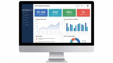
Dashboard design
Dashboards aggregate complex data into actionable insights without overwhelming users. For climate tech platforms, this is often where the product's core value proposition needs to be immediately legible: a utility buyer reviewing grid stability metrics, an enterprise customer tracking carbon reduction progress, or a project developer monitoring renewable energy output. Dashboards that obscure this data behind complex navigation undermine the product's primary commercial argument.
Effective dashboards support at-a-glance monitoring through clear visual hierarchy and instant visual cues, using length, color, and position to communicate status immediately.
Dashboard design principles:
- Prioritize critical metrics above the fold based on user roles
- Use bite-sized information layers that allow drilling down when needed
- Implement visual encoding (color for status, size for magnitude) for instant comprehension
- Balance density with clarity: show enough context without creating cognitive overload
Widget-based layouts offer flexibility for role-specific configurations. Fixed layouts ensure consistency for standardized reporting needs. Choose based on whether users need personalized metric arrangements or uniform views.
Forms and data entry
Most portals require complex transactional forms for applications, claims, or onboarding. According to Formstack's form conversion research, poor form design contributes to abandonment rates averaging 70%, with 18% of users citing forms being too long or complicated as their reason for leaving.
Form optimization strategies:
- Inline validation that provides immediate feedback prevents error-page reloads
- Progressive disclosure breaks long forms into steps, reducing cognitive load
- Smart defaults minimize required input by pre-filling known information
- Field reduction hides optional fields or consolidates related inputs
Limit visible fields to 10 or fewer. Breaking long forms into multiple pages reduces intimidation and makes errors easier to spot. In an evaluation context, a buyer who hits a complex form and abandons it is less likely to return—and more likely to interpret that friction as a signal about the broader product experience.
Search and filtering
In data-heavy portals, search is often the primary navigation method. This is particularly true for climate tech platforms where users need to locate emissions data, project records, sensor readings, or compliance documentation quickly. Effective search functionality reduces support ticket volume while demonstrating to enterprise buyers that your platform can handle the operational demands of their workflow.
Search best practices:
- Faceted search with hierarchical filters that update counts dynamically
- Auto-suggest that helps users formulate queries and discover content
- Saved searches for complex queries users run repeatedly
- Scoped search options for large portals, but default to comprehensive search
Microsoft's careers portal (handling 10M applications annually) significantly improved UX by implementing hierarchical facets and dynamic filtering, reducing drop-off in the application funnel and making it faster for users to find what they were looking for. Consistent metadata tagging is essential: vague titles and missing descriptions undermine search relevance and frustrate users.
Notifications and alerts
Timely, relevant notifications keep users informed without overwhelming them. Alert fatigue is a real problem in data-heavy platforms: when too many notifications arrive without clear priority signals, users start ignoring all of them, including the ones that matter. For climate tech platforms monitoring live operational data, this can mean missed alerts about system anomalies or contract milestones.
Priority-based delivery reserves high-priority channels like push notifications for genuinely urgent items. User-controlled preferences let people choose their notification frequency and channels, which dramatically reduces the "mute everything" response that alert fatigue triggers. Contextual in-app notifications surface information relevant to the current task without interrupting other workflows, while digest emails consolidate multiple updates into scheduled summaries for users who prefer a lower-frequency experience. Provide clear actions users can take in response to notifications, and make it easy to dismiss or snooze non-urgent alerts. For buyers in active evaluation, a notification system that surfaces the right information at the right time demonstrates the kind of operational intelligence that enterprise deals are built on.
Visual design and branding consistency
Maintaining brand consistency while ensuring usability and accessibility requires systematic approaches. Design systems and component libraries give you a uniform visual language across portal interfaces while supporting functional requirements.
Consistency strategies:
- Design tokens define colors, typography, spacing, and other properties centrally
- Component libraries provide reusable UI elements with consistent behavior
- WCAG-compliant color palettes ensure accessibility is built into the brand foundation
- Style guides document writing style, voice, and formatting standards
Visual consistency builds user trust and reduces cognitive load by making interfaces predictable. Consistency should never compromise usability though: if brand colors fail accessibility contrast requirements, adjust them for portal contexts. In a post-demo evaluation, a polished, coherent interface signals that your company has built something production-ready—not a prototype dressed up for a sales call.
User research and portal strategy
Conducting user research for portals
Standard usability methods need adaptation for the complexity of secure portals. We find that observational testing consistently outperforms surveys because behavior reveals far more than self-reported preferences.
Portal-specific research methods:
- Contextual inquiry observes users in their actual work environment performing real tasks
- Task analysis breaks down complex workflows to identify inefficiencies and pain points
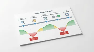
- Journey mapping traces user paths from login through task completion across multiple sessions
- Benchmarking tracks top search queries and zero-result queries to identify content gaps
Forrester research shows that investing in user research yields $2.5 million in avoided developer rework over three years through pre-launch testing. For climate tech platforms serving regulated industries or enterprise buyers, this kind of pre-launch validation is particularly valuable: building the wrong flows into a utility-facing portal has a compounding cost when sales cycles run six to eighteen months.
Creating user personas and journey maps
Personas represent distinct user types with specific goals, behaviors, and pain points. For portals, develop personas for each major role, whether administrator, manager, end user, or external partner, since their needs differ significantly. Research from real users forms the foundation for accurate personas.
The development process starts with interviews, surveys, and usage data analysis, then moves into pattern identification to find common characteristics across user segments. Detailed profiles capture demographics, goals, challenges, and technical proficiency, with contextual application that tailors personas to specific industries and use cases rather than staying generic.
Journey mapping essentials:
- Visualize the complete user experience across touchpoints and sessions
- Track user emotions and attitudes throughout different stages
- Identify pain points and opportunities at each stage
- Prioritize improvements based on impact on conversion and retention
When you map the evaluation journey specifically—from first portal login through the decision moments a buyer uses to validate your product—you can design the portal to clear doubt at exactly the right time rather than leaving it to chance.
Defining success metrics and KPIs
Portal success requires moving beyond vanity metrics to actionable KPIs that demonstrate business value.
Critical portal metrics:
- Task success rate (target ~78%): percentage of users completing tasks without assistance
- Time on task: duration to complete key workflows, with reductions indicating improved efficiency
- Support ticket reduction: decreased help desk volume demonstrates effective self-service
- User satisfaction scores (CSAT, NPS) gauge overall experience quality
- Adoption and retention rates measure how many users return and engage regularly
Establish baseline measurements before changes, then track improvements over time. In practice, we've seen portals move task success from 65% to 82% through iterative design refinements, directly contributing to higher retention and positive feedback. Track these metrics during evaluation periods specifically—low task success rates during trials are often the earliest signal that post-demo conversion is at risk.
Aligning stakeholder expectations
Managing stakeholder input while maintaining user-centered design requires you to lead with clear communication and evidence-based decision-making. For climate tech companies, stakeholders often include technical founders, business development leads, and pilot customers who each have strong opinions about what the portal should do. These inputs don't always align, and without a structured process, portals end up designed by committee rather than by user need.
Start with strategic workshops that define goals before any design begins—this surface-level alignment prevents the costly disagreements that happen when stakeholders review work they didn't help frame. Structured stakeholder interviews identify the concerns and priorities that don't always surface in group meetings. From there, design decisions should be defended with evidence from research rather than preference, and regular progress reviews keep everyone engaged without turning into design-by-committee.
Frame UX value in business terms: reduced support costs, increased productivity, higher conversion rates, improved retention—and faster deal closure. When stakeholder preferences conflict with user needs, present data showing the business impact of user-centered approaches.
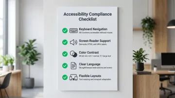
Accessibility and inclusive design
Accessibility is a legal and operational requirement for enterprise portals. WCAG 2.2 sets the current standard, ensuring that all employees and customers can complete essential tasks regardless of ability. For climate tech companies working with government procurement, utilities, or large enterprise buyers, accessibility is also a contractual requirement in many cases.
Beyond compliance, accessibility delivers measurable business value. Legal compliance with ADA and similar regulations reduces organizational risk. The accessible user base includes people with permanent, temporary, or situational disabilities—a group that represents a significant portion of any enterprise workforce. Accessible design also creates clearer, more intuitive experiences for everyone, not just users who need accommodations. And the operational value is real: reduced support costs and increased productivity follow when interfaces work for the full range of users who encounter them.
Practical accessibility implementation:
- Keyboard navigation ensures all functionality works without a mouse
- Screen reader support through semantic HTML and proper ARIA labels
- Color contrast meeting WCAG AA standards (4.5:1 for normal text, 3:1 for large text)
- Clear language with straightforward instructions and error messages
- Flexible layouts that accommodate text resizing and different viewport sizes
Inaccessible portals create barriers that result in lost productivity and increased support costs. Build accessibility into your design system from the start rather than retrofitting later. For companies selling into regulated enterprise environments, accessibility failures during an evaluation can disqualify a product before the commercial conversation progresses.
Implementation and testing best practices
Building an effective portal is the starting point, not the finish line. The real value comes from systematic testing and continuous refinement that prevents costly rework after launch—and that ensures the experience a buyer encounters during evaluation is the best version of your product, not a work-in-progress.
A structured testing approach validates design decisions before full deployment and reduces the risk of shipping flows that don't work for your actual users.
Essential testing methodologies:
- Conduct usability testing with real users to uncover unforeseen issues and validate interface decisions
- Run A/B tests comparing interface variations to determine which achieves better user outcomes
- Launch beta programs with limited user groups to gather feedback before full rollout
- Perform accessibility audits to ensure compliance and identify barriers for users with disabilities
Prioritize features and improvements based on user impact and business value. Teams using test-and-iterate approaches reduce iteration cycles by 25% by preventing costly rework.
Even well-designed portals fail when teams overlook critical implementation factors.
Avoid these common mistakes:
- Adding unnecessary features that overcomplicate the interface and obscure core functionality
- Ignoring mobile optimization. Statista reports that over 60% of global website traffic comes from mobile devices, and while enterprise portal users are often on desktop, field teams and operational staff at climate tech companies frequently access data on mobile in real-world conditions
- Overlooking performance optimization, which leads to abandonment regardless of functionality
- Allowing portal decay through degrading search quality and content relevance without governance
Successful portals require ongoing investment in maintenance and optimization. User needs evolve, content expands, and technology shifts. For climate tech companies, this is especially true as your product matures from pilot to commercial scale: the portal that served 10 trial users will create friction for 200 enterprise users if it hasn't been designed to scale.
Frequently asked questions
What is UX in a website?
UX (user experience) covers how people interact with a website or portal, including usability, accessibility, and performance. In portals, UX determines how quickly authenticated users, whether enterprise buyers, utility operators, or internal teams, can complete tasks without requiring support. For climate tech and deep-tech products, good portal UX is often the difference between a pilot that converts and one that quietly stalls.
What's the difference between a web portal and a website?
Websites are public-facing platforms for anonymous visitors, while portals are authenticated platforms with role-based access and personalized dashboards. Websites inform and persuade; portals help users complete specific tasks efficiently. For B2B climate tech companies, the website builds initial credibility and drives the first conversation, while the portal determines whether that conversation turns into a closed deal.
How does portal UX affect sales cycles and deal conversion?
Portal UX affects sales cycles in a direct and often underestimated way. After a demo, prospects are handed access to a trial environment or evaluation portal. If they encounter friction—slow load times, confusing navigation, authentication issues—they associate that experience with the product itself. The post-demo period is high-stakes: buyers are forming impressions about operational reliability, not just feature capability. A portal that requires multiple support tickets to navigate can stall a deal that the demo already closed.
What portal UX mistakes most commonly cost deals after demos?
The most common mistakes are authentication friction (complex passwords, no SSO, confusing MFA flows that require a support call just to log in), unclear information architecture that forces buyers to search for the data they were promised in the demo, and role-agnostic experiences that show a CFO evaluating pricing the same interface as a technical operator. Each of these creates doubt at exactly the moment when a buyer is deciding whether your product is enterprise-ready.
How do I know if my portal UX is costing me deals?
Signals include: prospects requesting guided walkthroughs after they already have portal access, support tickets concentrated in the first two weeks of a trial, low return visit rates during evaluation periods, and sales cycles that stall after initial access is granted rather than after a demo. If your post-demo conversion rate is lower than your demo-to-trial rate, the portal experience is worth examining closely.