
Why search UX design matters more than ever
Your climate tech company's website hosts detailed product specs, technical documentation, case studies, and support content. An engineer evaluating your carbon capture system and a procurement lead comparing costs need to find very different things, and they need to find them fast. If they can't, they leave.
The gap between what your site contains and what users can actually find is a search UX problem, and it's more common than most technical teams realize. According to Baymard Institute, 53% of users cite search problems as their biggest frustration when trying to find information online. For complex B2B sites with layered technical content, that friction translates directly into lost pilots, stalled partnerships, and missed opportunities to build credibility at critical moments.
Poor search UX has measurable downstream consequences. Forrester Research found that 76% of consumers report an unsuccessful search resulted in a lost sale — and 48% of those users immediately purchase from a competitor instead. High-intent visitors abandon before converting, often without any visible signal to your team.
This guide covers 9 research-backed best practices for search UX design, with specific attention to how these apply to climate tech, deep tech, and sustainability companies managing complex product catalogs and documentation. Each section draws from Nielsen Norman Group and Baymard Institute research and explains not just what to implement, but why it matters for your specific audience.
TLDR: key takeaways for search UX success
- Prominent search placement drives conversion — searchers convert 5-6x more than passive browsers
- Autocomplete boosts sales by 24% by guiding users toward queries that actually return results
- Unified search indexing across all content types prevents dead ends and keeps users engaged
- Zero-results pages cause 69% of users to abandon the site, making smart handling with clear alternatives critical
- Continuous analytics and testing reveal content gaps and optimization opportunities
What is search UX design and why it matters
When users can't find what they need in seconds on a technical B2B site, they rarely try again. Search UX design is the practice of creating intuitive, efficient search interfaces that help users find what they need quickly. It covers everything from search box placement and autocomplete behavior to results ranking and zero-results handling.
Search serves two distinct but equally important functions. For users who know exactly what they want, it serves as a primary navigation shortcut that bypasses your information architecture entirely. For users who are lost or overwhelmed by your site structure, it functions as a safety net that provides an escape route when navigation fails.
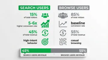
The conversion impact of well-designed search is well-documented. Forrester Research puts the conversion gap at 5-6x in B2B contexts — site search users convert substantially more than passive browsers. Only 15% of visitors actually use site search, yet Econsultancy data shows they account for 45% of total revenue, because they're high-intent customers actively looking for specific solutions, not casual browsers.
For your climate tech or deep tech company, this complexity compounds quickly. Your site might need to serve a process engineer looking for load specs on an electrolyzer, a procurement director comparing total cost of ownership across three vendors, and an investor cross-referencing your pilot data. Each of these visitors has a different vocabulary, a different tolerance for technical depth, and a different definition of what a successful search looks like. Building search that works for all three is a prerequisite for moving deals forward, not a nice-to-have.
Best practice 1: make your search box highly visible and accessible
Search box placement and design
Place your search box in the top-right or top-center of every page, above the fold where users expect to find it. Eye-tracking research from Nielsen Norman Group confirms users scan these locations first when looking for search functionality.
Use an actual input box, not just a magnifying glass icon. Research shows that visible text fields significantly outperform icon-only implementations in usage metrics. Users need to see an interactive element that clearly signals where to type.
When users can't find search, they can't demonstrate high-intent behavior. In technical B2B contexts, that lost moment often means a lost evaluation.
Visual design elements that enhance discoverability
Design your search box to accommodate 27-30 characters — the average query length according to Baymard Institute. Shorter boxes force text to scroll horizontally, hiding parts of the query and making editing difficult, which is especially problematic for long technical search strings.
Key design elements that enhance discoverability:
- Clear visual distinction from read-only text — use borders, background colors, or shadows
- Hint text that guides behavior ("Search products, support docs, or blog posts")
- Sufficient contrast between the input field and surrounding elements
- Interactive affordances that signal the box is clickable and typeable
The search field must look interactive at a glance. Users should immediately recognize it as an input element without having to guess or hover.
Making search available on every page
Search should be accessible from every page, not just the homepage. Users may enter your site through blog posts, product pages, or support documentation — they need search available wherever they land.
Implement sticky or fixed headers that keep search available during scrolling. This pattern works especially well for long-form technical content where users might decide mid-page that they need to search for a specific term or specification.
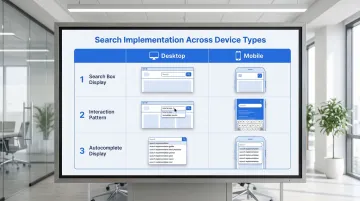
Mobile vs. desktop considerations:
| Context | Implementation |
|---|---|
| Desktop | Prominent open text field in header |
| Mobile | Search icon that expands to full-screen overlay when tapped |
| Both | Persistent availability regardless of scroll depth |
Best practice 2: implement intelligent autocomplete and query suggestions
The power of predictive search
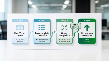
Autocomplete functions as a conversion tool as much as a usability feature. Baymard Institute research shows it increases sales by 24% by guiding users toward queries that actually return results, reducing the zero-results dead ends that cause abandonment.
The mechanism is straightforward: autocomplete increases average search length from 1.7 to 3.3 words, producing more specific, high-intent queries. Each additional word correlates with a 15% increase in conversion rate because longer queries reflect clearer user intent — and in technical domains, this distinction between "solar" and "bifacial solar panel efficiency at 25°C" is the difference between a browsing session and a buying evaluation.
Autocomplete also reduces typos and misspellings, which are among the most common causes of failed searches in technical domains where product names and specifications use complex terminology.
Types of query suggestions to implement
To maximize effectiveness, combine multiple suggestion types:
- Popular searches: Queries that other users frequently search for
- Trending queries: Time-sensitive searches reflecting current interests
- Personalized suggestions: Based on user's search history and browsing behavior
- Category scopes: Suggestions that include context like "in Solar Panels" or "in Support Docs"
Machine learning improves suggestion quality over time by analyzing which suggestions users actually click and which lead to successful outcomes. The system learns to surface suggestions that historically result in conversions, not just high search volume.
Best practices for autocomplete UX
Display 5-8 suggestions on desktop and 4-6 on mobile. More than 10 suggestions overwhelms users and creates scrolling issues, especially on smaller screens.
Critical implementation details:
- Keyboard navigation: Users must be able to arrow down through suggestions and press Enter to select
- Visual differentiation: Style category scopes differently from standard queries to avoid confusion
- Typo handling: Include "did you mean" corrections in the suggestion list
- Rich content: Show product images or result counts where relevant — Baymard Institute documents this can lift revenue by 1.42%
Baymard Institute found that only 19% of e-commerce sites implement autocomplete correctly. Getting these details right puts you ahead of most competitors from a pure usability standpoint.
Best practice 3: deliver comprehensive, relevant search results
Unified search across all content types
Implement unified indexing that searches across products, support content, blog posts, case studies, and documentation simultaneously.
This approach combines all content into a single index, enabling better relevance ranking than federated search (which queries separate systems in real-time).
Present results with categorized sections or tabs that help users navigate different content types:
- Products (with images, pricing, key specs)
- Support documentation (with article titles and snippets)
- Blog posts (with publication dates and authors)
- Case studies (with company names and outcomes)
This prevents the "wrong section" problem where users search in Products but the best answer lives in Support Docs — a common issue on technical B2B sites where content is siloed by department rather than organized around user intent. In a competitive evaluation, a procurement lead who searches "total cost of ownership" and lands in a blog post rather than your pricing documentation doesn't try again — they move to the next vendor.
Relevance ranking and personalization
Results ranking should account for multiple signals:
- Keyword matching quality: Exact matches, phrase matches, and semantic similarity
- User behavior data: Click-through rates, dwell time, and conversion rates for each result
- Personalization signals: User's role, previous searches, and browsing history
- Content freshness: Recent content may be more relevant for time-sensitive queries
Users rarely go beyond page 1 of results. If relevant content doesn't appear in the top 5-10 results, it effectively doesn't exist for most visitors.
Nielsen Norman Group research indicates that winning a spot in the top 5 positions gives content a 40-80% chance of receiving user attention. Ranking systems that learn from user click patterns can deliver 25-40% better result quality than basic keyword sorting.
Results page design elements
Design your results page with these scannable elements:
- Result count: "Showing 47 results for 'carbon capture'"
- Clear titles: Descriptive, not generic
- Descriptive snippets: 2-3 lines showing query context
- Relevant metadata: Product category, publication date, price, or status
- Visual hierarchy: Size, weight, and spacing that guide the eye
- Thumbnails or images: Especially for product results
- Rich snippets: Ratings, specifications, or key features when available
Nielsen Norman Group research shows users scan results in a nonlinear "pinball" pattern on complex pages, jumping between elements that catch their attention. Strong visual hierarchy helps your most relevant results stand out in that scanning behavior.
Search scoping options
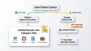
Default to "all" scope rather than pre-filtering results to a single category. Users often don't know which section of a technical site contains what they're looking for — forcing a scope choice before they've seen results adds friction to an already complex decision.
When scoped search is necessary, clearly indicate the active scope ("Searching in: Support documentation"), provide one-click expansion to "Search all content instead," and use smart defaults — if your visitors are browsing Products, default to that section while keeping the expansion option obvious.
Best practice 4: eliminate dead ends with smart zero-results handling
Zero-results pages are the single most damaging moment in a search experience. Baymard Institute finds they cause 69% of users to abandon the site entirely. A blank page with "No results found" is not a neutral outcome — it's an active signal to the visitor that your site can't help them. In a competitive evaluation where a buyer is comparing three vendors in the same afternoon, that signal is often enough to remove you from their shortlist.
Effective zero-results strategies
- "Did you mean" corrections: Suggest corrected spellings for common typos
- Related searches: "Try searching for [alternative query]"
- Category suggestions: Links to relevant product categories or content sections
- Popular content: Trending products or most-viewed articles
- Contact options: "Can't find what you're looking for? Chat with our team"
These strategies keep users engaged by providing a clear path forward. Rather than hitting a dead end, visitors encounter helpful alternatives that guide them toward relevant content.
For your technical products, zero-results often occur because visitors search for competitor terminology, old product names, or internal jargon that doesn't match your current naming conventions. Build a synonym dictionary that maps these variations to your current terminology. For example, if you've rebranded a "Carbon Analyzer" to "Emissions Tracker," ensure searches for the old name still surface the right product.
Best practice 5: use faceted search and filtering
When users face hundreds or thousands of search results, they need a way to narrow options quickly without starting over. Faceted search solves this by letting users filter results by categories, attributes, and characteristics — and if you're managing a complex product library or deep documentation archive, this is often what separates a usable search experience from an overwhelming one.
Dynamic faceting
Dynamic faceting uses machine learning to show the most relevant filters first based on the current result set and user behavior patterns. If users searching for "solar panels" most frequently filter by "power output" and "efficiency rating," show those facets first rather than presenting a generic filter list.
Implementing faceted search effectively requires attention to these elements:
- Clear labels: "Filter by power output" not just "Power"
- Result counts: Show how many results each filter will return
- Easy filter removal: One-click to remove individual filters or clear all
- Mobile considerations: Use slide-out tray pattern rather than a separate page
- Instant feedback: Update results immediately or provide a clear "Apply" button
Nielsen Norman Group research shows users complete tasks 25-50% faster with faceted navigation compared to keyword search alone. The combination of both approaches gives users the flexibility to search and refine simultaneously. For an enterprise buyer building a business case across three competing vendors, the ability to filter your documentation by application type or technical specification is often what determines whether your content gets fully evaluated.
Best practice 6: optimize search for mobile experiences
Mobile search imposes distinct challenges: smaller screens, touch interfaces, and on-screen keyboards that obscure a significant portion of the viewport.
Mobile-specific patterns:
- Prominent search icon: Easily tappable in header (minimum 48x48 dp touch target)
- Full-screen search overlay: Tapping the search icon expands to a full-screen experience
- Voice search integration: Microphone icon for hands-free input
- Autocomplete optimization: Fewer suggestions (4-6) that fit the viewport without scrolling
- Thumb-friendly targets: All interactive elements at least 44x44 pt with adequate spacing
Typing on mobile is error-prone and cognitively demanding, requiring users to divide attention between content and keyboard. This makes autocomplete more valuable on mobile than on desktop — it reduces the typing burden precisely when that burden is highest.
Speed matters equally on mobile, where network conditions and device capabilities vary widely. Think about a commercial lead at an industry event pulling up your spec sheet on their phone to share with a potential partner — a slow or broken mobile search at that moment doesn't just frustrate, it stalls a deal that was already in motion.
On performance: your interface must respond to input within 100ms to feel instantaneous — delays beyond 1 second cause users to lose focus, and your mobile site should become interactive in under 5 seconds on mid-range devices.
Best practice 7: use search analytics to continuously improve
You can't improve what you don't measure. Search analytics reveal exactly where users struggle and where your search experience succeeds, providing a concrete roadmap for optimization that doesn't rely on assumptions.
Establish baselines for search health and track improvements over time.
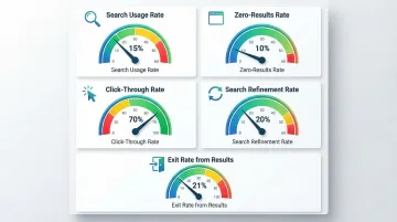
Essential metrics to track
| Metric | What it measures | Target/Benchmark |
|---|---|---|
| Search usage rate | Visitors who use search | ~15% |
| Zero-results rate | Queries returning no results | <10% |
| Click-through rate | Searches resulting in clicks | >70% |
| Search refinement rate | Users who modify their query | ~20% |
| Exit rate from results | Users exiting from search results | ~21% |
Diagnostic methods
Once you've established baseline metrics, dig deeper to uncover specific improvement opportunities:
- Top queries with zero results: Analyze these to identify content gaps and missing terminology in your index
- Queries with high refinement rates: These point to relevance problems — users aren't finding what they expected
- Abandoned searches: Track where users give up to identify the friction points costing you the most
- Successful query patterns: These inform smarter autocomplete suggestions and content prioritization
Professional UX audits can surface patterns that are difficult to catch through analytics alone. For your climate tech or deep-tech company, this often means mapping how different personas search differently: an engineer entering a part number versus a procurement lead searching by application type will follow entirely different paths through the same result set. What if Design works with climate and deep-tech teams specifically on this kind of search experience analysis, connecting search behavior data to conversion gaps in ways that generic audits rarely reach.
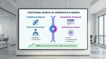
Best practice 8: integrate generative AI for conversational search
When generative answers add value
Generative AI synthesizes answers from multiple sources rather than returning a list of links. This approach works best for:
- How-to questions: "How do I install solar panels on a metal roof?"
- Troubleshooting: "Why is my battery management system showing error code E47?"
- Comparison queries: "What's the difference between monocrystalline and polycrystalline panels?"
Coveo's 2023 AI Search Report documented that companies deploying generative answering see up to a 20% increase in self-service success rates and a 2.3x improvement in case deflection, though outcomes vary significantly by implementation quality and content coverage.
Generative answers work best alongside traditional search results, not in place of them. Navigational queries ("pricing page") and transactional searches ("order EV charging station") still need conventional result pages where users can browse, compare, and decide at their own pace.
Implementing generative search responsibly
Grounding prevents AI hallucinations by constraining answers to verified, approved content. Without grounding, generative search will eventually produce confident-sounding wrong answers about your products.
Retrieval-Augmented Generation (RAG) systems retrieve relevant facts first, then instruct the AI to use only that context when generating answers — limiting the system's ability to fabricate details it wasn't given.
Essential safeguards:
- Source citations: Link to original documentation for every claim
- Transparency: Clearly indicate when content is AI-generated
- Verification process: Human review of answers for critical topics
- Fallback behavior: Revert to traditional results when confidence is low
When you're building for climate tech or deep tech, where technical accuracy is non-negotiable, AI hallucinations in search responses can permanently damage your credibility with enterprise buyers and investors. Never allow the AI to fabricate product specifications, pricing, or technical details.
Measuring generative search success
Once implemented, track metrics specific to generated answers:
- Answer acceptance rate: Percentage of users who engage with the answer (click sources, copy text)
- Follow-up query rate: Percentage who search again immediately (indicates incomplete answer)
- Case deflection: Reduction in support tickets for topics covered by generative answers
- User satisfaction: Direct feedback on answer quality
A/B test generative vs. traditional search experiences to measure impact on conversion, engagement, and satisfaction before full rollout.
Best practice 9: design for accessibility and inclusivity
Accessible search experiences serve everyone better. When users can't interact with your search function — whether due to disability, device limitations, or environmental context — they simply can't succeed. WCAG requirements ensure search is usable by people with disabilities, including those using screen readers or keyboard navigation.
Meeting accessibility standards
Critical accessibility requirements:
- Keyboard operability: All search functionality (input, autocomplete, filters) operable entirely via keyboard
- Focus indicators: Visible focus states for keyboard navigation
- Screen reader support: Proper ARIA labels and announcements for dynamic content
- Color contrast: Minimum 4.5:1 ratio for text and images per WCAG 2.1 guidelines
- Target size: Minimum 24x24 CSS pixels (44x44 recommended)
Designing for diverse user needs
Inclusive design considerations:
- Multiple languages: Support for your audience's primary languages
- Literacy levels: Clear, simple language in error messages and instructions
- Search patterns: Support both keyword search and natural language queries
- Synonym handling: Recognize industry jargon, abbreviations, and alternative terms
Accessibility isn't just compliance — it's good UX that benefits all users. Keyboard navigation helps power users, clear language reduces confusion, and proper contrast improves readability in a range of viewing conditions. For enterprise buyers whose procurement process includes an accessibility compliance review — increasingly standard in government, utilities, and large industrials — meeting these standards signals that your product is built to professional quality throughout.
Measuring search UX success: key metrics to track
Core performance indicators
Primary metrics:
- Search usage rate: Percentage of visitors using search (15% benchmark)
- Search success rate: Percentage who click at least one result (70%+ target)
- Time to successful search: Average time from query to finding desired content
Secondary metrics:
- Query refinement rate: Percentage modifying initial query (20% benchmark)
- Zero-results rate: Percentage getting no results (<10% target)
- Search abandonment rate: Percentage exiting from search results (21% benchmark)
Establishing benchmarks and tracking progress
Start by measuring your current performance across these metrics to establish a baseline. Run analytics for at least two weeks to account for normal traffic variations before drawing conclusions.
Set improvement goals based on your baseline and industry standards, then track metrics weekly or monthly to identify trends and measure the impact of each change you make.
Compare against your own historical data first, then against industry benchmarks. A 5% improvement in search success rate can translate to meaningful revenue lift for high-traffic sites — and for climate tech companies where a single enterprise deal can be worth hundreds of thousands of dollars, reducing search friction at the evaluation stage has outsized impact.
Where to go from here
If you treat search as infrastructure rather than a feature — the right framing when your buying journey involves multiple technical and business stakeholders — a well-designed search experience can be the difference between a site that qualifies leads and one that confuses them.
Start with the highest-impact fixes: visible placement, intelligent autocomplete, and zero-results handling. Instrument those changes with the metrics in Best Practice 7, and you'll have a clear picture of where to invest next. If your current search experience has gaps across multiple areas, a focused UX audit can help you prioritize the changes that will move your most important metrics.
Frequently asked questions
What is the 80/20 rule in UX and how does it apply to search design?
In search, 80% of users search for the same 20% of top queries. Optimize these high-volume queries first through curated "best bet" results or featured answers for maximum return on your optimization effort.
What are the 4 C's of UX design in the context of search?
The 4 C's — Consistency, Continuity, Context, and Complementary — create cohesive search experiences. Consistency makes search predictable across pages, continuity ensures a smooth flow from query to action, context delivers results relevant to where the user is in their journey, and complementary design means search works alongside navigation rather than competing with it.
How wide should a search box be for optimal UX?
Search boxes should display 27-30 characters without scrolling — the average query length per Baymard Institute. Shorter boxes hide text and make editing difficult, especially for the longer, more specific queries that technical buyers tend to use.
Should search be a box or a link on the homepage?
Use an actual input box. Research consistently shows that visible text fields outperform icon-only or link implementations in usage metrics. Users need to see an interactive element that clearly signals where to type, particularly first-time visitors who aren't yet familiar with your site structure.
How does autocomplete impact conversion rates?
Baymard Institute documents that implementing autocomplete increases sales by 24% and lengthens average queries from 1.7 to 3.3 words. Each additional word in a query correlates with a 15% increase in conversion because longer queries indicate clearer intent and lead to more relevant results.
What causes most search abandonment?
Zero-results pages cause 69% of users to abandon entirely, according to Baymard Institute. Other major causes include irrelevant results, slow performance, and confusing or missing filters. Smart zero-results handling with relevant alternatives prevents most of this abandonment.