The hidden connection between UX design and customer loyalty
You've spent months, sometimes years, refining the technology. The pilot data is strong. The team is credible. But when a potential partner or investor lands on your website, they can't tell.
The problem isn't the technology. It's that most climate tech websites are built to explain the science, not to build confidence in the company. When your digital presence reads like a technical brief rather than a business case, the gap between where you are and where you appear to be starts costing you real opportunities.
This article breaks down where UX design has the most direct impact on converting first-time visitors into repeat customers and long-term partners, and what specifically needs to change to close that credibility gap.
TLDR: key takeaways
- Users judge your credibility in 50 milliseconds, before reading a single word
- Every $1 invested in UX returns $100, with potential conversion rate increases up to 400%
- 40% of users abandon sites that take more than 3 seconds to load
- Trust signals like SSL certificates and testimonials boost sales by up to 32%
- Task completion rates above 78% correlate with stronger customer retention, particularly relevant for complex B2B tools where users need to navigate multi-step processes
What makes UX design essential for customer loyalty
The conversion vs. loyalty distinction
Conversion-focused UX gets users to act once: downloading a whitepaper, requesting a demo, or making a purchase. Loyalty-focused UX creates repeat behaviors and the kind of engagement that transforms customers into references and advocates.
For your business, this distinction has specific commercial consequences. Enterprise buyers in utilities, heavy industry, or government procurement don't make one-time purchases. They evaluate vendors over months, sometimes longer. A website that captures initial interest but doesn't give visitors a reason to return, or a way to understand the technology at increasing levels of depth, won't support the kind of relationship-building those sales cycles require. The same is true for investors reviewing companies between touchpoints.
The ROI reality
Research from Forrester demonstrates that every $1 invested in UX returns approximately $100, which works out to roughly a 9,900% ROI. The more relevant question for climate tech companies is not whether UX investment pays off, but whether the specific UX investments they're making match their current stage. An early-stage company spending on custom animations before fixing its messaging hierarchy is investing in the wrong layer. The compounding return from UX comes primarily from removing barriers to the actions that matter: a demo request, a partnership inquiry, a download of a technical brief.
Design-centric companies have outperformed the S&P 500 by 228% over a 10-year period, which reflects how superior user experience translates directly into commercial performance.
A well-designed user interface can boost conversion rates by 200%, while comprehensive UX improvements can increase conversions by up to 400%.
The psychology of user experience
The way an interface behaves communicates something about the organization behind it. When a procurement team or institutional investor navigates a climate tech website and has to work to find the business model, the proof points, or the contact information, that friction creates an implicit signal about organizational readiness. This happens before users read a single paragraph of copy, and it shapes how everything else on the page gets interpreted.
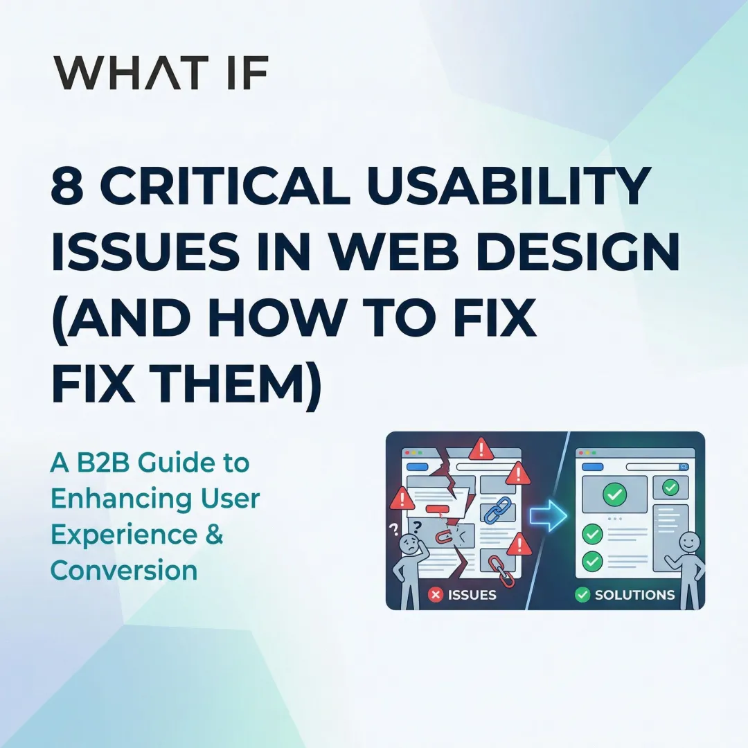
Four psychological principles shape how buyers and investors experience your site. Cognitive load reduction — simplified interfaces that help users reach information without effort — lets them make faster decisions. Pattern recognition means consistent design systems build familiarity across repeated visits, accumulating trust over time. Feedback clarity, where interfaces confirm user actions, reduces the uncertainty that causes abandonment. And value sequencing — showing the right information in the right order — builds confidence before asking for commitment.
Think about what happens when a procurement officer at a utility company visits two competing climate tech sites on the same afternoon. One requires three clicks to find a business model summary buried under technical specifications. The other surfaces it in the first scroll, with clear deployment context alongside it. The second company gets the meeting request — and cognitive load reduction is why.
Purpose-driven UX for climate tech
These principles become more consequential in climate technology because the stakes of a bad first impression are higher. A utility buyer or institutional investor landing on a climate tech website is making a judgment not just about the product, but about whether this company is credible enough to be worth a meeting.
As a technical founder, you may default to leading with technical accuracy rather than strategic positioning, which makes sense given your background. The result is usually a website that requires significant effort to decode. Simplifying the cognitive path through the site, without reducing the depth of the technology itself, is where UX does its most important work. The goal is a website that a potential customer or investor can navigate without prior knowledge of your technology, and that makes the commercial case clearly enough that they want to keep reading.
First impressions: how visual design builds trust
The 50-millisecond rule
Users form credibility judgments within 50 milliseconds of landing on your page. In that window, visual hierarchy, color scheme, typography, and layout quality determine whether visitors stay or investigate further.
94% of first impressions are design-related. Your visual design carries nearly the entire burden of establishing credibility before users engage with your content. For you, trying to signal maturity and commercial readiness, that 50 milliseconds is where a lot of the positioning work either lands or doesn't.
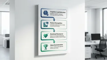
Visual hierarchy and consistent branding
Cohesive design systems create a professional appearance and reinforce brand recognition across touchpoints. Your visual hierarchy guides users naturally toward key conversion elements without creating clutter.
Effective visual consistency means using unified color palettes that meet WCAG-AA accessibility standards, typography hierarchies that establish clear information structure, consistent spacing and layout grids across all pages, and brand-aligned iconography and graphic elements.
The most effective brand systems for climate tech companies establish narrative hierarchy, visual identity, and guidelines before building the website. When those elements are defined first, every touchpoint, from pitch decks to product interfaces to the website itself, reinforces the same signal to investors, buyers, and partners.
When your pitch deck, website, and technical brief look like they come from different organizations, enterprise buyers notice — and it creates doubt about operational maturity at exactly the moment you're trying to advance an evaluation.
White space and clean layouts
You face an inherent communication challenge: your technology is often genuinely complex, and the temptation is to include as much technical context as possible on the website. The result is usually a page that overwhelms rather than converts. White space is the structural tool that prevents this. Giving content room forces prioritization, which is often the more useful discipline for a technical founder. Your team, when forced to choose what makes it above the fold, tends to land on the right message faster than if you include everything.
Authentic visuals that build trust
Generic stock photography creates immediate credibility friction for your company. When your site shows wind turbines that clearly didn't come from a real installation, or a team photo pulled from a library, technically sophisticated visitors notice. These audiences, whether they're infrastructure investors, utility procurement teams, or engineering partners, are evaluating whether your organization is real and operational.
Effective visual authenticity means showing actual product installations and real-world deployments, team photos that show the people behind the technology, documented pilot environments and verified use cases, and data visualizations that show measurable, attributed results.
Micro-interactions and animation
Small interface behaviors, like a button state that confirms a click was registered, a form that validates fields before submission, or a loading indicator during a slow API call, remove the ambiguity that causes users to abandon processes. When a demo request or technical inquiry form is your primary conversion action, a form that behaves predictably matters more than visual polish. These micro-interactions are especially important when guiding users through multi-step processes like product configurations or pilot application flows.
If a prospective partner submits your demo request form and receives no visible confirmation, they'll either resubmit or assume it failed and give up. Either way, you've lost the conversion at the exact moment intent was highest.
Reducing friction through intuitive navigation
Beyond the three-click myth
The "three-click rule", the idea that users abandon tasks requiring more than three clicks, is completely false and unsupported by data. User drop-off doesn't increase with click count, provided the path is clear and each step builds confidence.
What matters is information scent: the degree of confidence users feel that clicking a link is taking them closer to what they need. Clear labeling and logical categorization create strong information scent that keeps users engaged regardless of click count.
For you, this problem is compounded by the fact that your audiences are different from each other. An investor visiting your site needs to reach proof points and business model clarity quickly. A potential enterprise buyer needs to reach the use case that matches their industry. A policy stakeholder needs to understand scale and adoption pathways. Navigation that isn't structured around these distinct journeys forces everyone through the same path, and most of them leave before finding what they came for.
Navigation best practices
Strong navigation uses clear, descriptive labels that match how your users think rather than how your organization is structured, logical categorization based on user tasks and audience types, prominent search for visitors who already know what they're looking for, and breadcrumb trails so users always know where they are in the site hierarchy.
58% of desktop sites and 67% of mobile sites have mediocre to poor navigation performance, which represents a significant opportunity for competitive differentiation in a market where first-mover credibility matters.
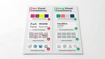
Simplified forms and registration
Each additional form field decreases conversion. The average checkout flow contains 23.48 form elements, yet ideal flows can be as short as 12-14 elements, and most sites can reduce default form fields by 20-60% without losing necessary information.
A major US retailer generated $300 million in extra sales simply by allowing guest checkout, proving that removing forced registration barriers drives both immediate revenue and long-term engagement. When your primary conversion action is a demo request or partnership inquiry rather than a purchase, the principle is the same: ask for the minimum needed to start a conversation.
The most effective form optimization tactics are progressive disclosure (showing fields only when relevant to what the user has already indicated), smart defaults that reduce effort, inline validation that catches errors immediately rather than at submission, and clear explanations of why specific information is needed.
Performance and speed as loyalty drivers
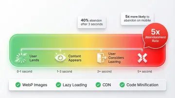
The three-second threshold
40% of users abandon sites that take more than 3 seconds to load. Site speed is a trust signal. When a page takes too long to load, users don't wait because they assume something is wrong, either with the site or the company behind it.
39% of users stop engaging with content if images fail to load or loading is too slow, which directly limits your ability to communicate value to buyers who are still in the evaluation stage.
Technical performance optimization
The core technical improvements are straightforward: optimize images using modern formats like WebP and AVIF, implement lazy loading for below-the-fold content, minify and compress code to reduce file sizes, and use Content Delivery Networks (CDNs) for consistent global access.
Getting these right typically brings load times below 3 seconds — the threshold below which you stop losing 40% of visitors before they've had a chance to evaluate what your technology does.
Mobile performance priorities
Mobile users are 5 times more likely to abandon tasks if sites aren't optimized for their devices. If you're targeting industrial or utility buyers, the assumption that everyone is on a fast desktop connection isn't always accurate. Field engineers, procurement teams reviewing options on the go, and international partners all experience your website under conditions you can't control. A site that loads in 1.5 seconds on fiber at a San Francisco office may load in 4-5 seconds for someone on a mobile connection at a project site. Optimizing for that range of conditions isn't optional if those audiences matter to your pipeline.
Trust signals that transform visitors into advocates
Security and credibility badges
Trust badges can boost sales by up to 32%, while 85% of shoppers are more likely to complete purchases when they see trust signals like SSL certificates prominently displayed.
49% of consumers perceive the absence of trust badges as indicating potential fraud, making these elements consequential even for your B2B site where the primary conversion is an inquiry or demo request.
Effective trust signals include:
- SSL certificates and security badges
- Industry certifications and standards compliance (like What if Design's Design Declares commitment)
- Third-party validations and awards from credible industry bodies
- Payment security indicators for any transactional elements
Social proof and testimonials
In climate tech, social proof carries extra weight because your technology may be newer than your competitors' and your buyer is taking on deployment risk. A signed LOI, a named pilot partner, or a quote from a credible industry organization tells prospective buyers that others have already made the judgment that you're worth working with. That reduces the perceived risk of being an early adopter.
Strategic placement of customer testimonials, case study results, client logos, and user reviews maximizes impact on conversion decisions.
The most effective social proof combines specific, quantifiable results rather than generic praise, photos and full names with organizational affiliations, industry-relevant testimonials matched to the type of buyer you're trying to convert, and video testimonials for complex technologies that benefit from explanation.
Transparency as trust builder
Clear pricing, honest product descriptions, accessible contact information, and visible team members build the kind of credibility that performs consistently in long sales cycles. For your company especially, being specific about what has been proven, at what scale, and under what conditions matters more than a strong vision statement. Buyers and investors who have seen a lot of early-stage companies are calibrated to the difference between documented results and projected ones.
When working with companies like Susteon and LabStart, the consistent pattern is this: founders with strong technologies often undersell their proof points while overselling their roadmap. Both create credibility problems. The websites that convert best in this space lead with documented results and are transparent about where the technology currently sits in its development and deployment cycle.
Accessibility and inclusion
WCAG-compliant design signals that your organization thinks carefully about who it serves. If you're working across markets, geographies, and communities, that signal matters to investors and partners who are evaluating organizational maturity. Accessibility is also a practical concern: broader device and assistive technology compatibility means fewer visitors hit technical barriers before reaching your content.
Effective calls-to-action
Design CTAs to feel like a helpful next step, not a sales close. More than 70% of small business websites don't use clear call-to-action buttons, which means the majority of interested visitors have no clear path forward.
Effective CTAs use action-oriented language that describes what happens next, not just what the user should do. Placement matters: thumb-friendly zones on mobile can increase conversions by 43%. Contrasting colors draw attention without overwhelming the surrounding content, and clear value framing reduces the uncertainty of clicking.
If your website is struggling with conversion, it probably isn't because of a single large problem. You're losing visitors through a series of small friction points: a navigation structure that doesn't match how buyers think, copy that prioritizes technical accuracy over business case clarity, and forms that ask for too much before demonstrating enough value. Addressing these systematically, with your specific audience in mind, consistently yields better results than a full visual redesign. If your site isn't performing the way your business already is, a focused UX audit is usually the right starting point.
Frequently asked questions
What is the difference between UX design and UI design when it comes to conversions?
UX (user experience) encompasses the entire user journey: the architecture of information, the flow between pages, the friction in forms, and the clarity of the path to conversion. UI (user interface) focuses on the visual layer, buttons, typography, color, layout. UI improvements alone can boost conversion rates by 200%, but when combined with structural UX improvements, that lift reaches 400%. For climate tech companies with complex, multi-audience websites, the UX layer tends to be where the most significant conversion problems live.
How long does it typically take to see results from UX improvements?
Quick wins like improved page speed or simplified forms can show measurable results within weeks. Comprehensive UX overhauls typically demonstrate clear impact within 2-3 months, with continuous iteration compounding gains over time. The timeline depends on how well baseline metrics were captured before the changes went live.
What are the most common UX mistakes that hurt both conversions and customer loyalty?
The most damaging mistakes are: navigation structured around internal org charts rather than audience types, copy that leads with technology specs rather than business outcomes, load times exceeding 3 seconds, forms that require too much commitment before establishing enough trust, and missing credibility signals like testimonials, named clients, or SSL certificates. For your climate tech company specifically, the most common issue is your site reads as if it was written for a technical peer rather than a prospective buyer or investor.
How much should a business expect to invest in professional UX design?
Investment varies widely based on scope, but the ROI case is well-established: every $1 invested typically returns approximately $100. Specialized agencies with domain knowledge in climate tech can offer a significant cost advantage over generalist agencies because they require far less onboarding time and fewer revision cycles. If you're at an early stage, a focused improvement to a few high-impact pages often delivers more near-term value than a full site rebuild.
Can small UX changes really make a significant difference in customer loyalty?
Yes. Measurable improvements in conversion rate or task completion often come from fixing one specific friction point. Reducing form fields, improving load time on mobile, making the primary CTA more visible, or restructuring navigation around audience type can each move metrics meaningfully without requiring a full redesign. These improvements compound over time as users develop familiarity with a site that behaves predictably.
How do you measure the success of UX design changes?
Key metrics include conversion rate, bounce rate, time on site, task completion rate (aim for 78% or higher), customer satisfaction scores (NPS), and repeat visit frequency. Establish baseline metrics before implementing changes, then track improvements through A/B testing and analytics platforms to demonstrate clear impact. For climate tech companies with long sales cycles, also track how often website visits appear in the early touchpoints of deals that eventually close.