What are usability heuristics?
You've built a carbon accounting platform that your engineering team understands inside out. But when a procurement lead at a utility company lands on your dashboard, they're met with unlabeled axes, status indicators that don't update, and error messages that read like server logs. They don't book a demo. They move on.
This isn't a technology problem. It's a usability problem, and for climate tech products specifically, it has a direct cost. When users can't navigate your interface confidently, trust erodes faster than any sales conversation can rebuild it.
Jakob Nielsen's 10 usability heuristics give you a structured way to identify and fix these gaps before they reach users. This guide explains each principle and how it applies to the kinds of complex, data-heavy products that climate tech companies build.
Nielsen refined these heuristics in 1994 through factor analysis of 249 usability problems, and they remain relevant and unchanged because they address fundamental human cognitive limitations, specifically memory capacity, attention, and perception, rather than fleeting technological trends. Whether you're designing for web, mobile, AI interfaces, or emerging platforms, these principles provide a proven framework for creating intuitive, user-friendly experiences.
TLDR: Key takeaways
- Nielsen's 10 heuristics identify usability problems based on analysis of 249 real interface issues
- Ten core principles guide everything from status visibility to error prevention and user control
- Catch 75% of usability issues early using just 3-5 evaluators in heuristic evaluation
- Especially relevant for climate tech dashboards, ESG reporting tools, and grid analytics platforms where data complexity creates usability risk
- Identify critical flow breakdowns before launch, reducing the redesign cycles that slow down product adoption
The 10 usability heuristics explained
Heuristic 1: Visibility of system status
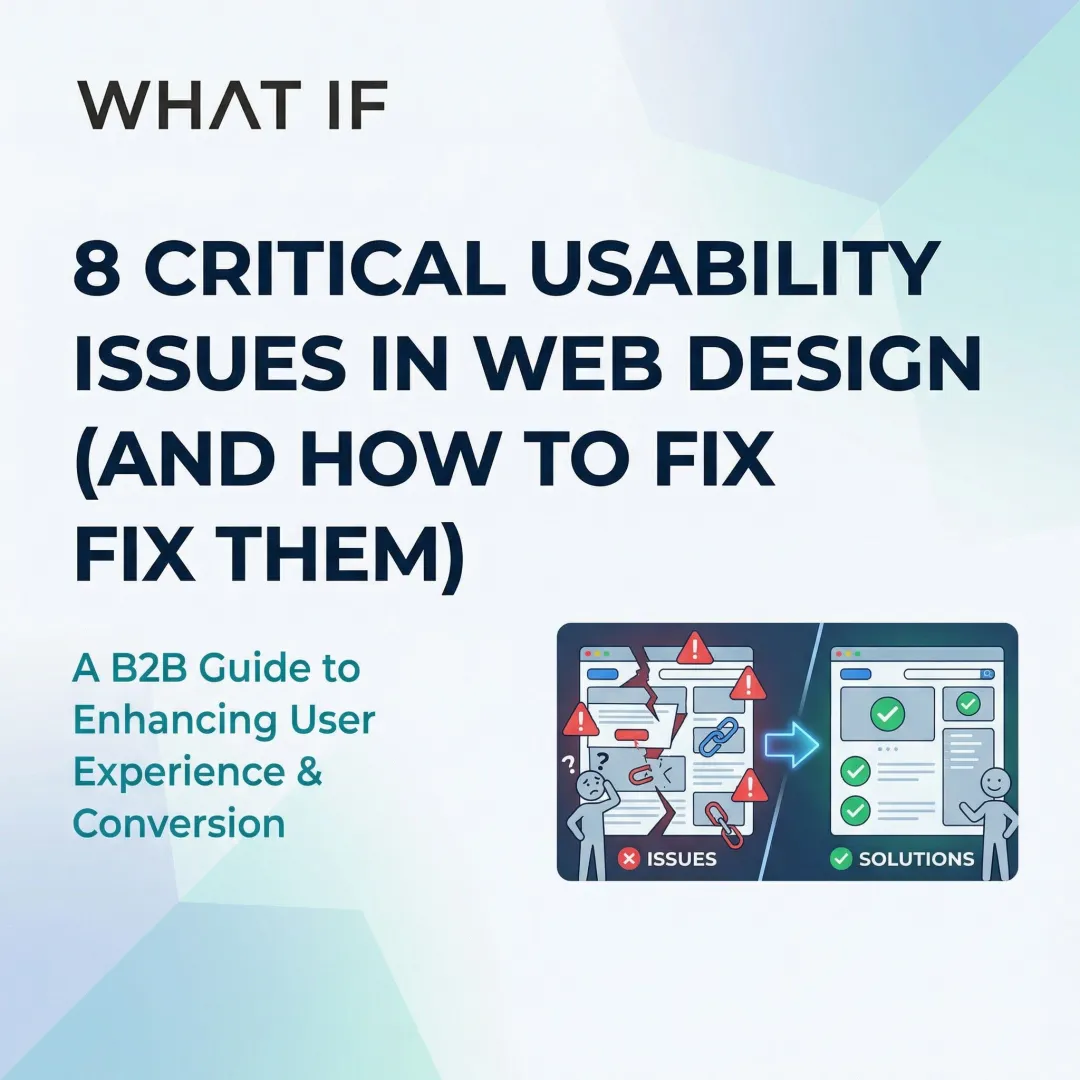
Users should always know what's happening through appropriate feedback within a reasonable time. When a system goes silent, users are left asking whether their action worked, whether something is processing, or whether it failed altogether.
Effective implementations include loading indicators during file uploads, progress bars for multi-step processes, real-time "Saved" confirmations in documents, status messages after form submissions, and visual feedback when buttons are clicked.
Silent failures create anxiety and lead to duplicate submissions. Users abandon processes they believe are broken when they're actually just slow to respond.
For climate tech dashboards calculating emissions across supply chains, display real-time progress indicators like "Analyzing transportation data... 47% complete." This transparency builds trust in data accuracy while managing processing expectations. During a pilot evaluation, a dashboard that communicates clearly under load signals the kind of reliability enterprise buyers notice before they ever speak to procurement.
Heuristic 2: Match between system and the real world
Interfaces should speak the user's language with familiar concepts, words, and phrases rather than system-oriented terms.
Research shows that stimulus familiarity modulates memory performance. When users encounter recognizable words, they can rely on existing knowledge rather than learning new definitions.
Good examples include trash/recycle bin icons for deletion, calendar interfaces that mirror physical planners, "Anywhere" and "Any week" shortcuts in travel booking (like Airbnb), and industry-specific terminology that matches user domain knowledge. Bad examples include technical error codes without plain-language explanations, system-oriented labels like "Execute batch process" instead of "Send all emails," and a coffee cup icon representing agent availability (coffee breaks imply unavailability, not availability).
For sustainability platforms, avoid unexplained jargon like "kWh" or "CO2e" without context. Instead, use familiar metaphors: "equivalent to planting 47 trees" or "same as driving 1,200 miles." The user's mental model of their emissions should anchor every label choice you make. When a procurement lead or sustainability manager can understand your data without asking for a glossary, you've removed a barrier that often stalls deals before they reach technical evaluation.
Heuristic 3: User control and freedom
Because mistakes happen, interfaces should enable easy recovery through undo, redo, and cancel operations. Users need clearly marked exits from unwanted states, and they need them without going through extended processes.
Common implementations include undo/redo functions in content editors, cancel buttons in multi-step wizards, Gmail's brief "Undo" option after sending emails, breadcrumb navigation showing clear paths back, and the ability to edit previous steps in checkout flows.
When users know they can reverse an action, they're more likely to explore features without hesitation, which matters for complex tools where one wrong click can feel costly.
For ESG reporting tools or carbon accounting platforms, this is especially critical. If a user accidentally deletes a data entry or submits an incomplete report, a clear undo path prevents a support ticket and preserves trust in the platform. For a buyer in active evaluation, encountering an unrecoverable error state can end a pilot before it begins. E-commerce sites that force users to restart checkout from scratch after a single error illustrate the same failure: better design allows editing the problematic field directly.
Heuristic 4: Consistency and standards
Users should not have to wonder whether different words, situations, or actions mean the same thing. Consistency applies both internally, within your product, and externally, by following platform conventions.
Research confirms that consistent inline validation saves user time and effort. Inconsistent patterns force users to learn new rules for every interaction.
Visual consistency means using the same colors, typography, and spacing for similar elements. Functional consistency ensures the same actions produce the same results across contexts. External consistency means following iOS, Android, or web platform conventions.
Microsoft Office maintains consistency across Word, Excel, and PowerPoint through the same Ribbon interface and menu structures. In contrast, 65% of mobile sites lack breadcrumbs on product pages, limiting users' ability to navigate hierarchy according to established web standards.
In climate data platforms, inconsistent labeling across modules, for example using "emissions" in one section and "CO2 output" in another for the same metric, creates confusion and undermines confidence in data integrity. When your users are making reporting decisions based on your interface, label consistency isn't a design nicety, it's a trust requirement. An inconsistent interface signals an immature product, and that impression forms fast during a vendor evaluation.
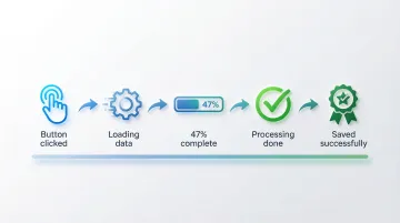
Heuristic 5: Error prevention
Good design prevents problems from occurring rather than just providing error messages after the fact, and prevention strategies differ depending on whether the error is a slip (unconscious) or a mistake (conscious decision).
Prevention techniques:
- Constraints: Disabling invalid options before users can select them
- Confirmations: "Are you sure?" dialogs for destructive actions like deletion
- Helpful defaults: Pre-filling forms with likely values
- Input validation: Real-time feedback as users type (password strength indicators)
- Clear affordances: Making interactive elements obviously clickable
Positive inline validation checks password strength as you type, preventing weak passwords before submission. In contrast, premature validation that flags a phone number as "invalid" after the first digit causes unnecessary friction.
In regulatory compliance tools or emissions reporting platforms, a submission error can have downstream consequences for audits, regulatory filings, or partner reporting. Preventing users from submitting incomplete or out-of-range data is far more valuable than a clear error message after the fact. When your enterprise buyer sees that your platform prevents costly filing errors by design, it becomes a concrete capability that accelerates procurement decisions.
Heuristic 6: Recognition rather than recall
Minimize memory load by making objects, actions, and options visible. Recognition is easier than recall because it provides more cues that help activate related information in memory.
Human working memory is limited, and Miller's Law suggests we can hold approximately 7±2 chunks of information at a time, which means interfaces that ask users to remember things across screens create unnecessary cognitive friction.
Recognition-based design shows up as visible navigation menus instead of hidden options, autocomplete in search fields, recently used items lists, tooltips explaining icon functions, and preview functionality before committing actions.
Search suggestions transform recall tasks into recognition tasks, allowing users to recognize their intended query rather than remembering exact spelling. Command-line interfaces, by contrast, require users to memorize commands without visual cues, which is appropriate for expert users but a significant barrier for general audiences.
For grid analytics dashboards or carbon tracking platforms where users work with complex, multi-variable data, recognition-based interfaces reduce cognitive load considerably. Showing previously analyzed facilities in a dropdown rather than requiring users to type exact facility IDs is a simple but high-impact application of this principle. This kind of friction reduction is what separates a platform users advocate for internally from one that gets quietly replaced after a pilot ends.
Heuristic 7: Flexibility and efficiency of use
Interfaces should cater to both inexperienced and experienced users through accelerators and customization options. As users become more familiar with your product, they should be able to work more efficiently.
Flexibility shows up in keyboard shortcuts for frequent actions, customizable dashboards and layouts, saved preferences and templates, bulk actions for power users, and multiple paths to accomplish the same task.
Novices need clear guidance and visible options, while experts benefit from shortcuts that reduce time on repetitive tasks. When your product supports this progression, you retain users longer and deepen the engagement that turns pilots into contracts.
Adobe Photoshop provides extensive keyboard shortcuts for expert users while maintaining full menu access for beginners. Forcing all users through lengthy step-by-step wizards for frequent tasks, with no shortcut path available, frustrates experienced users and signals that the product hasn't been designed with their workflow in mind.
For sustainability analysts who run the same calculations weekly, bulk data imports, saved report templates, and keyboard shortcuts are not convenience features. They determine whether a tool becomes part of the user's workflow or gets replaced by a spreadsheet.
Heuristic 8: Aesthetic and minimalist design
Interfaces should not contain irrelevant or rarely needed information. Every extra element competes with the relevant content and reduces its relative visibility.
A 2023 study found that high visual complexity significantly increased task completion time and cognitive load, particularly through higher fixation counts and longer eye-movement patterns.
The core techniques are progressive disclosure, showing advanced options only when needed; visual hierarchy, using size, color, and spacing to prioritize information; strategic white space, giving content room to breathe; and focused content, removing decorative elements that don't serve user goals.
Google's homepage remains the clearest example of this principle in practice, focusing users entirely on search without extraneous distractions. Cluttered news apps with excessive ads, pop-ups, and competing visual elements illustrate the opposite, and the data on task completion times shows the real cost.
For sustainability dashboards, resist the pull to display every available metric by default. Show only actionable data first, with drill-down options for detailed analysis. This is particularly important when your users are executives or procurement leads who need a clear signal, not a data dump.

Heuristic 9: Help users recognize, diagnose, and recover from errors
Error messages should be expressed in plain language, precisely indicate the problem, and constructively suggest a solution. Generic error messages leave users frustrated and stuck.
Good error messages use plain language ('This email is missing an @ symbol' not 'Error 502'), precisely identify what's wrong, suggest specific steps to fix the problem, and maintain a helpful rather than blaming tone.
Before/after comparison:
❌ "Invalid input"
✅ "Phone number must be 10 digits. You entered 9 digits."
❌ "Error: Transaction failed"
✅ "Your card was declined. Please check your card number and expiration date, or try a different payment method."
In B2B software, where users return to the same platform daily, a confusing error message compounds into lost confidence in the product. In climate software specifically, where a single field entry might represent thousands of tons of reported emissions, error messages need to be precise. "Invalid entry" tells a user nothing. "This figure exceeds your facility's historical peak by 300%. Verify the unit of measurement before submitting." gives them something to act on. In a pilot context, where every interaction is being evaluated, an error message that helps a user self-correct quickly is a trust signal that no sales deck can replicate.
Heuristic 10: Help and documentation
Systems should be usable without documentation, but when help is necessary, it should be easy to search and focused on user tasks rather than features. If users frequently need help for basic actions, that's usually a signal to fix the design, not write more instructions.
Effective help systems:
- Contextual help: Tooltips or "Learn more" links appearing exactly when needed
- Searchable knowledge bases: Organized by user tasks, not features
- Interactive tutorials: Guided walkthroughs for complex workflows
- Chatbots: Immediate answers to common questions
- Video demonstrations: Showing rather than telling
Contextual help tooltips that appear when users hover over unfamiliar icons provide just-in-time information without pulling them out of the workflow. Requiring users to download a PDF manual or search through a separate FAQ site to understand basic features is a sign that the interface hasn't done its job.
Climate tech platforms often deal with concepts that aren't intuitive to every user, from scope 3 calculations to grid interconnection standards. Contextual help that explains what a metric means and why it matters, surfaced within the workflow itself, reduces onboarding friction without requiring a separate knowledge base visit. Shorter time-to-value during onboarding directly affects whether a pilot converts — buyers judge readiness to deploy from their first session, not from the sales deck.
How to apply heuristics in your design process
Heuristic evaluation is a systematic method for identifying usability problems before they reach users. Research shows that 3-5 evaluators can identify up to 75% of usability issues, making it a cost-effective technique relative to full usability testing.
The heuristic evaluation process:
- Assemble evaluators - Recruit 3-5 people with UX expertise and domain knowledge
- Brief evaluators - Provide context on user goals, key workflows, and evaluation scope
- Conduct independent reviews - Each evaluator examines the interface alone, documenting violations
- Rate severity - Assess each issue based on frequency, impact, and persistence
- Consolidate findings - Combine individual reports, removing duplicates
- Prioritize fixes - Create an actionable remediation plan based on severity ratings
Severity rating framework: Rate each issue based on how frequently it occurs, how difficult it is for users to overcome, and whether it's a one-time problem or a repeated friction point.
When your team incorporates heuristic evaluation alongside user testing, you run a more comprehensive audit — one that catches both expert-identified violations and real user pain points.

For climate tech and sustainability platforms, specialized evaluators who understand sector-specific challenges, from carbon tracking interfaces to ESG dashboards, ensure evaluations address both general usability principles and domain-specific user needs. The difference between a generic UX reviewer and one who understands your user's reporting obligations is the difference between surface-level feedback and actionable findings.
At What if Design, heuristic evaluation is often the starting point when we work with climate tech and sustainability platform teams, because it's the fastest way to identify where user trust is breaking down in data-heavy tools. If your product experience hasn't been evaluated against these principles recently, it's worth finding out where the gaps are.
If your platform is adding features faster than users are adopting them, the issue is often in the flow, not the functionality. Connect with us to discuss a UX audit.
Frequently asked questions
What are the 10 guidelines for user interface design?
The 10 heuristics cover system visibility, real-world alignment, user control, consistency, error prevention, recognition over recall, flexibility, minimalist design, error recovery, and documentation. Together, they form a comprehensive framework for evaluating interface usability across any platform or product type.
What is a user interface heuristic?
A heuristic is a broad rule of thumb or general principle for interaction design, not a specific guideline with prescribed measurements. Heuristics help identify usability problems during interface inspection and apply across different contexts, platforms, and technologies.
How would you rank the 10 guidelines in order of importance?
There's no fixed ranking since priority depends on context and business goals. That said, error prevention and system status visibility are often the most critical to get right because they directly affect user trust and task completion, particularly in B2B tools with complex workflows.
Can usability heuristics conflict with each other?
Yes, they frequently do. Flexibility can conflict with simplicity, and comprehensive help documentation can conflict with minimalist design. You'll navigate these tradeoffs using user research and business priorities rather than applying heuristics rigidly.
How do you conduct a heuristic evaluation?
Assemble 3-5 evaluators with UX expertise to independently review the interface against each heuristic. Document violations, rate severity based on frequency, impact, and persistence, consolidate findings, and validate priorities with user testing where possible.
Are Nielsen's heuristics still relevant for modern interfaces in 2024?
Absolutely. The heuristics remain relevant because they're grounded in how humans perceive, remember, and process information, not in specific technologies. They apply equally to web applications, mobile products, AI interfaces, and emerging platforms.