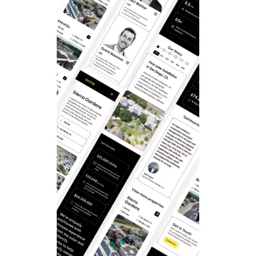
What exactly is mobile-first responsive design?
Mobile-first responsive design is an approach where we design the mobile experience first, then progressively enhance for larger screens. This ensures your website prioritizes the constraints and user needs of smartphone users, who represent the majority of web traffic in the United States, rather than treating mobile as an afterthought. The design adapts fluidly across all screen sizes using flexible grids, responsive images, and CSS media queries.
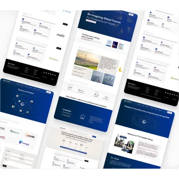
How does responsive design differ from having separate mobile and desktop sites?
Responsive design uses a single website that adapts to any screen size, whereas separate sites require maintaining two different codebases. Responsive design is more cost-effective, easier to maintain, better for SEO (Google prefers responsive sites), and ensures consistent branding and content across all devices. It also automatically works on new device sizes without requiring updates.
Will my existing website content work with responsive design?
Most content can be adapted for responsive design, but we'll likely recommend restructuring or condensing certain elements for optimal mobile performance. Long-form content may need better hierarchy, large images require optimization, and complex navigation structures often benefit from mobile-specific patterns like hamburger menus. We'll audit your existing content and provide recommendations during our discovery phase.
How long does it take to design and develop a responsive website?
Our responsive website projects typically range from 4-12 weeks depending on complexity, number of pages, and custom functionality requirements. This includes strategic discovery, mobile-first design, development, testing across devices, and refinement. We can provide a detailed timeline after understanding your specific needs and content volume.
What devices and screen sizes do you test responsive designs on?
We test across 20+ device types including popular smartphones (iPhone, Samsung Galaxy, Google Pixel), tablets (iPad, Android tablets), and desktop screens ranging from 320px to 2560px wide. We validate on both iOS and Android operating systems, multiple browsers (Chrome, Safari, Firefox, Edge), and ensure consistent experiences across all major platforms used throughout the United States.
How do you ensure fast mobile load times?
We implement multiple performance optimization strategies: responsive images that load appropriate sizes per device, lazy loading to defer off-screen content, minified CSS/JavaScript, efficient code structure, content delivery networks (CDN), and optimized web fonts. We target sub-3-second load times on mobile networks and monitor Core Web Vitals to ensure excellent performance for United States users.
Can you make our current non-responsive website responsive?
Yes, we can retrofit existing websites with responsive capabilities, though the approach depends on your current platform and code quality. Sometimes a full redesign is more cost-effective than trying to force responsiveness into outdated architecture. We'll evaluate your existing site and recommend the best path forward—whether that's responsive retrofitting, progressive enhancement, or a fresh mobile-first rebuild.
What's included in your responsive design pricing?
Our responsive website projects include strategic discovery workshops, mobile-first design and desktop adaptations, responsive Webflow development, content migration and optimization, cross-device testing and QA, performance optimization, basic SEO implementation, and post-launch support. Pricing varies based on scope, typically ranging from 4-12 week engagements. We're 3x cheaper than hiring in-house senior designers while delivering full-service quality.