You've built a product that works. The technology is real, the pilot results are solid, and the team understands the problem deeply. But when a potential enterprise buyer, partner, or investor sits down with your product for the first time, they lose confidence somewhere in the interface — and you don't always know where.
For climate tech and deep tech teams, this is more than a usability problem. Your product likely operates in a complex domain: grid analytics, carbon accounting, energy management, or industrial process optimization. Users may not be tech-native. The stakes of an error are high. A confusing interface doesn't just frustrate people; it signals that the underlying system might be unreliable too.
UI design research gives you a systematic way to find those failure points before they cost you deals. This guide covers the core methods, principles, and frameworks your team can use — from lightweight 5-user testing to building research-backed design systems that scale with your product.
TLDR
- As a climate tech or deep tech founder, UI research is how you verify that complex interfaces work for real users in real conditions, not just in internal demos
- Principles like real-time field validation and system status transparency have direct impact on error rates and task completion; the research benchmarks are specific and measurable
- Small usability studies (4-5 users) cost-effectively surface the majority of interface problems before they affect adoption
- The value of research compounds when you encode findings into a design system and tie them to specific metrics your team tracks over time
What is UI design research?
UI design research is the focused study of how users interact with interface elements: buttons, forms, navigation, visual hierarchy, and interaction patterns.
It focuses specifically on the surface layer where users engage with your product, measuring whether interfaces are usable, accessible, and efficient.
UI research vs. UX research
While often used interchangeably, these disciplines have distinct focuses:
UI research examines whether buttons are visible and clickable, whether users understand icon meanings, whether color contrast is sufficient for readability, and whether users can complete forms without errors.
UX research explores whether a feature solves the user's problem, how it fits into their daily workflow, what value the product provides, and why users choose this solution over alternatives.
UI research validates whether individual design elements work. UX research validates whether the product as a whole is worth using. Knowing which layer is causing friction — the interface or the value proposition — tells you exactly where to focus before your next buyer demo or procurement evaluation.
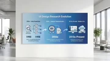
Evolution of UI design research
UI design research has evolved through three distinct phases:
Early foundation (1990s): Nielsen and Molich established heuristic evaluation in 1990, providing methods to identify usability problems without extensive user testing. Virzi's 1992 research then proved that 4-5 test participants could detect 80% of usability issues — fundamentally changing how teams approached research budgets.
Industry standardization (2000s): ISO 9241-11 (1998) formalized usability measurement through effectiveness, efficiency, and satisfaction, creating consistent benchmarks across industries.
Modern era (2010s-present): Remote testing platforms enabled continuous, large-scale validation. Sequential testing methods reduced false positives in A/B testing to under 5%, and integrated analytics made quantitative validation more reliable.
Each of these advances made the research cheaper and faster to run — which matters when you're iterating toward a contract renewal or enterprise pilot sign-off.
Core objectives
UI design research serves four primary purposes: understanding what your users actually need versus what you've assumed; validating whether interface changes improve or harm usability; identifying friction points before they affect adoption or conversion; and providing evidence for prioritization and roadmap decisions. Each of these connects to a commercial moment — whether that's catching the interface confusion that would have derailed your next buyer demo, or building the evidence base you'll need to defend your design decisions in a procurement conversation.
Integration with product development
For your climate tech or deep tech product, integrating research into development matters more than in most software categories. Your users often include utility operators, facility managers, or environmental analysts who interact with your product in high-stakes contexts, not casual browsing sessions. A confusing dashboard in a carbon accounting platform or an energy management system doesn't just generate support tickets; it creates doubt about whether the underlying data can be trusted.
UI research fits within agile workflows through lightweight research sprints, typically one to two weeks, run between development cycles. Testing prototypes before committing to a build prevents the kind of costly mid-cycle reversals that slow down teams already working under regulatory or pilot timelines.
Key principles of research-backed UI design
Visibility of system status
Users need continuous feedback about what's happening. Implementing persistent progress indicators and immediate feedback mechanisms reduces checkout abandonment by 31%. When users don't know whether their action registered or how long a process will take, they assume something broke and leave.
Consider a grid analytics platform running an enterprise pilot with a regional utility: operators were completing multi-step data submission forms and then calling support to ask whether their inputs had registered, because no visual confirmation existed. Adding a persistent progress indicator and a clear success state cut support escalations during onboarding in half — and the procurement lead cited system reliability as a primary reason for moving to a full contract.
Research-backed applications:
- Progress bars during multi-step processes
- Loading indicators for actions taking more than 1 second
- Success confirmations after form submissions
- Real-time validation feedback as users complete fields
Consistency and standards
Users carry expectations from every interface they've used before. In complex software environments — a grid monitoring dashboard or a carbon data management platform — those expectations matter even more, because learning new interaction patterns adds directly to user workload. Adhering to platform conventions improves task completion speeds by approximately 30%.
Deviating from established patterns increases cognitive load, forcing users to learn new behaviors for tasks they expect to be familiar.
Consistency requirements:
- Follow platform conventions (iOS, Android, web standards)
- Maintain internal pattern consistency across your product
- Use familiar icons and terminology
- Position navigation elements where users expect them
An energy management platform replaced its custom navigation pattern with standard web controls before a procurement evaluation. Onboarding time for new users dropped from 45 minutes to under 30, and the procurement team's vendor scorecard specifically cited ease of use — a criterion that would have been scored against them had the non-standard interface remained in place.
Error prevention and recovery
Preventing errors outperforms reporting them. Inline validation that checks fields after users finish typing reduces error rates by 22% compared to post-submission error messages.
Proactive prevention through constraints stops invalid data entry before it occurs.
Prevention strategies:
- Apply input masks for phone numbers, dates, and credit card fields
- Disable invalid options through smart constraints
- Validate on field blur, not while typing
- Require confirmation for destructive actions
A carbon accounting tool was seeing error rates in its data import flow that forced account executives to spend the first 20 minutes of every enterprise demo explaining the re-entry process. Switching to inline field validation reduced data entry errors by approximately 22% and eliminated that demo overhead. The sales team subsequently closed two enterprise pilots that had stalled at the evaluation stage.
Recognition over recall
Human short-term memory is limited, and interfaces that force users to recall commands or syntax rather than recognize visible options create unnecessary cognitive overhead. This is particularly relevant in data-heavy products where users switch between multiple views or modules. Replacing free-text entry with dropdowns, showing recently used items, and adding autocomplete reduces the mental load of navigating a complex system. Visible menus outperform command lines for the same reason: recognition is faster and less error-prone than recall.
An industrial monitoring platform replaced its free-text command interface with a dropdown-driven query builder. Engineers who had previously needed to memorize system syntax completed the same tasks in under a minute. That change shortened onboarding at each new enterprise site — which had been the specific friction point preventing pilot expansion from one facility to three.
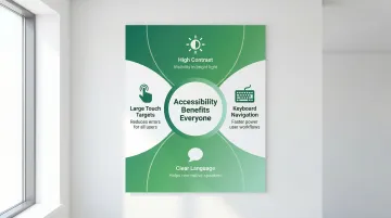
Accessibility as foundation
Accessible design benefits all users, not just those with permanent disabilities. High-contrast text helps in bright sunlight. Large touch targets help anyone using a device one-handed or wearing gloves on a job site. Keyboard navigation accelerates workflows for power users. In industrial and field-use contexts common in climate tech — solar installation sites, manufacturing floors, utility control rooms — these accessibility features are just good engineering.
A solar installation management tool discovered during a field pilot that technicians were stepping into shade to read the screen in direct sunlight — not because the product had failed, but because contrast ratios hadn't been tested for outdoor use. Fixing the contrast levels before the enterprise evaluation meant the product performed on-site without issue. A competitor being evaluated alongside it was flagged by the field team for exactly that problem.
Aesthetic-usability effect
Visually appealing interfaces are perceived as more usable, even when actual usability is equivalent. This aesthetic-usability effect builds trust and increases satisfaction scores.
Professional visual design is especially significant in climate and energy software, where users are entering operational data, financial figures, or compliance information. An interface that looks rough signals that the system behind it might be too. In a procurement evaluation comparing two carbon reporting platforms with functionally equivalent data models, the team with polished visual design was rated as more reliable and more accurate. The aesthetic-usability effect isn't a design nicety — in compliance-adjacent software, it's a deal factor.
UI design research methods and approaches
Quantitative methods
Quantitative research answers "how many" and "how much," providing statistical validation at scale.
A/B testing: Compares two live interface versions to determine which performs better on specific metrics (conversion, task completion, error rates). Sequential testing methods reduce false positives to under 5%, preventing premature conclusions from reviewing results before reaching statistical significance.
Analytics analysis: Tracks user behavior (clicks, navigation paths, time-on-task) to identify friction points. Error rates above 1% in critical flows indicate serious usability problems requiring immediate attention.
Eye-tracking studies: Measures visual attention to determine whether users actually see specific interface elements. Eye-tracking requires approximately 39 participants to generate stable heatmaps, making it more resource-intensive than other approaches.
For enterprise buyers conducting technical evaluations, the ability to present quantitative evidence — task completion rates, error rates, A/B test results — demonstrates that your design decisions are grounded in data, not intuition. That distinction comes up in procurement conversations more often than you might expect.
While quantitative methods measure behavior at scale, qualitative approaches explain the reasoning behind user actions.
Qualitative methods
Qualitative research answers "why," providing insights needed to fix problems identified by quantitative data.
Usability testing: Observing users attempting specific tasks reveals where interfaces fail. Testing with 5 users uncovers approximately 80% of usability problems, making small-sample testing highly cost-effective for qualitative insights.
Think-aloud protocol: Asking users to verbalize their thoughts during tasks exposes misconceptions and cognitive friction that analytics cannot capture. It reveals the reasoning behind user behavior: confusion, misunderstood labels, or incorrect mental models.
Heuristic evaluation: Expert review against established principles (Nielsen's 10 heuristics, WCAG accessibility guidelines) catches standard violations before user testing. It identifies obvious problems quickly, reserving user testing for complex interaction validation.
A five-user session run two weeks before a procurement demo can surface exactly the kind of interface issue — a mislabeled export button, a confirmation dialog blocking the key workflow — that would have cost a deal if the buyer discovered it first.
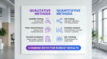
Mixed-method approaches
Combining methods yields the most complete picture. When analytics show high drop-off at a specific step in your onboarding flow, qualitative testing explains why users leave — whether it's a confusing label, a missing field definition, or an unexpected permission request.
This pairing matters particularly in climate tech products because users often claim comfort with a feature they rarely actually use. In a carbon reporting tool, for example, users might say they understand a data input field but analytics reveal they default to manual overrides every time. When the two conflict, behavioral data (what users actually do) outweighs attitudinal data (what they say in a session).
Effective combinations pair analytics with usability testing — analytics identifies problem areas, usability testing explains causes. A/B testing determines which solution performs better; user interviews reveal why. Heuristic evaluation catches obvious issues early, while user testing validates complex flows.
That gap between what users say and what they do is often the gap between a confident demo and a stalled pilot.
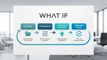
Translating research into UX strategy
From insights to design decisions
Translating research findings into actual design decisions requires a clear process, not just a list of problems. Without one, teams revert to debating opinions, and validated insights sit in a report no one references.
The translation process typically follows four steps:
- Synthesis: Group research findings by theme, not by method. A usability test observation and an analytics drop-off point pointing to the same screen belong in the same cluster.
- Prioritization: Rank issues by the combination of user impact (how many users are affected, how severely) and fix effort. A high-impact, low-effort fix should ship in the next sprint.
- Hypothesis formation: Turn each prioritized issue into a testable prediction: "If we change X, we expect Y to improve by approximately Z." This forces specificity and makes validation possible.
- Validation cycles: Test the proposed change through a prototype or limited release, measure the target metric, and document the result — whether it confirmed or challenged the hypothesis.
For your climate tech product, this synthesis process carries additional weight. Your product may need to communicate with multiple user types simultaneously: technical operators who run the system, procurement leads who approved the budget, and executives who need to demonstrate ROI on a sustainability initiative. Research findings need to be prioritized not just by usability impact, but by which audience friction points are blocking deals or adoption.
This is where focused design support for climate and deep tech products becomes valuable. What if Design works with Seed through Series B climate tech companies to translate research insights into interface decisions that serve both the user's workflow and the company's growth objectives. The goal is a product experience that builds confidence in the underlying technology, not just a cleaner UI.
Creating actionable design principles
Research findings should generate specific, concrete principles that guide ongoing development:
| Research finding | Design principle | Concrete decision | Metric to monitor |
|---|---|---|---|
| Inline validation increases success by 22% | Immediate feedback | Implement real-time validation on field blur | Task Success Rate |
| Consistency improves speed by ~30% | Platform conformity | Use standard OS controls and icons | Time on Task |
| System status visibility reduces abandonment by 31% | Transparency | Add persistent progress steps in checkout | Abandonment Rate |
| High Cumulative Layout Shift correlates with lower conversion rates | Visual stability | Reserve space for dynamic content | Cumulative Layout Shift |
Each of these principles is also a talking point. When an enterprise buyer asks how you decided on your validation approach or why your navigation works the way it does, being able to point to a research-backed decision and a measurable outcome is a significantly stronger answer than citing best practice from memory.
Research repositories and design systems
These principles become most valuable when encoded into design systems that maintain consistency across teams over time. Document why specific patterns exist by linking design components to the research that validates them. This prevents future team members from undoing effective solutions or repeating earlier mistakes.
A well-documented design system is also a signal of product maturity. Enterprise buyers evaluating whether your team can support a long-term contract look for evidence that your product is built with process, not improvised sprint-to-sprint.
Essential documentation covers four things: the component rationale (why this pattern exists), the research evidence supporting the design decision, usage guidelines based on testing results, and metrics showing component effectiveness.
Measuring impact
Task Success Rate (TSR): The percentage of users completing a task without critical errors. Formula: (Successful Tasks / Total Attempts) x 100. This is the most direct measure of whether your interface works.
Time on Task (ToT): Average time to complete specific tasks. If this number is high, something in the flow is creating unnecessary friction — whether that's unclear labeling, missing affordances, or too many steps.
Error Rate: How often users make mistakes per task. Formula: (Total Errors / Total Attempts) x 100. Error rates above 1% in critical flows signal problems that need immediate attention.
System Usability Scale (SUS): A validated 10-item questionnaire that produces a composite usability score (0-100). It's particularly useful for comparing perceived usability across product iterations without running a full test each time.
Building an evidence-based culture
When you connect design decisions back to research, you make fewer expensive reversals. A practical starting point is requiring that any design review reference at least one piece of evidence — whether that's a usability test finding, an analytics pattern, or a benchmark from prior testing. Your new feature planning should include a validation step before build, and your key usability metrics should be visible in dashboards, not buried in quarterly reports.
For climate tech product teams building in complex domains, this culture is also a credibility signal. When a prospect or enterprise buyer asks why your interface works the way it does, being able to point to research-backed decisions is a meaningful differentiator from competitors who built on assumptions.
If your team needs support establishing this kind of research infrastructure, or translating existing findings into a coherent design system, What if Design works with climate and deep tech product teams at Seed through Series B to do exactly that.
Common challenges in UI design research
Limited resources and time
Run multiple small studies rather than one large expensive study. The evidence for small-sample testing is well-established: Jakob Nielsen's research shows 4-5 participants surface around 80% of usability issues, making frequent lightweight cycles more valuable than infrequent expensive ones.
Informal testing with available participants — colleagues, café patrons, or passersby — catches glaring issues early. While lacking the rigor of formal studies, guerrilla testing prevents obvious mistakes from reaching users.
Remote unmoderated studies let users complete tasks in their own environment without researcher presence. This method costs less than lab testing but requires carefully designed tasks to avoid misinterpretation.
Before conducting new research, mine existing analytics for friction points. High drop-off rates, long time-on-task, or frequent error patterns indicate where to focus your next study.
Even a 2-day guerrilla test before a key buyer meeting is worth running. Enterprise evaluators often conduct their own hands-on product assessments — and the interface issues you find first are the ones you control.
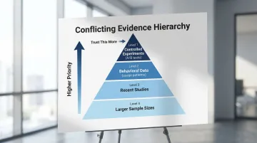
Conflicting research findings
Even in small research programs, you'll encounter conflicting signals. A usability session might show users completing tasks confidently, while analytics reveal they abandon the same flow at a 40% rate in production. When qualitative and quantitative data disagree, weight the behavioral data (what users actually do) over attitudinal data (what they say in a session). Users often report satisfaction with features they rarely use in practice.
When weighing conflicting evidence, prioritize controlled experiments (A/B tests) over observational data (analytics), behavioral data (usage patterns) over attitudinal data (surveys), recent studies over older research, and larger sample sizes over smaller ones for quantitative data.
This discipline also matters in enterprise sales: if a buyer's technical team runs their own usability assessment, knowing how to weigh conflicting findings and present your evidence clearly is the difference between a credible response and a credibility problem.
Novel interfaces and emerging technologies
Emerging interface paradigms are increasingly relevant in climate tech: sensor dashboards for field monitoring, AR overlays for infrastructure inspection, and voice-controlled systems for hands-free operation in industrial environments. Because standard patterns don't yet exist for many of these contexts, research has to start from first principles — can users operate the interface safely, does it add to their cognitive load, and does it hold up under real field conditions rather than lab settings.
For AR/VR specifically, maintaining latency under 30ms prevents motion sickness. "Trusted UI" elements must be non-spoofable, ensuring users can always exit immersive modes safely.
Privacy indicators must clearly show when cameras or microphones are active.
Validate novel interfaces by testing fundamental comfort and safety first, establishing baseline performance requirements, iterating rapidly with small user groups, and documenting emerging patterns for future reference.
For climate tech products deploying novel interfaces in field environments, validating before a formal buyer evaluation is how you avoid the worst-case outcome: a field team rejecting the product because it wasn't tested under real operating conditions.
Good UI research doesn't require a large team or an extended timeline. It requires consistency: deciding what to measure, testing with real users regularly, and connecting what you learn back to the decisions you make. For climate and deep tech products, that consistency compounds. Every research cycle makes your interface clearer, your users more confident, and your product easier to trust.
Tools and resources for UI design research
Essential tool categories
User testing platforms
Conduct remote moderated and unmoderated testing. Tools like UserTesting and Lookback enable observing users in their natural environment, reducing lab bias while maintaining research quality.
Analytics tools
Track behavior and identify friction points. Hotjar provides heatmaps and session recordings showing where users click, scroll, and abandon. Mixpanel tracks event-based analytics for detailed user journey analysis.
Survey tools
Gather attitudinal data through System Usability Scale (SUS), Net Promoter Score (NPS), and custom questionnaires. Typeform and SurveyMonkey offer user-friendly interfaces with robust analysis features.
Design and prototyping tools
Create testable interfaces rapidly. Figma enables collaborative design with built-in prototyping for quick validation cycles, allowing teams to test concepts before committing to development.
Having a documented research process — even a lightweight one — signals to enterprise buyers that your team builds with discipline rather than shipping on assumption. If your climate tech or deep tech team doesn't have a dedicated UX researcher in-house, these tools are most effective when paired with a structured research plan. What if Design supports Seed through Series B climate tech companies in setting up lightweight research processes that fit within existing product sprints, without requiring a full-time hire.
Free and low-cost resources
Budget constraints shouldn't stop you from doing thorough research. Several tools offer robust capabilities at minimal cost:
For small budgets:
- Google Forms for basic surveys
- Free tiers of analytics tools like Hotjar and Mixpanel
- Guerrilla testing with available participants
- System Usability Scale standardized questionnaire
For remote testing:
Unmoderated testing platforms offer lower costs than moderated sessions. Feedback Army uses Amazon Mechanical Turk for rapid, low-cost responses, though quality varies.
Being able to reference user testing in a buyer conversation — even informal testing — signals that your interface decisions are validated, not guessed.
Ongoing learning resources
Nielsen Norman Group
Authoritative articles on heuristics, methods, and psychology. Extensive free content with deeper training courses available.
Interaction Design Foundation
Comprehensive courses on usability testing, design principles, and research methodologies. Affordable membership model with certificates.
Academic journals
ACM Digital Library (CHI proceedings) provides deep dives into HCI research. Free access through many university libraries.
Industry standards
W3C specifications for web accessibility (WCAG) and emerging technologies (WebXR). Essential reference for compliance and best practices.
Staying current with published research also gives you the language to discuss your design decisions with technical buyers who expect evidence-based reasoning.
If your product's interface hasn't been systematically tested since launch, it's worth auditing where users are losing confidence — exploring what a focused research sprint could surface is a practical starting point.
Frequently asked questions
What is the difference between UI design research and UX research?
UI research focuses on interface elements like visuals, controls, and interaction patterns, measuring usability and efficiency. UX research encompasses the broader experience — user needs, journeys, and value propositions — validating whether the product solves real problems. Knowing which layer is causing friction tells you whether to fix the interface before your next demo or revisit the value proposition entirely.
What are the most effective methods for conducting UI design research?
Combine usability testing (5 users) for qualitative insights with analytics and A/B testing for quantitative validation. This mixed-method approach provides both the reasoning behind user behavior and statistical proof of which solutions work better.
How do you validate UI design decisions with users?
Create prototypes representing design alternatives and conduct usability tests with representative users performing realistic tasks. Measure key metrics like task success rate, time-on-task, and error rate, then track System Usability Scale scores to measure improvements across iterations.
What tools are commonly used in UI design research?
Essential categories include user testing platforms (UserTesting, Lookback), analytics tools (Hotjar, Mixpanel), survey tools (Typeform, SurveyMonkey), and prototyping tools (Figma, Adobe XD). Choose based on your research methods and budget.
How long does a typical UI design research project take?
Quick guerrilla studies take 2-3 days, while standard usability cycles (planning, recruiting 5 users, testing, analysis) complete in 1-2 weeks. Comprehensive research projects with multiple methods span 4-6 weeks, and A/B testing timelines depend on traffic volume.
Can small teams or startups conduct meaningful UI design research?
Absolutely. Small-sample testing with 5 users surfaces approximately 80% of usability problems cost-effectively. Remote unmoderated studies, guerrilla testing, and analytics analysis provide valuable insights with minimal resources. Focus on lightweight methods and frequent iteration rather than large, infrequent studies — and run at least one cycle before any major buyer evaluation or pilot review.