Why UI/UX design is your web app's conversion engine
You've built a product that works. The pilot showed results. The demo converts. But once users sign up, something breaks down — they don't complete the core action, they abandon the onboarding, or they cancel before month two.
This isn't a product problem. For most web apps and SaaS tools in the climate and energy space, it's a design architecture problem. The interface wasn't built to guide users to value quickly; it was built to ship features. And those two goals produce very different experiences.
This article breaks down six UX interventions that directly affect conversion at each stage of the SaaS funnel: from first signup to paid retention. Each one comes with the specific mechanics behind it, not just general direction.
TLDR: Key takeaways
- Incremental UX improvements typically produce 15-25% conversion lifts within 8-12 weeks, based on industry-reported A/B testing outcomes
- Cut signup fields from 8 to 3 to boost completions by 29%
- Page load times under 2 seconds correlate with significantly higher mobile conversion rates, per Google's mobile speed benchmarks
- WCAG compliance makes your product accessible to approximately 1.3 billion people globally who live with a disability, expanding your addressable audience meaningfully
- Statistical rigor in A/B testing separates real gains from noise
The strategic link between UX and web app conversions
Defining conversion for web applications
Unlike e-commerce's straightforward add-to-cart metrics, web app conversions span multiple milestones:
- Trial signups: Converting visitors into leads
- Feature activation: Getting users to complete their first core action
- Paid upgrades: Moving trial users to paying customers
- Retention milestones: Maintaining active usage at 30-day and 90-day marks
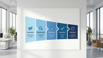
Each stage demands different UX interventions. The typical SaaS funnel progresses: Awareness → Consideration → Conversion → Activation → Retention.
The UX-revenue connection
The correlation between design quality and business outcomes is measurable. Design-led companies outperform the S&P 500 by 228% over ten years, and superior UX increases conversion rates by up to 400%. In practical terms, B2B SaaS visitor-to-lead conversion averages 0.7–1.1%, while trial-to-paid conversion runs 18.2% for opt-in trials and 48.8% for opt-out trials. Every $1 invested in UX returns up to $100 — a 9,900% ROI. Small percentage improvements at these bottlenecks translate to significant revenue gains.
Friction points: where users abandon
Friction points are UX obstacles that cause drop-offs: confusing navigation, unclear value propositions, cumbersome forms, or slow performance. Identifying these through analytics and session recordings is the foundation of strategic UX optimization.
Web apps face unique challenges: balancing feature richness with simplicity, managing onboarding complexity for sophisticated products, and demonstrating value quickly before users churn. This challenge is especially acute in climate tech SaaS. In our work at What if Design with energy and climate software teams, we consistently see that products built to serve utility companies, procurement teams, or industrial operators carry significant technical depth — which makes onboarding and navigation design even more critical. Buyers in these industries have low tolerance for confusion and high expectations around reliability signals.
Addressing these requires intentional design, not aesthetic polish alone.
Streamline onboarding and registration flows
Why onboarding is the highest-leverage point
Onboarding determines whether users recognize your product's value or abandon it. It's where the promise of your marketing meets reality.
If users don't activate within the first two days, they statistically won't convert. For energy software, carbon accounting tools, or grid analytics platforms, this is compounded by the fact that your buyers often have deeply ingrained workflows. They're evaluating whether your tool integrates with how they actually work, not just whether it's functional. Onboarding has to make that case fast.
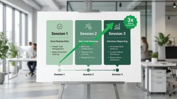
Progressive disclosure: reveal features gradually
Introduce capabilities as they become relevant rather than overwhelming users with every feature upfront.
A project management app might show only task creation in session one, add collaboration features in session two, and introduce reporting in session three. Progressive onboarding can lead to 3x higher conversion rates compared to comprehensive tutorials.
Registration form optimization
Every additional form field costs approximately 10% of conversions. Reducing signup fields from 8 to 3 increases completion rates by 29%.
Focus on these essential fields:
- Email address
- Password
- Name (only if needed for personalization)
Reduce friction further by adding social login options (Google, LinkedIn), which cut friction by up to 37%. If you need additional fields beyond the essentials, explain why you're asking — users are far more likely to complete a form when the request makes sense. Inline validation also helps by catching errors before submission, so users don't hit a wall at the end of a completed form.
Time-to-value: the 5-minute rule
Get users to their first "aha moment" within five minutes. Map your app's core value proposition, then design onboarding to deliver that experience immediately.
Example: Segment increased activation rates by 30-50% by personalizing onboarding based on user role (developer, marketer, product manager) and tailoring the first tasks accordingly. Developers saw code snippets immediately; marketers saw campaign templates.
Acceleration tactics include:
- Pre-populate accounts with sample data so users can explore immediately
- Offer "quick start" paths alongside comprehensive setup
- Reducing time-to-first-value from 45 to 22 minutes improved activation by 14%
Design clear visual hierarchy that guides action
Visual hierarchy fundamentals
Visual hierarchy uses size, color, spacing, and contrast to direct attention to conversion-critical elements. Users scan pages rather than reading comprehensively, so your design must guide their eyes to what matters. Consider what happens when a procurement evaluator opens your platform during a pilot: they're forming a judgment about product maturity within seconds. If your most important metric or action isn't immediately dominant, that first-impression moment becomes a deal risk — and hierarchy is how you control it.
The 60-30-10 color rule
This UI design heuristic creates focus and balance:
- 60% dominant/neutral color (backgrounds, large sections)
- 30% secondary color (supporting elements, sections)
- 10% accent color (CTAs, key actions)
The accent color should be reserved exclusively for primary actions, creating unmistakable visual priority. Applied consistently, this makes your primary action — whether that's booking a demo, starting a trial, or completing an upgrade — impossible to miss, which matters most when a buyer is evaluating your product alongside two or three competitors.
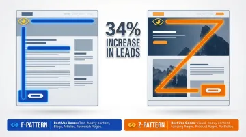
F-pattern and Z-pattern reading behaviors
Eye-tracking research by Nielsen Norman Group reveals predictable scanning patterns:
F-pattern (text-heavy pages): Users scan horizontally across the top, down a bit and across again, then down the left side. Position key conversion elements within this F-shaped zone: value propositions, CTAs, and social proof.
Z-pattern (visual-heavy pages): For pages with less text, the scanning path shifts. Users move top-left to top-right, diagonally to bottom-left, then across to bottom-right. Place your primary CTA at the end of this Z-path.
Optimizing CTA placement based on these patterns produces a 34% increase in leads.
Effective vs. ineffective hierarchy example
| Ineffective dashboard | Effective dashboard |
|---|---|
| All elements same size and color | Key metric displayed prominently with large typography |
| Multiple competing CTAs | Single primary action button in accent color |
| Important metrics buried in dense tables | Supporting data in smaller, organized cards |
| No clear entry point for user action | Clear visual separation between sections using white space |
Optimize calls-to-action for maximum impact
CTA fundamentals
Your call-to-action is the conversion tipping point. Four elements determine effectiveness: placement, color contrast, size, and copy.
Placement principles:
Position your CTAs where users are already looking — aligned with the F or Z scanning patterns described above. For simple products, above the fold works best; for complex solutions, give users enough context first. Repeat your CTA at natural decision points throughout longer pages so users never have to scroll back to act.
Action-oriented, benefit-driven copy
Once placement is optimized, copy becomes your conversion lever. Generic CTA copy converts lower than specific, benefit-driven alternatives:
Generic (weak):
- "Submit"
- "Click here"
- "Learn more"
Specific (strong):
- "Start my free trial"
- "Get my custom report"
- "See my savings"
- "Book my demo"
The pattern: possessive pronoun + specific outcome.
A frequently cited UX case study, published by UX researcher Jared Spool, found that changing a button from "Register" to "Continue" contributed to a $300 million annual revenue increase for a major e-commerce site. This simple shift removed the perception of forced account creation.
Single primary CTA per section
Multiple competing CTAs create decision paralysis. The Paradox of Choice suggests that too many options lead to anxiety and inaction.
Designate one primary action per page or section, and visually de-emphasize anything secondary. Use color contrast to make the hierarchy unmistakable — your primary CTA should stand out, not compete.
Example: WorkZone increased demo requests by 34% by changing customer testimonial logos from color to black and white near their form, reducing visual distraction while maintaining social proof.
Use social proof strategically
Social proof in web app context
Social proof reduces perceived risk by showing that others have successfully used your product. Effective formats include user testimonials highlighting specific outcomes, customer counts ("Trusted by 10,000+ teams"), case studies with quantifiable results, security badges (SOC 2, GDPR) and certifications, and integration partner logos from recognized brands. In enterprise and procurement contexts, your social proof is often doing pre-sales work before you're in the room — a recognizable customer logo or a specific quantified outcome on your pricing page can determine whether a buyer books a demo or moves on.
Optimal placement
Position social proof near conversion points where users experience the most friction or doubt — next to signup forms, on pricing pages, before feature gates or upgrade prompts, and throughout onboarding to reinforce the decision.
Different proof for different stages
The type of social proof matters as much as its placement. Match your evidence to the user's journey stage.
During the consideration stage, use testimonials addressing common objections and customer logos establishing credibility. For climate tech and energy software, this stage carries additional weight — buyers are often skeptical of new entrants making large impact claims, so proof from recognizable industry names or quantified emissions outcomes matters more than generic enterprise logos. At the conversion stage, emphasize security badges (SOC 2, GDPR compliance), money-back guarantees, and free trial offers. For retention, showcase success metrics, advanced feature case studies, and community size indicators.
Presenting reviews effectively
To maximize credibility and impact, include specific quantifiable outcomes ("Reduced processing time by 40%"), attribute sources with names, photos, and company details where possible, and keep testimonials to 2-3 sentences. Testimonials from recognizable brands or relatable personas carry the most weight — and in a procurement review, a specific attributed outcome from a named peer organization does more work than any feature description.
Ensure fast page performance
The performance-conversion link
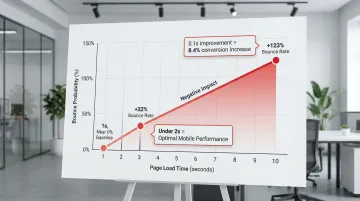
Speed directly determines whether users convert or abandon your web app. As page load time increases from 1 second to 3 seconds, bounce probability increases by 32%. From 1 to 10 seconds, it jumps by 123%.
A 0.1-second improvement in load time can increase conversions by 8.4% for retail and 10.1% for travel sites. One case study showed an 80-100% increase in mobile conversion rates after improving performance metrics.
This is particularly relevant for enterprise and utility buyers who may access your platform through managed corporate networks or older hardware, where performance gaps are amplified.
Performance optimization priorities
High-impact tactics:
- Image optimization through WebP format and compression
- JavaScript reduction via code splitting and deferred loading
- Lazy loading for content below the fold
- CDN implementation for faster global delivery
- Browser caching to speed up repeat visits
Mobile performance
Mobile users abandon at lower thresholds than desktop users. Target page load times under 2 seconds for optimal conversion.
Core Web Vitals benchmarks:
- Largest Contentful Paint (LCP): 2.5 seconds or less
- Cumulative Layout Shift (CLS): 0.1 or less
- Interaction to Next Paint (INP): 200 milliseconds or less
Build accessibility into your UX
Accessibility as a conversion driver
WCAG compliance opens up 15-20% more of your potential user base. Beyond avoiding legal exposure, it's a market expansion decision: approximately 1.3 billion people globally live with a disability, representing a significant segment that inaccessible products exclude.
Key accessibility principles that boost conversion
- Maintain 4.5:1 color contrast ratio for normal text — sufficient contrast helps users with visual impairments and anyone viewing screens in bright sunlight (WebAIM's contrast checker provides quick validation)
- Enable keyboard navigation for all interactive elements, benefiting power users, those with motor impairments, and anyone preferring keyboard shortcuts
- Use semantic HTML, proper ARIA labels, and descriptive alt text so assistive technologies can understand your interface
- Display clear focus indicators showing keyboard users their current position, reducing confusion and errors
These principles create a foundation that improves usability for everyone, not just users with disabilities.
How accessible design benefits everyone
Larger tap targets (minimum 44x44 pixels) help mobile users and reduce misclicks. Clear labels reduce confusion for all users, not just those using assistive technology. Alt text improves SEO by giving search engines more context, and captions and transcripts help users in sound-sensitive environments.
Implementation guidance
Start with automated testing:
- Axe DevTools browser extension
- WAVE Web Accessibility Evaluation Tool
- Lighthouse accessibility audit in Chrome DevTools
Follow with manual testing:
- Navigate your entire app using only keyboard (Tab, Enter, Arrow keys)
- Test with a screen reader (NVDA on Windows, VoiceOver on Mac)
- Verify color contrast for all text and interactive elements
Integrating WCAG 2.2 AA compliance from the start ensures your web app reaches the widest possible audience while building trust through inclusive design. For climate tech and sustainability software companies targeting enterprise procurement or government contracts, this is a credibility signal that matters beyond UX.
Measuring UX impact on conversion rates
The importance of instrumentation
Without baseline data, you're optimizing blind. Set up tracking before making any UX changes so you can measure actual improvements, not just assume them. Comprehensive analytics give you the foundation to know what's working and what isn't — and when a Series A investor or enterprise buyer asks about your product-led growth metrics, being able to cite a specific number ("our trial-to-paid rate improved from 12% to 19% over two quarters") is the difference between a credible commercial story and a vague one.
Key metrics to track
Conversion rate by funnel stage:
- Visitor to trial signup
- Signup to activation (first core action completed)
- Trial to paid conversion
- Month 1 to Month 3 retention
Behavioral metrics:
- Time-to-first-value (how long until users complete their first meaningful action)
- Feature adoption rate (percentage of users engaging with key features)
- Drop-off points (where users abandon flows)
- Session duration and pages per session
Tracking these metrics gives you the data to drive commercial conversations. When a buyer asks what your activation rate looks like, you should have a specific number, not an estimate.
A/B testing methodology
Once you're tracking the right metrics, structured testing helps you validate which changes actually move the needle.
Best practices:
- Test one variable at a time to isolate impact
- Ensure statistical significance (typically 95% confidence)
- Run tests for full business cycles (2-4 weeks minimum)
- To detect a 10% improvement with 95% confidence at a 3% baseline conversion rate, you need approximately 2,700 visitors per variation
Rigorous testing also builds commercial proof. Being able to say "we ran a structured A/B test and the redesigned onboarding flow improved trial-to-paid by 15%" is the kind of evidence that moves procurement conversations forward.
Common testing pitfalls:
The most common errors are ending tests before they reach statistical significance, testing too many variables at once, and ignoring seasonal variations or external factors that skew results — all of which make it impossible to know what actually drove a change.
Tools for measuring UX impact
Analytics and funnel tracking:
- Google Analytics 4 for conversion funnels and traffic analysis
- Mixpanel or Amplitude for product analytics and cohort analysis
Qualitative insights:
- Hotjar or FullStory for session recordings and heatmaps
- UserTesting for moderated user research
Experimentation platforms:
- Optimizely or VWO for A/B testing and multivariate testing
- Statsig or LaunchDarkly for feature flag-based experimentation
Realistic timelines
With the right tools in place, you can expect to see results within predictable timeframes. Most web apps see measurable conversion improvements within 8-12 weeks of implementing strategic UX changes. Quick wins like CTA optimization can show results in 2-4 weeks with sufficient traffic. That 8-12 week window also maps neatly onto a typical pilot-to-contract timeline — if you're running a 90-day pilot with an enterprise customer, starting UX improvements at the beginning gives you measurable results before the contract decision lands.
Ongoing optimization yields compounding gains over time as you continuously identify and eliminate friction points.
Frequently asked questions
How do you improve conversion rates?
Identify friction points through analytics and user testing, then prioritize high-impact improvements using the 80/20 rule. Implement changes incrementally and measure results through A/B testing with statistical rigor.
What is the 80/20 rule in UX?
The Pareto Principle states that 80% of conversion impact comes from 20% of design elements. Focus on high-traffic, high-friction areas like onboarding flows, primary CTAs, and checkout processes rather than perfecting every detail.
What is the 60-30-10 rule in UX design?
This color theory principle recommends using 60% dominant color for backgrounds, 30% secondary color for supporting elements, and 10% accent color for CTAs and key actions. This creates visual hierarchy that naturally guides users toward conversion points.
What is the 6-3-1 rule in UI design?
This principle suggests using 6 words for headlines, 3 sentences for descriptions, and 1 clear CTA to maintain focus and prevent cognitive overload on key conversion pages. It's particularly effective for landing pages and signup flows.
How long does it take to see conversion improvements from UX changes?
Most web apps see conversion gains within 8-12 weeks after implementing UX improvements. Quick wins like CTA optimization show results in 2-4 weeks, while retention impacts take several months to emerge.
Should I redesign my entire web app or make incremental UX improvements?
Choose incremental improvements for most situations. Iterative A/B testing typically outperforms full redesigns, which are risky and difficult to measure. Use complete redesigns only for severe usability issues or major brand pivots, with phased rollouts.
Conclusion: Strategic UX design as a growth lever
UI/UX design is a direct revenue lever. Small, consistent UX improvements compound into measurable gains across your entire funnel, and the tactics in this article give you a repeatable way to find and fix conversion bottlenecks.
The compounding nature of UX improvements means iterative optimization yields greater long-term gains than one-off redesigns. Each increment builds on the last, and the data from each test makes the next one more precise.
Getting started: Map your current funnel and identify the stage with the steepest drop-off. Prioritize that single friction point before moving to the next, then run a structured A/B test with a defined hypothesis and success metric. Let data determine the next iteration, not intuition alone.
Many climate tech and energy software companies tackle these improvements without dedicated design resources, which makes it harder to move at the speed the product deserves.
What if Design works with climate and deep-tech software companies at Seed through Series B to improve how users move through their products, from first signup to long-term activation. If your current flows aren't converting the way your product deserves, get an audit and we'll show you where users are losing the thread.