
Most climate tech products are technically impressive. The problem is that users figure this out slowly, if at all.
For product teams at deep-tech and climate startups, the gap between what a product can do and what users actually discover is rarely a feature problem. It's a design problem—specifically, one of flow clarity, feedback timing, and how well the interface guides someone from first login to confident, repeated use. When onboarding was built in a sprint and hasn't been revisited since, or when support tickets keep surfacing the same friction points, the underlying issue is usually a set of UX fundamentals that weren't applied rigorously enough from the start.
Fixing those problems in production costs 100 times more than addressing them during the design phase. This article breaks down the seven UX principles that make the most practical difference for complex digital products, and where climate tech teams most commonly get them wrong.
TLDR: 7 essential UX design principles
- Base every design decision on actual user research, not assumptions
- Maintain consistent patterns across your product to reduce cognitive load
- Use size, contrast, and spacing to guide attention strategically
- Provide immediate feedback for every user action
- Design for all abilities—accessibility expands your market and often determines procurement eligibility
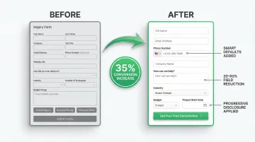
- Simplify ruthlessly: fewer form fields can boost conversions by 35%
- Build in error prevention and easy recovery mechanisms
Principle 1: User-centered design - start with real user needs
User-centered design means making decisions based on actual user research, not internal assumptions about how users should behave. As a technical founder or product lead at a climate startup, this distinction matters more than most. If you've built a carbon accounting platform or grid analytics tool, you've likely spent months—sometimes years—deeply inside the product. That depth creates blind spots. What's intuitive to you is often opaque to a utility buyer or a sustainability analyst encountering the tool for the first time.
Research methods that reveal real needs
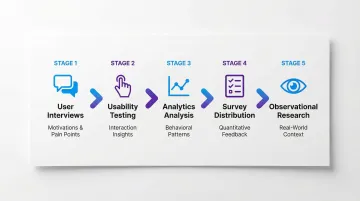
Effective user research combines multiple approaches:
- User interviews to understand motivations, pain points, and context
- Usability testing to observe how people interact with prototypes or existing products
- Analytics analysis to identify where users struggle or drop off
- Surveys to gather quantitative feedback at scale
- Observational research to see how products fit into users' real workflows
The business case for early research
These research methods deliver measurable returns when applied consistently.
Forrester Research found that every dollar invested in UX returns $100, representing a 10,000% ROI. The cost surfaces most dramatically during User Acceptance Testing, when teams discover that a core assumption about user behavior was wrong—too late in the build cycle to change the underlying structure without scrapping significant work. The UXPA documents this cost relationship extensively.
Creating data-driven personas and journey maps
User personas and journey maps should reflect real research, not marketing demographics. Base them on actual behaviors observed during testing, patterns identified in analytics data, direct quotes from interviews, and specific goals and pain points validated across multiple users.
For your climate tech product, this research-driven approach is especially important because your platform often serves fundamentally different user types with contradictory needs. Consider a carbon capture monitoring platform: the operations team checking equipment status needs fast, dense, real-time data, while the executive reviewing performance against targets needs trend summaries and variance flags. Both users are real—both may be paying customers—but their information needs and task frequencies are completely different. An interface designed for one will feel frustrating or inefficient for the other. This is why your user research needs to recruit across multiple user types, not just the most accessible one.
In our work with climate tech product teams at What if Design, this multi-persona gap comes up consistently in early-stage UX audits. When your product is built around your team's mental model—without systematic research across all the user types who actually need to navigate it—you tend to end up with a strong feature set and poor activation rates.
Principle 2: Consistency - build trust through predictable patterns
Consistency reduces cognitive load by letting users apply learned patterns across your product. When elements look and behave the same way throughout an interface, users can focus on their tasks rather than relearning interactions.
If your product serves multiple audiences—operators, executives, procurement teams—consistency is especially load-bearing. When different user types navigate the same platform, inconsistent patterns force each persona to rebuild their mental model from scratch, which increases error rates and slows time to value.
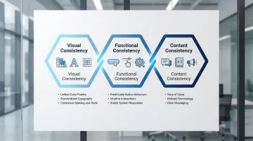
Three dimensions of consistency
- Visual consistency maintains uniform colors, typography, spacing, and component styling across your interface
- Functional consistency ensures interactions work the same way everywhere—buttons that look similar should behave similarly
- Content consistency keeps tone, terminology, and messaging aligned across all touchpoints
The cognitive cost of inconsistency
When interfaces lack consistency, users must spend mental energy figuring out how each new screen works. Research shows that interface consistency significantly reduces error rates, particularly in difficult tasks. The stakes can be significant.
Research by Alphonse Chapanis and colleagues on early aviation found that inconsistent control configurations contributed significantly to pilot error—a finding that informed modern interface design principles. In everyday digital products, the consequences are less dramatic but still measurable: consistent interfaces help users navigate through significantly fewer pages when searching, predictable patterns reduce decision fatigue and task completion time, and familiar interactions decrease learning curves for new features.
Design systems done right
Successful design systems like Material Design and Apple's Human Interface Guidelines provide comprehensive consistency frameworks that define component libraries with reusable UI elements, clear interaction patterns for common tasks, typography scales and color palettes, and spacing and layout grids.
The result is faster development, fewer one-off design decisions, and products that feel cohesive as they scale across multiple platforms and teams. Consider what an enterprise IT buyer or procurement evaluator experiences when first navigating your platform: if patterns are consistent across every screen, it signals engineering maturity and reduces their risk assessment. If a modal behaves one way in the configuration flow and differently in reporting, it introduces doubt—about product quality, about readiness for scale—that's difficult to address once the evaluation is underway.
Principle 3: Visual hierarchy and clarity - guide attention strategically
Data-heavy interfaces—dashboards, analytics platforms, reporting tools—are where visual hierarchy failures are most costly. When everything appears equally important, users either scan randomly or default to ignoring most of the screen. In energy management platforms, carbon tracking tools, and grid analytics dashboards, this isn't just a usability problem; it's a trust problem. A user who can't quickly orient themselves in your interface will question whether the data itself is reliable.
Visual hierarchy uses size, color, contrast, and spacing to direct users' attention to the most important elements first.
Understanding natural reading patterns
Eye-tracking research identified the F-shaped pattern as dominant web reading behavior. Users fixate on content at the top and left of pages, forming an 'F' shape. This means critical information must appear where users naturally look first.
Common reading patterns include:
- F-pattern: Users scan horizontally at the top, then down the left side—ideal for text-heavy pages
- Z-pattern: Eye moves top-left to top-right, diagonally to bottom-left, then across—works for minimal layouts
- Hierarchy override: Strong visual design can redirect default patterns to guide attention exactly where needed
Practical hierarchy techniques
Effective hierarchy relies on several core techniques:
- Whitespace: Creates breathing room between content blocks, reducing visual overwhelm
- Typographic scale: Larger text signals importance while consistent sizing creates rhythm
- Color and contrast: High contrast highlights primary actions; muted colors recede to the background
- Strategic color use: Guides users through workflows without requiring explicit instructions
These techniques work together to support how people actually interact with interfaces. Users rarely read every word—they scan. Supporting this natural scanning behavior with subheadings, bulleted lists, and visual styling helps users find information quickly without additional cognitive strain. In a product demo or pilot review, a buyer scanning your energy management dashboard for a specific metric should locate it within seconds. When they can't orient themselves quickly, the conversation stops being about your product's capabilities and starts being about whether it's ready for their organization—a shift that rarely ends in a signed contract.

Principle 4: Feedback and response - confirm every user action
Every user action needs immediate confirmation. When users click a button or submit a form, they need to know the system received their input and is responding.
Complex workflows in climate tech platforms—multi-step onboarding, bulk data imports, scenario modeling—are where absent or slow feedback does the most damage. A user uploading emissions data who sees nothing for 8 seconds will often hit refresh, resubmit, or abandon the task entirely. The data may have been received correctly, but the silence communicates failure.
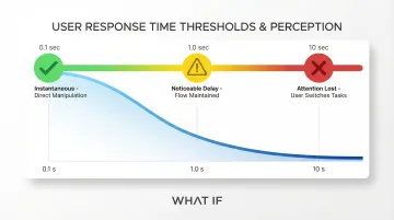
The 0.1 second rule
Research by Miller (1968) and Card et al. (1991) established response time thresholds that still hold true:
- 0.1 seconds for instantaneous reactions: users feel they're directly manipulating objects
- 1.0 seconds to maintain flow: users notice the delay but stay engaged
- 10 seconds to keep attention: beyond this, users will switch to other tasks
The cost of slow feedback
53% of mobile users abandon websites that take more than 3 seconds to load, and the BBC found they lost 10% of users for every additional second their site took to load. Research on the psychology of waiting shows that uncertain, unacknowledged delays are disproportionately frustrating—users who see no feedback interpret silence as system failure, even when the system is working correctly. In a pilot evaluation or product demo, that perception of failure can end a deal that your product's actual performance would have won.
Effective feedback patterns
Different interactions require different feedback approaches:
- Micro-interactions: Subtle confirmation like buttons changing color on click or checkboxes animating when selected
- Toast notifications: Communicate success or errors without disrupting workflow
- Skeleton screens: Show content structure while data loads, making waits feel shorter than blank screens or spinners
- Progress bars with time estimates: Work best for operations taking more than 10 seconds, giving users a clear reference point that makes waiting less frustrating
Principle 5: Accessibility first - design for universal usability
Accessibility ensures everyone can use your product regardless of ability. For enterprise and government-facing products—common in the deep tech and energy space—meeting accessibility standards is often a procurement requirement that determines whether you're in the RFP at all. And the design decisions that make products accessible—semantic structure, clear labels, predictable navigation—tend to make them better for all users, not just those using assistive technology.
Why accessibility is non-negotiable
Approximately 15% of the world's population lives with some form of disability, representing over one billion potential users.
The European Accessibility Act takes effect June 28, 2025, requiring digital products to meet accessibility standards. In the US, the ADA applies to web content, creating legal risk for inaccessible sites.
Key accessibility considerations
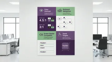
Essential accessibility requirements include:
- Color contrast ratios: Meet WCAG standards (4.5:1 for normal text, 3:1 for large text) to ensure readability for users with low vision or color blindness
- Keyboard navigation: Make every interactive element reachable and operable via keyboard alone for users who can't use a mouse
- Screen reader compatibility: Use semantic HTML, alternative text for images, proper heading hierarchy, and ARIA labels so assistive technologies interpret content correctly
- Touch target sizes: Maintain minimum 44x44 pixels to accommodate users with motor impairments and reduce errors on mobile devices
The business benefits
Accessible design expands your addressable market, improves SEO (semantic HTML helps search engines understand content), and reduces legal risk. If you're competing for enterprise or government contracts, meeting accessibility standards often removes a disqualifying barrier before the conversation even starts.
When you prioritize accessibility, you often discover it improves the experience for all users: captions help people in noisy environments, keyboard shortcuts speed up power users, and clear language improves comprehension across the board.
Principle 6: Simplicity and efficiency - minimize user effort
Every additional choice or step in a user flow creates friction. Simplification directly impacts conversion rates and task completion.
If you've built a technical product, you've likely seen this pattern: features accumulate faster than flows get simplified. What starts as a clean onboarding sequence acquires edge-case options, rarely-used toggles, and admin settings that shouldn't be in the primary path. Over time, your product becomes harder to use not because it's less capable, but because it's carrying the weight of every decision that was easier to add than to reorganize.
Hick's law: more choices, longer decisions
W.E. Hick's 1952 research established that decision time increases proportionally with the number of choices. This principle explains why overwhelming users with options leads to decision paralysis and abandonment.
Simplification techniques that work
Four core techniques deliver measurable simplification:
- Progressive disclosure: Reveal information gradually, showing only what's relevant for the current step while keeping advanced options available when needed
- Smart defaults: Pre-select the most common option so users can proceed without additional decisions, but retain the ability to customize
- Form field reduction: The average checkout flow contains 11.3 form fields, but most sites need only 8. Sites can achieve a 20-60% reduction by removing unnecessary requests
- Consolidated actions: Replace multiple similar buttons ("Save," "Save and Continue," "Save and Close") with one smart action that handles the most common scenario
Measurable impact
These simplification techniques deliver real business outcomes. Optimizing checkout flows can increase conversion rates by 35.26% through redesign alone.
DocuSign achieved a 35% increase in mobile conversions by simplifying their sign-up process and removing non-essential form fields—a result consistent with what Baymard's checkout research shows across industries.
Principle 7: Error prevention and recovery - design for mistakes
The cost of UX errors in climate tech products isn't limited to user frustration. In compliance reporting tools, billing platforms, or equipment configuration interfaces, a poorly designed input field can propagate incorrect data through an entire workflow—meaning the error doesn't surface until a report is filed or a configuration goes live. Good UX prevents errors before they happen and makes recovery straightforward when they do occur.
In UX audits we conduct with climate tech and deep tech companies at What if Design, error-prone input flows in compliance reporting and configuration-heavy tools are among the most common—and highest-stakes—issues we identify. The fix is usually clear at the design stage. The cost is typically borne later, in customer trust, corrective work, or failed audits.
Prevention techniques
Effective error prevention relies on clear communication before users act:
- Input validation with visible constraints shows password requirements upfront, validates email formats in real-time, and marks required fields clearly
- Confirmation dialogs ask users to verify destructive actions like permanently deleting content or canceling orders
- Disabled button states keep submission buttons inactive until all requirements are met, preventing invalid submissions
When errors do occur, recovery patterns help users get back on track without penalty.
Recovery patterns
Help users recover quickly with these patterns:
- Clear error messages explain what went wrong and how to fix it ("Email address must include an @ symbol" is more useful than "Invalid input")
- Undo functionality lets users reverse actions without consequence, especially for destructive operations or complex data entry
- Auto-save features protect work from browser crashes, accidental navigation, or session timeouts
Specific, actionable error messages significantly reduce abandonment during checkout and form-heavy flows, according to Baymard Institute's research on checkout UX. In complex technical products, the same principle applies to any multi-step workflow where users are entering configuration data, submitting measurements, or setting methodology parameters.
These seven principles aren't isolated techniques. In products serving complex use cases—energy platforms, compliance tools, grid analytics dashboards—they work as a system. Weak feedback undermines trust. Inconsistent patterns break learned behavior. Missing hierarchy makes data-heavy screens overwhelming. When these gaps accumulate, they show up as slow user activation, a rising support burden, and feature adoption that lags behind development.
If your product is past its initial build but the UX hasn't been revisited systematically, that's usually where the friction lives. At What if Design, we work with climate and deep-tech product teams to identify and close those gaps through research, flow analysis, and structured design iteration.
Frequently asked questions
What are the 7 principles of UX design?
The seven core principles are user-centered design, consistency, visual hierarchy, feedback and response, accessibility, simplicity and efficiency, and error prevention and recovery. These fundamentals create usable digital experiences across platforms, and they matter particularly when your users need to reach value quickly without extensive training.
What's the difference between UX principles and UX best practices?
Principles are durable fundamentals—like consistency and feedback—that apply across all contexts regardless of platform or technology. Best practices are specific techniques—like using skeleton screens or 44px touch targets—that evolve with technology and user expectations. Principles shape strategy; practices shape implementation decisions.
How do I apply UX principles to AI-powered products?
The same principles apply, but transparency becomes especially important. Users need to understand what the AI is doing, why it produced a particular result, and what to do when the output is wrong. Managing expectations about AI capabilities and providing clear feedback when algorithms are processing or uncertain are the most common gaps when building early AI products.
Why is accessibility considered a core UX principle?
Accessible design tends to improve the experience for all users—captions help in noisy environments, keyboard shortcuts speed up power users, and plain language improves comprehension across the board. With 15% of people living with some form of disability and regulations like the European Accessibility Act (2025) and ADA applying to web content, it's both a product quality issue and a legal one. If you're selling to enterprise or government buyers, it's often a contract prerequisite.
How can small teams implement these UX principles on a budget?
Start with guerrilla testing—quick sessions with colleagues, existing customers, or people unfamiliar with your product. Use free tools like Figma for prototyping and Google Analytics for behavior tracking. Focus on one principle at a time rather than trying to address everything simultaneously. Existing design systems like Material Design give you a consistency foundation without building from scratch.
What's the ROI of following UX design principles?
Forrester Research estimates every $1 invested in UX returns $100, primarily because design changes are exponentially cheaper to make before development than after. For your climate tech product with complex workflows, the returns extend beyond conversion metrics—a well-designed product reduces support burden, accelerates user activation, and builds the trust that enterprise buyers need before committing to a long-term contract.