Why designing for all users matters
Your climate tech company has real traction: funding raised, pilots underway, enterprise conversations happening. But your website is doing positioning work every time a stakeholder lands on it, whether you've intentionally designed it to or not.
Web accessibility is rarely on the roadmap for early-stage climate and deep-tech teams. Technical founders are focused on the science, product teams are running experiments, and the website gets treated as something to revisit later. The problem is that "later" often arrives at the exact moment someone important is evaluating whether to partner with you, fund you, or buy from you.
The scale of the issue is concrete: 94.8% of the world's top one million homepages fail basic accessibility standards. The most common failure isn't technically exotic. Low contrast text appears on 79.1% of homepages, which makes content difficult to read for users with visual impairments and for anyone viewing a screen in bright sunlight or on a low-quality display. These aren't edge cases. They describe the conditions under which a significant portion of your prospects encounter your site.
This guide breaks down what web accessibility and usability actually mean for digital products, where organizations most commonly fall short, and how to build a more inclusive digital presence that works for every stakeholder you need to reach.
TLDR: key takeaways
- Accessible design removes barriers for people with disabilities while improving usability for a broader audience
- WCAG 2.1 Level AA standards address most accessibility needs and legal requirements
- The disability market represents 1.3 billion people with significant purchasing power globally
- Accessible sites receive 23% more organic traffic and rank 12% higher on average than inaccessible competitors
- Addressing accessibility during the design phase costs significantly less than retrofitting it later, and reduces exposure to the 5,000+ lawsuits filed annually in the US
Understanding accessibility and usability
What is web accessibility?
Web accessibility ensures that people with disabilities can perceive, understand, navigate, and interact with digital products on equal terms. This includes designing for a range of conditions:
- Visual impairments: Blindness, low vision, and color vision deficiencies (affecting 8% of males and 0.5% of females of Northern European descent)
- Auditory disabilities: Deafness and hearing loss requiring captions and transcripts
- Motor limitations: Physical conditions affecting mouse or keyboard use, such as tremors or limited dexterity
- Cognitive and neurological conditions: Affecting learning, memory, attention, and information processing
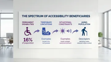
Think about the people who access your site: some have permanent disabilities, others might have a temporary limitation like a broken arm, and many face situational constraints like a noisy environment or a slow connection. Your design choices affect all of them. Slow internet connections create technical barriers too. Accessible design accommodates the full spectrum of those circumstances.
How usability differs
Usability measures how effectively, efficiently, and satisfactorily your users can achieve their goals with your digital product. According to ISO 9241-11:2018, usability focuses on the user experience for all users — prioritizing intuitive navigation, clear information architecture, streamlined task flows, and effective visual design that guides attention and communicates hierarchy.
Usability research improves the overall experience, but it often doesn't specifically address disability-related needs. That's where accessibility becomes essential.
Key differences between the two
Accessibility addresses discriminatory barriers that prevent people with disabilities from using digital products. It involves technical requirements like proper code structure for screen readers, sufficient color contrast ratios, and keyboard navigation support. Accessibility also carries legal weight through standards like the Americans with Disabilities Act (ADA) and Web Content Accessibility Guidelines (WCAG).
Usability addresses effectiveness and satisfaction for all users, focusing on visual design, user flow optimization, and task completion efficiency. It's primarily a competitive and customer satisfaction concern rather than a compliance requirement.
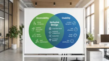
Why both matter for inclusive design
Inclusive design means designing for the full range of human diversity in ability, language, culture, gender, age, and other forms of difference. Accessibility alone doesn't guarantee a good experience, and usability alone doesn't guarantee equal access. Both are necessary.
The evidence supports this integrated approach. Enhancing cognitive accessibility features increases cognitive engagement for individuals without disabilities, not just those with cognitive impairments. When you design inclusively from the start, you create digital products that serve the widest possible audience while avoiding the higher costs of retrofitting accessibility later.
Where accessibility meets usability
The curb-cut effect in digital design
The "curb-cut effect" describes how features designed for disability access end up benefiting a much wider group. Curb cuts in sidewalks were required for wheelchair users, but they now assist parents with strollers, travelers with luggage, and delivery workers with carts. Digital accessibility creates the same kind of downstream benefit.
Examples of overlapping benefits
Captions and transcripts help people who are deaf or hard of hearing. They also benefit:
- People in noisy environments who can't hear audio
- Non-native speakers learning vocabulary and pronunciation
- Users in quiet spaces where audio would disturb others
- Anyone who prefers reading to listening or wants to search video content
People with motor disabilities rely on keyboard navigation to navigate without a mouse. Power users benefit too: keyboard shortcuts reduce time on repetitive tasks, a malfunctioning trackpad becomes a non-issue, and anyone can keep working when their hands are otherwise occupied.
Sufficient color contrast (minimum 4.5:1 ratio) helps people with low vision and color blindness. It equally helps:
- Anyone using a device in bright sunlight or a poorly lit space
- Older users experiencing natural vision decline
- Anyone viewing content on a low-quality display
Cognitive disabilities and learning differences require clear, simple language. That clarity benefits equally the non-native speaker navigating unfamiliar content, the adjacent-field expert who doesn't share your vocabulary, and the time-pressed reader scanning your site before a call.
The 'usable accessibility' approach
These overlapping benefits only materialize when accessibility features are genuinely usable, not just technically present. Meeting the letter of accessibility standards is not the same as meeting user needs.
Consider alt text for images. A screen reader can detect that an alt attribute exists (technically compliant), but if the text reads "image123.jpg" instead of describing the image's content and purpose, it provides no functional value. Depending on the tool used, automated testing catches between 30% and 57% of accessibility issues, because scanners evaluate code structure, not whether that structure actually communicates anything useful.
True accessibility requires understanding what your users need and validating that understanding through testing with people who use assistive technologies.
When to prioritize one over the other
Accessibility takes precedence when legal compliance is required (government contracts, public services), when you're serving users with known disabilities in your audience, or when a barrier completely blocks access to content or core functionality.
Addressing both together from the start is more efficient than adding accessibility later. While some requirements may initially seem to conflict with aesthetic preferences, workable solutions almost always exist. Building accessibility into your digital product from day one costs significantly less than retrofitting it, and it means your site can reach every stakeholder you need, from enterprise buyers to policy audiences.
Common barriers and how to address them
Visual barriers
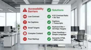
The problem: Low contrast text affects 79.1% of homepages, making content unreadable for users with visual impairments and difficult for everyone in challenging lighting conditions. Other common issues include using color as the only way to convey information and missing text alternatives for images.
Solutions:
- Ensure minimum 4.5:1 contrast ratio for normal text and 3:1 for large text (WCAG Level AA)
- Use text labels alongside color coding (not "click the red button" but "click the Submit button")
- Write descriptive alt text that conveys both content and purpose ("graph showing 40% reduction in emissions from Q1 to Q2" not "graph")
- Test designs with color blindness simulators
Auditory barriers
Video content without captions excludes people who are deaf or hard of hearing. Audio-only information with no visual alternative creates the same problem for a different format.
Solutions:
- Add synchronized captions to all video content (auto-generated captions average only 70-80% accuracy and shouldn't be the final step)
- Provide transcripts for podcasts and audio content
- Ensure visual indicators accompany audio alerts (a visible notification when a form error occurs, not just a beep)
- Include visual cues for important audio information in videos
Motor and physical barriers
Mouse-only navigation blocks users who rely on keyboard input or assistive devices, while small click targets create friction for users with tremors or limited dexterity. Time-limited interactions create additional pressure for users who need a few extra seconds to complete a step.
Solutions:
- Ensure full keyboard accessibility (users can navigate and interact using Tab, Enter, and arrow keys)
- Make buttons and links at least 44x44 CSS pixels (WCAG 2.1 Level AAA) or 24x24 pixels minimum (WCAG 2.2 Level AA)
- Avoid time limits or allow users to extend them before expiration
- Provide large, clearly separated click targets with sufficient spacing
Cognitive barriers
Complex navigation, unclear instructions, inconsistent design patterns, and information overload each add cognitive friction. For users managing attention, memory, or processing differences, that friction is often enough to abandon a task entirely. But these same issues affect anyone using your site under time pressure or in an unfamiliar context.
Solutions:
- Use clear headings (H1, H2, H3) and logical structure to organize content
- Provide clear error messages that explain what went wrong and how to fix it
- Maintain consistent navigation, terminology, and design patterns throughout the site
- Break complex tasks into smaller steps with progress indicators
- Use white space and visual hierarchy to reduce cognitive load
Technical implementation barriers
Missing form labels affect 48.2% of homepages, making forms unusable with screen readers. Improper heading hierarchy confuses navigation for both assistive technology users and search engines, while inaccessible custom widgets often lack keyboard support and screen reader compatibility entirely.
Solutions:
- Use semantic HTML elements (
<nav>,<main>,<header>,<button>) instead of generic<div>tags - Ensure proper heading structure (don't skip from H1 to H3)
- Label all form fields with associated
<label>elements, not just placeholder text - Add ARIA labels to custom widgets when semantic HTML isn't sufficient
- Test with actual screen readers (NVDA, JAWS, VoiceOver) to verify functionality
Testing for barriers
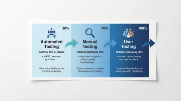
Once you've addressed common barriers, testing ensures your solutions work in practice. Effective accessibility testing requires combining three approaches rather than relying on any single method:
- Automated testing catches syntax errors quickly but identifies between 30% and 57% of WCAG issues depending on the tool. WAVE, axe-core, and Lighthouse are useful for flagging missing alt text, contrast failures, and improper markup, but they won't catch everything.
- Manual testing evaluates subjective quality that automation can't assess: whether alt text is actually descriptive, whether headings are logically sequenced, whether content makes sense in reading order. This catches an additional 40% of issues that automated tools miss.
- User testing with people who have disabilities reveals real-world usability problems that neither automated nor manual review surfaces. The remaining issues only appear when actual users navigate with screen readers, keyboard-only input, or other assistive technologies.
A practical framework for accessible, usable design
Following established standards
Web Content Accessibility Guidelines (WCAG) 2.1 provides the internationally recognized standard with three conformance levels:
- Level A: Minimum accessibility, addressing the most severe barriers
- Level AA: The target for most legislation and the practical standard for compliance
- Level AAA: The highest level, not recommended as a blanket policy because it's impossible to satisfy all AAA criteria for some content types
WCAG AA satisfies most legal requirements globally — relevant for climate tech companies pursuing federal contracts, state procurement partnerships, or EU market entry:
- Section 508 for US federal agencies
- ADA Title II rule for state and local governments (compliance required by April 2026-2027)
- European Accessibility Act for products placed on the EU market after June 2025
Building an accessible design process
In our work with climate and deep-tech startups, the most common mistake we see is treating accessibility as a final QA step rather than a design requirement from day one. Here's how that shift changes the process:
- State accessibility requirements upfront in your design briefs alongside scope and timelines. If WCAG Level AA isn't in the brief, it won't be in the output.
- Start with accessible component libraries rather than building from scratch. This prevents accessibility debt from accumulating before a single line of copy is written.
- Review for accessibility at each milestone, not just at the end. Catching contrast issues in wireframes is cheaper than catching them post-development.
- Treat it as cross-functional, because accessibility spans content, design, and engineering. A button with the right contrast ratio and correct keyboard behavior requires both.
- Designate someone to own it. Without an accessibility lead or champion, the responsibility diffuses and the issues compound.
Tools and resources
Testing requires the right combination of automated and manual tools:
Automated testing:
- WAVE browser extension - Visual feedback showing WCAG errors in context
- axe DevTools - Automated testing that finds approximately 57% of WCAG issues, making it one of the more comprehensive automated options
- Lighthouse in Chrome DevTools - Audits accessibility, performance, and SEO
- WebAIM Contrast Checker - Verifies color contrast ratios
Learning resources:
- W3C Web Accessibility Initiative (WAI) guidelines and tutorials
- WebAIM articles and training materials
- Accessible design systems like the US Web Design System
User testing with real people:
Even the strongest automated tools will miss a substantial portion of accessibility problems. Involving people with disabilities in testing sessions is the only reliable way to validate that technically compliant features work in real-world scenarios.
The business case for accessible design
Expanding your addressable market
The disability market represents significant purchasing power that many organizations overlook. The WHO estimates 1.3 billion people (16% of the global population) experience significant disability. In the US, people with disabilities control over $490 billion in disposable income. In the UK, the "Purple Pound" is valued at £274 billion in spending power from disabled households.
This market extends beyond people with permanent disabilities. Accessible design also serves aging populations, people with temporary injuries, and anyone facing situational limitations. Every design decision that removes a barrier expands the set of people who can actually use your product.
SEO and technical benefits
Accessible design creates concrete technical advantages, because many accessibility practices directly improve how search engines interpret your content. Proper heading structure signals content hierarchy; descriptive alt text gives images context; clear page titles improve search result relevance; and semantic HTML communicates content meaning to crawlers.
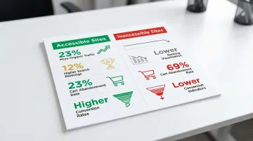
A 2025 study of 10,000 websites found that accessible sites received approximately 23% more organic traffic than less accessible competitors. Accessible sites also rank 12% higher on average because search engines reward well-structured, semantic content.
Accessible sites also demonstrate better user engagement overall — cart abandonment sits at 23% on accessible sites versus 69% on inaccessible ones, with higher conversion rates and improved session duration across all user segments.
These metrics translate directly to revenue outcomes for any organization relying on its website to support a sales or partnership pipeline.
Legal protection and risk mitigation
Digital accessibility litigation has increased significantly year over year. More than 5,000 lawsuits were filed in 2025, representing a 20% increase over 2024. E-commerce bears the largest share, accounting for nearly 70% of all ADA web lawsuits.
Notably, 22.6% of lawsuits in the first half of 2025 targeted websites that already had accessibility widgets or overlays installed, which removes the assumption that bolt-on tools provide adequate legal coverage. Proactive accessibility built into design and development is far less expensive than reactive remediation or legal settlements.
Brand reputation and stakeholder confidence
For organizations in climate tech, an accessible digital presence is increasingly a procurement signal. Enterprise buyers and institutional partners evaluate operational maturity across every touchpoint, and a site that creates barriers by default raises questions about the quality of your product and processes more broadly.
The organizations that get this right treat accessibility as a design standard rather than an afterthought. The result is a digital presence that works for every stakeholder in their ecosystem: customers, partners, investors, and policy audiences.
This is where a messaging-first website strategy becomes critical. At What if Design, we work with climate and deep-tech startups to build digital presences that communicate credibility at every touchpoint. Accessibility is part of that foundation. If your website hasn't been reviewed for accessibility, book a strategic audit to understand where the gaps are before they cost you a conversation.
Frequently asked questions
What is the difference between web accessibility and usability?
Accessibility ensures people with disabilities can perceive, navigate, and interact with digital products. Usability measures how effectively any user can achieve their goals with a product. Both are necessary for an inclusive experience: accessibility removes barriers for specific users, while usability improves the experience for everyone.
Why does accessibility matter for climate tech and deep-tech companies specifically?
For climate and deep-tech organizations, accessibility affects credibility with enterprise buyers, institutional partners, and government-affiliated stakeholders who increasingly evaluate digital maturity as part of procurement decisions. Practically, accessible sites tend to rank higher in search results (approximately 12% on average), and inaccessible sites face growing legal exposure, with over 5,000 ADA-related web lawsuits filed in 2025 alone. For organizations reaching diverse stakeholder audiences across policy, enterprise, and technical communities, inclusive design also means more of those stakeholders can actually access your content.
How much does it cost to make a website accessible?
Comprehensive accessibility audits range from $10,000 to $30,000 depending on complexity. Building accessibility from the start typically adds 10-20% to development costs, while retrofitting an existing site later costs significantly more. Industry estimates suggest proactive accessibility investment can cost 60-80% less than remediation after the fact.
What are the most common accessibility mistakes on early-stage startup websites?
Top failures include low contrast text (79.1% of sites), missing alt text (55.5%), missing form labels (48.2%), and empty links or buttons. These are foundational issues that block large numbers of users but are straightforward to address once identified.
Do I need to test with real users who have disabilities?
Yes. Automated tools identify between 30% and 57% of accessibility issues depending on the tool used, and real-world usability problems only surface when actual users navigate with assistive technologies. Testing with people who have disabilities is the only reliable way to catch what automated and manual review misses.
Can an accessible website still look like a well-designed, credible brand?
Yes. Color contrast requirements, clear typographic hierarchy, and logical layout structures are the same principles that make a website look credible and professionally executed. An accessible site is not a constrained or simplified version of a well-designed one. In most cases, it's a better-executed one.