Why usability can make or break your web design
Your technology is ready. You have closed a pilot. You are talking to investors. But a utility procurement team landing on your website cannot figure out what you actually do in the first ten seconds, so they move on.
This is a usability problem, but it is also a positioning problem. Climate tech websites carry an unusual burden: they have to communicate to investors, enterprise buyers, regulatory contacts, and field operators, often from a single page. When the information hierarchy does not reflect that complexity, users do not struggle harder to understand. They leave.
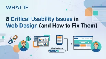
This guide covers the eight most common usability failures that hurt climate tech and deep-tech websites specifically, with concrete fixes you can act on.
TLDR: Key takeaways
- Page speed matters: 0.1-second improvements boost retail conversions by 8.4%
- 51.29% of global web traffic is mobile—responsive design is not optional
- Better checkout flows increase conversions by 35% on average
- Accessibility improvements lift conversions 17% and expand reach to 16% more users globally
- User testing prevents costly post-launch redesigns
Issue 1: Slow page load speed
Why speed matters
For climate tech companies presenting complex data dashboards or technical product visualizations to utility buyers and investors, slow load times do not just frustrate users. They signal a lack of polish at exactly the moment you need credibility.
Research tracking 37 brands found that a 0.1-second improvement in mobile site speed increased retail conversions by 8.4% and travel conversions by 10.1%. As load times increase from 1 to 3 seconds, bounce probability jumps 32%. By 5 seconds, that probability hits 90%.
Common causes of slow load times
The primary culprits:
- Large JPEG and PNG files that lack compression or modern format conversion
- Too many JavaScript libraries loading simultaneously
- Render-blocking resources: CSS and JavaScript files that prevent page display until fully loaded
- Shared servers with limited resources or distant geographic locations
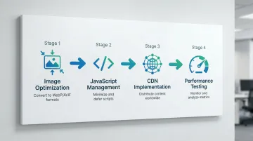
How to fix it
Apply these solutions immediately:
- Convert to WebP or AVIF: These modern formats offer ~30% file size savings over JPEG, with AVIF providing even greater compression
- Never lazy-load your hero image (the Largest Contentful Paint element), as this delays the most important visual content
- Use a CDN: Content Delivery Networks reduce physical distance between your server and users, improving Time to First Byte
- Load below-the-fold images only as users scroll down
Validate your improvements with these testing tools:
- Google PageSpeed Insights
- Lighthouse (built into Chrome DevTools)
- WebPageTest for detailed waterfall analysis
The business impact
A procurement officer reviewing five vendor sites in an afternoon will not wait for yours to load. Speed is not a technical nicety; it is the first signal of organizational competence. Prioritizing performance from the design phase ensures your technical solutions load quickly even when presenting dense data visualizations.
Issue 2: Poor mobile responsiveness
The mobile-first reality
Mobile devices now generate 51.29% of global web traffic as of January 2026, surpassing desktop.
Yet retailers still experience 45% lower conversion rates on mobile compared to desktop, revealing a persistent usability gap that most sites have not closed.
Common mobile usability failures
Users encounter these friction points constantly:
- Buttons and links too small to tap accurately without zooming
- Content that extends beyond the screen width, forcing horizontal scrolling
- Font sizes requiring pinch-to-zoom to read
- Form fields that do not trigger appropriate mobile keyboards
- Navigation menus that fail to open or require multiple taps
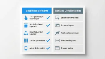
Responsive design best practices
These fixes address the most critical mobile usability barriers:
- Enforce minimum touch targets - Use 44x44 pixels minimum (Apple HIG) or 48x48 dp (Material Design) for all interactive elements
- Design mobile-first - Start with the mobile layout and enhance for larger screens, not the reverse
- Simplify layouts - Mobile screens demand focused content without clutter
- Use flexible grids - Implement CSS Grid or Flexbox for layouts that adapt smoothly across breakpoints
Testing your mobile experience
Do not rely solely on browser simulators. Test on actual devices, including iPhones, Android phones, and tablets, to identify touch responsiveness issues that desktop testing misses.
For climate tech products, this means testing across the contexts where your users actually work: control rooms, field sites, and mobile dashboards. Real-device testing reveals friction points that simulators cannot replicate.
Issue 3: Confusing navigation structure
Navigation is the vehicle for task completion, and for climate tech companies it is particularly prone to failure. Most climate tech websites serve at least three distinct audiences: investors looking for traction and market size, enterprise buyers evaluating technical specifications and integration requirements, and policy or regulatory contacts looking for compliance and impact data. When a single navigation structure tries to serve all three without clear segmentation, it ends up serving none of them well.
Research debunks the "3-click rule" as a design principle. Users will tolerate longer paths if each step clearly signals progress toward their goal. The real issue is not click count; it is weak information scent.
Common navigation failures:
- Overloaded menus - Too many top-level items create choice paralysis
- Vague labels - Generic terms like "Solutions" or "Resources" that do not communicate what users will find
- Inconsistent placement - Navigation that moves between pages or disappears on certain screens
- Missing breadcrumbs - Users cannot determine their location within the site hierarchy
Addressing these issues requires both simplification and clarity:
How to fix it:
- Streamline to 5-7 main items - Consolidate related pages under clear parent categories
- Use descriptive labels - Replace "Services" with specific offerings like "Website design" or "UX audits"
- Implement breadcrumb navigation - Show users exactly where they are: Home > Services > Website design
- Maintain consistent placement - Keep navigation in the same location across all pages
Issue 4: Unclear or missing CTAs
Climate tech companies face a specific CTA problem: technical founders often write their own copy. "Learn more about our direct air capture process" feels precise and accurate to an engineer. To an enterprise buyer with 20 minutes to evaluate five vendors, it provides no direction and no promised outcome.
Research shows content above the fold is viewed 102% more than content just below it. Yet most climate tech sites bury their primary action or frame it around the technology instead of the result it delivers.
CTA best practices:
- Place primary CTAs above the fold so users see your main action without scrolling
- Replace vague phrases like "Get started" with specific actions: "Schedule your UX audit" or "Download the guide"
- Use colors that stand out from your background with minimum 3:1 contrast ratio
- Size appropriately - Minimum 44x44 pixels on mobile ensures buttons are obviously clickable
- Differentiate primary vs. secondary actions through size and color hierarchy
The key principle: generic CTAs like "Get started" can act as roadblocks when users cannot predict what happens next. Be explicit about the value and the outcome they are agreeing to.
Issue 5: Lack of visual hierarchy
Poor visual hierarchy makes content difficult to scan and comprehend. Users do not read word-for-word; they scan in F-patterns or layer cake patterns, looking for headings and visual anchors that signal important information.
For climate tech companies presenting dense technical content, clear visual hierarchy determines whether visitors extract the key points or give up. When everything looks equally important, nothing gets read.
Common hierarchy problems:
- Uniform text sizes - No clear distinction between headings and body text
- Insufficient contrast - Text that is difficult to read against its background
- Inconsistent spacing - Random gaps between elements that do not guide the eye
- Everything emphasized - When everything is bold or highlighted, nothing stands out
Fixing these issues requires a systematic approach to typography, spacing, and contrast.
Solutions:
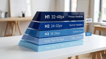
- Establish a typographic scale - Create clear size differences: H1 (32-48px), H2 (24-32px), H3 (18-24px), body (16-18px)
- Meet WCAG contrast standards - Maintain 4.5:1 minimum for normal text, 3:1 for large text
- Use whitespace strategically - Space groups related content and separates distinct sections
- Implement color contrast for UI elements - Ensure 3:1 minimum contrast for buttons and interactive elements
These hierarchy principles guide users through your content naturally, directing attention to key information and calls-to-action.
Issue 6: Poor form design
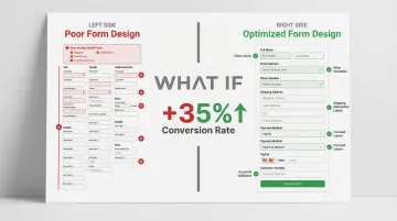
Forms are the final step between a visitor and a conversion, and in climate tech, they break down in a specific way: founders want to qualify leads before they invest time in a conversation, so they add fields. Company size. Current technology in use. Annual energy spend. Each additional field costs you submissions from legitimate prospects who will not share that information before a relationship exists.
The Baymard Institute found that 18% of US online shoppers abandon checkout due to overly complex processes. The average checkout contains 23.48 form elements, but research shows the ideal flow uses just 12-14 elements. Optimizing this can lift conversions by 35%. The same psychology applies to B2B lead capture: the form is asking for more than the relationship has earned.
Common form failures
- Asking for unnecessary information at the wrong stage of the relationship
- Users do not understand what information is required vs. optional
- Errors only appear after submission, frustrating users
- Generic error messages that do not explain how to fix the problem
Solutions for better forms
- Minimize required fields: Only ask for what you absolutely need at this stage
- Show errors as users complete each field, not after submission
- Explain exactly what is wrong and how to fix it (e.g., "Password must include 8+ characters and one number" vs. "Invalid password")
- Use proper HTML5 input types so browsers can auto-complete
- Design single-column layouts for easier mobile completion
Forms with inline validation show a 22% decrease in errors and 42% decrease in completion time, which translates directly to higher conversion rates.
Issue 7: Accessibility barriers
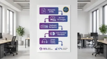
Approximately 1.3 billion people, or 16% of the global population, experience significant disability. Websites that fail to meet WCAG standards exclude this demographic and often signal broader usability problems across the site.
Beyond inclusion, accessibility has a direct business case. Accessible e-commerce sites have demonstrated conversion rate increases of up to 17%. For climate tech companies pursuing government contracts, WCAG-AA compliance is frequently a mandatory requirement in procurement criteria, not a preference.
Common accessibility barriers
- Missing alt text: Screen readers cannot describe images to visually impaired users
- Poor keyboard navigation: Users cannot tab through interactive elements
- Insufficient color contrast: Text is unreadable for users with low vision
- No focus indicators: Users cannot see which element is currently selected
- Small touch targets: Difficult for users with motor impairments
How to fix accessibility issues
- Use semantic HTML: Proper heading hierarchy (H1, H2, H3) and landmark elements
- Provide descriptive alt text: Explain what images show and their purpose
- Enable keyboard navigation: Ensure all interactive elements are accessible via the Tab key
- Meet WCAG 2.2 standards: Minimum 24x24 pixel touch targets and 3:1 contrast for focus indicators
- Test with screen readers: Use NVDA or VoiceOver to experience your site as visually impaired users do
Issue 8: Inconsistent design elements
Inconsistency is a credibility issue before it is a design issue. When buttons look different across pages, font weights shift without reason, and spacing feels arbitrary, visitors sense something is off even if they cannot name it. That friction costs you trust at exactly the point where you are trying to build it.
For scaling climate tech companies, this problem compounds quickly. A team shipping fast across multiple product areas, a few different contractors contributing to the site over time, pages added for new audiences or partnerships: each decision made in isolation adds to the visual debt.
The four patterns that appear most often:
- Multiple button styles - Different colors, sizes, and hover states across pages
- Varying typography - Font families and sizes that change without reason
- Inconsistent spacing - Random gaps between elements that break visual rhythm
- Conflicting color usage - The same color meaning different things in different contexts
The structural fix is a design system: a documented set of colors, typography rules, spacing values, and component patterns that every page draws from. Build a library of reusable buttons, form components, cards, and other UI elements. Define variables (design tokens) for colors, spacing, and typography that update globally when changed. Audit pages quarterly to catch inconsistencies before they accumulate.
Design systems become especially critical when your product is scaling from an MVP into an enterprise platform. Building the component library and token structure early prevents the visual fragmentation that appears when a company grows faster than its design infrastructure.
Conclusion: Building usability into your design process
The eight issues here share a common root: websites built for an internal audience that already understands the product. When your team knows the technology deeply, it is easy to assume the navigation makes sense, the CTAs are clear, and the load time is acceptable. First-time visitors, especially procurement teams and investors evaluating multiple options simultaneously, do not extend that benefit of the doubt.
Start with these steps:
- Audit your current site against these eight criteria
- Use analytics to identify where visitors drop off rather than guessing
- Fix mobile responsiveness and page speed before anything cosmetic
- Test with people who are not already familiar with your technology
When a utility buyer can evaluate your grid solution without a sales call, or a potential partner can understand your carbon accounting methodology from the website alone, that is the real conversion. Not just a form submission.
At What if Design, we work with Seed to Series B climate and deep-tech startups to build websites that do that work. If your digital presence has not caught up to where your company actually is, that is worth addressing before your next funding round or partnership announcement.
Frequently asked questions
What are the 7 C's of a website?
The 7 C's framework defines critical interface elements: Context (layout), Content (text/media), Community (user communication), Customization (personalization), Communication (dialogue), Connection (external links), and Commerce (transactions). Together, these create comprehensive user experiences.
What are the 5 E's of usability?
The 5 E's framework defines core usability principles: Effective (accuracy), Efficient (speed), Engaging (satisfaction), Error Tolerant (mistake recovery), and Easy to Learn (supports continued learning). These principles guide user-centered design decisions.
How do you test website usability?
Primary methods include user testing with representative users, heuristic evaluation by experts against usability principles, and analytics review of bounce rates and conversion paths. Combining qualitative observation with quantitative data provides comprehensive insights.
What is the difference between UX and usability?
Usability focuses specifically on ease of use: how effectively, efficiently, and satisfactorily users can complete tasks. UX (user experience) encompasses the entire interaction including emotions, perceptions, attitudes, and overall satisfaction before, during, and after using a product.
How long does it take to fix usability issues?
Simple fixes like button sizes or color contrast take hours to days. Navigation restructuring or form optimization requires 1-2 weeks. Comprehensive redesigns addressing multiple systemic issues take 4-8 weeks depending on complexity.
What tools can help identify usability problems?
Google Analytics reveals behavior patterns, heatmap tools like Hotjar show click patterns, accessibility checkers like WAVE identify compliance issues, and Google PageSpeed Insights pinpoints performance bottlenecks. Combining these tools provides comprehensive usability insights.