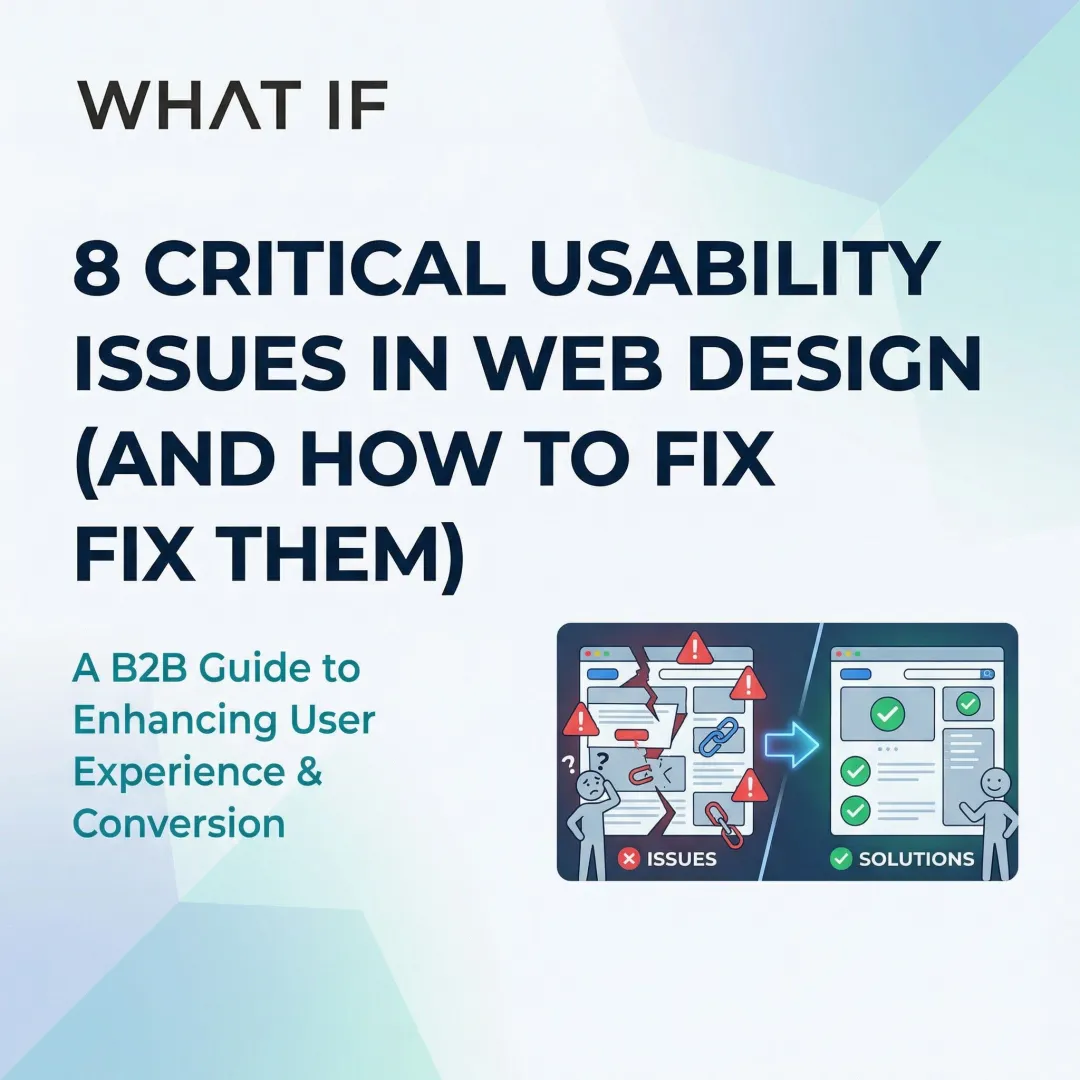
You've built a product that works. Your team understands the science, you've survived the technical slog, and you may have even closed a pilot or two. But when a potential enterprise buyer, a policy partner, or an investor lands on your website, they encounter something else: a wall of jargon, a form that doesn't work on mobile, a data visualization that means nothing without a PhD to decode it. The product is real. The website isn't keeping up.
For climate tech and deep-tech companies, this gap between product maturity and digital experience is more costly than it looks. Your buyers aren't casual browsers. They're procurement teams, sustainability directors, and infrastructure decision-makers who are already skeptical of early-stage vendors. When your website creates friction instead of building trust, you're not just losing a click. You're losing a conversation that may have taken months to earn.
This guide covers what usability guidelines actually mean for technical companies, where most climate tech websites fall short on accessibility, and how fixing the fundamentals can turn your site into a more credible, functional tool for the people who need to trust you most.
TLDR: key takeaways
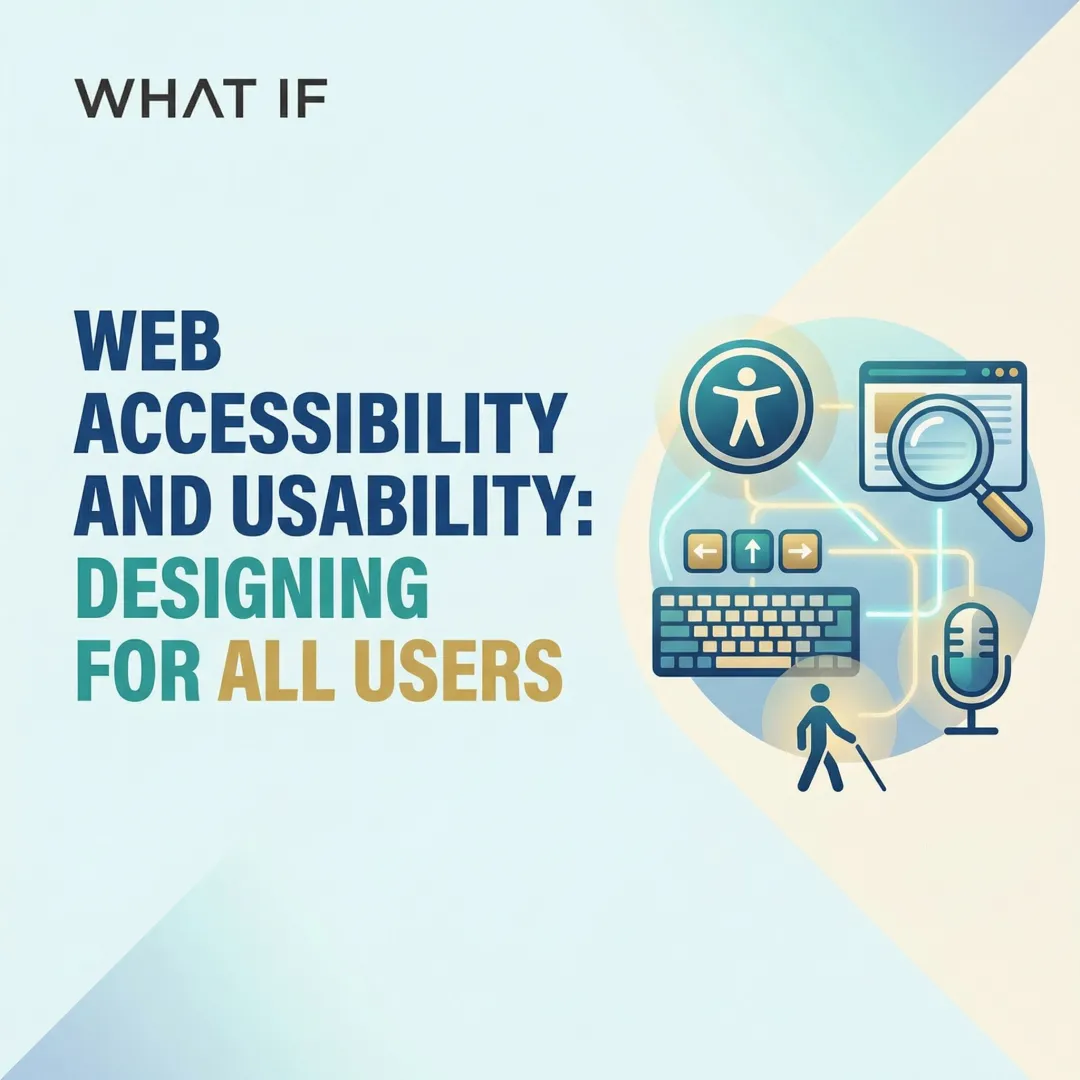
- Accessible design benefits all users, from captions in noisy spaces to keyboard shortcuts for power users
- WCAG 2.1 Level AA compliance is now required for ADA Title II, with enforcement beginning in 2-3 years
- Six common fixes (contrast, alt text, form labels, link text, button labels, document language) resolve 96% of detectable issues
- Building accessibility from the start adds less than 1% to project costs versus expensive retrofits
Why accessibility matters for your organization
The business case for accessible design
The global disability market represents 1.3 billion people with significant purchasing power. According to the World Health Organization, this population represents approximately 16% of people worldwide, or 1 in 6 individuals.
Excluding this audience means leaving substantial revenue on the table, but your practical stakes run deeper than market size.
Think about what that means in a vendor evaluation: a sustainability director evaluating two carbon accounting platforms submits a demo request from your site. If your form has unlabeled fields that a screen reader can't parse, or breaks on mobile when she's reviewing it between meetings, the qualified lead goes cold before you ever know it existed. That's not just a UX problem — it's a pipeline problem.
Accessible websites deliver measurable business benefits beyond market reach:
- Improved SEO performance - Semantic HTML and proper heading structures that serve screen reader users also help search engines understand your content
- Reduced bounce rates - Clear navigation and readable text keep all users engaged longer
- Increased conversion rates - Accessible forms with proper labels and error messages reduce abandonment
- Lower legal risk - Despite a 13% decrease in 2024, over 2,400 federal ADA Title III lawsuits were still filed targeting inaccessible websites
Accessibility improves usability for everyone
The "curb-cut effect" describes how accessibility improvements benefit broader populations than originally intended. Captions help people in noisy environments and those who prefer reading to listening. Keyboard navigation benefits power users who prefer shortcuts over a mouse. Clear, plain language helps non-native speakers and users with cognitive differences. High contrast text improves readability in bright sunlight or on older displays. And proper heading structure allows everyone to scan content efficiently — a detail that matters on any dense technical page where a reader is looking for a specific section relevant to their role.
WebAIM research shows that 71.6% of screen reader users navigate via headings, but this semantic structure benefits any user trying to quickly find specific information in a dense technical page.
For your enterprise buyers reviewing technical documentation or evaluating a platform, the ability to navigate a dense page efficiently shapes their first impression of whether your product is built for serious use.
Legal requirements and compliance standards
If you're building for enterprise buyers, government contracts, or any client with a public-facing mandate, compliance isn't optional. The current regulatory requirements across your likely markets look like this:
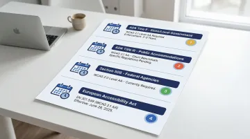
- ADA Title II (State/Local Government): The DOJ's April 2024 final rule explicitly designates WCAG 2.1 Level AA as the technical standard for web content and mobile apps
- ADA Title III (Public Accommodations): While specific regulations are pending, courts frequently reference WCAG 2.1 AA as the benchmark
- Section 508 (Federal Agencies): Requires WCAG 2.0 Level AA compliance for government contractors
- European Accessibility Act: Member states must implement these measures starting June 28, 2025, aligning with EN 301 549 which references WCAG 2.1 AA
For enterprise and government buyers, WCAG 2.1 AA compliance is increasingly appearing in procurement questionnaires and RFP requirements. Being able to confirm conformance in a vendor evaluation — and point to an accessibility statement as evidence — can advance you past a filter that eliminates most early-stage vendors.
Worth noting: Standards evolve, content changes, and new features introduce new issues. A one-time audit won't hold. Accessibility needs to be part of your regular development and QA workflow, not a checkbox you run through before a product launch.
The connection between accessibility and your audience reach
There's a specific and practical reason to prioritize accessible design beyond compliance: your buyers and stakeholders span a much wider range of contexts than most SaaS products.
You're communicating with utility procurement teams in rural areas who may be on older hardware, policy researchers accessing dense data visualizations, community representatives without technical backgrounds, and investors reviewing your platform on mobile between meetings. An inaccessible website doesn't just fail people with disabilities. It fails the range of contexts your technology needs to work within.
Clear, accessible data communication also matters when your product involves complex outputs like energy dashboards, carbon accounting interfaces, or grid analytics. If those outputs aren't perceivable and understandable to a non-technical decision-maker, adoption slows regardless of how strong the underlying science is.
When your digital presence works for the full range of people it needs to reach, from procurement teams reviewing your platform before a pilot decision to researchers accessing your data outputs, it stops being a friction point and starts functioning as part of your adoption infrastructure.
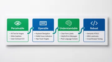
The four principles of web accessibility (POUR)
The WCAG framework organizes accessibility requirements around four foundational principles. Every website element must satisfy all four to be truly accessible.
Perceivable: users must be able to perceive information
Information must be presented in ways all users can perceive, regardless of sensory abilities. This means providing alternatives for visual and audio content, ensuring sufficient color contrast, and creating flexible layouts.
In practice, this means providing text alternatives for images, charts, and non-text content; captions and transcripts for audio and video; color contrast of at least 4.5:1 for normal text and 3:1 for large text; and content structured so it can be presented in different ways without losing meaning.
Low contrast text affects 79.1% of home pages, making it the single most common accessibility failure measured annually. If your interface is data-heavy — with energy dashboards or map-based visualizations — this matters beyond body text. Charts, graphs, and interactive data components all need to meet the 3:1 minimum for UI elements, or the information they carry becomes inaccessible. When an enterprise buyer opens your demo and can't distinguish one data series from another due to insufficient contrast, that's a credibility gap that's difficult to recover from.
Operable: users must be able to operate the interface
Every interface function must work via keyboard, not just mouse. This ensures users with motor disabilities, temporary injuries, or power users who prefer keyboard shortcuts can navigate effectively.
Every function must work via keyboard with a logical tab order and no keyboard traps. Focus indicators need to be visible so users can track which element is active. Touch targets must be at least 24x24 CSS pixels (the WCAG 2.2 Level AA standard). Users need sufficient time to complete tasks, with options to extend time limits. And hover-only interactions that exclude keyboard and touch users have no place in a well-built interface.
Since 91.3% of screen reader users access content via mobile devices, touch targets and screen reader gesture support deserve careful attention in any product built for field use or multi-device environments. In an enterprise evaluation, it also means that a procurement team member who navigates via keyboard — whether from preference or necessity — can actually assess your platform rather than abandoning the session when they hit a trap.
Understandable: content and interface must be understandable
Beyond perceiving and operating an interface, users must understand both the content and how to interact with it. This principle addresses cognitive accessibility and intuitive design patterns, and it's where many technically sophisticated products stumble.
Meeting this principle requires consistent navigation that behaves predictably across all pages, clear labels for every form field and interactive element, error messages that identify what went wrong and suggest how to fix it, plain language written at approximately an 8th-grade reading level, and components that behave consistently with user expectations throughout.
Missing form labels affect 48.2% of home pages, creating significant barriers for screen reader users who cannot determine what information each field requires. If you're running a B2B platform with complex multi-step workflows, this is a conversion problem as much as an accessibility one.
Robust: content must work across technologies
Robust code ensures your website works reliably across browsers, devices, and assistive technologies, both current and future versions. This principle focuses on technical implementation quality.
Technical requirements here include valid HTML with proper semantic markup, ARIA labels used sparingly when semantic HTML is insufficient, progressive enhancement ensuring basic functionality without JavaScript, and compatibility with assistive technologies including screen readers, voice control, and switch devices.
Meeting this standard is also what allows your platform to pass an IT accessibility review — the kind increasingly required by enterprise buyers before vendor approval.
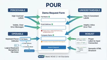
How these principles work together
Consider a form for requesting a climate tech product demo. To be fully accessible, it must satisfy all four principles simultaneously:
- Perceivable: Labels visible with sufficient contrast, error messages display clearly
- Operable: Navigable via keyboard with visible focus, touch targets appropriately sized
- Understandable: Clear field labels, helpful error messages, predictable submission behavior
- Robust: Semantic HTML form elements, proper label associations, ARIA attributes only where semantic HTML falls short
This holistic approach ensures the form works for users with permanent disabilities, temporary impairments like a broken arm, and situational limitations like bright sunlight or a noisy environment. When all four principles work together, accessibility becomes integrated into the user experience rather than something bolted on before launch. In a competitive vendor evaluation, a demo form that works for every stakeholder who touches it — including those using assistive technology — is a quiet but concrete signal that your product is enterprise-ready.
Designing for accessibility: practical guidelines
Create accessible visual design
Color contrast requirements:
- Normal text: minimum 4.5:1 contrast ratio
- Large text (18pt or higher, or 14pt bold or higher): minimum 3:1 contrast ratio
- UI components and graphics: minimum 3:1 contrast ratio
Test contrast using tools like WebAIM's Contrast Checker or browser extensions like WAVE. Never rely on color alone to convey information. Always pair color with text labels, icons, or patterns.
Typography best practices: Body text should be at minimum 16px with a line height at least 1.5 times the font size. Line length between 45–75 characters supports optimal readability, and justified text should be avoided — the uneven spacing it creates makes scanning harder for most users.
On your case study pages and product documentation, these details determine whether a procurement lead reviewing your technical evidence can actually read it — regardless of their display environment or visual needs.
Design accessible navigation and information architecture
Clear, consistent navigation: Use descriptive labels that indicate destination ("Contact us" rather than "Click here"), maintain consistent navigation placement across all pages, and provide multiple ways to find content — navigation, search, and sitemap all serve different user needs.
Proper heading hierarchy:
Screen reader users rely heavily on headings for navigation, with 71.6% using this method as their primary technique. Create a logical document outline using H1-H6 headings in sequential order, with one H1 per page and H2-H6 nested beneath. This structure also helps all users scan a dense technical page to find the section relevant to their role or question.
Accessibility aids: Skip links let keyboard users bypass repetitive navigation on every page load. Breadcrumbs show current location within the site hierarchy. Search provides direct access to specific content — particularly useful on technical sites with large amounts of reference material.
For enterprise buyers who land on your site to evaluate a specific capability, clear navigation and findable content directly affects whether they get to the evidence they need before moving on to the next vendor.
Make forms accessible and user-friendly
Forms are where accessibility failures most directly become conversion failures. A procurement lead who can't complete a contact form isn't going to call you instead.
Proper form labeling:
Use <label> elements explicitly associated with inputs via the for attribute. Missing form labels affect 48.2% of websites, and for complex multi-step product inquiry forms, this creates barriers that cost you qualified leads.
Clear error messages:
- Identify which field has an error
- Describe the problem in plain language
- Suggest how to fix it
- Display errors both visually and in text (never color alone)
Additional best practices: Group related fields using <fieldset> and <legend>, provide inline help text for complex fields, ensure tab order follows visual order, and mark required fields clearly with text — not just with color.
Build accessible interactive components
Buttons, links, and controls: Every interactive element needs a clear, descriptive label, sufficient size (minimum 24x24 CSS pixels), and a visible focus state. The distinction between links and buttons matters too: links navigate to a destination, buttons perform an action. Conflating them creates confusion for screen reader users who interact with each differently. In a product demo or platform evaluation, a modal that traps keyboard focus or a button that doesn't announce its state can end the session before your core value proposition registers.
Complex components:
Modals, dropdowns, and tooltips require careful focus management, particularly in dashboard interfaces with multiple interactive layers:
- Move focus inside when opening
- Trap focus until component closes
- Enable keyboard controls (Escape key to close)
- Return focus to triggering element when dismissed
Motion and animation: Avoid auto-playing content, provide pause and stop controls for animations, and respect the prefers-reduced-motion CSS media query — for users with vestibular disorders, unexpected motion isn't just annoying, it can cause genuine physical discomfort.
Consider mobile accessibility from the start
With 91.3% of screen reader users on mobile, mobile accessibility is a baseline requirement, not a nice-to-have.
- Touch target sizes: Minimum 24x24 CSS pixels with adequate spacing between targets
- Screen reader gestures: Test with VoiceOver (iOS) and TalkBack (Android)
- Orientation support: Allow both portrait and landscape viewing
- Responsive design: Ensure content reflows properly when zoomed to 200%
If you're building sustainability dashboards or ESG data platforms, you face a specific challenge here. Complex data visualizations need to remain comprehensible on smaller screens while working with screen reader announcements. This means designing with accessibility as a core requirement from the wireframe stage, not something to address after the component library is built.
A concrete example: an infrastructure partner reviews your ESG platform on their phone between site visits. If the chart data has no accessible text equivalent and the filter controls are too small to tap, they leave without the information that would have moved the conversation forward.
Developing accessible websites: technical implementation
Write semantic HTML
Use proper HTML elements that convey meaning, not just visual styling. If you're building climate and energy software with complex dashboards or multi-user workflows, semantic HTML is foundational. A screen reader navigating a carbon accounting interface needs proper table markup, labeled inputs, and logical heading structure to make the data comprehensible to the person using it.
Semantic elements to use:
<nav>for navigation menus<main>for primary content<article>for self-contained content<button>for actions,<a>for navigation<h1>through<h6>for heading hierarchy
Avoid generic <div> and <span> with CSS styling when semantic elements exist. Semantic HTML provides structure that assistive technologies understand without additional markup overhead.
ARIA attributes:
Use ARIA (Accessible Rich Internet Applications) attributes only when semantic HTML is insufficient. The first rule of ARIA: don't use it if you can use semantic HTML instead. Overuse of ARIA creates maintenance complexity without improving the experience.
Create accessible images and media
Once you've structured your HTML properly, ensuring media content works for all users is the next layer.
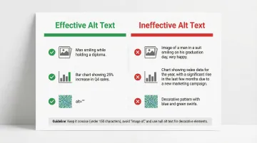
Effective alt text:
Write alt text that conveys the purpose and content of images:
- Be concise but descriptive (aim for under 150 characters)
- Describe the content and its function, not just "image of"
- For decorative images, use empty
alt=""to hide from screen readers - For complex images like charts or diagrams, provide a longer description either inline or via a linked summary
Missing alt text remains one of the most common accessibility failures on websites today and is particularly problematic on pages carrying technical data visualizations where the image is the entire point. If that visualization is on your solutions or case study page, and a procurement team member using a screen reader can't access it, the technical case you built around it doesn't reach them.
Audio and video: For audio and video content, provide captions for all audio, transcripts for audio-only content, and audio descriptions for video-only content. Ensure your media players have accessible controls.
Build accessible data tables and content
Proper table markup:
- Use
<th>elements with scope attributes for headers - Include
<caption>describing table purpose - Use
<thead>and<tbody>for complex tables - Keep tables simple where possible; if a table is complex, consider whether a summary or different format would serve the user better
Plain language:
Write content understandable by users with approximately an 8th-grade reading level, but don't confuse plain language with dumbing down. The goal is precision without unnecessary complexity. Short sentences, common words, active voice, and strategic use of headings and lists all support readability. Define technical terms when introducing them, but don't pad content with jargon — if a concept requires a paragraph of context just to understand the label, that's a signal to simplify.
Plain, structured content — across your case studies, technical pages, and product documentation — also signals to non-technical buyers that you can communicate what your technology does in terms they can evaluate and act on.
Testing and maintaining accessibility
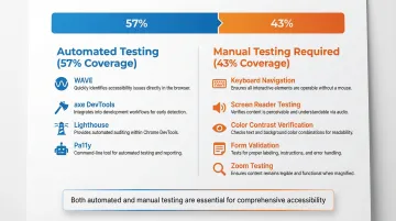
Conduct automated and manual testing
Automated tools like WAVE, axe, and Lighthouse are essential but cover only part of the picture. Deque research analyzing over 2,000 audits found automated testing identifies approximately 57% of total issues, which means the remaining 43% require manual review by someone who understands the context and intent behind the interface.
Manual testing checklist:
- Keyboard navigation: Tab through the entire site, verify all interactive elements are reachable and operable
- Screen reader testing: Use NVDA (Windows), JAWS (Windows), or VoiceOver (Mac/iOS) to navigate content
- Color contrast verification: Check all text and UI components meet minimum ratios
- Form validation: Test error messages and field labeling
- Zoom testing: Verify content remains usable at 200% zoom
Combine automated tools for comprehensive coverage:
- WAVE: Browser extension for visual accessibility evaluation
- axe DevTools: Comprehensive testing integrated into browser developer tools
- Lighthouse: Built into Chrome DevTools for quick audits
- Pa11y: Command-line interface for CI/CD integration
Running this process before a website launch, a major content update, or a product demo also means you're not discovering accessibility failures when a prospective enterprise buyer's IT team reviews your platform as part of vendor due diligence.
Include users with disabilities in testing
While automated and manual testing catch many issues, they can't replace feedback from real users with disabilities. Testing tools check structure. Only actual users can identify critical usability barriers that emerge in real-world interaction.
Recruit participants with diverse disabilities — visual, auditory, motor, and cognitive — and compensate them at professional rates. Their expertise is real and it deserves to be treated that way. Rather than running accessibility user testing as a separate track, integrate it into regular usability testing cycles and document issues from the user's perspective so the team understands the real-world impact, not just the technical failure mode.
The outcomes from this testing also give you something concrete to reference when enterprise buyers ask how you validate your platform's accessibility — increasingly a standard vendor qualification question.
Establish ongoing accessibility maintenance
Websites change. New content gets added, features are built, and standards evolve. Accessibility testing needs to be integrated into your regular development and content workflow, not treated as a separate audit you run once before a product launch.
Maintenance framework:
- Regular audits: Conduct comprehensive accessibility audits quarterly
- Accessibility statement: Document conformance level and provide contact for reporting issues
- Team training: Educate designers, developers, and content creators on accessibility requirements
- Governance processes: Include accessibility in QA workflows and definition of done
- Issue tracking: Monitor and prioritize accessibility issues alongside other bugs
Integrating accessibility from the start adds less than 1% to construction costs. Retrofitting is significantly more expensive than building with accessibility from the start, with some estimates placing renovation costs at 4 to 35 times higher than initial inclusive design.
Accessibility tools and resources you can use today
Automated testing tools
Free tools:
- WAVE: Browser extension providing visual feedback about accessibility issues
- axe DevTools: Detects around 57% of issues, useful for catching common structural errors
- Lighthouse: Built into Chrome DevTools, offering accessibility scoring alongside performance
- Pa11y: Open-source command-line tool for integrating accessibility testing into CI/CD pipelines
Limitations: All automated tools miss complex issues requiring human judgment, including contextual alt text appropriateness, logical heading structure, keyboard navigation flow, and form usability in real interaction scenarios.
For a pre-launch check before a product demo, investor meeting, or website redesign, these tools are a fast way to catch structural issues before a buyer or evaluator does.
Once you've identified issues through testing, you'll need authoritative guidance and well-built components to fix them efficiently.
Essential design and development resources
Authoritative standards:
- WCAG 2.1 guidelines: The official W3C specification and current legal standard
- WebAIM resources: Checklists, articles, and the annual WebAIM Million report
- Section508.gov: Official guidance for federal compliance
- A11y Project: Community-driven accessibility resources and checklists
Accessible design systems:
- U.S. Web Design System (USWDS): Conforms to Section 508/WCAG 2.0 AA, striving for 2.1 AA
- Material Design: Google's design system with comprehensive accessibility documentation
- Adobe Spectrum: Component library with built-in accessibility features
If you're building a climate tech or sustainability platform, starting from an accessible design system significantly reduces the amount of accessibility work at the component level. That means your team can focus on the harder challenges specific to your product, like accessible data visualization or complex multi-step workflows.
At What if Design, accessibility is built into the design process from the start rather than layered on before launch. If you're building novel technology for skeptical enterprise buyers, every element of your digital presence needs to build trust, and an inaccessible experience does the opposite.
Frequently asked questions
What's the difference between accessibility and usability?
Accessibility ensures people with disabilities can use your website through screen reader compatibility, keyboard navigation, and sufficient color contrast. Usability ensures ease and efficiency for everyone. The two are deeply interconnected; accessible websites improve usability for all users, not just those with disabilities.
Do I need to meet WCAG 2.0, 2.1, or 2.2 standards?
WCAG 2.1 Level AA is the current legal standard in most jurisdictions, including the DOJ's 2024 rule. WCAG 2.2 (October 2023) is the latest version and is backward compatible, meaning 2.1 AA compliance also satisfies 2.0 requirements. Building to 2.2 now means fewer changes when it becomes the enforced standard.
How much does it cost to make a website accessible?
Building accessibility in from the start adds less than 1% to project costs, while retrofitting can cost 2-3 times more. Accessibility lawsuits and settlements cost significantly more than either, which makes proactive investment the straightforward business decision here.
What are the most common accessibility issues on websites?
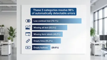
The top five issues affect the majority of websites: low contrast text (79.1% of sites), missing alt text (55.5%), missing form labels (48.2%), empty links (45.4%), and empty buttons (29.6%). Addressing these five categories, along with missing document language declarations, resolves 96% of automatically detectable errors.
Can I use overlays or plugins to make my site accessible?
No. Automated overlays are not a substitute for properly coded accessible websites. Research shows 67% of practitioners rate overlays as ineffective, and they don't ensure WCAG 2.1 AA conformity or provide legal protection. There is no shortcut that replaces building accessibility into the structure of the site.
How do I prioritize accessibility fixes if I have limited resources?
Start with the issues that create the most friction for the most users: forms, navigation, and images. Focus on your most-visited pages first rather than trying to address everything at once. Fixing the six most common errors (contrast, alt text, form labels, empty links, empty buttons, and document language declarations) resolves 96% of detectable issues. Most importantly, integrate accessibility into your regular development workflow rather than treating it as a separate remediation project. That's how you stop new issues from accumulating.
When you get this right, you don't just reduce legal exposure. You remove friction from every conversation that matters: with investors, partners, procurement teams, and the communities you're building for.
If your website still reads like it was built in a sprint two years ago, it's worth taking a hard look at what signal it's sending today.