
Introduction: Why Usability Testing is Critical for Responsive Web Design
Picture this: a climate tech company launches a beautifully designed website showcasing their carbon capture technology. On desktop, it's stunning—interactive charts, detailed specifications, compelling imagery. But when potential investors visit the site on their phones during a conference, they encounter frustration: navigation buried behind a hamburger menu they never find, touch targets too small to tap accurately, and load times that trigger a bounce before the hero image even appears.
This scenario plays out daily. Mobile devices now account for roughly 50% of global web traffic, yet mobile bounce rates spike 123% when page load exceeds 10 seconds.
The problem runs deeper than load times. Responsive design alone doesn't guarantee usability—a site can technically adapt to different screen sizes while remaining completely unusable. Navigation that works perfectly on desktop can become invisible on mobile, and interactive elements can shrink to untappable sizes.
Effective responsive design requires thorough usability testing across devices, breakpoints, and real-world contexts. This guide covers proven strategies for testing responsive designs, from identifying common issues to implementing testing methods that ensure your site works for actual users—not just technical validation checkboxes.
TLDR:
- Responsive design usability testing evaluates user experience across devices, not just layout adaptation
- Poor mobile experiences increase bounce rates by 123% and directly reduce conversion rates
- Testing must cover navigation patterns, touch targets, content readability, performance, and forms
- Combine moderated testing for deep insights with unmoderated testing for scale
- Test iteratively throughout design and development—not just at launch
What is Responsive Web Design Usability Testing?
Responsive Web Design (RWD) usability testing evaluates how easily users can interact with a website across different screen sizes, devices, and orientations. Unlike simple responsive design testing—which verifies that layouts adapt technically—usability testing focuses on whether those adaptations actually support user tasks and goals.
The Critical Distinction
Responsive design testing checks technical implementation: Do CSS breakpoints trigger correctly? Do images scale properly? Does the grid system reflow as expected?
Usability testing asks different questions: Can users find what they need? Are interactive elements easy to use? Does the experience feel intuitive on each device?
A site can pass every responsive design check while failing usability spectacularly. Elements might resize perfectly but become too small to tap. Navigation might technically adapt but hide critical links.
Content might reflow beautifully but lose all visual hierarchy.
Multi-Device, Multi-Context Evaluation
RWD usability testing differs from traditional usability testing by requiring evaluation across:
- Devices: Smartphones, tablets, desktops, and sometimes hybrid devices
- Orientations: Portrait and landscape modes reveal different usability challenges
- User contexts: Mobile users browsing on-the-go face different constraints than desktop users in focused work sessions
- Breakpoints: Issues often emerge at specific viewport widths where layouts transition
Business Impact: The Revenue Connection
These technical considerations directly impact your bottom line. Performance and usability directly correlate to business outcomes:
| Metric Improvement | Business Outcome |
|---|---|
| 0.1s load time reduction | 8.4% conversion increase (retail); 10.1% (travel) |
| 31% LCP improvement | 8% increase in sales (Vodafone) |
| Responsive vs. fixed layout | 32% faster task completion; 4.4/5 vs. 3.4/5 satisfaction |
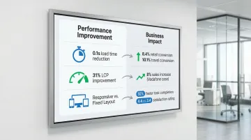
Research shows users complete tasks 32% faster on responsive sites compared to fixed layouts, with significantly higher usability ratings. But these benefits only materialize when responsive designs are actually usable—not just technically responsive.
The Accessibility and Performance Connection
Beyond immediate business metrics, RWD usability testing intersects with broader quality concerns:
- Accessibility: Touch target sizes, color contrast, and text scaling affect users with motor or visual impairments especially on mobile devices
- Performance: Mobile users on slower networks experience degraded usability when sites load heavy resources optimized for desktop
- Engagement: Poor mobile experiences drive users away, directly impacting long-term engagement metrics
Common Usability Issues in Responsive Web Design
Navigation Problems Across Breakpoints
Navigation consistently ranks as the primary casualty of responsive design constraints. What works on desktop often becomes unusable on mobile.
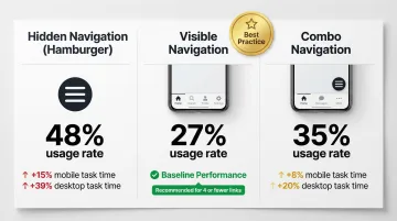
Hidden Navigation (Hamburger Menus):
- Only 27% of sites use hidden navigation on desktop, compared to 48% for visible navigation
- Hiding navigation increases task completion time by 15% on mobile and 39% on desktop
- Avoid hidden navigation on desktop entirely
- On mobile with 4 or fewer links, display them visibly (tab bar format)
Visible navigation or "combo" navigation (combining visible primary links with hidden secondary options) consistently outperforms purely hidden menus.
Touch Target and Interactive Element Issues
Touch targets that work on desktop often become unusable on mobile devices.
Size requirements:
- WCAG 2.2 minimum: 24×24 CSS pixels for accessibility compliance
- NN/g recommendation: Physical size of 1cm × 1cm (approximately 44×44 pixels) to prevent errors
- View-tap mismatch: Elements large enough to read but too small to tap accurately (common with carousel dots, close buttons, or dense link lists)
Content Readability and Hierarchy Problems
Content hierarchy often collapses when moving between screen sizes:
- Font sizes: Text that's readable at desktop sizes often becomes too small on mobile, while mobile-optimized text can appear comically large on desktop if not properly scaled
- Line length: Optimal line length is 50–60 characters per line; lines exceeding 80 characters (common on unoptimized desktop views) cause eye fatigue and tracking errors
- Visual hierarchy: Content prioritization that's clear on desktop often collapses on mobile, losing information scent and making it difficult for users to understand content relationships
Layout and Visual Design Inconsistencies
Visual design elements frequently create usability issues during responsive adaptation:
- Images and videos: Media that scales improperly creates awkward white space, crops critical content, or fails to load efficiently on mobile networks
- Broken grids: Layout elements that overlap, misalign, or create unexpected spacing issues at specific breakpoints
- Responsive pattern failures: Poor implementation of common patterns (card layouts, hero sections, multi-column content) that work at some sizes but break at others
Performance Issues on Different Devices
Performance degradation affects usability differently across devices:
- Load time sensitivity: A page load increase from 1 second to 3 seconds increases bounce probability by 32%; from 1 to 10 seconds, it rises by 123%
- Device disparity: A 4-inch phone receiving the same heavy code bundle as a 24-inch desktop monitor suffers severe performance degradation
- Network conditions: Mobile users on 3G or 4G networks experience dramatically slower load times than desktop users on broadband
Large images, unoptimized code, and resource-heavy elements that perform acceptably on desktop can render a site completely unusable on mobile devices.
Form Usability Challenges
Forms present specific challenges on mobile devices:
- Abandonment rates: Approximately 18% of users abandon checkout flows due to complexity or excessive fields
- Keyboard optimization: 63% of mobile sites fail to trigger the correct keyboard (numeric keypad for credit cards, email keyboard for email fields)
- Autocorrect issues: 87% of mobile sites fail to disable autocorrect for fields like names or addresses, leading to valid input being erroneously "corrected"
- Multi-step forms: Forms that work well as single pages on desktop often need restructuring into multi-step flows on mobile
Responsive form design patterns that improve completion rates include single-column layouts, appropriately sized input fields, clear error messaging, and strategic use of input types to trigger optimal keyboards.

Key Components to Test in Responsive Designs
Thorough responsive design testing requires focused evaluation across five critical areas. Each affects how users interact with your site, regardless of device.
Navigation systems determine whether users can find what they need:
- Menu discoverability and usability across devices
- Search functionality and filters
- Breadcrumbs and wayfinding elements
Interactive elements must respond correctly to touch and click:
- Buttons, links, and calls-to-action
- Forms and input fields
- Carousels, sliders, and galleries
- Expandable sections and accordions
- Modal windows and overlays
Content consumption affects engagement and comprehension:
- Text readability and hierarchy
- Image and video presentation
- Data tables and complex information
Task completion flows reveal friction points in user journeys:
- Multi-step processes (checkout, registration, applications)
- Cross-device continuity (starting on mobile, finishing on desktop)
- Error prevention and recovery
- Confirmation and feedback mechanisms
Performance and technical function impact usability directly:
- Page load times across devices and network conditions
- Resource usage and battery impact
- Offline functionality and error states
These components behave differently at various screen sizes, making breakpoint testing essential.
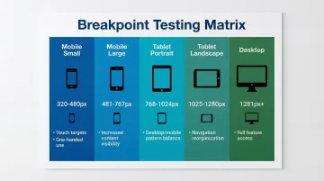
Breakpoint and Orientation Testing
Test across major breakpoints and both orientations to catch layout shifts and usability issues:
| Breakpoint | Width Range | Key Considerations |
|---|---|---|
| Mobile (small) | 320px–480px | Touch targets, one-handed use |
| Mobile (large) | 481px–767px | Increased content visibility |
| Tablet (portrait) | 768px–1024px | Balance of desktop/mobile patterns |
| Tablet (landscape) | 1025px–1280px | Navigation reorganization |
| Desktop | 1281px+ | Full feature access |
Landscape orientation often reveals issues that portrait testing misses, particularly with navigation, forms, and content hierarchy. Users switch orientations frequently, especially on tablets.
Context-Specific Use Cases
Testing across devices means accounting for how and where people use them:
- Mobile users face interrupted attention, one-handed use, variable lighting, and unreliable connectivity
- Tablet users typically browse casually in relaxed settings, often during evening hours
- Desktop users pursue task-oriented goals with detailed information needs and multiple windows open
Design for these contexts, not just screen sizes.
Usability Testing Methods for Responsive Design
Device-Specific Usability Testing
Method: Moderated testing where users complete tasks on specific devices (smartphone, tablet, desktop) while being observed by a facilitator.
When to use:
- Early design phases when exploring device-specific interaction patterns
- Complex interfaces requiring detailed, in-depth feedback
- Products with critical device-specific features
Insights provided:
- Device-specific pain points and confusion
- Touch interaction accuracy and patterns
- Mental model differences across devices
- Contextual usage behaviors
Best practices:
- Use real devices, not just emulators
- Test in environments matching actual usage contexts
- Allow natural device handling (one-handed mobile use, tablet rotation)
- Probe "why" users struggle at specific points
These moderated sessions work best early in the design process, but they're time-intensive. For broader validation, consider combining them with unmoderated approaches.
Cross-Device User Journey Testing
Method: Testing scenarios where users start tasks on one device and complete them on another (browse on mobile, purchase on desktop).
When to use:
- E-commerce and conversion-focused sites
- Applications where users frequently switch between devices
- Complex decision-making processes
Insights provided:
- Cross-device continuity expectations
- Information persistence needs (cart, saved items, progress)
- Device-switching trigger points
- Consistency requirements across devices
Implementation note: Moderated sessions work better for tracking cross-device journeys. Most unmoderated tools struggle to follow a single user across devices in one session.
Remote Unmoderated Testing
Method: Users test responsive designs on their own devices in their natural environment, completing tasks without real-time guidance.
When to use:
- High-fidelity prototypes or live sites
- Validating fixes at scale (larger sample sizes)
- Benchmarking metrics (task completion rates, time on task)
Benefits:
- Tests on real user devices (not lab devices)
- Natural usage contexts and behaviors
- Cost-effective for larger sample sizes (65+ participants)
- Faster turnaround than scheduling moderated sessions
Limitations:
- No real-time probing of "why" users struggle
- Risk of "cheater" participants
- Less effective for complex prototypes requiring guidance
Quick Comparison:
| Method | Sample Size | Cost | Depth of Insights |
|---|---|---|---|
| Device-Specific | 5-8 users | $$$ | Deep |
| Cross-Device | 8-12 users | $$$ | Medium-Deep |
| Remote Unmoderated | 65+ users | $ | Broad but shallow |
Breakpoint-Specific Testing
Method: Systematic testing at each major breakpoint to identify where layouts break or usability issues emerge.
When to use:
- During development to catch layout issues
- When troubleshooting specific viewport problems
- As part of quality assurance before launch
Tools and approach:
- Browser developer tools for manual breakpoint testing
- Responsive design testing platforms (BrowserStack) for automated checks
- Real device testing at key breakpoint thresholds
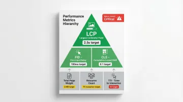
Performance and Load Testing Across Devices
Method: Testing page load times, resource usage, and performance on different devices and network conditions.
When to use:
- Before launch to establish performance baselines
- When investigating bounce rate or conversion issues
- After major updates or feature additions
Key metrics:
- Largest Contentful Paint (LCP)
- First Input Delay (FID)
- Cumulative Layout Shift (CLS)
- Total page weight and resource count
- Time to Interactive (TTI)
Performance directly impacts usability. Poor performance creates poor usability, especially on mobile devices with limited processing power and network connectivity.
Step-by-Step Guide to Testing Responsive Designs
Planning Phase
Define Testing Objectives
Start by clarifying what you need to learn:
- What specific questions do you need answered?
- Which user tasks are most critical to test?
- What success looks like for this test
Identify Critical User Tasks
Base your task selection on real user behavior. Pull from analytics data to find the most common user flows, then include both simple tasks (find information) and complex tasks (complete purchase). Prioritize tasks that directly drive business outcomes.
Determine Device and Breakpoint Priorities
Review your analytics to identify the most common devices and screen resolutions. Test at minimum: one smartphone, one tablet, one desktop browser. Focus testing resources on devices your actual users rely on rather than attempting comprehensive device coverage.
Establish Success Criteria
Define how you'll measure usability performance:
| Metric | Definition | Purpose |
|---|---|---|
| Task completion rates | Percentage of users who successfully complete tasks | Identifies blocking issues |
| Time on task | How long tasks take to complete | Reveals efficiency problems |
| Error rates | Frequency and types of errors encountered | Pinpoints confusion points |
| Satisfaction scores | Post-task ratings (SUS, UMUX-Lite) | Measures user sentiment |
Participant Recruitment and Setup
Once you've defined your testing framework, recruit participants who match your target audience.
Recruit Representative Users
Match your target audience demographics and technical proficiency. Ensure participants actually use the specific devices you're testing—for unmoderated testing, screen carefully for device ownership before scheduling sessions.
Sample Size Guidance
- Discovery testing (formative): 5 users uncover 85% of common problems
- Benchmarking (summative): 65+ users needed for quantitative precision with <10% margin of error
Prepare Testing Environment
Moderated sessions: Set up real devices, screen recording software, and observation tools.
Remote sessions: Configure your testing platform, prepare task scenarios as realistic prompts, and verify recording setup before participant arrival.
Conducting the Test
Guide Participants Through Realistic Tasks
Present tasks as scenarios, not instructions. Say "Find a carbon capture solution for industrial applications" rather than "Click on Products." Let participants interact naturally with devices—rotating, zooming, scrolling—without intervention. Avoid leading questions or hints that would mask genuine usability problems.
Use Think-Aloud Protocol
Ask participants to verbalize their thoughts while completing tasks. When you spot confusion, probe deeper: "What were you expecting to see?" or "Why did you choose that option?" Document both what users do and why they do it—the reasoning reveals whether issues stem from design problems or user mental models.
Observe and Document Issues
Note where users hesitate, backtrack, or express frustration. Capture specific usability failures:
- Can't locate navigation elements
- Can't tap buttons (too small, wrong placement)
- Can't read text (size, contrast, line length)
Record both critical failures that block task completion and minor friction points that slow users down.
Analysis and Reporting
Categorize Findings
Organize issues by device type (mobile, tablet, desktop), by breakpoint (problems emerging at specific viewport widths), and by severity (critical blocks task completion, major creates significant friction, minor causes small annoyance).
Identify Patterns Across Devices
Issues appearing on multiple devices suggest fundamental design problems requiring broad solutions. Device-specific issues may need targeted fixes. Breakpoint-specific issues often indicate layout or CSS problems.
Prioritize Issues
Rank problems using three criteria:
- Impact: How many users does this affect? How severely?
- Frequency: How often does this issue occur?
- Business criticality: Does this block revenue-generating tasks?
Create Actionable Recommendations
Provide specific solutions, not just problem descriptions. Include examples of effective patterns or reference competitors handling it well. When possible, estimate implementation effort and link each recommendation directly to business impact—whether that's reducing drop-off rates, increasing conversions, or improving user satisfaction scores.
Best Practices and Tools for Responsive Design Testing
Test on Real Devices
Emulators and browser developer tools can't fully recreate touch accuracy, "fat finger" issues, hardware performance limits, or real network conditions. Use them for initial development checks, but prioritize real device testing for validation.
Essential Testing Tools
BrowserStack:
- Provides access to 3,000+ real mobile and desktop devices in the cloud
- Supports testing under real-world network conditions (3G, 4G, variable Wi-Fi)
- Offers Figma plugin for accessibility checks during design
- Essential for verifying device-specific bugs emulators miss
Figma:
- Create responsive prototypes that can be mirrored to mobile devices
- Integrates with UserTesting and Maze for direct prototype testing
- Enables rapid iteration based on testing feedback
UserTesting:
- Supports both moderated and unmoderated remote testing
- Strong for qualitative insights and observing user behavior
- Video recording shows exactly where users struggle
- Best for understanding "why" users fail
Maze:
- Specialized for unmoderated testing of prototypes
- Provides quantitative metrics: success rates, misclick rates, heatmaps
- Best for rapid, iterative testing of high-fidelity prototypes
- Cost-effective for validating design decisions quickly
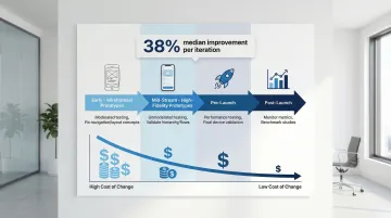
Iterative Testing Throughout Development
The right testing tools only deliver value when integrated into your development cycle. Testing only at the end often reveals critical issues that become expensive to fix. Historical data shows a median usability improvement of 38% per iteration.
Test at these key stages:
- Early (wireframes/prototypes): Moderated testing to fix navigation and layout concepts
- Mid-stream (high-fidelity prototypes): Unmoderated testing to validate visual hierarchy and task flows
- Pre-launch: Performance testing and final validation across devices
- Post-launch: Monitor live metrics and run benchmark studies
Early testing catches issues when changes are cheap to implement, saving significant costs compared to fixing problems discovered at launch.
Partner with Experienced Design Teams
Integrating usability testing into responsive design workflows requires expertise in research methodology, device testing, and iterative design processes. Partnering with experienced design teams helps ensure user-centered solutions from the start.
What if Design works with climate tech and sustainability companies to integrate usability testing throughout the responsive design process. From wireframe validation to post-launch monitoring, they apply the testing strategies and tools outlined in this guide to create responsive experiences that work across devices and support business goals.
Frequently Asked Questions
What is the difference between responsive design testing and mobile testing?
Responsive design testing evaluates how a website adapts across all screen sizes, focusing on layout flexibility. Mobile testing targets mobile-specific experiences and constraints like touch targets, network speed, and interruptions.
How many devices should I test my responsive design on?
Use your analytics to identify actual user devices. Test on one small phone (360px), one large phone (414px), one tablet, and one desktop (1920px) to cover primary breakpoints. Focus on the top 3-5 devices serving the majority of your users.
What are the most common responsive design usability issues?
Hidden navigation (reduces discoverability by 50%), undersized touch targets (should be 44px minimum), poor readability (line lengths over 80 characters), and slow load times (over 3 seconds increases bounce rates by 32%).
When should I conduct usability testing for responsive designs?
Test early with low-fidelity prototypes to fix navigation and layout concepts. Test during development with high-fidelity prototypes to validate visual hierarchy. Test after launch for ongoing optimization and performance tracking.
What tools are best for testing responsive web designs?
BrowserStack excels at cross-device testing with access to real devices and network conditions. Figma is ideal for creating and testing interactive responsive prototypes. UserTesting works well for remote moderated and unmoderated studies with strong qualitative insights. Maze specializes in rapid quantitative testing of prototypes with metrics like success rates and heatmaps.
How do I test responsive designs on different screen sizes without owning every device?
Use cloud-based platforms like BrowserStack for real device access. Leverage browser developer tools for breakpoint testing. Run remote unmoderated tests where participants use their own devices.
Conclusion
Effective responsive design requires more than technical implementation—it demands ongoing usability testing to ensure experiences work for real users across all devices and contexts. The data is clear: responsive designs that haven't been tested with users often fail at critical moments, leading to increased bounce rates, abandoned tasks, and lost conversions.
Investing in responsive design usability testing early saves time and money while improving user satisfaction and business outcomes. The impact is measurable:
- 0.1-second load time improvement → 8% conversion lift
- Well-designed responsive sites → 32% faster task completion
- Real user testing → improvements that actually materialize in production
These gains only happen when you test with real users on real devices in real contexts.
What if Design integrates usability testing into responsive design projects for climate tech and sustainability companies from strategy through launch. Their process validates designs with real users across devices, ensuring your product supports business goals like accelerating pilots, securing funding, or driving market adoption.
Ready to validate your responsive design with real users? Connect with What if Design to discuss how usability testing can strengthen your digital product.