Design as infrastructure for a sustainable future
Your climate technology works. The pilot data is solid. The science is defensible. But the people who need to use it aren't adopting it at the rate your models predicted.
This is one of the most consistent gaps we see across climate tech: the engineering clears every hurdle, and the product still stalls at the user level. Research shows that smart energy systems fail not because the technology is flawed, but because users find them too complex or intrusive. In documented cases, users have unplugged sensors entirely to bypass systems they can't understand, effectively disabling solutions that could have delivered real impact.
The contrast is stark: a utility portal redesign achieved 80% faster task completion rates and cut support costs significantly, through design changes alone. The technology didn't change. The way people interacted with it did.
This article breaks down where design creates or destroys adoption in climate tech, across brand identity, digital products, data visualization, and website experience, and what specifically to fix in each area.
TLDR: Key takeaways
- Strategic design drives adoption. It's infrastructure for change, not cosmetic polish
- Authentic brand design builds trust; research shows a one-point increase in perceived greenwashing reduces investment likelihood by 1.68 percentage points
- User-centered design reduces the friction between sustainable intent and actual behavior
- Data visualization transforms overwhelming climate data into actionable insights for decision-makers
- Your website is often where investors, partners, and customers form their first impression of your company's credibility
The role of design in accelerating sustainability adoption
Bridging the green gap
The "green gap" refers to the disconnect between sustainability intentions and actual behavior. It remains one of the climate sector's most persistent challenges. Environmental awareness is high, but it rarely translates into action without deliberate structural intervention.
Design bridges this gap by reducing friction in sustainable choices. A study of smart energy apps in Norway found that app-related factors, specifically "applicability of insights and the appeal of the interface," had stronger associations with behavior change than demographic variables. Design quality mattered more than who the users were. When your design determines whether users engage with your product, it also determines whether your pilot data holds up — and whether buyers trust that enterprise deployment will succeed.
How design accelerates adoption:
Well-designed climate products reduce cognitive load in complex workflows like carbon tracking and energy management, provide immediate feedback that reinforces sustainable behaviors, and create emotional connection through purposeful visual storytelling. Most importantly, they simplify decision-making by making sustainable choices the default option.
Understanding what works also means recognizing what actively fails.
When poor design hinders climate action
Design failures can quietly undermine sustainability initiatives, and the consequences are rarely obvious at first. A Norwegian climate adaptation portal, despite containing genuinely valuable data, received little use because it confused or overwhelmed users with the amount of information. The problem wasn't data availability. It was information architecture. The data sat unused, not because it wasn't there, but because no one could navigate to it without giving up.
Smart home energy systems face a similar pattern: adoption barriers that stem from "complexity, lack of consistent user experience, usability problems, and time-consuming programming requirements" rather than the underlying technology. The technology clears the technical bar. The design fails to clear the usability bar.
The correction here is not to simplify the technology. It's to simplify the interaction with it. That means information hierarchy that surfaces the most relevant data first, progressive disclosure for users who want depth, and workflows that require minimal configuration to get started. In a procurement evaluation, this is the difference between a demo that builds confidence and one that creates doubt about whether your product can be deployed at scale.
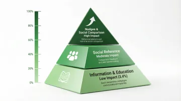
Design for behavior change
Behavioral research reveals a clear hierarchy of effectiveness for climate interventions:
| Intervention type | Effectiveness | Key insight |
|---|---|---|
| Nudges and social comparison | High | Choice architecture and peer comparisons drive the strongest behavior shifts |
| Social reference | Moderate | Providing social context has limited impact without actionable nudges |
| Information and education | Low (3.4%) | Static facts and displays have minimal effect on changing behavior |
Source: Meta-analysis of behavioral interventions to promote household action on climate change
The takeaway: design interventions that incorporate behavioral nudges, not just information, are essential for driving sustainable action. Products that demonstrably shift behavior also give you concrete pilot outcomes to present — the kind of measurable results that can convert a trial engagement into a signed contract.
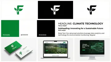
Visual identity and brand design for climate tech companies
Why brand design matters in the climate space
Climate tech companies operate in a difficult information environment. 85% of investors report that greenwashing is a worsening problem, and 78% suspect unsupported claims in corporate reporting.
This skepticism has direct financial consequences. Research shows that a one-point increase in perceived greenwashing reduces investment likelihood by 1.68 percentage points.
If you're a climate tech startup seeking capital, authentic brand design isn't optional. It's essential for getting past the initial credibility filter.
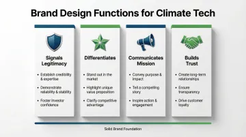
Professional brand identity serves specific functions at this stage: it signals legitimacy to skeptical investors and enterprise customers, differentiates you in crowded climate tech markets, communicates mission and values alongside technical credibility, and builds trust through transparent, evidence-based visual communication.
Elements of effective climate-focused brand design
Color psychology and visual language
Effective climate tech brands avoid clichéd "green" stereotypes in favor of sophisticated color systems that convey both innovation and environmental responsibility. The best brands use color to signal technical sophistication while maintaining environmental authenticity, not as a shorthand for sustainability, but as a deliberate visual argument.
Typography and imagery balance
Typography choices must balance technical credibility with accessibility. Climate tech brands need typefaces that work equally well in investor pitch decks, product interfaces, and public-facing communications. These choices communicate both scientific rigor and human approachability, often across very different audience contexts.
Scalable brand systems
Logo and brand systems must function across diverse contexts: from favicon displays to billboard-scale applications, from investor presentations to product dashboards. Flexibility without loss of recognition is the practical requirement, especially for companies building across multiple channels simultaneously. When your brand shows up consistently across pitch deck, product interface, and website, it closes the credibility gap with enterprise evaluators who are assessing whether you're a serious long-term partner.
Case studies: brands that get it right
Octopus Energy transformed the energy sector by treating electricity as a digital product. Their brand voice, characterized by clarity and directness, helped them grow to 7.5 million UK customers and a valuation of approximately $9 billion. Their transparent billing and responsive support created referral patterns that traditional utilities rarely achieve.
Impossible Foods shifted from niche eco-branding to a bold, Americana aesthetic with red packaging that emphasizes "craveability". By repositioning as a direct meat competitor rather than a sustainability alternative, they substantially expanded their addressable market.
The common thread in each of these cases: the brand made a clear decision about what the company is and who it's for. That clarity is what separates a pitch investors immediately understand from one they have to decode.
The ROI of brand investment for climate startups
The business case for brand investment in climate tech is specific, not theoretical.
Investors reviewing dozens of opportunities in a day rely on visual and narrative signals to triage what's worth their time. Your brand sends a signal before you've said a word — and an underdeveloped one tells them something you didn't intend.
Enterprise buyers and utilities operate in slow-moving procurement cycles. A credible, clear brand reduces the friction at every stage of that evaluation, from initial awareness through to vendor shortlisting.
Research confirms that a one-point increase in perceived greenwashing reduces investment likelihood by 1.68 percentage points. The inverse is also true: brands that clearly communicate evidence-backed claims increase investor confidence.
Talent at the senior technical and commercial level has options. Mission-aligned brands with clear positioning attract candidates who want to understand your company before they even apply.
In climate tech, the brand maturity gap is a real cost, measured in deals that stall, partnerships that don't close, and capital that goes to better-positioned competitors.
Digital product design driving sustainable behavior change
Digital products, apps, platforms, dashboards, are where users interact with sustainability solutions daily. Design determines whether these tools get adopted or abandoned.
UX principles for sustainability applications
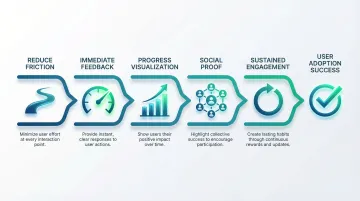
Simplicity and friction reduction
The most successful climate tech products eliminate unnecessary steps. ChargePoint's single-tap charging feature helped them reach 1 million quarterly active drivers by removing the steps between intention and action. The fewer decisions a user has to make, the more likely they are to complete the intended behavior.
Immediate feedback and progress visualization
Users need to see the impact of their sustainable choices in real time. Energy monitoring platforms like Sense provide device-level visualization and carbon intensity forecasts, helping users time energy consumption for cleaner grid periods. Visible feedback closes the loop between action and outcome.
Social proof and comparison
Behavioral research shows that social comparison drives stronger behavior change than information alone. Successful sustainability apps include peer benchmarking and community features to tap into this social dynamic, making sustainable behavior feel normal rather than exceptional.
Examples of well-designed sustainability products
| Product | Key UX features | Adoption metrics |
|---|---|---|
| ChargePoint | Single-tap charging, clear station identification, speed filtering | 1M+ quarterly active drivers; 36% of public ports in North America |
| Octopus Electroverse | Map filtering, in-app charging initiation, battery-integrated route planning | Growing network; app-integrated EV charging across multiple European markets |
| Sense | Real-time device-level energy visualization, carbon intensity forecasts | Partnered with utilities; targeting millions of homes by 2030 |
| Sweep | Centralized value chain emissions data, automated compliance reporting | Enterprise-grade carbon management platform serving sustainability teams across Europe and North America |
These examples share common principles: low-friction workflows, iteration based on real user feedback, and fast prototyping cycles that test assumptions before they become expensive problems. When you apply these principles, you'll see measurably higher adoption rates — and adoption rates are exactly what enterprise buyers want to see before committing to a full deployment.
Mobile-first design for sustainability
If your climate tech product relies on mobile for engagement, current usage data should directly inform your UX priorities. According to a ChargeDevs study on EV app engagement, 79% of Tesla drivers and 32% of non-Tesla drivers use vehicle apps every time they drive. Yet 54% of non-Tesla drivers have never used their app to pay for charging, which points to a significant gap between app availability and actual utility.
In markets with high smartphone penetration, energy apps provide a practical channel for behavioral intervention, offering feedback and efficiency guidance at scale without requiring additional hardware. That 54% gap between app availability and active use isn't just an engagement problem — it's a revenue gap and a barrier to demonstrating the commercial traction that investors and enterprise partners want to see before scaling up.
Accessibility: reaching beyond early adopters
Your climate solution must work for diverse audiences, not just tech-savvy enthusiasts. The accumulation of smart features, settings, and apps creates confusion for non-specialist users, leading to distrust and avoidance.
Accessible design, including WCAG compliance, clear information hierarchy, and simplified workflows, ensures sustainable technologies reach the broad adoption necessary for meaningful climate impact. If your product only works well for users who already understand the technology, your adoption ceiling is low by design — and so is the addressable market you can credibly present to enterprise buyers evaluating deployment at scale. A building energy management tool that reduced its onboarding from seven steps to two increased active usage among non-technical facility managers from under 20% to over 60% — the kind of broad adoption story that turns a pilot into a procurement commitment.
Data visualization and communication design for complex climate solutions
Climate data is inherently complex, and the gap between a dataset that gets used and one that gets ignored often comes down to how it's presented. Poor visualization renders valuable information unusable. Effective visualization makes it actionable. For enterprise buyers evaluating your platform, the visualization layer is often what determines whether your data becomes useful inside their organization — and useful data is what gets budgets approved.
Principles of effective climate data visualization
Key principles include:
Hierarchy and context: Data must be organized to highlight what matters most. The IPCC Interactive Atlas allows users to explore global and regional climate projections with clear hierarchy, helping policymakers understand scenarios without being overwhelmed by the underlying dataset.
Uncertainty communication: Scientific integrity requires depicting uncertainty accurately. Effective visualizations show ranges of possible outcomes rather than false precision, helping stakeholders make informed decisions despite inherent unpredictability.
Comparison and narrative: Data becomes meaningful through comparison. Our World in Data uses interactive charts to show climate metrics over time, making long-term trends comprehensible to broad audiences who don't have a background in climate science.
Examples of excellent climate data visualization
Leading climate platforms demonstrate how thoughtful design drives understanding and action. Climate TRACE uses satellite imagery and AI to track emissions from over 745 million sources, making pollution plumes visible and holding emitters accountable through transparent data. Interactive dashboards take a similar approach, transforming abstract metrics into engaging experiences through progress visualization and social proof to maintain user engagement with sustainability metrics. For your enterprise buyers, this is the layer that makes your data actionable inside their organization — and actionable data is what closes deals.
User testing is mandatory
Even well-intentioned design choices require validation. Research shows that "preferences for a particular visualization approach do not always align with the approaches that achieve greatest accuracy in interpretation".
Testing visualizations with actual users reveals where interpretation breaks down. What feels intuitive to a climate scientist often fails with a policy generalist or an enterprise procurement manager. Validating before deploying is not optional.

Website and digital experience design for green organizations
If your website is the first place a prospective investor or enterprise buyer lands, it has one job: make your value clear before they lose patience. For climate tech companies, that window is short, and the credibility threshold is high.
Key elements of effective climate tech websites
Effective climate tech websites balance technical depth with accessible communication. The elements that separate ones that convert from ones that create confusion:
Clear value propositions
Visitors need to understand what you do and why it matters within a few seconds of landing. Moving beyond generic sustainability claims toward specific, quantifiable benefits is the difference between a bounce and a conversation. If your homepage leads with your technology's mechanism rather than the problem it solves, you're writing for yourself.
Compelling storytelling
Technical innovation needs narrative context. The strongest sites weave founder stories, technology explanations, and impact metrics into narratives that connect emotionally while maintaining scientific credibility. The goal is not to simplify the science; it's to make the business case legible.
Transparent impact metrics
Credibility demands evidence. Display concrete data, tons of CO2 captured, megawatts generated, partnerships secured, to build trust with skeptical stakeholders. Vague commitments don't move investors or enterprise buyers. Specific, verifiable numbers do.
Intuitive navigation
Complex technologies demand clear information architecture. Your site must serve multiple audiences simultaneously: investors seeking financial data, engineers evaluating technical specifications, customers comparing solutions. Without logical, accessible navigation, each of those audiences hits a dead end at a different point.
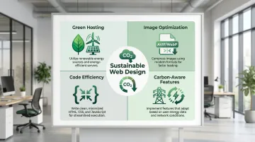
Website performance and environmental alignment
Digital presence has a measurable environmental cost. Mobile page weight increased 594% between 2011 and 2022, directly increasing energy required for data transfer.
A desktop web page in the 90th percentile of size emitted 1.47g of CO2e per view in 2024. Yet only 12% of global websites use green hosting, despite widespread availability of renewable options.
For climate tech companies, this gap is a practical inconsistency that skeptical investors and buyers will notice.
Best practices for sustainable web design:
- Switch to green hosting powered by renewable energy
- Optimize images using modern formats (AVIF, WebP) and responsive sizing
- Minimize code bloat by removing unused CSS and JavaScript
- Implement carbon-aware features that serve lighter versions during high fossil fuel grid periods
When your site runs on renewable energy and minimizes unnecessary data transfer, it becomes a visible demonstration of alignment between what you say and how you operate.
Conversion-focused design
Beyond communication and sustainability alignment, your website needs to drive specific business outcomes.
Effective climate tech sites guide visitors toward concrete next steps — newsletter signups for ongoing engagement, demo requests from qualified prospects, partnership inquiries from strategic collaborators, and pilot program applications from early adopters.
Strategic placement of calls-to-action, combined with content that matches what each audience actually needs, converts interest into a demo request, a pilot inquiry, or a partnership conversation. A carbon accounting startup that restructured its website to route enterprise visitors to a compliance-focused landing page with a direct 'Request a demo' CTA saw its enterprise demo request rate double within 60 days of relaunch.
Closing the gap between where you are and where you need to be
Climate tech companies we've worked with, including Susteon (carbon capture), HYDGEN (hydrogen energy), and LabStart (a climate venture studio), often arrive at the same inflection point: the technology is proven, the funding is in, and the commercial push is underway. But the brand and digital presence haven't kept pace with where the company actually is.
The work is not cosmetic. It's about making your credibility readable quickly, for the investor reviewing your deck, the enterprise buyer evaluating your website, and the partner deciding whether you're worth the risk of a pilot. What if Design works with climate and deep-tech companies at exactly this stage — building brand identities that communicate technical credibility and market readiness, and digital presences that do the commercial heavy lifting before the first conversation.
If your digital presence hasn't evolved since your last raise, it's worth assessing the signal it's currently sending.
Frequently asked questions
What is green renewable energy design?
Green renewable energy design applies visual design, UX, and communication strategies to make renewable energy solutions accessible and understandable. This includes designing solar management interfaces, creating brand identities for wind companies, and visualizing complex energy data to drive adoption.
What are green renewable energy solutions?
Green renewable energy solutions include solar photovoltaic systems, wind power, hydropower, bioenergy, and geothermal energy. Design makes these technologies user-friendly through intuitive interfaces, clear pricing structures, and accessible monitoring systems.
How does design contribute to sustainability outcomes?
Design reduces friction in sustainable choices, visualizes complex climate data clearly, builds trust through authentic branding, and makes sustainable behaviors the default option. It transforms sustainability from aspiration into practical action.
Why do climate tech companies need strong brand design?
You're operating in a market where greenwashing skepticism is widespread and differentiation is hard to establish. Strong brand design builds investor credibility, communicates your mission to stakeholders, and signals the maturity needed for partnerships and regulatory approval.
What makes a digital product "sustainable" from a design perspective?
Sustainable digital products use energy-efficient code, accessible interfaces, behavior change principles, and minimized data transfer. They incorporate carbon-aware functionality that adapts based on grid energy sources.
How can design help combat greenwashing perceptions?
Authentic visual identity that avoids eco-clichés, transparent communication with evidence-based claims, and data visualization showing measurable impact all build credibility. Design makes sustainability claims specific, verifiable, and grounded in real outcomes rather than aspirational language.