The business impact of B2B SaaS UX design
Your carbon accounting platform passed the pilot. Your grid analytics tool is closing deals. But users are taking three weeks to reach the core workflow your product was built around, and your support queue is filling up with questions that your onboarding should have answered.
This is one of the most common gaps in climate and energy software products: the technology works, but the product experience hasn't scaled to match it. Onboarding was built fast, during an early sprint, and never revisited. Feature adoption is lagging well behind feature development. The result shows up in churn, in extended implementation timelines, and in support costs that compound every quarter.
According to recent industry research, firms prioritizing enterprise UX see adoption rates increase by 25% and onboarding time reduced by nearly one-third. For climate tech and energy software companies selling to utilities, enterprise buyers, or procurement-heavy organizations, those numbers translate directly into shorter sales cycles and fewer implementation failures.
This guide covers the core UX design principles, patterns, and measurement strategies that matter most for B2B SaaS products, with particular attention to the complexity and multi-stakeholder dynamics common in climate and energy software.
TLDR: key takeaways
- Intuitive B2B SaaS UX cuts onboarding time by 60% and support requests by 50%
- Strategic UX investment delivers measurable ROI, with Forrester documenting 451% returns over three years for enterprise organizations
- Effective B2B design balances power and simplicity through role-based interfaces and progressive disclosure
- Feature bloat is primarily a discoverability problem, not a development problem. Most enterprise features go unused because users don't know they exist or don't understand their purpose
Why B2B SaaS UX design matters for business success
Business outcomes driven by UX
Superior UX in B2B SaaS is less about how a product looks and more about whether users can reach productive workflows without friction. That difference translates directly into financial outcomes that show up on the balance sheet.
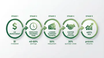
Intuitive interfaces reduce onboarding and training time by 40% to 60%, allowing users to focus on productive work rather than learning how to navigate the software. One Zendesk analysis showed a 50% reduction in support requests when platforms simplified navigation and task flows.
A Forrester Total Economic Impact study found that investing in digital experience intelligence delivered 451% ROI over three years for an enterprise organization. General Electric's unified software UX initiative generated a 100% productivity gain in development teams and saved an estimated $30 million in the first year after launch.
Strong UX delivers these kinds of business outcomes: training costs decrease when interfaces are clear enough that users don't need extensive hand-holding; support ticket volume drops when users can complete tasks without asking for help; and sales cycles shorten when prospects immediately understand product value during demos, without a 45-minute walkthrough to get there.
For climate tech SaaS companies in particular, where sales cycles already run long and early customer relationships are critical to expansion, reducing implementation friction is not a nice-to-have.
User adoption and engagement
B2B products frequently fail when users cannot discover or understand existing features, regardless of how much functionality sits behind the interface. In enterprise software, a large share of built features go unused — not because they're unwanted, but because they're undiscoverable. Poor onboarding and weak in-app guidance are usually the culprit.
A B2B SaaS company working with JourneyTrack redesigned their onboarding experience based on user journey insights. The results were concrete: a 27% improvement in early-stage activation and a 21% reduction in churn within the first 90 days. HubSpot's major UX iteration, involving extensive user feedback and testing, resulted in conversion rates doubling, and tripling in some areas.
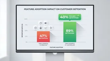
When users can quickly understand and adopt features, engagement follows. Users who adopt at least 3 core features during onboarding have 40% higher retention rates, demonstrating that effective UX influences long-term customer success in measurable ways.
Competitive differentiation
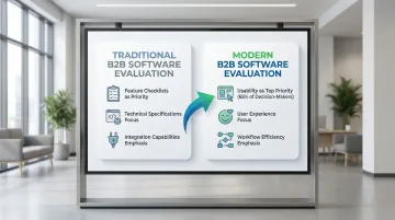
In crowded B2B markets where feature parity exists across competitors, superior UX becomes the deciding factor. Decision-makers increasingly evaluate software based on user experience rather than feature checklists. When two platforms offer similar capabilities, the one with the clearer, faster experience tends to win.
Bank of America's UX redesign of an online enrollment application nearly doubled the yield metric — the percentage of customers completing the process — the week it went live. This wasn't about adding features; it was about removing friction from an existing workflow that users were already motivated to complete.
First impressions carry significant weight in B2B sales. Users form judgments within 50 milliseconds, and 94% of customers' first impressions are design-related. A confusing interface during a product demo can remove your solution from consideration before prospects have explored any of its actual functionality.
ROI of strategic UX investment
The costs of poor UX compound over time. Failed implementations, user resistance, and the expense of retrofitting design after launch consistently exceed what it would have cost to build UX into the product from the start. For climate tech SaaS companies with long sales cycles and implementation-heavy deployments, a poor product experience doesn't just frustrate users — it creates delays that can extend timelines by months and strain the early customer relationships that matter most for growth.
Strategic UX investment pays dividends throughout the product lifecycle. Every dollar invested in UX yields returns between $2 and $100, depending on the context and implementation quality. That range reflects reduced support costs, faster sales cycles, higher retention, and increased user productivity compounding over time.
While UX improvements can deliver quick wins — like the Bank of America example showing immediate conversion gains — the full return develops over quarters and years as reduced churn, increased expansion revenue, and lower customer acquisition costs accumulate.
Core principles of effective B2B SaaS UX design
Role-based and contextual design
B2B products serve diverse personas simultaneously: end users focused on daily tasks, administrators managing configurations, and executives monitoring business metrics. Each role requires different information, different levels of functionality, and a different interface complexity.
In climate tech SaaS, this complexity is amplified. An ESG reporting platform might serve a sustainability analyst running emissions data pulls, a CFO reviewing board-level summaries, and an IT administrator managing API integrations with third-party systems. A carbon accounting tool sold to a manufacturing enterprise may need to address procurement, operations, and finance — each with a different frame for what value looks like. A CFO needs high-level financial health views, while a data analyst needs drill-down access to patterns and anomalies. Showing them an identical interface ensures neither gets what they actually need, which is why role-based design — presenting features and information relative to who is using them — is the more functional default for complex products.
HubSpot demonstrates this approach: buyers and leaders see high-level ROI dashboards, daily users (marketers and sales teams) get task-driven interfaces, and admins access a separate layer for permissions and configuration.
Key implementation strategies include adaptive dashboards that surface role-specific KPIs rather than a universal view, progressive navigation that reveals advanced features only to users who need them, customizable views that let users tailor interfaces to their actual workflows, and contextual help that provides guidance based on role and current task — not generic tooltips.
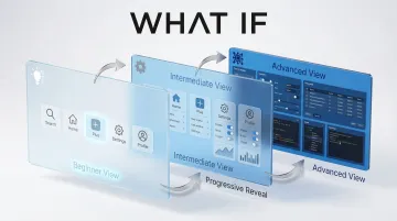
Progressive disclosure and complexity management
Progressive disclosure reveals complexity gradually as users need it, rather than presenting the full surface area of the product upfront.
The approach reduces cognitive load by showing only essential information initially, with advanced options accessible when required. This matters particularly in climate and energy software, where the underlying system complexity — API connections, data schema configurations, emissions calculation methodologies — is real, but most users don't need to interact with it directly.
Progressive disclosure techniques:
- Layered interfaces with beginner, intermediate, and advanced modes that users can move through at their own pace
- Smart defaults that handle the most common 80% of use cases automatically
- Advanced settings behind clearly labeled sections, accessible but not intrusive
- Contextual help that expands only when users need guidance, and stays out of the way when they don't
- Collapsible panels to hide secondary information until it becomes relevant
Consistency and design systems
Consistency is critical in B2B products where users perform repetitive tasks and need to build reliable muscle memory. When buttons, navigation patterns, and interaction models remain consistent across features, users work faster and make fewer errors — which in compliance-sensitive contexts like emissions reporting or grid monitoring, matters more than it does in consumer software.
Design systems maintain this consistency across features, teams, and product evolution. They establish component libraries, interaction patterns, and visual language standards that ensure every part of the product feels cohesive — and that new features added six months from now don't introduce unexpected inconsistencies.
Design system essentials:
- Reusable component libraries for buttons, forms, navigation, and data displays
- Documented interaction patterns for common tasks (filtering, sorting, bulk actions)
- Visual language standards for color, typography, spacing, and iconography
- Living style guides that evolve with the product rather than becoming stale artifacts
- Accessibility compliance (WCAG) across all components
Data visualization and information hierarchy
B2B users need to process complex data quickly to make business decisions. Effective dashboards prioritize information, use appropriate chart types, surface actionable insights, and avoid visual overload.
In climate and energy software, dashboard design carries additional weight. ESG platforms need to surface emissions data in a way that satisfies both operational users and executive reporting requirements. Grid analytics tools must present real-time and historical energy data without overwhelming users who are making time-sensitive decisions. The principles are the same as any B2B dashboard — prioritize what matters, reduce visual noise, enable drill-down — but the stakes of getting it wrong are higher when the data informs compliance reporting or infrastructure decisions.
High-value metrics should appear top-left to bottom-right, following standard scanning patterns. Shopify places high-impact metrics front and center to avoid unnecessary scrolling, ensuring users immediately see critical business information.
Information hierarchy principles:
- KPIs prominently placed at the top of dashboards
- Appropriate chart types (line charts for trends, bar charts for comparisons, pie charts used sparingly)
- Drill-down capabilities from summary to detail views
- Filtering and customization for different analysis needs
- Export functionality for further analysis or compliance reporting
Feedback, status, and transparency
B2B workflows involve long-running processes, integrations, and critical business operations that require clear system feedback. Users need to know when actions succeed, when processes are running, and when errors occur — especially in products where a failed data sync or a stalled calculation has downstream consequences.
For wait times under 10 seconds, skeleton screens reduce the perception of loading time by providing structural cues about the final page layout. For delays of 10 seconds or more, progress bars are essential. Dynamic progress indicators meaningfully improve user patience during long wait times.
System feedback guidelines:
- Skeleton screens for short loading times (under 10 seconds)
- Progress bars with percent-done indicators for longer processes
- Clear, actionable error messages explaining what went wrong and how to resolve it — not generic error codes
- System status indicators for background processes and integrations
- Success confirmations with subtle, non-intrusive notifications
Key design patterns for B2B SaaS products
Onboarding and time-to-value
B2B onboarding must balance thorough setup with early wins that demonstrate value before users lose momentum or escalate to support.
Enterprise SaaS products with assisted onboarding see completion rates of 70-90%, compared to 40-60% for general B2B SaaS. Intercom's Product Tours feature achieved a 64% engagement rate during beta testing, with a 6x to 7x improvement over email and in-app messages, demonstrating the value of interactive, in-context onboarding.
Effective onboarding spreads configuration across multiple sessions rather than front-loading everything on day one. Interactive walkthroughs that guide users through core workflows — with contextual tips at the point of action, not buried in a help center — significantly reduce time-to-productivity. Empty state design matters here too: clear next-action suggestions when a user first accesses a feature can eliminate the blank-screen confusion that drives early churn. Quick win tasks let users experience the product's core value within the first session. And role-specific onboarding paths are especially important in climate SaaS, where a sustainability analyst and a CFO have fundamentally different reasons for logging in.
Navigation and information architecture
B2B navigation faces real pressure: deep feature sets, multiple workflows, and the need for fast access to frequently used functions. Getting the structure wrong means users default to support tickets instead of self-service.
Common navigation patterns and when to use them:
- Sidebar navigation: Works well for products with 5-15 main sections and clear hierarchies — a reliable default for most climate SaaS products
- Command palettes: Suited to power users who know what they want and prefer keyboard-driven workflows
- Breadcrumbs: Essential for deep hierarchies to show location and enable quick backtracking without losing context
- Search-first approaches: Useful when feature sets are large and users approach the product with diverse, specific goals
Intercom redesigned its information architecture to balance simplicity with depth, using progressive disclosure to make features discoverable without overwhelming users.
Dashboards and reporting interfaces
Dashboards often serve as the primary interface in B2B SaaS, requiring careful design to surface what users actually need to act on. The challenge is balancing executive-level overviews with analyst-level detailed views without building two separate products.
Dashboard design should offer customization options so users can prioritize the metrics that matter for their role, with drill-down capabilities from summary metrics to underlying data. Robust filtering to analyze specific segments, time periods, or conditions is expected in any enterprise context. Export functionality enables sharing and further analysis outside the platform. And consistent chart types and color coding across the platform mean users don't have to relearn the visual language every time they navigate to a new section.
Collaboration and multi-user features
B2B products increasingly support team collaboration, permissions, and workflow handoffs. Users need to communicate, share context, and coordinate actions within the platform rather than resorting to email threads and spreadsheets on the side.
Effective collaboration UX typically includes commenting systems with @mentions for in-context communication, activity feeds that surface recent changes and team actions, and version control with audit trails — particularly important in compliance-sensitive workflows. Approval processes need clear status indicators so users can see where a request sits without having to ask. Permissions management should be intuitive enough for admins to configure independently, without a support call each time the org structure changes.
Successful collaboration tools prioritize simplicity, making it easy for users to organize tasks and communicate without adding a layer of process overhead on top of the work itself.
Settings, configuration, and admin interfaces
Admin and settings areas are consistently underprioritized, yet they are often the first place an implementation stalls. In climate and energy software, this problem is acute because implementations involve complex data integrations — API connections to utility meters, carbon registries, or emissions databases. Poor admin UX in these contexts doesn't just slow adoption; it can create compliance risk or data errors that undermine the product's core value proposition.
Settings should be organized by category or workflow rather than alphabetically — users come with a task, not a letter. Preview modes let admins see changes before applying them, which matters most in complex data environments where a misconfigured API connection can corrupt downstream emissions calculations. Validation that catches configuration errors before they propagate is essential. Bulk operations save significant time when managing large user sets, and templates or presets for common configuration scenarios mean new implementations don't start from a blank slate.
Common B2B SaaS UX design challenges and solutions
Feature bloat and complexity creep
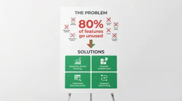
B2B products accumulate features over time to satisfy diverse customer requests. In climate and energy software, this pressure is especially high. Products are often first-of-a-kind, meaning the feature roadmap is shaped by a small number of early pilot customers whose needs may not represent the broader market. The result is an interface that serves edge cases well but confuses the majority of users.
Research shows 80% of features in enterprise software go unused, representing substantial wasted investment and opportunity cost.
Addressing feature bloat starts with analytics — understanding which features are actually being used, and which are collecting dust. Modular architecture helps by letting users activate only the features relevant to their workflow rather than loading the full interface on every session. Disciplined roadmapping should prioritize core use cases over edge cases that serve a single customer. Regularly auditing feature usage can surface valuable but buried capabilities worth promoting. And onboarding design can do more work here than most teams realize: surfacing the right features for the right role during onboarding can turn low-adoption capabilities into regular parts of the workflow.
The underlying issue is usually discoverability. Users often can't find valuable features or don't understand what they're for. Improving that through better onboarding and in-app guidance can turn low-adoption features into regular parts of the workflow.
Balancing power users vs. beginners
B2B products must serve both advanced users who want keyboard shortcuts and streamlined workflows, and new users who need clear labels, tooltips, and step-by-step guidance. Designing for one group at the expense of the other creates friction for half your user base.
Serving both audiences comes down to layering rather than choosing. Customizable interfaces let users show or hide features based on their proficiency level, and adaptive UI can gradually reveal advanced capabilities as users demonstrate they're ready for them. Neither keyboard-driven power-user workflows nor mouse-driven beginner flows should penalize the other — both should coexist. Progressive disclosure keeps the default interface clean, with clear paths into advanced functionality for those who need it. For help content specifically, newer users benefit from contextual guidance that experienced users can dismiss permanently.
Multi-stakeholder design requirements
B2B purchases involve multiple decision-makers — buyers, end users, IT administrators, and executives — each evaluating the product through a different lens with different success criteria.
Buyers care about ROI and cost. End users care about whether the product makes their daily work easier or harder. Admins need security and control. Executives need reporting that connects product activity to business outcomes.
The key to serving diverse stakeholders without building separate products is intelligent role segmentation. Role-specific views surface relevant information for each stakeholder type without requiring navigation through irrelevant screens. Executive reporting needs to satisfy oversight requirements without cluttering operational workflows, and admin controls should give IT the security and compliance features they require while remaining invisible to end users. Demo and trial experiences matter too — a CFO evaluating a carbon accounting tool should see board-level reporting, not emissions data configuration screens.

Implementing strategic UX design in your B2B SaaS product
Building UX into your product development process
Integrating UX research and design early in product development — not as a post-launch cleanup effort — prevents costly redesigns and ensures the product actually maps to how users work.
Over 40% of companies still don't talk to end users during development, despite the consistent evidence that user-centric products outperform those built on internal assumptions alone.
In practice, this means conducting user testing throughout development — not just at launch when it's too late to change the structure. Design sprints help rapidly prototype and validate concepts before engineering time is committed. Cross-functional collaboration between designers, developers, and product managers ensures UX decisions don't get quietly overridden in implementation. Early validation with actual users catches wrong assumptions before they're built in. And establishing design systems upfront maintains consistency as the product scales and new contributors come on board.
When to partner with a UX design agency
External UX expertise is worth considering when your in-house design resources are stretched, when you need a perspective that isn't shaped by years of internal assumptions, when the product requires specialized domain knowledge, or when a critical product phase demands faster iteration than your current team can sustain.
When evaluating a design partner, look for a portfolio that demonstrates experience with products at a comparable level of complexity — not just visual polish. The approach should connect design decisions to specific business outcomes, not just deliverables. A genuine understanding of your users' world matters: the workflows, the vocabulary, the constraints. Look for a working process that integrates with your team rather than one that disappears for six weeks and returns with a deck. And prioritize domain familiarity with your industry, so you're not spending the first month explaining what your product does.
For climate tech and energy software companies, specialized domain knowledge matters more than most clients expect. A design partner who already understands how carbon registries work, what utility procurement teams care about, or how ESG data flows through an enterprise system requires significantly less onboarding before contributing meaningfully. What if Design works specifically with climate and deep-tech startups to close the gap between technically sophisticated products and the product experiences needed to drive adoption across complex organizations. You can see examples of that work at whatifdesign.co.
Measuring UX success and iterating
Key metrics for B2B SaaS UX include task completion rates, time-to-value, feature adoption, user satisfaction scores (NPS, SUS), and support ticket trends. These metrics provide concrete, trackable evidence of UX impact on business outcomes.
Track these core indicators:
- Task success rate: Percentage of users completing core workflows (a reasonable benchmark is approximately 78%)
- Time-to-value: How quickly new users reach productive use — for climate SaaS, this often means time to first meaningful data output
- Feature adoption: Percentage of users engaging with key features within defined timeframes after onboarding
- User satisfaction: NPS and SUS scores that indicate overall product experience quality
- Support indicators: Ticket volume and category, which reveal where users are consistently getting stuck
Products that treat UX as an ongoing investment — iterating based on usage data and user interviews — consistently outperform products where design was a one-time launch activity. The compounding effect shows up in support ticket trends, feature adoption curves, and renewal rates over time.
If your product experience was built for an earlier version of your user base, or designed quickly during a growth sprint and never revisited, it may be creating more friction than you realize. A focused UX audit can surface where users are dropping off, which features are being adopted, and where onboarding is losing people before they reach value.
Connect with us to start that conversation.
Frequently asked questions
What is UI/UX design for B2B SaaS?
B2B SaaS UI/UX design creates interfaces for business software delivered via the cloud. It emphasizes workflow efficiency, role-based needs, and business outcomes like productivity gains and ROI rather than just individual user satisfaction.
What is the 80/20 rule in UI/UX design for B2B SaaS?
The 80/20 rule suggests that 80% of users typically use only 20% of features. Designers should prioritize making core workflows exceptional rather than giving equal weight to all features, focusing resources where they will drive the greatest user success.
What is the 60/30/10 rule in UI/UX design for B2B SaaS?
This color theory principle recommends 60% dominant color (neutral backgrounds), 30% secondary color (sidebars and supporting elements), and 10% accent color (calls-to-action). This creates visual hierarchy and guides user attention without overwhelming the interface.
What is the 6/3/1 rule in UI/UX design for B2B SaaS?
This information hierarchy principle suggests presenting 6 pieces of primary information, 3 secondary pieces, and 1 call-to-action per screen. This prevents cognitive overload and creates clear paths to action for users navigating complex workflows.