
Why B2B website UX design requires a different approach
You've raised your seed round. You have a working pilot. You're in conversations with enterprise buyers and utility partners who move slowly and scrutinize everything. And then a prospect visits your website and can't find your technical specifications without filling out a form.
That friction isn't a minor inconvenience. For climate and deep-tech startups navigating 12- to 24-month sales cycles, every point of website confusion adds time to a process that's already long. 61% of the B2B buying journey happens before a prospect ever contacts sales, which means your website is often doing the work of your entire sales team during the most critical evaluation phase.
The problem for most technical founders isn't that they don't understand their technology. It's that the website reflects how they think about the product rather than how a procurement director, utility executive, or infrastructure investor evaluates it. Those audiences need different things: one wants ROI data and integration specs, another wants to understand commercial viability in under 30 seconds.
This guide breaks down the B2B UX design strategies that actually move the needle for companies selling complex technologies into risk-averse industries.
TLDR: Key takeaways
- Climate tech and deep-tech sales cycles run 12-24 months; your website needs to hold buyer attention across multiple return visits by different stakeholders
- Design for the full buying committee, not just the technical evaluator: procurement, finance, and executive roles all need a clear path to the information they care about
- 70% of LinkedIn users access the platform via mobile, and professional research now happens on phones as much as desktops
- Measure UX improvements against lead quality and sales cycle length, not just page views
Why B2B website UX matters more than ever
The business impact of poor B2B UX
The data on poor B2B UX is consistent, and for companies with long sales cycles, the stakes are higher than average:
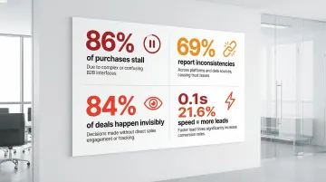
- 86% of B2B purchases stall during the buying process due to decision complexity and inadequate vendor information. In industries like grid modernization or carbon capture, where buyers are already cautious, adding navigation friction to that equation accelerates stalls
- 69% of buyers report inconsistencies between website content and sales rep communications, which creates trust problems. For first-of-a-kind technologies, trust is already the primary purchase barrier
- 84% of B2B deals are decided before marketers are even aware of them, which means the website is often the entire evaluation experience for the first several months of a buying process
- A 0.1-second improvement in mobile load speed drives 21.6% more lead completions, and this effect compounds across the multiple return visits typical of complex B2B purchases
When prospects can't quickly find technical specifications, pricing details, or relevant case studies, they move to competitors.
The unique challenges of B2B user experience in technical markets
The average B2B purchase now involves 13 stakeholders across different departments. For climate and deep-tech companies, that buying committee typically spans at least three distinct audiences with fundamentally different information needs: technical evaluators assessing feasibility, executives evaluating commercial viability, and procurement teams working through compliance and integration requirements.
If you're like most technical founders, you've probably built your website for the first audience because that's the world you know best. The result is a site full of process diagrams and efficiency metrics that a procurement director from a 50-year-old manufacturing company can't parse in a 10-minute session.
B2B buyers use an average of 10 interaction channels across a non-linear journey, returning to the same pages multiple times as the deal progresses. For a carbon capture company selling to utility executives and grid operators simultaneously, that means a single website must work for a site reliability engineer running a feasibility check on Tuesday and a VP of Operations deciding whether to schedule a demo on Thursday.
Getting that balance right requires intentional architecture, not just good design instincts.
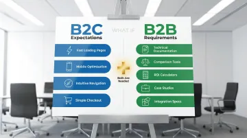
B2B buyers expect consumer-grade experiences but need B2B depth
61% of B2B buyers now prefer a rep-free buying experience, and 87% want self-service options for at least part of their evaluation journey. That preference extends to expectations around mobile optimization, page speed, and navigability that mirror what buyers experience on consumer sites.
But your site can't sacrifice functionality for simplicity. Unlike consumer purchases, B2B evaluations require comprehensive technical documentation accessible without sales gatekeeping, comparison tools that help evaluate multiple solutions, ROI calculators and pricing transparency, case studies filtered by industry and use case, and integration specifications for existing enterprise systems.
The goal is delivering intuitive navigation while maintaining the depth and specialized content that your decision-makers need to move forward in their evaluation. Each of those requirements — the ROI calculator, the ungated technical docs, the case studies filtered by use case — is a checkpoint in your buyer's internal evaluation process. A buyer who can self-serve an ROI calculation is a buyer who can make the case to their CFO without waiting for a sales call.
Essential B2B UX design strategies for user engagement
Strategy 1: Design for multiple user personas and buying committee roles
The most common UX mistake you can make as a technical founder is building a website that answers questions you would ask, rather than questions your buyers would ask. An engineer evaluating your grid storage technology wants efficiency curves and integration specs. The VP of Operations approving the budget wants to understand what happens to their existing infrastructure. These are different content needs requiring different page architecture.
Create distinct content pathways for each role rather than forcing everyone through the same journey. Surface business value first on every page, then provide clear navigation to technical depth for those who need it. Progressive disclosure keeps the experience readable for executives while ensuring evaluators can access specifications without friction.
Consider what happens when you get this right: a grid storage startup restructures its homepage so commercial outcomes — capacity guarantees, deployment timelines, grid compliance — appear above the fold, with a single click to technical specifications for engineers. Non-technical buyers can now reach the demo request without parsing efficiency curves they're not equipped to evaluate, and VP-level discovery calls start arriving from contacts who would previously have bounced.
Avoid audience-based navigation labels like "For CEOs" or "For Engineers." Research from Nielsen Norman Group shows users often fail to self-identify correctly, which creates friction and uncertainty. Instead, organize navigation around tasks: "Evaluate the technology," "Calculate ROI," "View integration specs."
For climate and deep-tech companies, this matters particularly at the homepage level. Your core benefit should be clear within the first 10 seconds to a non-technical buyer, with an obvious next step toward the technical depth your evaluators need.
Strategy 2: Prioritize information architecture and intuitive navigation
B2B sites average a 58% task success rate compared to 66% for consumer sites. That 8-point gap represents a significant number of potential buyers who couldn't find what they were looking for and left. For a company selling into utilities or heavy industry, where a single deal might represent 18 months of pipeline, that failure rate is expensive.
The root cause is usually navigation built around how the company thinks about its own products, rather than how buyers search for solutions. A climate tech company selling both hardware and software might organize navigation by product category internally, while a procurement director arriving from LinkedIn is searching by application: "what does this replace?" and "does it work with our existing systems?"
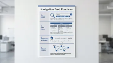
Several navigation patterns consistently improve findability in complex B2B contexts. Descriptive labels communicate content immediately without requiring interpretation — "Integration specifications" beats "Resources" every time. Robust search with filters for content type, application, and industry vertical helps buyers narrow to what's relevant. Mega menus show the full scope of a site at a glance for companies with multiple solutions. Breadcrumb navigation lets stakeholders returning mid-journey reorient quickly, and related content suggestions guide buyers through a logical research sequence.
For companies with multiple product lines, consider whether a single navigation system is serving all audiences well or whether separate entry points would reduce the cognitive load on each visitor. A company that reorganizes navigation from internal product categories to buyer-facing application outcomes often finds that discovery calls start at a later stage — buyers arrive having already answered their own basic questions, which shortens the sales cycle rather than just improving time-on-site metrics.
Strategy 3: Create self-service content hubs and resources
87% of B2B buyers want self-service options, but only 67% of vendors actually provide them. For climate and deep-tech companies, this gap is often even wider because most technical content lives behind sales conversations or in whitepapers that require a form fill to access.
The issue with excessive content gating in this context is specific: when a buyer from a large utility is evaluating your technology against an incumbent they've used for 15 years, asking them to provide their email address before accessing your integration documentation signals hesitation on your part. Buyers read it as a barrier to transparency.
Self-service content that builds trust at each stage of the buying journey includes technical specifications and integration documentation accessible without form fills, industry-specific case studies that show measurable outcomes rather than just testimonials, and honest comparison guides that address your solution's limitations alongside its strengths. Pricing information or calculators that help buyers build internal business cases, implementation timelines so buyers can plan realistically, and video demos for stakeholders who won't sit through a sales call all serve the same function: giving buyers what they need to move forward without requiring a sales conversation.
On gating strategy: Reserve form fills for genuinely high-value content like custom research or detailed ROI models. Ungated technical depth is what builds the credibility that eventually makes a buyer willing to engage with sales. A carbon capture company that ungates its process specs and integration documentation — alongside case studies with documented capture rates — can expect buyers to arrive at initial sales conversations already past the basic feasibility questions. That alone can compress weeks out of the early evaluation cycle.
Strategy 4: Optimize for technical content readability
If you write your website content the way you write grant applications or internal documentation — comprehensive, precise, structured for someone who already understands the domain — you're creating a significant readability barrier for the executives and procurement teams who will approve or block the deal.
The goal isn't to simplify your technology. It's to organize information so each type of reader can get what they need without wading through what they don't.
In practice, this means using H3 subheadings every 200-300 words so readers can navigate long technical pages, reserving bullet lists for specifications and feature comparisons where they genuinely aid scanning, and using white space between sections to signal topic shifts and reduce visual density. A clear hierarchy between primary claims (what the technology does) and supporting data (how it was validated) helps both audiences move through the page on their own terms.
Visuals carry specific weight in deep-tech contexts. A flowchart explaining how your carbon capture process integrates with an existing industrial facility will do more for an engineering evaluator than three paragraphs of description. Financial projection visualizations help executives make internal business cases. Annotated architecture diagrams answer integration questions before they become sales objections.
Lead each page with the most important information for the primary audience of that page, then layer in supporting technical detail for those who need it. Think about what this means at the procurement review stage: a VP of Operations at a utility lands on your solution page, finds commercial outcomes above the fold — capacity guarantees, deployment timelines, compatibility with existing infrastructure — then clicks through to the integration architecture diagram. They arrive at the demo request with enough context to sponsor the evaluation internally. That sequence only works if the page is structured for how they actually read, not how you wrote it.
Strategy 5: Design for trust and credibility
Professional design quality is a credibility signal in its own right. If you're selling a first-of-a-kind technology into a risk-averse industry, how your website looks and feels communicates something about your organization's maturity before a buyer reads a single word of content.
In B2B contexts where purchases involve significant investment and long-term operational commitment, credibility indicators matter at every stage.
Social proof that builds confidence: Display client logos from recognizable organizations early, before buyers have to scroll. Include testimonials with full names, titles, and company names — not anonymous quotes. Back these with case studies showing specific, measurable outcomes rather than general praise, and make your industry certifications and compliance credentials visible where evaluation happens.
Transparency elements that reduce purchase friction: Give buyers direct contact options, not just a contact form. Include team profiles that demonstrate relevant domain expertise. Communicate honestly about what your solution does and doesn't do — buyers who find limitations mid-deal are harder to recover than buyers who find them on your website. And wherever possible, support your claims with third-party validation from industry bodies, peer-reviewed research, or independent audits.
If you can showcase concrete traction — utility partnerships, completed pilots with documented results, or institutional backing — you'll reduce the buyer hesitation that comes with evaluating a new or unproven technology. Consider what a procurement director sees when evaluating two vendors: one has named enterprise clients, a pilot case study documenting a 23% efficiency gain, and transparent team profiles. The other has an impressive technology page but no verifiable traction. The first vendor gets the next meeting, regardless of which technology is objectively stronger.
Strategy 6: Implement mobile-first B2B design
The assumption that B2B buyers only research on desktop no longer holds. Approximately 70% of LinkedIn users access the platform via mobile, and the initial stages of B2B research increasingly happen on phones during commutes, between meetings, and while at industry events.
If your early awareness is coming through conference networking and LinkedIn content — as it does for most climate and deep-tech companies at your stage — this matters more than it would for traditional enterprise software.
Mobile optimization requirements:
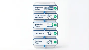
- Responsive design that preserves full functionality across device types
- Touch-friendly navigation with tap targets at minimum 24x24 CSS pixels
- Simplified forms with autofill support and minimal required fields
- Click-to-call options for buyers ready to start a conversation
- Load times under 3 seconds on mobile networks
Mobile experiences should support quick content consumption through short videos, scannable bullet points, and summary information, while making it straightforward for buyers to move to desktop when they're ready for technical deep-dives. That first mobile impression often happens at an industry conference or after a LinkedIn post — a context where a buyer decides in 30 seconds whether your company is worth following up. A site that loads slowly or buries key information behind unclear mobile navigation means that buyer never becomes a prospect.
B2B UX best practices checklist
User research and testing
The single most reliable way to improve B2B UX is to watch actual buyers try to use your site. What you'll typically discover is that the information you thought was clear is either missing, buried, or framed in terms that only make sense to someone already familiar with your technology.
Research activities that surface these gaps effectively start with usability testing that includes representatives from each buying committee role — not just technical evaluators. Task-based testing, where you ask participants to find specific information and measure where they get stuck, reveals friction that analytics alone won't show. Session recordings and heatmaps identify where visitors stop scrolling or repeatedly click on non-interactive elements. Post-purchase interviews with converted customers often surface the most valuable insight: what information actually mattered during their evaluation, which is rarely what founders assumed.
In a typical testing session with a utility procurement representative, you might find them spending five minutes searching for a compliance certification that's buried in a PDF on your resources page — information that could have answered their vendor qualification question and moved the evaluation forward. That single finding is often worth more than weeks of analytics data.
Including utility buyers, infrastructure operators, or enterprise procurement representatives in your testing is particularly valuable because their information needs are often less obvious than those of technical evaluators.
Performance and accessibility
Page speed has a direct, documented relationship with conversion. A 0.1-second improvement in load time drives measurable increases in form completion and reduces bounce rates. If a single completed form on your site might represent a six-figure opportunity, treat page speed as infrastructure work, not a polish item.
Compress images and use modern formats like WebP to reduce file size without quality loss, deploy a content delivery network to improve load speeds for geographically distributed buyer teams, implement lazy loading for below-the-fold content that isn't needed immediately, and minify CSS and JavaScript to reduce initial page load overhead.
WCAG 2.2 accessibility compliance addresses legal exposure and also improves usability for a broader range of buyers. Key implementation areas include sufficient color contrast for text on data visualizations, keyboard navigation support for buyers with motor impairments, proper focus indicators for screen reader users, and descriptive alt text for technical diagrams.
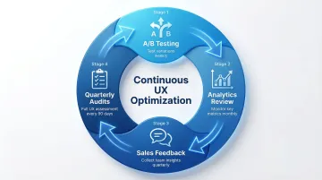
Continuous improvement
A website launch is a starting point, not a completion event. The most useful improvement signals for B2B tech websites come from actual buyer behavior, and that data only accumulates after the site is live.
Run A/B tests on your highest-traffic pages to validate whether changes actually improve completion rates. Pair that with regular analytics reviews focused on low-conversion pages where investment has the highest return. Close the loop with your sales team — the questions buyers ask on every discovery call are usually pointing to gaps on the website. Quarterly UX audits ensure the site still reflects your current positioning, messaging, and traction as the business evolves.
The most productive way to approach this is to treat your website UX as a standing operational process rather than a project with an end date. The clearest signal that it's working commercially: if your average time-to-demo-request shortens after a navigation change, or buyers arrive at calls asking better questions after you ungated your technical content, your UX is doing sales work.
Implementing B2B UX improvements: where to start
Audit your current B2B website experience
A structured UX audit identifies where your website is creating friction and gives you a prioritized list of what to fix. Before engaging an agency or committing internal resources to a redesign, run through these diagnostic questions. Can a buyer from a relevant industry find your key technical information in under three clicks? Is your core business outcome clear within five seconds of landing to someone unfamiliar with your technology? Does the site remain fully functional on a phone, including forms and technical documentation? Do pages load in under three seconds on a standard mobile connection? And can buyers access technical specifications and case study data without unnecessary barriers?
Use analytics to identify your highest-traffic, lowest-conversion pages. These are usually where the most significant UX problems are concentrated.
Your sales team will also surface gaps that analytics can't: the questions that come up on every discovery call are typically questions the website should already be answering.
Prioritize changes based on business impact
Once you've identified UX issues, focus resources on pages that sit directly in the path of buyer decisions.
Start with the homepage — it's both the first impression and the navigation hub for every buyer type. From there, prioritize key product and solution pages where evaluation decisions form, contact and demo request pages where conversion happens, and pricing or ROI calculator pages where internal business cases get made.
Quick wins like improving form usability, adding missing navigation links, or clarifying above-the-fold messaging typically deliver measurable results within a few weeks and don't require a full redesign commitment.
Comprehensive information architecture changes or new self-service tools take longer to build and deploy, but they create the structural foundation that short-term fixes can't.
Working with B2B UX design experts
A specialized design agency brings the ability to identify UX problems you've stopped seeing, because they're evaluating your site from the same outside perspective your buyers bring.
In your market, domain familiarity matters as much as design skill. An agency that understands how grid interconnection agreements work, or what a procurement director at a chemicals manufacturer needs to see before approving a vendor evaluation, can make architectural decisions that a generalist agency won't.
What if Design works with Seed to Series B climate and deep-tech startups on websites that serve complex buying committees across technical and non-technical audiences. Our process starts with stakeholder alignment on positioning and audience needs before any design work begins.
The practical value of bringing in external expertise comes down to a few things: objective evaluation without the accumulated assumptions that build up inside any organization, domain knowledge that reduces onboarding time, access to research methodologies and testing tools that aren't economical to maintain in-house, and faster execution through dedicated resources focused on a single project.
For most growth-stage companies, UX optimization projects run 4-8 weeks. Comprehensive website redesigns that include positioning strategy and content development typically take 10-14 weeks.
Frequently asked questions
How is B2B website UX different from B2C UX?
B2B UX serves multiple stakeholders with different information needs across a buying process that can span months. Unlike B2C transactions, a single B2B purchase typically involves technical evaluators, financial decision-makers, and procurement or compliance teams who all need to reach confidence independently. For your company specifically, the gap between what your founding team knows about the technology and what the average buyer understands creates an additional layer of UX complexity.
What are the most common B2B website UX mistakes?
The most common issues are unclear value propositions above the fold, content architecture built around internal product logic rather than buyer information needs, excessive form gating that blocks access to technical content, and no clear pathway for non-technical decision-makers. If you're a technical founder, over-indexing on technology depth at the expense of business outcome clarity is the most frequent pattern.
How do you measure B2B website UX success?
Track engagement metrics like time on site, page depth, and task completion rates alongside business outcomes including lead quality scores and sales cycle length. The most meaningful signal is whether qualified buyers are progressing further into the funnel before requiring sales intervention. If your sales cycle runs 12-24 months, connecting UX changes to pipeline velocity is more revealing than tracking form completions alone.
Should B2B websites prioritize aesthetics or functionality?
Both matter, but for different reasons. Visual design quality communicates organizational maturity and builds initial trust, which is particularly important when you're competing against established incumbents. Functionality determines whether buyers can actually accomplish what they came to do. The best B2B websites deliver both, rather than trading one off against the other.
How long does it take to improve B2B website UX?
Targeted fixes like form optimization, navigation corrections, or content restructuring can produce results in 2-4 weeks. Full website redesigns for mid-market companies typically take 10-14 weeks when they include positioning strategy and content development. Enterprise platforms with complex integrations and multiple product lines can run 4-6 months. Ongoing optimization should continue after launch.
Do B2B websites need to be mobile-optimized?
Yes. 70% of LinkedIn users access the platform via mobile, and B2B decision-makers increasingly do initial research on phones. For climate and deep-tech companies that generate awareness through conferences and industry events, mobile optimization matters particularly because those first impressions often happen on a phone. Google also weights mobile performance in search rankings, which affects visibility.