
Understanding UX metrics for website success
Your carbon accounting platform works. Users log in, they run reports, they have the data they need. But 40% of them never complete onboarding, and your support queue is filling up with the same questions every week. Feature adoption is lagging three releases behind development. Users aren't struggling because the product is bad. They're struggling because the experience hasn't been measured or improved with any consistency.
The problem isn't the technology. It's that you build fast and measure later — and in our experience working with these teams, "later" tends to keep getting pushed. Without a clear read on where users stall, backtrack, or abandon workflows, design decisions become guesswork, and guesswork is expensive when your sales cycles run six months or longer.
This guide breaks down the 12 UX metrics that give you an accurate picture of how your product is actually performing, how to track them, and how to connect them to the business outcomes your stakeholders care about.
TLDR:
- Without baselines, you can't tell whether a redesign helped or hurt, and climate tech product cycles are too long to afford that uncertainty
- Behavioral metrics track what users do; attitudinal metrics capture how they feel about doing it
- Task success rate, time on task, and error rate are the three behavioral metrics every product team should have before adding anything else
- NPS, CSAT, and SUS give you user sentiment in numbers you can track over time and present to stakeholders
- Pick 3-5 metrics that map directly to your current product goals, not a comprehensive dashboard that nobody reads
What are UX metrics?
UX metrics are measurable data points that evaluate how users interact with your website or digital product.
They translate subjective design quality into objective numbers that you can track, analyze, act upon, and present to buyers, investors, or enterprise procurement teams as evidence that your product works.
Two main categories
Quantitative behavioral metrics track what users actually do: the clicks, scrolls, and navigation paths they take; how often they complete tasks; how long those tasks take; and how frequently they make errors.
Qualitative attitudinal metrics measure how users feel — satisfaction ratings, loyalty indicators, perceived ease of use, and emotional responses to interactions.
Characteristics of effective UX metrics
Strong UX metrics share three essential qualities: they're timeframe-specific ("Task success rate increased 15% in Q1" beats "task success improved"), directly aligned with business objectives like revenue or retention, and tied to specific, observable user behaviors.
Why UX metrics matter for product success
Research consistently demonstrates that every dollar invested in UX returns $100, representing a 9,900% ROI. When you're building in climate tech or deep tech, where complex interfaces often present adoption barriers, measuring UX becomes even more critical.
Evidence-based progress tracking
UX metrics provide objective evidence to track progress toward design and business goals over time. Rather than waiting months into a sales cycle to discover that onboarding was the reason deals stalled, you can identify friction early and address it before it compounds into churn.
Problem identification
Metrics reveal specific friction points in the user journey that need improvement — high error rates on particular form fields, extended time on task for critical workflows, low feature adoption rates. Each of these signals points to a specific, addressable design problem rather than a vague sense that something isn't working. Consider a realistic scenario: your task success rate for a critical reporting workflow drops to 61% while support tickets on the same workflow increase by 25% in the same sprint. That combination tells you exactly where to look — and gives you a clear before/after measure once you've fixed it.
Stakeholder communication
When you're presenting to executives or investors, showing that optimizing design can increase conversion rates by 400% carries more weight than a designer's intuition about what's working. Concrete data removes the subjectivity from design conversations and shifts the discussion to impact.
Data-informed decisions
Beyond communication, metrics enable data-informed design decisions rather than relying solely on assumptions. A/B testing different navigation structures or button placements becomes meaningful when measured against task success rates or conversion metrics. If you test two versions of a report generation flow and one lifts task success from 71% to 88%, you can take that directly into a product review with your enterprise customer as evidence the product is measurably improving.
Mission alignment
For your climate tech product, UX metrics help ensure it successfully serves its purpose.
If your carbon tracking app has low retention rates or high abandonment, it fails to drive the sustained behavior change necessary for environmental impact, no matter how strong the underlying science is.
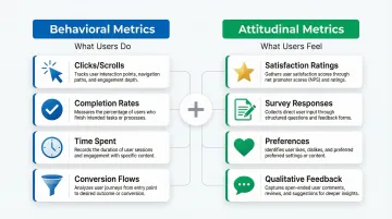
The difference between behavioral and attitudinal metrics
Understanding the distinction between behavioral and attitudinal metrics is essential to complete UX measurement. Each type reveals different aspects of user experience:
Behavioral metrics track what users actually do — observable actions like clicks, scrolls, and navigation paths; quantifiable behaviors like time spent and completion rates; objective evidence of how people interact with your product.
Attitudinal metrics capture what users think and feel: perceptions and satisfaction measured through surveys, qualitative feedback that reveals motivations behind actions, and preferences that behavioral data alone cannot explain.
The most effective measurement strategies combine both types. For example, behavioral metrics might show users abandoning an emissions report halfway through, while attitudinal metrics reveal why: the data entry process feels too manual, or the carbon categories don't map clearly to their operations. Understanding both layers matters when you're investigating why a pilot customer's engagement has dropped — behavioral data tells you where; attitudinal data tells you why.
6 essential behavioral UX metrics
Task success rate
Task success rate measures the percentage of users who successfully complete a specific task or goal within your product. It's the most fundamental indicator of whether your interface works.
How to calculate: Divide successful task completions by total task attempts, then multiply by 100. If 78 out of 100 users successfully complete checkout, your task success rate is 78%.
For a carbon accounting platform, the critical task might be generating a Scope 3 emissions report. For an EV fleet management tool, it might be scheduling a charging session across multiple depot locations. Knowing whether 78% or 95% of users complete these tasks shapes every design prioritization decision you make — and in an active pilot with an enterprise buyer, that number can be the difference between an expanded contract and a polite exit.
Benchmark: Research suggests 78% is a reasonable baseline for task success rates, though this varies by task complexity. Critical tasks like account creation or purchase completion should aim higher, at 85% or above.
Time on task
Time on task measures the duration users take to complete a specific action. Shorter times generally indicate better efficiency, though context shapes interpretation.
Faster completion is the goal for productivity tools, checkout flows, form submissions, and routine administrative tasks. Longer engagement can signal value in educational platforms, content discovery, and decision-support tools that require thoughtful input.
A carbon footprint calculator completed in 30 seconds might be efficient, but one taking 5 minutes with detailed explanations might drive better behavior change. In either case, documenting time-on-task gives you concrete efficiency evidence that IT evaluators and procurement leads increasingly ask for during product assessments.
Measurement note: Task time data is typically skewed (no upper limit but a lower bound of zero), so report the median or geometric mean rather than the arithmetic mean for accuracy.
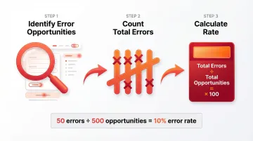
Error rate
Error rate tracks the frequency of mistakes users make while interacting with your product, including wrong clicks, form validation failures, navigation mistakes, or repeated attempts at the same action.
How to calculate: Identify opportunities for errors (form fields, navigation choices, button clicks), then divide total observed errors by total opportunities.
For your platform in the climate space, where your users often include procurement leads, sustainability officers, or operations managers who didn't choose the software themselves, high error rates on data entry fields can translate directly to reporting delays or compliance issues. Errors correlate with longer task times, failed tasks, and lower satisfaction ratings, so high error rates on specific interface elements are a clear signal that the UI or instructions need redesign.
Navigation path analysis
Navigation path analysis examines the routes users take through your site to accomplish goals. Do users take direct paths to their objectives, or do they navigate in circles, backtrack frequently, or get lost?
Navigation problems show up as users backtracking more than twice to find information, making multiple visits to the same page without converting, high exit rates on navigation-heavy pages, and circuitous paths when direct routes exist.
For your dashboard handling emissions data, energy consumption metrics, or fleet analytics, your users often arrive with a specific data question. If they can't find the answer without backtracking, they stop trusting the platform, regardless of how accurate the underlying data is. In an enterprise evaluation, that loss of trust rarely surfaces as explicit feedback — it shows up as a pilot that doesn't convert.
Click-Through Rate (CTR)
CTR measures the percentage of users who click on a specific element, link, or call-to-action. It indicates whether design elements successfully draw user attention and encourage action.
How to calculate: Divide total clicks by total impressions (views), then multiply by 100. If 1,000 users view a "Start free trial" button and 150 click it, your CTR is 15%.
Low CTRs typically point to weak visual hierarchy or contrast, unclear value propositions, poor button affordance or placement, or competition from other page elements pulling attention away. On a trial signup or demo request flow, a low CTR means potential enterprise buyers are landing but not taking the next step — a fixable problem once you can see where attention is going.
Page/screen load time
Load time measures how quickly pages or screens become interactive for users. Performance is a foundational element of UX, with specific thresholds that directly affect whether users stay or leave.
The numbers make the stakes clear: 53% of mobile visits are abandoned if a page takes longer than 3 seconds to load, a 100ms delay can reduce conversion rates by 7%, and a 2-second delay in load time increases bounce rates by 103%.
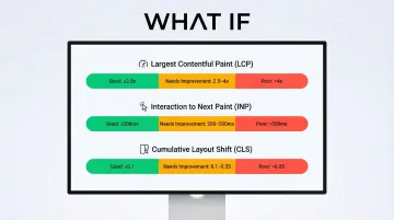
Core Web Vitals provide standardized performance metrics:
- Largest Contentful Paint (LCP): Should occur within 2.5 seconds
- Interaction to Next Paint (INP): Should be 200 milliseconds or less
- Cumulative Layout Shift (CLS): Should maintain 0.1 or less
6 essential attitudinal UX metrics
Net Promoter Score (NPS)
NPS tracks user loyalty with a single question: "How likely are you to recommend this product to a friend or colleague?" Users respond on a 0-10 scale.
Calculation: Promoters (9-10) are loyal enthusiasts, Passives (7-8) are satisfied but unenthusiastic, and Detractors (0-6) are unhappy customers likely to spread negative feedback.
NPS = % Promoters - % Detractors
This single number tracks loyalty over time and enables comparison with competitors. It's also a credible metric for investor updates — a rising NPS tied to a specific product change tells a clear momentum story without requiring a full product deep-dive. Keep in mind that NPS measures loyalty rather than usability directly, so it works best alongside behavioral and satisfaction metrics for a complete picture.
Customer Satisfaction Score (CSAT)
CSAT gauges satisfaction with a specific interaction, feature, or overall experience. Deploy it immediately after users complete a task or interaction.
Format: "How satisfied were you with [specific experience]?" rated on a 1-5 scale (very unsatisfied to very satisfied).
Deploy it after checkout completion, following customer support interactions, after a user engages with a new feature, or at the end of onboarding.
Calculation: Percentage of respondents rating 4 or 5 (satisfied or very satisfied).
CSAT provides immediate feedback on specific touchpoints, which makes it easier to pinpoint exactly which interactions need redesign rather than guessing across the entire product. In a pilot-to-contract conversation, CSAT scores from specific onboarding moments are strong evidence that you're tracking user experience actively, not just hoping users adapt.
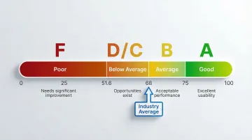
System Usability Scale (SUS)
SUS is a standardized 10-question survey that produces a single usability score from 0-100. Questions alternate between positive and negative statements about usability.
To interpret your score: 68 is the average (50th percentile), 80 or above is considered a good score (an "A-" grade), and anything below 51.6 is an "F".
Standardization gives the SUS score its real value: you can benchmark against industry norms, track your own progress across design iterations, and compare against competitors using the same universal scale. In a competitive evaluation, a SUS score above 80 for a core workflow shifts the conversation from "does this work?" to "how quickly can we deploy it?"
User Effort Score (UES)
UES captures how much effort users feel they spent accomplishing their goal. Ask immediately after task completion: "How much effort did you personally have to put forth to handle your request?"
Users rate effort on a 5-point or 7-point scale (very low effort to very high effort).
Why it matters: 94% of customers reporting low effort expressed intention to repurchase, while 81% of those facing high effort intended to spread negative word-of-mouth. Lower effort correlates strongly with higher satisfaction and retention, which is especially significant when you're competing against tools or manual processes buyers already know.
Feature adoption rate
Feature adoption rate tracks the percentage of users who try a new feature within a given timeframe.
Calculation: (Number of users who used the feature / Total active users) × 100
Low adoption tells you whether users are discovering new functionality at all, whether features provide perceived value once found, and where onboarding or in-product communication gaps exist.
In our work with climate and energy software teams, features like automated Scope 2 calculations or grid demand forecasting often represent significant development investment — yet low adoption rates signal a disconnect between what was built and what users currently understand or trust enough to use, no matter how capable the product actually is. Low adoption of a flagship feature is also a health signal that precedes churn — the kind of metric to track ahead of renewal conversations.
Retention and churn rate
Retention rate measures the percentage of users who return to your product over time. Churn rate tracks those who stop using it.
Calculations:
- Retention: (Users at end of period / Users at start of period) × 100
- Churn: (Users lost during period / Users at start of period) × 100
These metrics indicate whether your UX creates lasting value and satisfaction. Companies that improve customer experience see a 42% increase in customer retention, directly impacting long-term revenue and growth.
How to choose the right UX metrics for your product
Tracking every possible metric creates noise rather than clarity. The key is selecting metrics that align with your specific product goals.
Start with product goals
Work backward from your product goals to identify which metrics directly measure progress. If your goal is "increase user activation," focus on metrics like task success rate for onboarding flows, time to first value, and feature adoption rates. If you're heading into a Series A or approaching enterprise pilots, the metrics you select here are also what you'll need to report progress against when buyers or investors ask.
The Goals-Signals-Metrics framework
Google's Goals-Signals-Metrics (GSM) framework provides a structured approach:
- Goals: Define high-level user or product goals (e.g., "Users find carbon tracking helpful")
- Signals: Identify how success or failure shows up in behavior (e.g., "Users return weekly")
- Metrics: Define quantitative measurements (e.g., "% of users logging data weekly")
This structure is particularly useful when preparing product updates for a board meeting or customer success review — it keeps the conversation grounded in measurable outcomes rather than design opinions.
Focus on 3-5 core metrics
Select 3-5 core metrics to track consistently rather than trying to measure everything at once.
Choose metrics that cover different aspects of UX:
- One behavioral metric (task success rate or time on task)
- One attitudinal metric (CSAT or NPS)
- One engagement metric (feature adoption or retention)
- One performance metric (page load time)
- One business metric (conversion rate or LTV)
This balanced approach gives you comprehensive UX insights without overwhelming your team with data.

Best practices for tracking and reporting UX metrics
Establish baselines
Measure baseline performance before making changes so you can accurately assess impact. Without knowing your current task success rate or NPS, you can't determine whether design changes improved the experience. This is particularly consequential in climate and energy software, where product cycles are long and the cost of misreading progress is high. A documented baseline also gives you a before/after story you can present in a renewal conversation or board update — concrete evidence that the product has improved since a customer first signed on.
Combine quantitative and qualitative data
Pair metrics with qualitative user feedback to understand the "why" behind the numbers.
Behavioral analytics alone might show users abandoning at a specific step, but combining this with qualitative research reveals the root cause: confusing language or unclear instructions, a lack of trust signals at critical moments, technical problems blocking completion, or missing information users need to proceed. That combined picture is what you need to prioritize fixes confidently and to reassure an enterprise buyer that you're actively improving the experience — not just monitoring it.
Create regular reporting schedules
Establish consistent reporting schedules, weekly for fast-moving products, monthly or quarterly for more stable platforms. Regular reporting creates accountability and ensures metrics inform decision-making rather than sitting unused in a dashboard. It also means you have a current performance narrative ready when a customer asks for a product review or when you're heading into a contract renewal.
Connect UX metrics to business KPIs
When presenting to stakeholders, connect UX metrics to business outcomes — for example: reducing error rates decreased support tickets by 30%, improving task success rates increased conversion by 15%, or faster load times reduced bounce rate by 22%.
This translation demonstrates ROI and secures continued investment in UX improvements.
Measurement isn't the goal. The goal is a product that users actually adopt and return to. When user behavior change is part of your product's purpose, that distinction matters more than in most verticals. When the right 3-5 metrics are in place, tracked consistently, and connected to design decisions, you move from reactive to proactive: problems surface before they become churn, and improvements can be demonstrated to stakeholders in terms they understand.
If your product is at the stage where you need to establish what to measure, or you've accumulated data but aren't sure how to act on it, What if Design works with Seed to Series B climate and energy software teams to build UX measurement practices that connect directly to product outcomes. Connect with us to talk through where your product is now.
Frequently asked questions
What are the most important UX metrics to track?
Start with task success rate, CSAT, and time on task as foundational metrics: they cover effectiveness, satisfaction, and efficiency. Add page load time for performance and retention rate for long-term value based on your specific goals.
How do you measure user experience quantitatively?
Quantitative UX measurement uses analytics tools (Google Analytics), heatmap platforms (Hotjar), and A/B testing software to capture numerical data about user behavior, including page views, click patterns, session duration, and conversion rates.
What's the difference between behavioral and attitudinal UX metrics?
Behavioral metrics measure what users actually do: actions, clicks, navigation paths, and task completions. Attitudinal metrics measure what users think and feel, specifically satisfaction ratings and perceived ease of use, captured through surveys and feedback.
How many UX metrics should I track?
Focus on 3-5 core metrics aligned with current goals rather than tracking everything. Select metrics covering different UX aspects (one behavioral, one attitudinal, one engagement, one performance) and track them consistently over time.
What tools can I use to measure UX metrics?
Google Analytics, Mixpanel, and Amplitude track behavioral data. UserTesting and Lookback provide qualitative insights. SurveyMonkey and Typeform capture attitudinal metrics. Hotjar and FullStory visualize interactions. Optimizely and VWO handle A/B testing.
How do UX metrics relate to business KPIs?
UX metrics connect directly to business outcomes: improved task success rates increase conversions, higher CSAT scores reduce churn, and lower error rates decrease support costs. Linking UX improvements to revenue and cost metrics is what secures stakeholder buy-in and continued investment in the product experience.