You've built a technology that works. Maybe you've completed a pilot, closed an early partnership, or raised your seed round. But when a potential investor, enterprise buyer, or strategic partner lands on your website, they can't tell any of that from the homepage.
That credibility gap is common in cleantech. Technical founders are focused on the science, the regulatory pathway, and the next milestone. The website is an afterthought until it becomes the reason a deal doesn't close.
This article breaks down seven cleantech companies that have solved this problem well. Each one translates a genuinely complex technology into a clear, credible digital presence that works for multiple audiences at once. If you're approaching a raise, pitching at a conference, or pushing into enterprise sales, these examples show what a website that pulls its weight actually looks like.
Research shows that 94% of first impressions are design-related, and with 42% of green marketing claims found to be exaggerated or false, the bar for credibility in this sector is unusually high. Your website has to clear it before any conversation happens.
TL;DR
- The seven sites analyzed here each serve multiple audiences simultaneously without watering down technical depth
- Real-time data dashboards, third-party certifications, and quantified case studies do more for credibility than any mission statement
- The right design approach depends on whether you're selling to homeowners, enterprise utilities, or corporate carbon buyers
- Conversion paths need to be audience-specific: a quiz for homeowners, gated whitepapers for enterprise buyers, and tiered service CTAs for direct purchasers
Why great web design matters for cleantech companies
Most cleantech founders know their website isn't quite right. The problem is rarely that they don't care. It's that the technology demands all their attention, and by the time a conference, a funding round, or an enterprise pilot conversation forces the issue, the website has fallen well behind what the company has actually become.
That gap has real consequences.
The trust problem is specific to this sector: With 58% of global companies admitting to greenwashing, investors and buyers now approach cleantech websites with skepticism as a default. They're looking for third-party certifications, verifiable metrics, and transparent methodologies. A website that can't surface these signals quickly gets dismissed before the first conversation.
Design directly affects business outcomes: Forrester Research estimates every $1 invested in UX returns $100 in increased revenue and reduced costs. A 1-second page load converts 3x better than a 5-second load, according to Google benchmarks. These aren't abstract design metrics. They show up in your demo conversion rate, your sales cycle length, and the quality of inbound inquiries you receive.
Mobile traffic matters even in B2B: Mobile devices account for 54.8% of global website traffic, and investors and media regularly research companies on mobile devices. A load time increase from 1 to 10 seconds raises bounce probability by 123%, which means a slow, poorly optimized site costs you attention at the exact moments it matters most.
The core challenge is making complex technologies understandable without losing the technical audiences who need to trust you most.
7 inspiring cleantech websites
The companies below were selected based on design quality, user experience, conversion architecture, and how accurately they communicate their actual mission. Each one shows how deliberate design decisions translate into cleaner sales cycles and more confident fundraising conversations.
Website 1: Aurora Solar
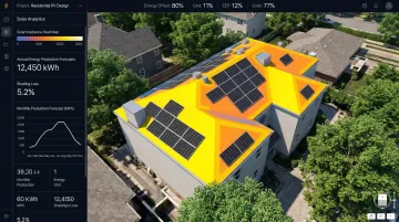
Aurora Solar provides the world's leading solar design software, serving installers and sales teams with tools that streamline the entire solar sales process. They've established themselves as the industry standard, powering solar proposals for millions of homeowners.
Their website makes a strong first impression through high-quality software interface imagery that demonstrates value immediately. The design is clean and professional, which positions them as a mature market leader, while data-driven proof points build credibility with both technical and business audiences throughout the experience.
Design approach:
- Minimalist and professional with emphasis on software visualization
- Clean layouts mirror product sophistication while maintaining accessibility
- Balances technical depth with business-friendly messaging
Key features:
- Lead Capture AI widget provides instant solar estimates using just an address and utility bill, driving a 4x increase in web leads
- Interactive demos showcase real software capabilities
- Case study library with quantified metrics like "Design time dropped by 70%"
Conversion strategy:
- Segments users (installers vs. sales teams) with tailored messaging
- Prominent "Schedule a Demo" CTAs throughout the journey
- Specific ROI data validates investment for different stakeholder types
Website 2: Dandelion Energy
Dandelion Energy is the nation's leading home geothermal company, spun out of Alphabet's X lab. They focus on replacing fossil fuel heating systems with geothermal heat pumps, making sustainable home heating accessible to average homeowners.
The site uses clear, accessible storytelling to simplify complex geothermal technology. Animations and diagrams explain how ground loops work across heating and cooling cycles, transforming what might seem like an intimidating infrastructure project into something comparable to a solar panel installation.
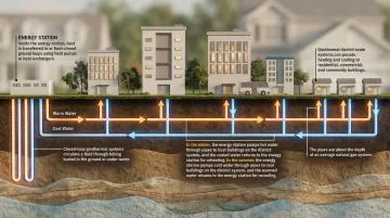
Design approach: The site takes a consumer-friendly approach with heavy use of visual explainers, balancing technical credibility — including AHRI certifications — with homeowner-focused messaging that emphasizes comfort and savings rather than engineering specs.
Key features:
- "See if your home qualifies" quiz acts as primary lead magnet throughout the site
- Process visualization graphics break down installation steps
- Impact metrics reference industry standards to validate performance claims
Conversion strategy:
- Optimized specifically for homeowner lead generation
- Qualification quiz provides a low-friction entry point
- Segments users immediately based on eligibility, reducing unqualified leads
Website 3: Camus Energy
Shifting to enterprise cleantech, Camus Energy provides grid orchestration platforms for utilities. Founded by former Google engineers, they help utilities manage renewable energy integration through a unified data fabric that connects disparate systems into actionable intelligence.
The design is minimalist and mission-forward, using a "data fabric" visual motif to represent their software's capability to unify utility data. It balances high-level positioning around decarbonization with technical product details that satisfy engineering audiences without losing executives along the way.
Design approach:
- Data-driven and technical, reflecting their enterprise utility audience
- Sophisticated product architecture diagrams maintain clean visual hierarchy
- Guides non-technical stakeholders through complex concepts without removing depth for engineers
Key features:
- Product architecture visuals explain how "Data Fabric," "AI Layer," and "Applications" work together
- Resource gating for whitepapers and case studies captures enterprise leads
- Clear navigation segmentation for "Utilities" and "Developers" paths
Conversion strategy:
- Targets enterprise buyers with "Request Demo" CTAs and authority-building content
- Progressive disclosure lets executives grasp value while engineers access technical specifications
- Deep-dive content establishes technical credibility for long enterprise sales cycles
Website 4: WindESCo
WindESCo uses AI and analytics to optimize wind turbine performance, serving independent power producers and investors. Their "found energy" approach increases output from existing assets without physical modifications.
The site uses bold data visualization and interactive elements to communicate value. Video demonstrations of "Swarm" technology visualize invisible concepts like wake steering, making complex aerodynamics understandable to non-engineers while maintaining the technical depth that IPP procurement teams require.
Design approach: WindESCo's site is visual and data-centric, with an emphasis on quantified results. High-quality video and animation explain invisible wind phenomena, while partner validation from ABB and Deloitte maintains professional credibility.
Key features:
- Interactive technology pages explain collective control with clear visuals
- Quantified case studies like "Wind Farm Unlocks $430,000 in Annual Revenue"
- Prominent partner logos establish market position
Conversion strategy:
- Specific, high-value CTAs like "Meet with our Experts" rather than generic "Contact Us"
- Technical whitepapers capture qualified leads
- Case studies provide concrete social proof for decision-makers evaluating ROI
Website 5: Micatu
Where WindESCo optimizes energy generation, Micatu focuses on grid safety. They develop optical sensing technology for the power grid, offering safer alternatives to traditional instrument transformers. Their technology eliminates explosion risks associated with oil-filled transformers while improving measurement precision.
The site is strongest in technical clarity and safety messaging. High-quality product photography and clear "Optical vs. Legacy" comparisons highlight the specific benefits utility operators care about most: field crew safety and data reliability.
Design approach:
- Technical and safety-focused, reflecting utility industry priorities
- Professional product photography communicates quality and precision
- Comparison tables make complex advantages accessible for procurement teams
Key features:
- Centralized resource center for product catalogs, whitepapers, and case studies
- "How it works" sections break down optical sensing physics
- Safety visuals emphasize field crew benefits and risk reduction
Conversion strategy:
- "Download Product Brochure" and "Contact Us" CTAs target utility operators
- Detailed technical documentation satisfies engineering review processes
- NYSERDA pilot validation provides third-party credibility for risk-averse buyers
Website 6: CarbonCure
CarbonCure manufactures technology that injects captured CO2 into fresh concrete, permanently mineralizing it. They serve both concrete producers seeking to reduce emissions and corporations purchasing carbon credits.
The site features a real-time impact counter showing metric tons saved and truckloads delivered, which provides immediate proof of scale. What makes it particularly effective is that it successfully serves two distinct audiences, concrete producers interested in technology adoption and corporations seeking verified carbon credits, without either path feeling like an afterthought.
Design approach: CarbonCure's site is impact-focused, with real-time data and transparency at its center. It balances technical product information with verification documentation, with clear visual separation between the two audience paths — concrete producers and carbon credit buyers.
Key features:
- Live impact dashboard showing CO2 emissions saved and carbon credit revenue shared
- Interactive producer map helps builders find CarbonCure suppliers
- Dedicated pages for their Verra-approved methodology (VM0043) and global regulatory approvals
Conversion strategy:
- Distinct pathways for "Concrete Producers" and "Designers & Builders"
- "Carbon Credit" section targets corporate buyers with verification data
- Transparency throughout directly addresses greenwashing concerns
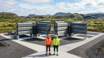
Website 7: Climeworks
Our final example sits at the frontier of climate technology. Climeworks leads Direct Air Capture (DAC), operating the world's largest DAC plants in Iceland. They offer carbon removal services to businesses and individuals seeking permanent CO2 removal solutions.
The site uses immersive visual storytelling anchored in high-end photography of their actual facilities, Orca and Mammoth. It balances an ambitious climate mission with rigorous scientific validation, addressing both the emotional and rational factors that drive purchasing decisions across very different buyer types.
Design approach:
Climeworks' site is mission-driven with premium visual quality. Facility photography makes the abstract DAC technology tangible to non-technical buyers, while the site maintains scientific rigor through detailed technical explanations and third-party certifications.
Key features:
- Clear service tier distinction between "Tailored portfolios" and "Self-service"
- Technology deep dives explain the DAC process and permanent storage via mineralization
- Prominent third-party validation as the first DAC provider certified under Puro standards
Conversion strategy:
- Clear "Remove CO2" CTA enables immediate action for self-service buyers
- "Get in touch" pathway serves enterprise deals
- Reduces friction in the purchase journey by making a technically complex climate solution commercially accessible
What these websites do differently
Authentic visuals over stock imagery
Generic sustainability imagery, aerial wind farm shots, abstract green icons, stock photos of nature, signals to cleantech buyers that a company doesn't fully understand its own story. The seven sites above use actual product footage, facility photography, and real-world customer environments. Climeworks showcases their Iceland facilities, WindESCo uses custom animations of wake steering, and CarbonCure features real concrete production. This specificity builds credibility with sophisticated audiences who can spot generic sustainability imagery quickly.
Data visualization that builds credibility
Complex metrics like carbon reduction, energy efficiency, and impact statistics can be transformed into compelling visual stories when they're tied to specific, verifiable numbers. CarbonCure's real-time impact counter, WindESCo's quantified case studies ($430,000 in annual revenue unlocked), and Aurora Solar's efficiency improvements (70% design time reduction) all work because the numbers are specific and traceable. Vague claims about environmental impact don't survive scrutiny in this sector.
Third-party validation as table stakes
These sites treat certifications, partnerships, and independent verifications as core content, not footnotes. CarbonCure's Verra-approved methodology (VM0043) is given its own dedicated page. Climeworks highlights being the first DAC provider certified under Puro standards. WindESCo displays partnerships with ABB and Deloitte prominently, and Micatu publishes its NYSERDA pilot validation to support procurement decisions.
For buyers who've encountered unsubstantiated green claims before, these signals are what move a conversation forward.
Layered content for mixed audiences
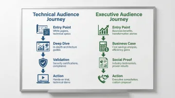
Every one of these companies sells to audiences with very different technical backgrounds. The sites that handle this well present a clear, accessible value proposition at the surface and then layer in technical depth for those who want it. Camus Energy separates "For Utilities" and "For Developers" navigation paths explicitly. Dandelion Energy leads with homeowner-friendly language about comfort and savings, while keeping AHRI certification references available for technical reviewers. The mistake most cleantech sites make is trying to serve both audiences in the same paragraph, which ends up serving neither.
CTAs matched to buyer intent
Strategic CTAs reflect a clear understanding of where different visitors are in their decision process. Aurora Solar's Lead Capture AI widget meets installers who are early in the evaluation process. Dandelion's qualification quiz filters leads before they reach the sales team. Climeworks offers a distinct "Remove CO2" path for self-service buyers alongside an enterprise "Get in touch" pathway. Each CTA is designed for a specific buyer type making a specific decision, not just a generic prompt to get in touch.
How to choose the right design approach for your cleantech website
There's a tension most cleantech companies face when designing their website: simplify too much and you lose technical credibility; go too deep and you lose everyone else. The right balance depends on four specific factors.
Who you're primarily selling to
Enterprise utility buyers need technical specifications, integration documentation, and procurement-ready validation. Residential customers need simplified benefits, cost calculators, and social proof from people like them. These require fundamentally different content architectures. Camus Energy and Micatu are built for enterprise procurement teams. Dandelion Energy is built for homeowners. Neither approach works for the other audience.
Where you are in your company's development
Pre-seed and seed-stage companies typically need websites that serve investor conversations first. That means leading with team credibility, technology validation, and the problem you're solving, not the full product spec. Growth-stage companies need conversion-optimized sites with case studies, demo flows, and clear paths for different buyer types. The same design doesn't serve both stages well.
How complex your technology is to explain
Direct Air Capture requires progressive disclosure and layered technical content because the mechanism itself needs explanation before the value proposition lands. Residential solar doesn't face that same barrier. The depth of explanation your site needs should match how much your buyer needs to understand before they'll trust you, not how much your team wants to share.
What you're competing against
If your differentiation is technical superiority, your website needs to show specifications and independent validations prominently. If your differentiation is accessibility, the user experience itself needs to prove that. WindESCo leads with quantified outcomes because they're competing against other wind optimization approaches on ROI. Dandelion leads with simplicity because they're competing against the assumption that geothermal is complicated and expensive.
Your design investment needs to match your current business priority. A pre-seed company and a Series B company are not making the same decision.
What if Design has worked with cleantech companies at various stages to navigate exactly these decisions, including HYDGEN, Ribbit Network, and Susteon. Each engagement started with positioning alignment before any design work began, because getting the strategy wrong first makes the design work harder to fix later.
Conclusion
Effective cleantech web design is not a trend exercise. It's about building a digital presence that accurately reflects what your company has become, communicates clearly to the specific people you need to reach, and gives them a reason to take the next step.
Before you look at your next conference, funding announcement, or enterprise pilot push, audit your current website against these questions:
- Does your homepage communicate who you solve problems for, and what specifically changes for them?
- Are your proof points (pilots completed, certifications earned, partnerships signed) visible above the fold?
- Do different visitors (investors, enterprise buyers, technical evaluators) each have a clear path through your site?
- Does your current website reflect the company you are today, or the one you were 18 months ago?
If the answer to any of those is no, the gap between your website and your actual traction is costing you something in every sales and fundraising conversation you're having right now.
We work with climate tech companies at Seed through Series B to close that gap, starting with positioning and building the website around it. View our work to see how we've approached this across different stages and technologies.
Frequently asked questions
What makes a cleantech website different from other B2B tech websites?
Cleantech sites serve more diverse audiences simultaneously: investors, customers, technical talent, and policymakers often land on the same site. They also carry a higher burden of proof because the sector has a documented greenwashing problem, which means vague impact claims don't build trust. The website has to connect technology to tangible, verifiable outcomes rather than just efficiency gains.
How much should a cleantech company invest in website design?
Investment typically aligns with company stage. Early-stage companies generally invest $15,000 to $40,000 for a foundational brand and website, while growth-stage companies invest $50,000 to $100,000 or more for conversion-optimized sites with segmented buyer journeys. Specialized agencies that work exclusively in cleantech often deliver stronger results faster than generalist agencies because the onboarding is shorter and the strategic context is already understood.
What are the most common web design mistakes cleantech companies make?
The most common issues are: using generic stock imagery that signals a lack of deep domain understanding, leading with mission statements instead of the problem you solve, neglecting mobile experience despite significant mobile traffic among investors and media, and building a site with no clear conversion paths for different buyer types. The result is a website that looks credible to no one in particular.
How long does it take to design and launch a cleantech website?
Timelines vary based on complexity. Simple sites typically launch in 6 to 8 weeks, while comprehensive builds with custom features and segmented buyer journeys take 12 to 16 weeks. Agencies that specialize in cleantech can often move faster because they don't need time to understand the regulatory context, the technical landscape, or the typical sales cycle dynamics that shape how these sites need to work.
Should cleantech websites prioritize aesthetics or functionality?
This is a false choice. The best cleantech sites use design quality as a credibility signal while ensuring every design decision serves a specific user or business need. Climeworks' high-end facility photography isn't decorative; it makes an abstract technology tangible to buyers who've never seen a DAC plant. Aurora Solar's clean interface imagery isn't just attractive; it communicates product maturity to evaluators who are deciding whether to trust the software with their sales process.
How important is mobile optimization for cleantech websites?
Very. Mobile traffic represents a significant share of B2B site visits, and investors and media regularly research companies on mobile devices before or between meetings. Mobile experience also directly affects SEO rankings, which affects how easily you get found in the first place. A load time increase from 1 to 10 seconds raises bounce probability by 123%, which means a slow mobile experience is actively costing you attention from the people you most want to reach.