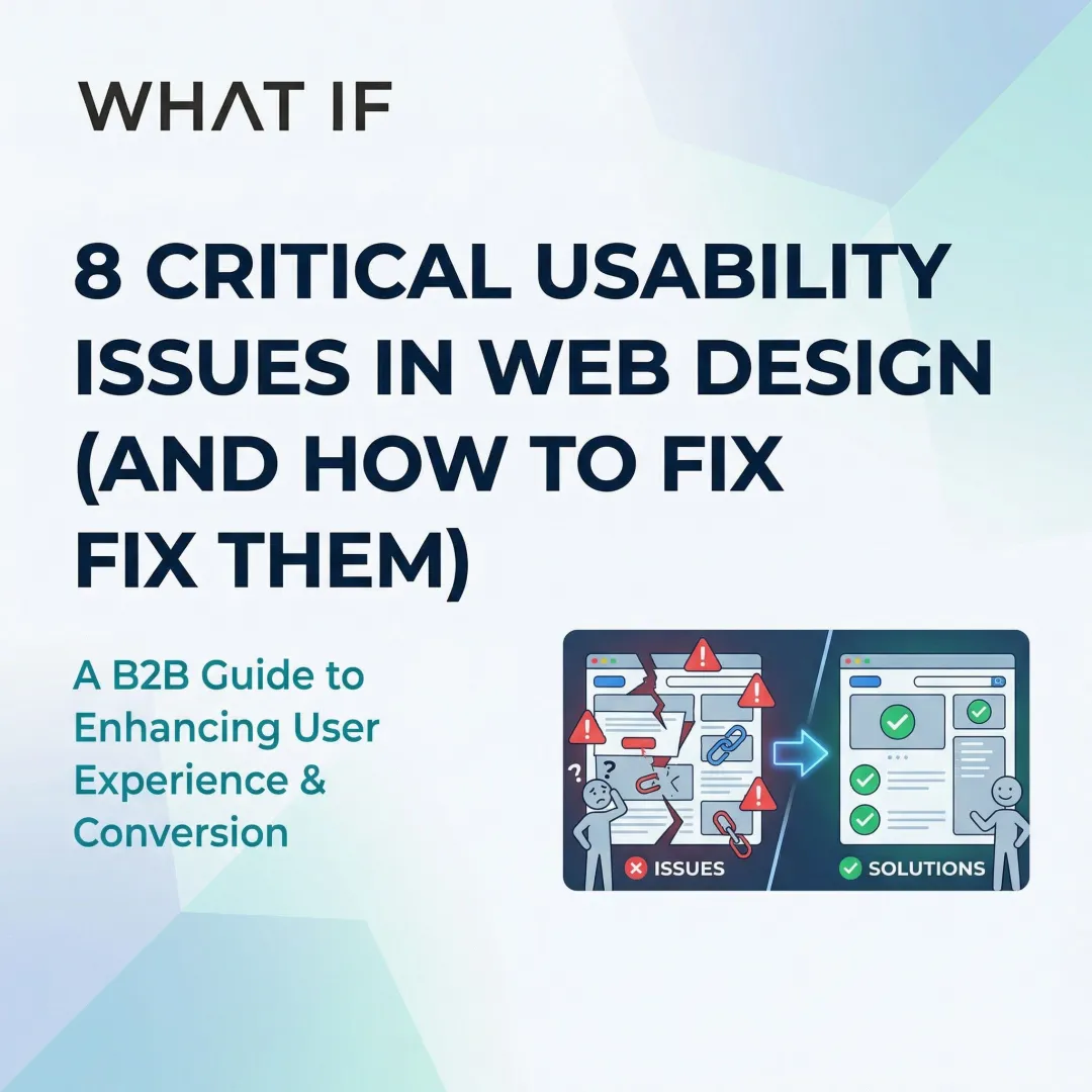
When your website undermines the technology behind it
You've built something technically rigorous. Maybe you've run a pilot, closed early partners, or raised your first round. But when someone visits your website for the first time, before any call, before any demo, what do they actually encounter?
For many climate and deep-tech startups, the answer is a website that reads like a research summary. Complex navigation, cluttered layouts, slow load times, and no clear path for the visitor to follow. The technology is real. The website doesn't reflect it.
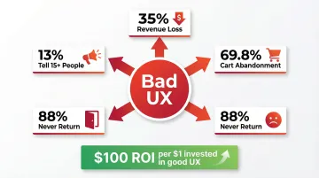
This matters beyond aesthetics. Poor UX directly erodes the credibility you've worked to build. Research by the Baymard Institute shows companies lose approximately 35% of potential revenue due to poor user experience, and 75% of users judge a company's credibility based on its website design before engaging with anything else.
This article breaks down the most common UX failures that undermine credibility and what to do about each one.
TLDR: key takeaways
- 88% of users won't return after a poor experience, making first impressions a business decision, not just a design one
- The most common failures: visual clutter with no hierarchy, navigation that buries key information, and mobile designs that break under real conditions
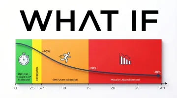
- Users form visual judgments in roughly 50 milliseconds, before reading a single word
- The most damaging failures are often invisible: 91% of unsatisfied users leave without providing any feedback
What a UX audit actually reveals
How to identify real usability problems
Most UX problems aren't obvious until you set structured tasks and measure them against defined benchmarks. The audit methodology below applies whether you're evaluating a competitor's site or your own, and it reflects the same framework we use to surface the failures documented throughout this article.
Sites were selected based on documented user complaints, visibly outdated design, navigation structures that made core tasks impossible, and measurable accessibility violations. The types evaluated included e-commerce sites with load times exceeding 20 seconds, corporate pages with no clear conversion path, technical product sites where key information was buried three levels deep, and sites with accessibility failures immediately visible to a screen reader.
The benchmarks that matter
For each site, specific tasks were timed and tracked: finding contact information, completing a core action, filling out a form, and locating specific content.
Reasonable UX benchmarks:
- Finding contact info: under 30 seconds, under 3 clicks
- Completing a core action: under 2 minutes, under 8 clicks
- Locating specific content: under 45 seconds, under 5 clicks
Anything beyond these thresholds is friction that costs you visitors. For a climate or deep-tech startup asking enterprise buyers or investors to engage, that friction compounds: your visitor already has to work to understand your technology. Your website shouldn't add to that effort.
What the testing process showed
Structured testing creates objectivity. Rather than relying on intuition, you're measuring actual behavior: where users slow down, where they abandon tasks, and where they stop entirely.
The failures documented in the next section weren't edge cases. They were patterns that appeared consistently across the sites evaluated, and they map directly to the problems that appear in early-stage technical product websites.
The most common UX failures, and why they matter
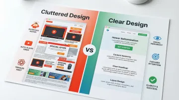
Visual clutter: when too many priorities become no priority
One of the most consistent failure patterns is pages that try to communicate everything at once. One site had 14 separate call-to-action buttons above the fold, three auto-playing videos, and two pop-ups triggering within 5 seconds of arrival. There was no clear entry point.
This is a structural problem, not an aesthetic one. Research confirms that cluttered layouts significantly degrade how users scan for information, spreading attention across the page rather than directing it.
For technical product websites, this pattern tends to emerge when multiple audiences are being served by a single page. You want investors to understand the technology. You want customers to see the solution. You want partners to assess the integration. Without deliberate visual hierarchy, those competing priorities produce a page that speaks to everyone and communicates clearly to no one.
The cost is direct: visitors leave without taking any action because the next step isn't visible, investors struggle to extract the core claim quickly, and partners can't assess fit before a first conversation. Important proof points — pilots, funding, LOIs — get buried in visual noise.
Navigation depth: how buried information loses visitors
One site required 17 clicks to reach its pricing page. The main menu had 9 top-level items, each with 6 to 12 sub-items, organized without consistent logic. Half the links led to dead ends or pages that simply repeated the navigation menu.
Finding basic contact information took 12 minutes, eventually discovered under "Corporate Resources" in the footer rather than any obvious "Contact" section.
The same structural problem is common in early-stage technical product sites. Information architecture often follows how your founding team thinks about the product, not how a first-time visitor tries to navigate it. A potential enterprise buyer looking for integration documentation and a series A investor looking for team credentials are starting from very different mental models. If the navigation doesn't account for that, both groups end up lost.
Navigation failures that consistently block conversion: Labels that change depending on where you are in the site, menus that require hovering to reveal or appear inconsistently, no search function to bypass the structure entirely, and breadcrumbs that break or disappear on deeper pages.
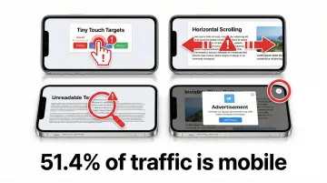
Mobile responsiveness: what happens when desktop design gets squeezed
Multiple sites evaluated were effectively unusable on mobile. One required constant horizontal scrolling to read a single sentence. Buttons were so small that three attempts were needed to tap the correct one. Text sizes ranged from too small to read to inexplicably large within the same paragraph.
Mobile devices now account for 51.4% of global web traffic, and mobile users are five times more likely to abandon tasks on sites that aren't optimized for smaller screens. When an investor reviews your website from a phone between meetings, the experience they have reflects directly on the product.
Common mobile failures include fixed-width layouts that require constant zooming, touch targets smaller than the recommended 44x44 pixels, forms designed for desktop-style input, and pop-ups that cover entire mobile screens with invisible close buttons.
Accessibility gaps: the users you're excluding without knowing it
Accessibility was tested using keyboard navigation and screen reader software. The results: 80% of sites evaluated were completely unusable without a mouse.
Tab order jumped randomly across pages. Images had no alt text. Color contrast ratios failed WCAG 2.2 standards by significant margins.
One site used light gray text (#CCCCCC) on white backgrounds, unreadable for most users and completely inaccessible for those with visual impairments. Another conveyed critical information through color coding alone, excluding colorblind users from understanding it.
Accessible design has a broader benefit than compliance alone. Enterprise procurement processes increasingly include accessibility audits as a threshold requirement — a site that fails WCAG 2.2 can be disqualified from a vendor evaluation before your product is even reviewed. Clear labels, logical tab order, and keyboard navigation improve the experience for every visitor, not only those using assistive technology.
Page performance: load time as a conversion variable
Load times exceeding 30 seconds were encountered. One e-commerce site loaded a 15MB hero image uncompressed. Another ran 47 tracking scripts before displaying any content. The cumulative effect on a visitor attempting to complete any meaningful task was abandonment before the page finished loading.
40% of users abandon websites that take more than 3 seconds to load. Google recommends Largest Contentful Paint (LCP) of 2.5 seconds or less for a good user experience, and none of the sites evaluated came close to that standard.
Performance issues that consistently cause abandonment include unoptimized images serving multi-megabyte files, render-blocking JavaScript, excessive third-party tracking scripts, and no caching strategy in place. For a prospect arriving from a warm introduction or a post-conference meeting, a 30-second load time doesn't just lose a page view — it undermines the credibility your outreach just built.
Visual credibility: why design signals trust before content does
Visual inconsistency undermines trust before a visitor reads a single word. In the sites evaluated, this manifested as broken SSL certificate warnings, inconsistent typography spanning 12 or more font styles, and low-resolution imagery that appeared unintentionally pixelated.
Approximately 75% of users judge company credibility based on website design. If you're asking enterprise buyers or investors to trust in a first-of-kind technology, that number matters. The design has to signal that the company behind it is serious, even before the visitor reads about the technology itself. Suspicious pop-ups, aggressive upsells, and copy riddled with errors compounded the problem across the sites reviewed.
The business cost of poor UX
The financial impact of poor UX is measurable. Companies lose approximately 35% of potential revenue due to friction in the user experience, while strong UX can increase conversion rates by up to 400% in some contexts.
For climate and deep-tech startups, the cost compounds differently than in e-commerce. Sales cycles are longer. Stakeholders are more varied. The window to make a credible first impression is narrower. When an investor arrives at your website after hearing your pitch at a conference, or a potential enterprise partner checks your site before a procurement review, a UX failure doesn't just lose a conversion. It creates doubt at a moment when you need the opposite.
The ripple effect amplifies over time. 13% of customers with a poor experience tell at least 15 other people, spreading negative impressions that are difficult to reverse. Even more significant, 91% of unsatisfied users simply leave without saying anything, creating a pattern of silent attrition that's hard to detect and harder to address.
The financial impact runs through every part of the business: conversion rates fall, customer acquisition costs rise to replace churned users, reputation takes damage through negative reviews and lost referrals, and customer lifetime value drops when there's no reason to return.
What these failures reveal about effective UX
Simplicity as a signal, not just a style choice
The best websites lead with clarity: focused messaging, deliberate white space, and a single obvious next step for the visitor. For your technical product website, this is harder than it sounds because the product itself is complex. The instinct is to show everything, the science, the differentiators, the use cases, the team, the roadmap. The result is a page that requires the visitor to do work your website should be doing for them.
Reducing complexity on a website is a strategic decision. It means deciding which audience you're serving on which page, what action you want them to take, and what information is essential to get them there. Each element should either help users accomplish a specific goal or it's creating friction. Consider what happens when an enterprise buyer's procurement team lands on a homepage with nine sections and no clear path forward: they stop reading, not because the technology isn't compelling, but because the page doesn't tell them where to go next. Consolidating to a single primary call to action for each audience can move that buyer to a product page or contact form in two clicks instead of abandoning after thirty seconds.
How users actually read web content
Eye-tracking research confirms users scan web content in an F-shaped pattern: two horizontal stripes followed by a vertical stripe down the left side. They don't read thoroughly. They scan to find what's relevant, choosing the path of least effort. When an investor or enterprise buyer spends 60 seconds on your site before deciding whether to request a demo, your headline claim and the opening line of each section are carrying most of the commercial weight.
To support scanning behavior:
- Place critical information in the first two paragraphs
- Use subheadings that carry information, not just label sections
- Use bullet points for lists rather than embedding them in prose
- Bold key phrases selectively so they stand out during a scan
- Break up longer sections with visual elements every 200 to 300 words
Consistency reduces the cognitive work visitors have to do
Consistent design patterns reduce cognitive load by letting users apply existing mental models. When navigation, buttons, and interactions behave predictably, visitors feel oriented and complete tasks faster.
Inconsistency forces users to relearn the interface at every turn, increasing mental effort and error rates. For a visitor encountering your product or technology for the first time, that added friction is a reason to disengage rather than continue. In a procurement evaluation where your site is being assessed alongside competitors, a visitor who gets confused and leaves has effectively handed that comparison to someone else.
Mobile-first design isn't optional anymore
With mobile holding 51.4% of worldwide web traffic, designing for mobile first ensures core functionality works on the most constrained screens, then scales up for larger displays rather than being retrofitted down.
In practice, this means touch-friendly interfaces with minimum 44x44 pixel tap targets, navigation simplified for smaller screens, layouts that adapt fluidly across device sizes, and performance optimization built for variable connection speeds. An enterprise contact reviewing your documentation over mobile before a partnership call needs the same experience a desktop user gets — anything less creates a credibility gap before the conversation has started.
Accessibility improves usability for every visitor
Clear labels help all users find information quickly. Logical structure and keyboard navigation benefit power users and those with disabilities alike. Following WCAG 2.2 guidelines often makes web content more usable generally, while also meeting legal requirements for ADA compliance. For your enterprise deals, this matters commercially: a WCAG-compliant site removes accessibility as a procurement question entirely, keeping the conversation focused on your technology.
How to avoid these UX failures in your own site
Avoiding UX failures requires a disciplined, user-centered approach from the beginning of a project through launch and beyond.
Ground your design in real user research. Conduct interviews, surveys, and usability tests before designing anything. Test with actual users, not assumptions — five participants uncover 80% of usability problems. Use qualitative research to understand the reasoning behind user behavior, not just the behavior itself.

Follow proven UX patterns: Implement clear navigation hierarchies that visitors can scan quickly, build consistent design systems to reduce cognitive load at each interaction, use mobile-responsive layouts that adapt to any screen size, and stick with conventions users already understand rather than reinventing standard patterns. Each of these reduces the cognitive work your enterprise buyers have to do when evaluating your product, keeping their attention on your technology rather than your navigation.
Test continuously throughout development: Use A/B testing, heatmaps, and session recordings to identify friction points. Run tests for a minimum of 1 to 2 weeks to account for behavioral variation, and for quantitative validation, test with 40 or more participants for statistically reliable results. Catching and fixing friction points before your site goes in front of a buyer is considerably less costly than recovering credibility after a poor first impression.
When to bring in outside UX support
Some signals are data-driven. Conversion rates declining month over month. Bounce rates holding above 70%. Support tickets clustering around the same navigation issues. A design that hasn't evolved since the last funding round.
Others are more contextual. A fundraising announcement is approaching. You're speaking at a major conference in six weeks. A prospective enterprise partner requested your website before an introductory call. These are visibility moments, and they require a website that reflects where the company actually is, not where it was 18 months ago.
You face a specific version of this challenge: your technology is often genuinely ahead of the market's ability to immediately understand it. That gap doesn't close by explaining more on the page. It closes by building a website that translates technical depth into clear positioning for each audience segment. Investors, customers, partners, and policy stakeholders are each reading different things into the same site, and the navigation and messaging structure has to account for that.
For every $1 invested in UX, businesses see a return of approximately $100. For your early-stage company where every credibility signal matters, that math is direct.
What if Design works with climate and deep-tech startups at Seed through Series B to close the gap between where a company's technology is and what their website communicates to the people evaluating it. If your website hasn't evolved since your last milestone, it may be worth assessing what signal it's currently sending.
Frequently asked questions
What makes a website's UX "bad"?
Bad UX includes confusing navigation, slow load times (over 3 seconds), cluttered layouts, and missing accessibility features. These issues prevent users from completing tasks efficiently and finding information quickly. If your site is a technical product, the additional challenge is that your visitors are often already working to understand a complex technology: any added friction accelerates disengagement.
How quickly do users judge a website's quality?
Users form stable judgments about visual appeal in just 50 milliseconds. This initial assessment happens before the visitor reads anything, making the visual hierarchy and design quality of the first screen particularly important.
Can bad UX actually hurt my business financially?
Companies lose approximately 35% of potential revenue due to poor UX. If you have longer sales cycles and higher-stakes first impressions, the impact extends beyond direct conversion loss to include damaged credibility with investors, slower partner engagement, and attrition that goes unreported.
What's the difference between UX and UI design?
UX focuses on the overall user journey and how visitors move through a site to accomplish goals. UI covers the visual elements and interactive components they encounter along the way. Both work together: strong UI without thoughtful UX produces a site that looks good but frustrates users, while strong UX without UI care can produce functional but unconvincing experiences.
How often should I update my website's UX?
Conduct quarterly reviews of analytics to identify where visitors slow down or drop off. Implement updates whenever data shows declining performance at key steps. Beyond scheduled reviews, any significant company milestone, a new funding round, a new product line, an enterprise partnership, is a reasonable trigger to reassess whether the site still accurately represents the business.
Is it worth hiring a UX agency or should I handle it internally?
If you're at an early-stage company with a limited budget, handling basic UX improvements internally is viable if someone on your team has the time and relevant skill. If you're at a visibility moment — an upcoming raise, a conference appearance, an enterprise deal in progress — the cost of a poor experience is often higher than the cost of professional support. Specialized UX partners bring research methodology, established design patterns, and faster execution from working across similar products. Research shows businesses see approximately $100 return for every $1 invested in UX.