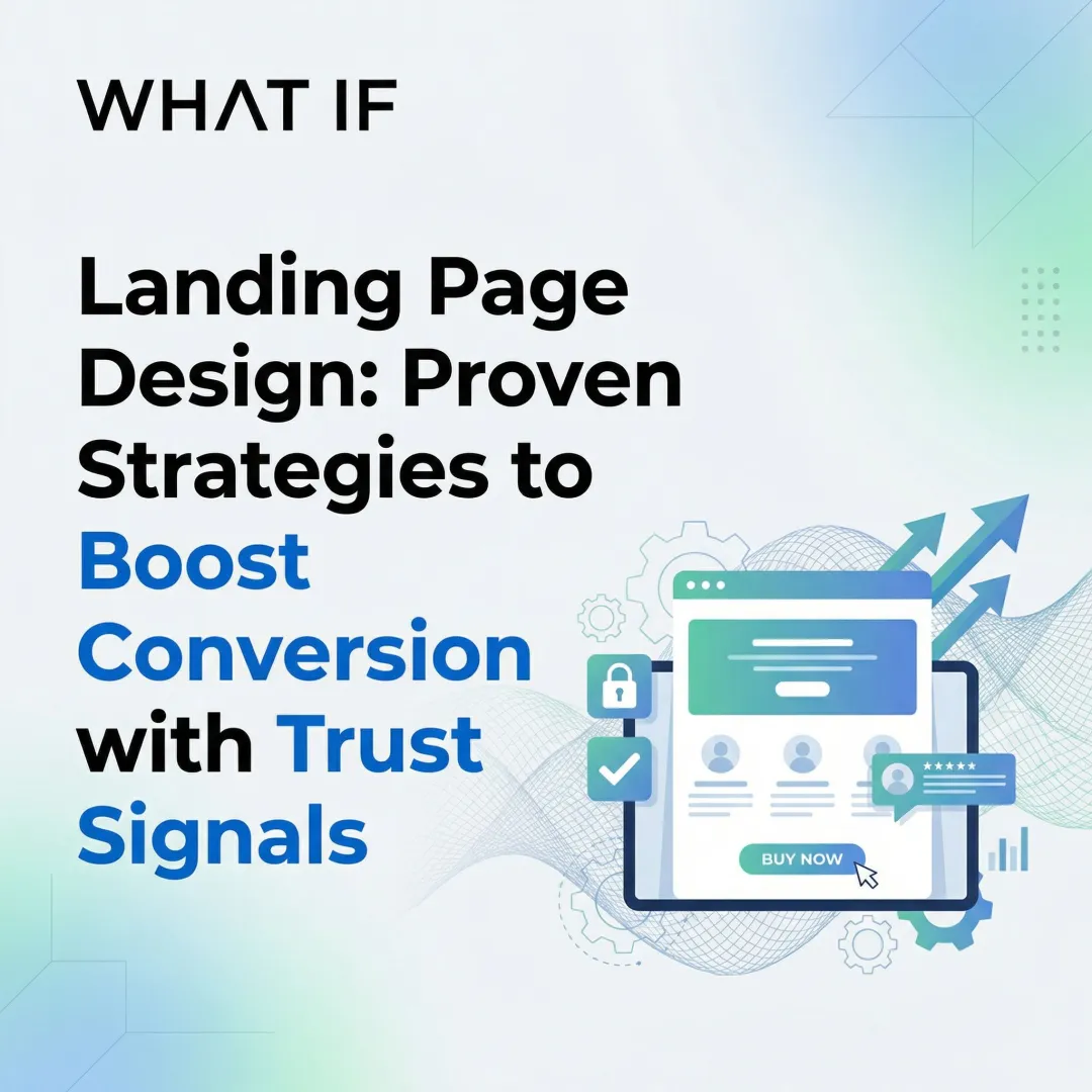
You've built something technically complex and commercially meaningful. You've secured funding, maybe completed a pilot or signed early LOIs, and you're heading into conversations with enterprise buyers or larger partners. But your landing page still reads like a product spec sheet written for engineers, not for the procurement lead, VP of operations, or investor sitting across from you.
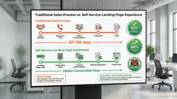
That's the credibility gap most B2B companies in climate and deep tech face. The technology is real, the traction is there, but the website doesn't reflect either. And in a buying process where 61% of B2B buyers now complete 70-80% of their decision-making before any sales contact, your landing page is doing the selling whether you've designed it to or not.
A landing page isn't just a design problem. It's a positioning problem. The wrong structure, unclear hierarchy, or misaligned messaging means qualified visitors leave without converting, and your sales team inherits a harder conversation.
This guide covers the five design trends reshaping B2B landing page performance in 2026, with specific context for climate tech and deep tech companies navigating long sales cycles, multi-stakeholder buying committees, and high-trust purchase decisions. The median B2B landing page converts at 13.3%, but performance varies considerably. SaaS pages average just 3.8% due to complex value propositions, while top performers convert at 11% or higher.
TLDR
- Climate and deep tech companies lose conversions when hero sections lead with technology mechanics rather than buyer outcomes; outcome-focused headlines with a single CTA lift conversions by 13-15%
- Multi-stakeholder B2B buying committees (averaging 13 people) respond to trust signals placed near conversion points, lifting decision rates by 34%
- AI-powered personalization delivers conversion lifts up to 68% by serving different content to engineers, executives, and procurement leads visiting the same page
- Clear visual hierarchy lets time-pressed decision-makers assess your value within 30 seconds, reducing bounce from high-intent visitors
- Pages loading under 1 second convert 3x higher than slow alternatives, and for climate tech companies, fast lean design is also operationally consistent with your sustainability positioning
Conversion-centric hero design
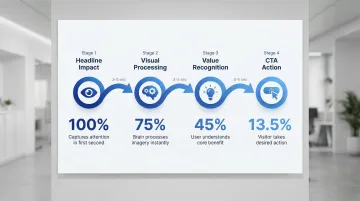
Conversion-centric hero design means optimizing the above-the-fold section specifically to capture attention and drive action within the first few seconds of a visit. For climate and deep tech companies, this is where most websites lose the plot.
Technical founders default to leading with how the technology works rather than what problem it solves for the buyer. The result is a hero section loaded with process diagrams, acronyms, and ecosystem context that makes complete sense to the engineering team but loses procurement managers and investors within the first scroll. Your above-the-fold section has one job: make the right visitor understand immediately why this matters to them.
Headline clarity drives conversions
Your headline determines whether visitors stay or investigate further. Strong, relevant headlines can deliver a 250-300% conversion lift, while vague or jargon-heavy ones end engagement immediately.
Weak headline approach: "Industry-leading solutions for modern businesses"
Strong headline approach: "Reduce carbon emissions by 40% while cutting energy costs"
The difference is specificity and outcomes.
Top-performing B2B landing pages use headlines under 44 characters written at a 5th-7th grade reading level. Pages with simple, clear copy convert at 11.1% compared to just 5.3% for complex, jargon-heavy text.
Single CTA focus
Beyond the headline, your call-to-action structure determines whether interest converts to action.
Pages with one primary CTA convert at 13.5% versus 10.5% for pages with five or more links, and multiple offers can decrease conversion rates by up to 266%. Even button copy matters: generic labels like "Submit" depress conversions by 3%, while personalized CTAs such as "Get my free ROI calculator" convert 202% better than default versions.
Place your primary CTA above the fold with high-contrast design and action-oriented copy that speaks directly to your visitor's intent.
Supporting visual elements
The human brain processes images in just 13 milliseconds, and 80% of people remember what they see versus only 20% of what they read. Strategic use of visuals reinforces your message:
- Product demo videos can increase conversions by up to 86%
- Hero images should reinforce your value proposition, not just fill visual space
- Subheadings should expand on your headline's promise with specific benefits
- Visual hierarchy guides the eye from headline to value proposition to CTA in a logical sequence
Removing navigation menus from landing pages eliminates distractions and maintains singular focus on conversion. One page, one goal.
Strategic social proof & trust signal placement
In B2B buying, trust is built or lost before anyone picks up the phone. With 69% of B2B buyers reporting inconsistencies between what sales reps say and what websites communicate, social proof elements aren't optional features. They're the mechanism through which buyers reduce perceived risk.
The trust gap
Despite their proven impact, 76.8% of marketers still fail to include social proof on landing pages, which represents a significant competitive opportunity for companies willing to be specific.
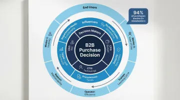
B2B buying committees average 13 internal stakeholders, each evaluating credibility through a different lens. Your landing page has to serve as a tool that helps that group reach consensus, which means different types of proof need to be positioned strategically, not scattered.
High-impact trust elements
Different social proof types deliver measurably different conversion improvements:
| Trust element | Conversion impact | Why it works |
|---|---|---|
| Customer testimonials | +34% lift | Specific, quantifiable outcomes build credibility |
| Reviews | Up to +270% boost | Critical for considered B2B purchases |
| Video testimonials | +80-86% vs. text | Emotional connection accelerates trust |
| Trust badges & certifications | +5% lift | Reduces anxiety at decision points |
Effective testimonials share four characteristics: specific metrics ("reduced processing time by 40%") rather than vague praise, full attribution with name, title, and company, industry relevance to your target audience, and strategic placement near key decision points.
Strategic placement matters
Position trust signals where they will have maximum impact on the buying decision:
- Client logos near the hero section establish immediate credibility for new visitors
- Testimonials next to key value propositions validate specific claims at the moment of evaluation
- Case study links before the final CTA provide proof at the decision moment
- Certifications near forms reduce perceived risk when prospects are committing to share their information
Climate tech companies face a trust challenge that generic B2B companies don't encounter to the same degree. Technical founders often have deep proof, including pilots, federal grant awards, peer-reviewed research, and signed letters of intent, but bury it in PDFs or footnotes rather than surfacing it where buyers are actually making decisions.
An early-stage clean energy company with three signed utility LOIs should have those prominently positioned, treated with the same weight as a case study. A carbon capture startup that has cleared rigorous third-party validation should display that certification directly near the conversion point where enterprise buyers are assessing risk. The proof exists. Strategic placement is often the only thing missing.
AI-powered personalization & dynamic content
Static landing pages are becoming a liability, and the gap this creates is especially acute for climate and deep tech companies. Your buying committee typically includes engineers, operations leads, finance directors, and executives, each evaluating your offering through a completely different lens. A single static page cannot speak credibly to all of them at once.
AI-powered personalization closes that gap by dynamically adjusting content based on who's visiting, where they came from, and what they've already engaged with.
Conversion impact of personalization
Personalization delivers measurable results when implemented with the right data infrastructure.
Highly customized landing pages achieve 68% higher conversions compared to generic pages. AI-powered personalization increases conversions by 40% through real-time behavioral adaptation, and dynamic content that changes based on user data converts 25% more mobile users than static pages.
Current adoption and maturity
While 42% of companies use AI-powered tools like chatbots or predictive analytics on landing pages, sophistication varies considerably across the market.
Most efforts remain surface-level. 89% of organizations claim to personalize content, but 59% describe their efforts as basic (simple name insertion). Only 1% have achieved comprehensive, full-journey personalization. That gap is the opportunity.
Personalization in action
Effective personalization means different content for different visitors, not just a name in the subject line. Advanced implementations include:
Industry-specific messaging:
- Manufacturing visitors see case studies about production efficiency
- Healthcare visitors see compliance and patient outcome messaging
- Financial services visitors see security and regulatory content
Role-based CTAs:
- Engineers receive "Download technical specifications"
- Executives see "Schedule ROI consultation"
- Procurement teams get "Request pricing information"
Behavioral triggers drive further adaptation. Returning visitors see different content than first-time visitors. High-intent visitors from targeted campaigns see stronger CTAs. Mobile users at conferences receive streamlined, fast-loading experiences designed for on-the-go evaluation.
Technical implementation
Successful personalization requires integrated systems working from clean data:
- CRM integration to apply firmographic and behavioral data to page content
- Progressive profiling to gather information over multiple interactions rather than demanding it all upfront
- Privacy compliance with GDPR, CCPA, and other applicable regulations
- Dynamic text replacement matching ad copy or search terms to landing page content
The buying landscape is shifting in one more relevant direction: 95% of buyers anticipate using generative AI to support their decision process, and 25% now use generative AI instead of traditional search. Your landing pages need to be structured for both human readers scanning the page and AI agents summarizing your offering to a buyer who may never visit directly.
Minimalist, scannable layouts
B2B decision-makers evaluating climate and deep tech solutions are navigating multiple vendor comparisons simultaneously, often alongside technical advisors, procurement teams, and executive sponsors. They don't read landing pages linearly. They scan for the signal that tells them whether to go deeper.
The problem for most climate tech companies is that their pages are built to explain, not to filter. They front-load context, backstory, and technical architecture before getting to what the buyer actually cares about: can this solve my problem, do I trust this team, and what do I do next?
The scannability imperative
Eye-tracking research shows F-pattern and Layer Cake pattern behaviors dominate, with visitors focusing primarily on headings and opening lines. Your landing page must communicate value in under 30 seconds.
Strategic white space prevents cognitive overload and guides attention toward what matters. Limited color palettes (2-3 primary colors) maintain focus on content rather than visual noise. Clear visual hierarchy uses size, color, and spacing to tell visitors what to read first, and grid-based layouts organize information for quick processing across different screen sizes.
The length paradox
For simple offers, brevity is the stronger choice. Pages with under 1,000 words show 50% higher conversion than text-heavy alternatives when the offer is straightforward.
Complex B2B solutions sometimes require more depth to convert effectively.
Use short-form (under 1,000 words) for:
- Low-friction offers like ebook downloads or webinar registrations
- Well-known product categories where the buyer already understands the solution type
- Top-of-funnel awareness content
Use long-form (1,500+ words) for:
- High-value, complex products such as enterprise software or first-of-a-kind climate technologies
- Technical solutions requiring detailed explanation for skeptical buyers
- Bottom-of-funnel decision content where objection handling matters
Long-form landing pages for complex offers can generate 220% more leads by thoroughly addressing buyer questions and objections. The key is matching length to offer complexity and buyer journey stage, not padding for the sake of appearing thorough.
Visual hierarchy essentials
Create clear information flow through consistent structural choices:
- Heading hierarchy with H2s for major sections and H3s for subsections
- Bullet points for scannable lists of benefits or features
- Contrast to highlight CTAs and key information against surrounding content
- Directional cues like arrows or images oriented toward CTAs to guide attention
Ensure your landing page passes the "blink test": visitors should understand your core value proposition within 3 seconds of arriving.
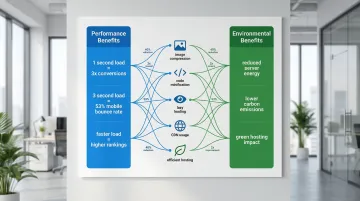
Sustainability-conscious design
For a climate tech company, a slow-loading website isn't just a performance problem. It's a brand inconsistency. Over one-third of B2B buyers report that ethics and sustainability are dealbreakers in vendor selection, and buyers evaluating climate solutions are particularly attuned to signals like this. A bloated, carbon-intensive website undermines the credibility you're working to build everywhere else.
The good news is that sustainable design and high-converting design are the same thing.
The business case for green design
Sustainable design choices differentiate brands while delivering measurable performance benefits. The connection between environmental responsibility and business outcomes is no longer theoretical.
Performance and sustainability alignment
Fast pages deliver on both environmental and commercial goals:
- Pages loading in 1 second convert 3x higher than those taking 5 seconds
- A delay of just one second can cut conversions by 20%
- 53% of mobile visitors leave if a page takes more than 3 seconds to load
Every optimization that reduces page weight (from compressed images to streamlined code) simultaneously lowers energy consumption and improves user experience. These aren't competing priorities.
Sustainable design practices
Image optimization:
- Compress images without quality loss using tools like Squoosh or ImageOptim
- Switch to modern formats like WebP or AVIF for significantly smaller file sizes
- Implement lazy loading for below-the-fold images
- Serve device-appropriate image dimensions rather than scaling in the browser
Code efficiency:
- Minimize JavaScript and CSS files
- Audit and strip unused code libraries
- Choose lightweight frameworks with efficient build processes
- Implement caching strategies to reduce repeat server requests
Hosting considerations:
Green hosting on renewable energy infrastructure reduces carbon footprint by up to 9%. CDNs distribute content closer to users, cutting server load and reducing latency, while efficient server configurations minimize energy consumption per request.
For climate tech companies, these technical optimizations align design practice with brand values. A website that loads fast, uses minimal resources, and communicates clearly is itself a signal of operational intentionality.
What's driving these B2B landing page design trends
Three macro forces are reshaping what B2B landing pages need to do in 2026.
The self-service mandate
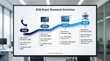
B2B buyers have fundamentally changed how they research and evaluate solutions. The preference for rep-free buying isn't a trend to monitor; it's the new default for most buying journeys. Buyers now consult 4-6 sources of information before engaging a vendor, and for complex climate or deep tech products, those sources include peer reviews, technical documentation, case studies, and increasingly, AI-generated summaries.
Your landing page now carries the weight of what used to be a relationship. It needs to handle objections, demonstrate credibility, and guide buyers toward action without a human in the room, covering the pricing transparency, technical specifications, and competitive comparisons that sales reps formerly delivered in a conversation.
AI and automation saturation
Artificial intelligence is transforming both how landing pages function and how buyers interact with them.
95% of buyers anticipate using generative AI to support their decision process, 25% of B2B buyers now use generative AI instead of traditional search, and 42% of companies already deploy AI-powered tools like chatbots on landing pages.
This creates a dual optimization challenge that most landing page guides overlook. You need to design for human readers scanning your page and simultaneously structure content for AI agents summarizing your offering to a buyer who may never visit directly. Clear information architecture and structured data aren't just technical SEO considerations anymore. They determine whether your company shows up accurately in AI-generated vendor comparisons.
Attention fragmentation and mobile dominance
Competition for attention has intensified across every metric that matters.
Mobile devices account for 83% of landing page visits, the average B2B buying group includes 13 internal stakeholders, and decision-makers evaluate multiple vendors simultaneously, often using mobile devices between meetings.
With 94% of buyers operating in groups of six or more, your landing page faces a specific challenge: it needs to speak credibly to end-users evaluating functionality, executives assessing ROI, and procurement teams managing risk, all from a single URL.
How these trends are impacting B2B landing pages
Implementing these trends consistently produces measurable improvements in the metrics that matter most to B2B companies: conversion rate, lead quality, and sales cycle length.
Conversion impact
Optimized hero sections and clear CTAs directly increase form completion rates and demo requests. The median B2B landing page conversion rate sits at 13.3%, significantly outperforming B2C averages of 9.9%. Top performers convert at 11%+ while SaaS pages average 3.8% due to complex value propositions that are harder to communicate quickly.
Reducing form fields from 11 to 4 yields a 120% increase in conversions. Personalized experiences reduce bounce rates from typical 70-90% levels, and targeted content increases time-on-page for qualified visitors.
Addressing buyer fears on landing pages (data privacy concerns, spam worries, commitment anxiety) can increase conversion rates by 80%, which matters especially for climate tech buyers who are already navigating procurement scrutiny around new technologies.
Marketing & sales alignment impact
Landing pages with integrated CRM data feed higher-quality leads to sales teams through better qualification upfront. High-quality landing pages can achieve 12-21% MQL-to-SQL conversion rates, significantly higher than average lead sources.
This quality filtering extends to sales velocity. Leads sourced from high-quality platforms and pages close faster: 127 days versus 158 days for lower-quality sources, demonstrating that landing page quality filters for better-fit buyers before the sales conversation even begins.
Interactive elements like chatbots increase engagement meaningfully. Visitors who use live chat are 16x more likely to purchase, and chat can lift conversions by 20%.
Competitive positioning impact
For B2B buyers evaluating multiple solutions, landing pages that load quickly and communicate clearly differentiate companies from competitors using outdated designs or jargon-heavy messaging.
Page speed has become a critical competitive factor. With 53% of mobile visitors leaving slow pages, technical performance directly determines whether prospects reach your value proposition at all.
Future signals for B2B landing page design
Several technologies are moving from early adoption to mainstream use. These developments will shape B2B landing page design over the next one to three years.
Conversational AI and voice interfaces
42% of companies already use AI-powered tools like chatbots on landing pages, and adoption is accelerating. The trajectory is clear: marketing tools are moving from assistants that surface recommendations to agents that automate complex tasks like A/B testing cycles and content iteration at scale.
Voice-activated interfaces will become a standard option, guiding visitors through content while qualifying leads conversationally. These tools are maturing quickly, moving from scripted FAQ responses toward handling complex technical questions and adapting in real time based on visitor behavior.
Predictive personalization
30% of companies plan to use AI for landing page optimization, moving toward predictive models that adapt content in real time. These systems read visitor intent signals (industry, browsing behavior, referral source) to anticipate needs before explicit actions occur.
The practical output is landing pages that adjust messaging, offers, and CTAs based on behavioral patterns and company data, without manual segmentation or complex rules engines maintained by your team.
Interactive elements and self-service tools
Interactive content (videos, quizzes, calculators) can boost conversions by up to 80%. The trend is accelerating toward embedded tools that qualify leads while providing immediate value:
- ROI calculators that demonstrate product value for specific use cases and buyer profiles
- Product configurators allowing self-service customization before the first sales conversation
- Assessment tools that diagnose problems and recommend solutions based on buyer inputs
- Interactive demos providing hands-on evaluation without requiring a scheduled call
This shift aligns directly with how buyers now prefer to evaluate solutions. Self-service tools let prospects move through their evaluation on their own timeline, which for climate tech buyers navigating long internal approval processes, matters considerably.
Conclusion
If your landing page is still structured the way it was when you launched, it's likely working against your current goals. The buyers you're targeting now are evaluating multiple vendors simultaneously, doing the bulk of that evaluation before anyone on your team speaks to them, and making trust judgments within seconds of arriving on your page.
The trends covered in this guide aren't about aesthetics. They're about signal clarity. A well-structured hero section tells the right visitor they're in the right place. Strategic social proof removes the risk your buying committee is quietly weighing. Personalized content serves the engineer and the executive differently, without making either feel like they're reading a generic brochure. Fast, lean pages reflect the operational discipline that enterprise buyers want to see before committing.
The data supports this direction: optimized hero sections lift conversions by 13-15%, strategic social proof increases conversions by 34%, and AI-powered personalization drives up to 68% improvement when implemented with the right infrastructure.
For climate tech and deep tech companies in particular, your website is often the first credibility signal a new buyer encounters. It needs to reflect where you are now, not where you started.
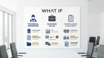
What if Design works with companies like Ribbit Network and Susteon to close the gap between the quality of the technology and the quality of the digital presence. If your website hasn't kept pace with your traction, it's worth addressing before the next visibility moment.
Frequently asked questions
What's the difference between a landing page and a website homepage?
Landing pages have a single conversion goal and remove navigation distractions to focus visitor attention on one action. Homepages serve multiple purposes (brand awareness, navigation, general information) and accommodate diverse audiences with different intents. A landing page for a specific campaign or offer should never share the same structure as your homepage.
How long should a B2B landing page be?
Length should match offering complexity and buyer journey stage. For simple offers like ebook downloads, pages under 1,000 words convert 50% better. For complex, high-value products like enterprise software or first-of-a-kind climate technologies, long-form pages can generate 220% more leads by thoroughly addressing buyer questions and objections before asking for commitment.
What are the most important elements of a high-converting B2B landing page?
Essential elements include: a compelling benefit-driven headline (under 44 characters), a relevant hero visual that reinforces the value proposition, social proof (logos, testimonials, certifications) near conversion points, a single clear action button, and a short form (4 fields maximum for top-of-funnel offers). Everything else should either support one of these elements or be removed.
How can I measure the success of my landing page design?
Track conversion rate (aim for 4-5% average or 11%+ for top-tier performance), bounce rate (monitor against 70-90% benchmark), page load speed (target under 3 seconds, ideally under 1 second), and lead quality through MQL-to-SQL conversion rate (benchmark 12-21%). For climate tech companies with long sales cycles, also track the time from first page visit to first qualified conversation.
Should I use video on my B2B landing page?
Yes, when the video adds specific evidence rather than general enthusiasm. Video is cited by 38.6% of marketers as the top conversion element, with product demos increasing conversions by up to 86%. Ensure videos don't slow load times: pages loading in 1 second convert 3x higher than those taking 5 seconds, so compress and host video properly rather than embedding heavy autoplay files.
How often should I update my landing page design?
Adopt continuous testing with major redesigns every 18-24 months or when conversion rates plateau for two consecutive quarters. Run monthly A/B tests on headlines, CTAs, form fields, and trust signal placement while monitoring performance metrics weekly. For climate tech companies, also revisit messaging whenever your proof points change significantly (new pilots completed, new certifications earned, new enterprise contracts signed).