You've put real work into your technology. The pilots are promising, your team is growing, and the deck is tight. But your landing page still reads like a technical brief written for a conference, not a page designed to move investors, partners, or buyers to action.
If you're like most climate and deep-tech founders, your landing page got built quickly and hasn't been revisited since. The result is a page that explains the technology without communicating the value, lists features without addressing the buyer's decision process, and loses credibility in the first scroll.
This guide breaks down what a high-performing landing page design actually requires for technical founders: how to structure your message, which design decisions directly impact conversion, and how to build a page that works as hard as your technology deserves.
TLDR: Key takeaways
- For technical founders, the biggest landing page problem isn't design - it's message hierarchy. Investors and buyers shouldn't have to decode your technology
- A focused, well-structured landing page converts at 10%+ compared to the 6.6% industry median. The gap between those is usually clarity, not aesthetics
- Mobile traffic represents 51% of visits but converts 8% lower. Climate tech audiences checking your page at conferences or during due diligence are part of that gap
- Testing matters, but only if you're changing the right things first. Most startups optimize before they've nailed the core message
What makes a high-converting landing page
Landing pages differ from homepages in one critical way: singular focus.
While homepages serve multiple audiences with various navigation paths, landing pages target one audience, one goal, one action. They're campaign-specific tools designed to convert traffic from ads, emails, or social media into leads or customers.
The psychology of conversion
Your visitor makes a judgment about your page before they read a single paragraph. Research shows users form visual assessments within 50 milliseconds, and that first impression is either working for you or against you.
The three factors driving those split-second decisions are clarity, relevance, and trust. For climate and deep-tech companies, all three are harder to establish than in most industries. Your technology is genuinely complex. Your proof points are real but often buried in technical language. Your buyers include investors who need to feel confident, enterprise procurement teams who need to see operational ROI, and policy partners who need to understand scale.
A page written at a 5th-7th grade reading level consistently outperforms technically dense copy - not because you're dumbing it down, but because clear writing signals confidence. Technical founders often default to explaining the science when what buyers actually need is a clear articulation of the business problem being solved.
Performance benchmarks
Understanding what good looks like gives you a baseline to work from. Across industries, the median landing page converts at 6.6%. Pages hitting 10% or higher are considered strong performers.
For early-stage climate companies, conversion benchmarks need additional context. Your audience isn't making impulse decisions. A procurement lead at a utility company evaluating your technology has a very different decision timeline than someone signing up for a SaaS trial. The goal of your landing page isn't always an immediate conversion; it's often building enough signal clarity that the right person books a call or downloads your technical brief.
That said, if your page isn't moving qualified visitors toward any action, the benchmarks still matter. A 6.6% median means more than 9 out of 10 visitors leave without taking action. In a niche climate tech market where each qualified lead matters, that gap has real consequences.
The brand-conversion connection
Brand consistency doesn't compete with conversion - it reinforces it.
Maintaining core brand elements (logo, colors, typography, voice) improves trust and conversion by creating coherent experiences from ad to landing page.
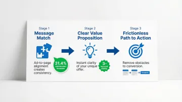
The three non-negotiables:
- Message match - Your landing page must deliver on the promise made in the ad. Dynamic text replacement that matches search terms can increase conversions by 31.4%
- Clear value proposition - Visitors should understand your unique benefit within 3 seconds
- Frictionless path to action - Every element should guide users toward your single conversion goal
Essential design elements that elevate your brand
Headline and subheadline
Your headline is often the only element a visitor reads before deciding whether to stay or leave. For climate and deep-tech companies, this creates a specific challenge: the most important thing about your technology is often deeply technical, but the most important thing to your buyer is the problem it solves for their operations, their portfolio, or their organization.
Effective headlines don't lead with the mechanism — they lead with the outcome. "Real-time methane monitoring that reduces compliance risk by 40%" works harder than "AI-powered sensor network for industrial emissions." Both describe the same product. Only one speaks to the buyer's decision.
Benefit-driven headline formula: Lead with the outcome, not the feature. Address a specific pain point your buyer faces, not a general industry problem. Keep it under 10 words when possible, and make sure it reflects your brand's tone — whether that's formal, conversational, or technical.
Your subheadline expands on the promise with specificity. It should add context, clarify the benefit, or address the "how" while maintaining brand tone.
Together, headline and subheadline do the job of establishing relevance before the visitor has read a single bullet point. If a prospect can't tell within five seconds what you do and why it matters to them, the rest of the page doesn't get read.
Visual hierarchy and layout
Users rarely read landing pages from top to bottom. They scan, moving quickly through the page looking for relevance markers. Understanding how that scanning happens lets you place your most important content where it will actually be seen.
F-pattern scanning: Users scan horizontally across the top, then down the left side on text-heavy pages. Place your value proposition and key benefits along these sight lines.
Z-pattern scanning: On simpler, image-focused pages, users follow a Z-path from top-left to bottom-right. Position your CTA at the end of this natural eye movement.
White space strategy: White space creates visual breathing room, guides attention to priority elements, and prevents decision fatigue by reducing clutter. Frame important content with generous margins and let the layout breathe.
Think about what happens when a procurement lead or investor lands on your page with five minutes to evaluate your technology. If your strongest proof point is buried in the third scroll because the layout wasn't built around how the eye actually moves, that evaluation — and potentially that deal — ends before you've made your case.
Call-to-action (CTA) design
Your CTA button is where interest becomes a decision. Every element of its design - size, color, copy, placement - affects whether that decision happens.
Design best practices: Your CTA needs to be large enough to notice immediately — minimum 44x44 pixels on mobile. High contrast with the background matters more than any specific color choice. For simple offers, place it above the fold; for complex products requiring more information, below the fold can increase conversions by 20%. Use specific, action-oriented copy: "Get your free audit" outperforms "Submit" every time.
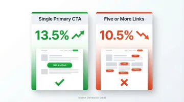
The one-page, one-goal principle: Pages with a single primary CTA convert at 13.5%, compared to 10.5% for pages with five or more CTAs. For technical founders who want to communicate everything about their technology, this is often where pages go wrong: multiple CTAs, navigation links, and secondary offers all compete for the visitor's attention. Every link that isn't your primary CTA is a potential exit path.
Trust and credibility elements
Trust signals reassure visitors and reduce perceived risk. If you're an early-stage climate company, they also serve a specific credibility function: they signal that others have already validated what you're building.
- Testimonials: Adding testimonials can increase conversions by 34%
- Social proof: Customer logos, user counts, or media mentions
- Trust badges: Security certifications, industry memberships, or awards
- Data and statistics: Real numbers from credible sources like the IPCC and EPA
Integration without clutter: Place testimonials near related benefit claims, and use client logos in a simple grid or carousel. Position trust badges near form fields or CTAs, and let white space separate trust elements from surrounding content.
For purpose-driven brands and climate tech companies: Include sustainability certifications, impact metrics backed by verifiable data, government program acknowledgments where relevant, and partnership logos that demonstrate credibility in the clean energy sector. Specificity matters more than comprehensiveness. One verifiable pilot result carries more weight than five vague impact claims.
Brand consistency components
Maintain these core elements across all landing pages: consistent logo placement and sizing, primary and secondary brand colors, headline and body font families, a consistent tone of voice (formal, conversational, technical, or friendly), and a coherent imagery style — whether photography, illustration, or graphics.
Adapting for conversion: If you're at an early-stage climate company, brand consistency serves a credibility function that goes beyond aesthetics. When an investor encounters your page after seeing your deck, or a procurement lead visits after a conference introduction, a polished and coherent visual identity signals organizational maturity - which directly affects their confidence in you as a long-term partner. Allow flexibility in layout and CTA design for specific campaigns, but maintain core brand elements consistently across all pages to reinforce that signal.
Step-by-step landing page design process
Step 1: Define your audience and their decision context
You likely have more than one audience arriving on the same page: an investor evaluating the opportunity, a procurement lead assessing operational fit, a policy partner looking at regulatory alignment. Before designing anything, you need clarity on which audience this specific page is for.
Start with these questions:
- Who is the primary decision maker for this page's goal?
- What does that person need to believe before they take action?
- What objections are most likely to stop them?
- How did they arrive here - paid search, a partner referral, a conference introduction?
- What does their approval process look like after they engage?
The answers shape everything: headline choice, proof point selection, CTA language, and page length.
Step 2: Establish your single conversion goal
Define your most wanted action (MWA) — whether that's a newsletter signup, a demo request, a free trial activation, or a purchase. Every element on the page must support this single goal. Remove anything that doesn't directly contribute to conversion. For buyers in complex B2B or climate markets, that action is rarely a purchase — it's a booked call or a downloaded technical brief. Build everything on the page toward that one step, and you'll move more qualified conversations toward a deal.
Step 3: Craft your core message
Develop your headline, subheadline, and value proposition that balance brand voice with conversion psychology.
Write five to ten headline variations that address the core pain point your buyer faces. Test them with colleagues or target users, then select the clearest, most compelling option. Follow with a subheadline that adds specificity, and ensure both reflect your brand's tone.
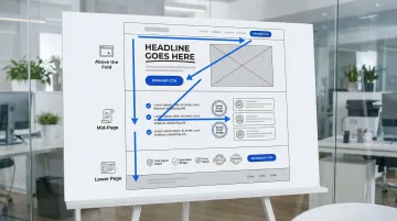
Step 4: Create wireframe structure
Sketch the layout placing essential elements strategically. The page structure follows a predictable hierarchy: above the fold, lead with your headline, subheadline, hero image, and primary CTA. The mid-page carries benefits, features, social proof, and testimonials. Below that, add additional trust signals, a secondary CTA, and the footer.
Consider F-pattern or Z-pattern scanning when positioning elements. The structure you commit to here determines what an enterprise buyer sees in their first scroll — which often determines whether they book a call or leave the page.
Step 5: Design the visual layer
Apply brand colors, typography, and imagery while maintaining visual hierarchy.
Use contrast to highlight priority elements, employ white space generously, and ensure mobile responsiveness by testing on multiple devices. Subtle animations or illustrations can add visual interest without creating distraction. A polished visual layer also signals organizational credibility to investors and enterprise buyers who have little else to evaluate before a first meeting.
Step 6: Optimize for speed and performance
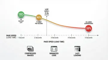
A one-second delay in page load can reduce conversions by 7%. Pages loading in 5 seconds have 3x lower conversion rates than those loading in 1 second.
Performance optimization:
- Compress all images (aim for under 200KB each)
- Minimize code and remove unused scripts
- Implement lazy loading for below-fold images
- Target Largest Contentful Paint (LCP) under 2.5 seconds
Mobile-first design considerations
Mobile devices account for over half of web traffic, yet mobile landing pages convert 8% worse than desktop. For climate tech companies, this gap has a specific context: your audience is often checking your page at conferences, during due diligence, or while preparing for a partner meeting. A slow or poorly formatted mobile experience in those moments creates friction at precisely the wrong time.
Why mobile-first is critical
Google uses mobile-first indexing, meaning it primarily uses the mobile version of your content for ranking. Poor mobile experience doesn't just hurt conversions - it damages your search visibility.
Mobile-specific design requirements
Essential mobile optimization elements include buttons and links at a minimum of 44x44 pixels, with adequate spacing between clickable elements and the primary CTA within easy thumb reach. Remove or minimize navigation menus. For readability, use a minimum 16px font size for body text, generous line height (1.5x font size), and short paragraphs of two to three lines maximum.
Responsive design testing
Test across various device sizes (phone, tablet, desktop), different browsers (Chrome, Safari, Firefox), loading speed on 3G/4G networks, and form functionality on mobile devices.
Landing page examples that elevate brands
Learning from real-world success stories shows what actually drives conversions. These examples demonstrate specific tactics you can adapt for your brand.
Example 1: Love Child Organics (purpose-driven food brand)
Love Child Organics achieved a 69% conversion rate by testing one critical element: whether to show babies or toddlers in their imagery. This single decision, based on audience data, reduced their cost per acquisition by 35%.
Apply this approach: Test visual elements systematically against audience data. Segment messaging based on specific customer demographics, and use authentic imagery that reflects your users' context.
Example 2: Zola (wedding registry platform)
Zola created 300+ landing page variations targeting specific segments - Pinterest users, rustic decor enthusiasts, minimalists - and increased conversions by 5-20% through personalized messaging.
The lesson: One landing page can't serve all audiences effectively. Create variations that speak directly to different user contexts, then scale what works across similar segments.
Example 3: Climate tech landing pages
You face a unique challenge: proving credibility to technical audiences while remaining accessible to investors and executives.
Your landing page should include government program acknowledgments and partnership logos where applicable, data from credible sources like the IPCC and EPA supporting impact claims, dual content layers for technical and executive audiences, sustainability certifications and measurable metrics, and fast mobile loading for conference networking.
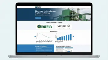
At What if Design, we've built landing pages for climate innovators including HYDGEN (green hydrogen production) and Ribbit Network (environmental sensing infrastructure). Both required translating genuinely complex technologies into pages that could serve technical validators and non-technical investors simultaneously - a challenge that's different in kind from typical B2B landing page work.
Testing and optimization
Most A/B tests don't produce statistically significant results. Only 12% of tests do, which means running experiments without a clear hypothesis about what's underperforming is largely a waste of time. The companies that see real conversion lifts (averaging 30% over time) are running structured experiments against specific problems, not testing random elements.
For early-stage companies with limited traffic, this matters especially. You may not have the volume to run statistically significant tests on every element. Start with the highest-impact variables: your headline and your primary CTA. Get those right before optimizing image treatments or button colors.
A/B testing fundamentals
What to test (in priority order):
- Headlines and value propositions
- CTA button copy, color, and placement
- Hero images or videos
- Form length and field labels
- Page length (short vs. long form)
- Trust signal placement
How to structure tests: Change one element at a time for clear results, and run tests until you reach 95% statistical significance. Plan for an adequate sample size — typically 3,000 or more visitors per variation — and test for at least two to three weeks to account for weekly traffic patterns.
Tools and methods
Start with analytics to understand user behavior, then use dedicated A/B testing tools to run experiments.
Analytics platforms: Start with Google Analytics for traffic and conversion tracking. Add heatmaps (Hotjar or Crazy Egg) to visualize user behavior, and session recordings to watch how actual users interact with the page.
A/B testing tools: Unbounce and Leadpages both include built-in A/B testing. VWO works well for mid-market testing needs, and Optimizely scales for enterprise requirements.
Note: Google Optimize was discontinued in September 2023. GA4 now includes some basic experimentation capabilities, but dedicated tools give you more control over test design and reporting.
When to DIY vs. hire design professionals
The decision between a DIY landing page builder and professional design support usually comes down to one question: is the primary problem a design problem or a messaging and positioning problem?
If your core message is clear and your offer is simple, a well-configured Leadpages or Unbounce template can do the job. If you're a technical founder struggling to articulate a complex technology to multiple audiences - investors, buyers, and partners who all need to hear something different - a DIY builder won't solve the underlying problem.
DIY landing page builders work well for:
DIY tools make sense for simple lead capture pages, small budgets ($37–187/month for tools like Leadpages or Unbounce), and quick campaign launches that need rapid deployment. They're also a reasonable choice for testing new markets before significant investment, or for offers that are genuinely straightforward.
Professional design becomes essential for:
Complex products that require detailed explanation, high-stakes campaigns where conversion rates directly impact revenue, and brand launches that need strategic positioning. If you're communicating technical innovations to non-technical audiences — which is likely the case — a professional approach is rarely optional.
For your company, the choice often comes down to strategic clarity. A DIY tool can build a functional page, but it won't solve the messaging problem - which is typically the core issue. That requires someone who understands the technical landscape and the buyer's decision context at the same time.
At What if Design, we work with Seed to Series B climate companies on exactly this: building landing pages that reflect both the depth of the technology and the clarity that investors and buyers need. Projects typically move from brief to live in under two weeks, with strategy and positioning built into the process from day one. If you want to see how we've approached this for other climate companies, take a look at our UX and conversion work.
Where to go from here
If your landing page was built quickly to support a launch or campaign and hasn't been revisited since, it may be doing less work than your business currently needs.
Before your next visibility moment - whether that's a conference, a funding announcement, or an enterprise partnership conversation - it's worth assessing whether your page clearly communicates what you've built and who it's for.
Reach out if you want a clear read on what your landing page is doing well and where it's losing people.
Frequently asked questions
What makes a high-performing landing page?
A high-performing landing page starts with a clear value proposition that speaks directly to your specific audience, not a general claim about what the product does. From there: a single focused goal, a headline that surfaces the right problem, trust signals placed where decisions happen, and a load speed under 2.5 seconds. The pages that consistently outperform are the ones where message and design are aligned from the start, not patched together after launch.
How much does a custom landing page cost?
DIY tools cost $37-187/month, freelance designers charge $500-2,000, and agencies typically charge $2,000-10,000+ depending on complexity and whether strategy and copywriting are included.
How long should a landing page be?
Length depends on offer complexity. Use short pages (1-2 screens) for simple or free offers. Complex products or high-commitment purchases — which likely describes your offering — need longer pages (3-5+ screens) to address objections and build the case. The guiding principle: as long as necessary to overcome resistance, no longer.
Should landing pages have navigation menus?
Generally no. Removing navigation can increase conversions by 100% in some contexts by eliminating distractions. However, some high-trust contexts (B2B enterprise or high-ticket deals) benefit from minimal navigation that reinforces credibility without creating unnecessary exit paths.
What's the difference between a landing page and a website homepage?
Homepages serve multiple audiences and goals with various navigation paths, acting as hubs for exploration. Landing pages serve one audience with one goal and one action, functioning as focused conversion tools for specific campaigns. For climate tech companies with multiple stakeholder audiences, this distinction is especially important - one page cannot effectively serve an investor, an enterprise buyer, and a policy partner at the same time.
How do you maintain brand consistency on landing pages?
Use your brand color palette, maintain typography standards, include your logo, match your tone of voice, and use on-brand imagery. Allow flexibility in layout and CTA design for conversion optimization, but keep core brand elements consistent to build recognition and trust. For early-stage companies, consistency across touchpoints also reinforces credibility - a landing page that looks disconnected from your deck or website creates doubt rather than confidence.