
You've built the technology, secured the funding, and started conversations with potential partners. But when someone lands on your website or picks up your pitch deck, your visual brand still looks like it was assembled on a weekend.
The issue isn't aesthetics. A generic color palette signals to investors and partners that the brand hasn't kept pace with the company. When your visual identity looks identical to fifteen other climate startups, the cognitive shortcut is: not yet ready.
This guide gives you a step-by-step process for building a color palette that accurately signals your company's maturity, differentiates you from competitors in your category, and holds up across every touchpoint from pitch decks to product interfaces.
TLDR
- Color is processed before text or logos, making your palette one of the first signals your brand sends to investors and partners
- Effective palettes use 4-5 colors: 1-2 neutrals, 1 primary, 1-2 secondary, 1 accent
- Start by defining what your brand needs to communicate to each audience, then select colors that match that intent across cultural contexts
- Apply 60/30/10 proportions adjusted to your brand's maturity and personality
- Test all combinations for WCAG 4.5:1 contrast and validate across real-world applications before finalizing
Why color choices matter more than most climate founders realize
Color bypasses conscious processing to trigger immediate cognitive and emotional responses. For climate tech companies selling to skeptical enterprise buyers, conservative utility procurement teams, or institutional investors, those first impressions carry real weight.
Color processes faster than text
Human visual processing detects color differences within 30-50 milliseconds, significantly faster than recognizing text or shapes. This pop-out effect means distinct hues capture attention immediately, regardless of how many other visual elements compete for focus.
Strategic implication: Your primary brand color becomes a recognition trigger that works before viewers consciously engage with your content. For a climate startup trying to build credibility with buyers who receive dozens of vendor pitches, that instant recognition matters.
Color psychology fundamentals
While color psychology is often oversimplified in generic branding advice, consistent associations exist that matter for climate tech specifically. The added complexity here is that you're typically communicating to multiple audiences simultaneously: investors looking for credibility signals, enterprise buyers evaluating reliability, and policy stakeholders assessing institutional weight. A single palette needs to work across all of them.
- Blue: Signals competence, trust, and intelligence, widely used in tech and finance to convey reliability
- Green: Strongly associated with nature, security, and environmental intent, though overuse in climate tech has diluted its differentiation value
- Orange: Communicates energy, optimism, and forward momentum
- Red: Linked to urgency and activation, but also danger and caution depending on context
- Earth tones (browns, tans): Signal authenticity, organic qualities, and regenerative positioning
Authentic mission communication
For climate tech companies, buyers have become increasingly skeptical of sustainability signals. Defaulting to green reads as generic or, in some cases, performative. The brands that get this right tie their color choices to a specific narrative, not just a category association.
The Global Energy Alliance for People and Planet (GEAPP) explicitly uses "GEAPP Orange" to represent the sun, energy, and optimism, paired with dark and neon greens to visualize the shift to renewable power. The color choice is backed by a defined narrative, and that level of intentionality is what separates a credible visual identity from a palette that looks assembled from a template.
Competitive differentiation
Beyond signaling intent, color creates differentiation in crowded categories by helping your brand stand out while staying relevant to the space.
Strategic positioning examples: Most finance brands use blue to signal trust, so alternative colors immediately signal that you're doing something different. Climate tech brands can differentiate with teal, energetic yellows, or earth tones rather than defaulting to the obvious green that every competitor also uses — adjacent hues maintain category relevance while creating visual distinction.
This is particularly worth thinking through carefully, because sustainability alone is no longer a differentiating factor. The visual system needs to communicate what makes your company worth engaging with beyond the fact that it operates in climate.
Step-by-step: building your brand color palette
Step 1: Define your brand's positioning intent
Before selecting any colors, you need to know what your brand needs to communicate and to whom. For most climate tech companies, this is more complex than a typical startup because you're managing multiple distinct audiences with different evaluation criteria.
Identify 3-5 core attributes your brand needs to signal. Base these on your positioning strategy, not your mission statement. Mission drives product decisions; positioning drives how you need to appear to the people you're trying to close.
- Trust and institutional credibility
- Innovation and technical differentiation
- Momentum and forward progress
- Urgency appropriate to the problem
- Operational credibility
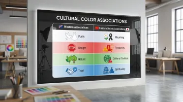
Research your target audience's color associations, especially if you serve global markets or multiple industry verticals. Color meanings shift across cultures in ways that can undercut an otherwise strong palette:
| Color | Western associations | Eastern/Asian associations |
|---|---|---|
| White | Purity, cleanliness | Death, mourning, humility |
| Red | Excitement, danger | Luck, happiness, prosperity (China) |
| Green | Nature, environment | Infidelity (China - "wearing a green hat") |
| Blue | Trust, authority | Immortality, spirituality |
Analyze competitor color palettes to identify gaps before you finalize anything. For climate tech, this often reveals that breaking from the predictable green palette is both feasible and strategically smarter. Document which colors dominate your category and where there's room to differentiate without losing category relevance.
Step 2: Build your base with neutral colors
Select 1-2 neutral colors that serve as your foundation. These provide contrast space for bolder colors and keep your palette versatile across applications from investor decks to product UI.
Choose neutrals by temperature:
- Warm neutrals (creams, tans, warm grays) signal approachability and organic qualities, well suited to human-centric or market-facing brands
- Cool neutrals (pure white, cool grays, charcoal) signal precision, technical credibility, and institutional weight, common in SaaS, fintech, and enterprise platforms
Verify accessibility compliance. Neutrals often serve as backgrounds or body text colors, making contrast ratios critical:
- Normal text requires 4.5:1 contrast ratio against backgrounds
- Large text (18pt+ or 14pt+ bold) requires 3:1 contrast ratio
- UI components like input borders need 3:1 contrast against adjacent colors
Test your neutrals using the WebAIM Contrast Checker to verify WCAG 2.2 compliance before you build anything else on top of them.
Step 3: Choose your primary brand color
Your primary color will be the most consistent visual signal your brand sends. It appears across your website, pitch materials, product interfaces, and physical touchpoints, and over time it becomes synonymous with your identity.
Align with your core positioning attribute using color psychology as a guide:
- Patagonia: Uses earth tones to signal environmental commitment and operational authenticity
- Stripe: Employs purple to communicate that it's doing something different in fintech, deliberately avoiding the blue that dominates the finance category
- Tiffany & Co.: Trademarked "Tiffany Blue" (Pantone 1837) as a standalone brand asset that carries their entire brand identity without requiring a logo
Test for versatility before committing:
- Reproduces accurately across formats (screen, print, fabric)
- Maintains visual impact at different scales (from favicons to conference signage)
- Works on both light and dark backgrounds
- Remains distinguishable when converted to grayscale
Step 4: Add secondary and accent colors
Choose 1-2 secondary colors that complement your primary and give your design system room to breathe. These often work as lighter or darker shades of your primary, or as adjacent colors on the color wheel.
Select 1 accent color that creates visual interest and draws attention to calls-to-action. This should contrast strongly enough with your primary to be immediately distinguishable.
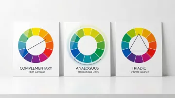
Apply color harmony principles:
- Complementary: Colors opposite on the color wheel (blue/orange) create high contrast and visual impact
- Analogous: Adjacent colors (blue/blue-green/green) create harmonious, cohesive looks
- Triadic: Three evenly spaced colors (red/yellow/blue) offer vibrant contrast with balance
Contrast drives conversion. Research on CTA buttons shows that contrast ratios matter more than specific hues. The highest-converting button color is whichever one stands out most from the surrounding page, not any universally "best" color.
Step 5: Document color values and usage rules
Record precise color values in multiple formats to ensure consistency across every output:
- HEX: For web design (HTML/CSS) — Example: #2E7D32
- RGB: For digital displays and monitors — Example: RGB(46, 125, 50)
- CMYK: For standard four-color printing — Example: CMYK(63, 0, 60, 51)
- Pantone (PMS): For precise spot-color printing — Example: Pantone 356 C
Many saturated RGB colors cannot be perfectly reproduced in CMYK. Always specify the "master" source format (usually Pantone or RGB) and derive other values from it to minimize color drift across applications.
Create clear usage guidelines that specify when and where each color should appear, minimum sizes for colored elements, approved background pairings, and contexts where certain colors are preferred or restricted.
Understanding color proportions and usage rules
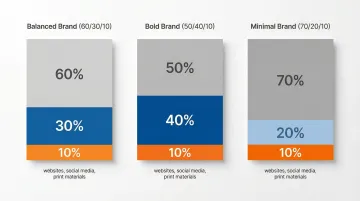
The 60/30/10 rule gives you a working starting point for balanced color application:
- 60% dominant neutral color (backgrounds, large surfaces)
- 30% primary and secondary brand colors (headers, key elements)
- 10% accent color (CTAs, emphasis, interactive elements)
This rule originates from interior design principles rather than brand research, but it's a useful heuristic for managing visual hierarchy across a system.
These ratios are not fixed. Adjust based on what your brand needs to communicate:
- Bold brands: 50/40/10 increases color presence and energy
- Minimal brands: 70/20/10 creates breathing room and signals precision
- Balanced brands: 60/30/10 works as a default foundation
Application also varies by channel. Follow the rule closely for websites and core landing pages. For social media, shift toward 40/50/10 for more visual impact in fast-scrolling feeds, and use 70/20/10 for print materials where readability at scale is the priority. Presentations vary by slide purpose.
Testing your color palette
Before finalizing your palette, test it across real-world applications to confirm it's accessible, functional, and sends the right signals to each of your audiences. This step catches problems that aren't visible when you're only looking at color swatches in isolation.
Create mockups across multiple contexts:
- Website homepage and key landing pages
- Social media posts (Instagram, LinkedIn formats)
- Business cards and letterhead
- Presentation slides (title, content, data visualization)
- Product interfaces or sales materials specific to your business
Once you see how colors work together in context, validate accessibility using WCAG 2.2 standards:
- Check all text and background combinations against minimum contrast ratios
- Test with colorblindness simulators (Color Oracle, Coblis) to ensure designs remain distinguishable
- Verify that information isn't conveyed by color alone; use icons, labels, or patterns as backup
Then gather feedback from team members, board members, and where possible, people from your target buyer segments.
Ask specifically what the palette makes them think about the company, whether it feels like a company at the stage you've described, whether they can easily distinguish between different elements, and how it compares visually to the competitors you showed them.
Common mistakes when building brand color palettes
Choosing based on what the team finds appealing, not what the audience needs to see
Technical founders are typically heads-down on the product. The brand gets assembled quickly, often defaulting to colors that feel environmental or that appeal to the founding team's aesthetic. The problem: a palette built without audience research sends signals that may not match what your buyers or investors are looking for. A deep blue that appeals internally might read as "legacy infrastructure" to a clean energy procurement officer evaluating your credibility against newer competitors. Test your palette against your audience's mental model before committing.
Creating palettes with too many or too few colors:
- More than 5-6 colors dilutes recognition and increases cognitive load across a design system
- Fewer than 3 colors restricts design flexibility and makes it harder to create visual hierarchy
- Excessive variety reduces visual search efficiency, making key elements harder to identify at a glance
Skipping accessibility validation
Palettes that fail WCAG contrast requirements exclude roughly 1 in 12 men and 1 in 200 women who have some form of color vision deficiency. For climate tech companies building broad commercial or institutional coalitions, that's a meaningful share of your audience. Accessibility compliance also protects you from legal exposure as WCAG standards become increasingly referenced in procurement requirements.
When to get professional help with your brand color palette
Consider working with brand design experts when you're:
- Launching a new brand where color will establish your first impression with investors and early partners
- Rebranding to signal that the company has evolved past its early-stage positioning
- Entering new markets where color meanings differ significantly from your current positioning
- Lacking internal design expertise to validate color choices against real-world applications and audience expectations
In these scenarios, professional designers bring strategic value that goes beyond color selection. They validate choices through mockups, real-world testing, and structured feedback processes that ensure your palette works across every channel before you commit to it.
This is particularly relevant for climate tech companies because the trust bar is higher. Buyers in this space have seen a lot of companies that looked credible but couldn't deliver. A brand that looks polished and intentional reduces that friction, but only if it was built with the right inputs.
If your visual identity hasn't kept pace with your funding, traction, or the conversations you're now having, that's the problem worth solving. What if Design works with Seed to Series B climate startups to build color systems and brand identities that hold up across investor materials, product interfaces, and partner communications. You can see examples of that work at whatifdesign.co.
A color palette isn't the most technically complex part of your brand, but it's the part that works hardest before anyone reads a word. When it's right, it signals the right things to the right people without requiring explanation. That's the standard worth building toward.
Frequently asked questions
How do I determine a color palette for my brand?
Start by defining what your brand needs to communicate to each of your core audiences: investors, buyers, and partners often respond to different signals. Select 4-5 colors (neutrals plus primary, secondary, and accent), analyze competitor palettes to find differentiation opportunities, and test across real applications before finalizing.
What are common color proportion rules for brand color palettes?
The 60/30/10 rule is the most common starting point: 60% dominant neutral, 30% primary and secondary colors, 10% accent for calls-to-action and interactive elements. Minimal brands often use 70/20/10 for a more precise feel, while bolder brands might shift to 50/40/10 for greater color presence.
How many colors should a brand palette have?
Most effective palettes contain 4-6 colors: 1-2 neutrals, 1 primary, 1-2 secondary, and 1 accent. Fewer than 3 restricts design flexibility, while more than 6 tends to dilute recognition and make the system harder to maintain consistently.
What is the difference between primary and secondary brand colors?
Your primary color is the most prominent brand color, appearing in your logo and across the majority of touchpoints. It becomes the visual shorthand for your identity. Secondary colors complement it and give the design system flexibility without breaking consistency.
Should I consider accessibility when choosing brand colors?
Yes, and not just as a compliance checkbox. Accessible palettes communicate more effectively across your entire potential audience, including the roughly 1 in 12 men who have some form of color vision deficiency. Check contrast ratios using WCAG guidelines (minimum 4.5:1 for body text) and test with colorblindness simulators like Color Oracle or Coblis.
How do I test whether my color palette is working?
Create mockups of key brand applications including your website, pitch deck, social media posts, and business cards so you can see colors in actual context rather than as swatches. Test contrast ratios for accessibility, gather structured feedback from stakeholders and target audience members, and validate that the palette communicates the positioning attributes you defined at the start of the process.